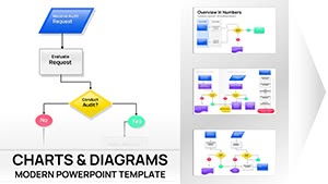
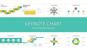
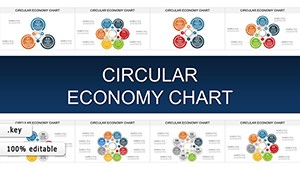
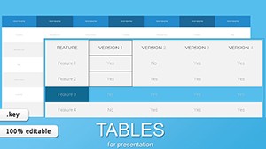
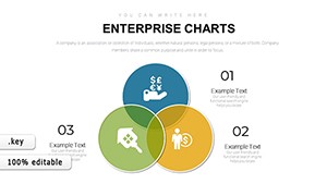
Audit Keynote Charts

Our audit charts for Keynote are crafted to empower professionals in finance and compliance with tools that turn intricate data into clear, compelling visuals. Whether you're an internal auditor reviewing operations or an external consultant presenting findings, these templates provide a foundation for effective communication.

Imagine streamlining your workflow by starting with pre-designed flowcharts, matrices, and graphs that highlight discrepancies, trends, and recommendations. These elements not only save time but also ensure consistency across your documents, making your presentations more persuasive to stakeholders.

Targeted at busy auditors who value efficiency, our collection includes options for various audit types, from financial to operational. Users appreciate how these charts integrate seamlessly into Keynote, allowing quick edits on the fly. Ready to make your next audit report shine? Browse our templates and select the ones that resonate with your project goals.


View by: Last Added | Most Popular
  • like 4
    (10)
    Psychology of Leadership Charts Template for Keynote - Insightful, Professional, and Ready to Impress
    ID: #KC01051
    $24.00
  • like 5
    (377)
    Vibrant Beauty Makeup Cosmetic Keynote Charts for Presentation
    ID: #KC01004
    $22.00
  • like 3
    (926)
    Bank Security Safeguarding Keynote Charts Template
    ID: #KC00981
    $18.00
  • like 2
    (490)
    Data Financial Keynote Charts Template for Presentation
    ID: #KC00973
    $20.00
  • like 5
    (1181)
    Project Timeline Management Keynote Charts for Presentation
    ID: #KC00942
    $25.00
  • like 2
    (352)
    Financial Statement Analysis Keynote Charts Template for Professional Presentations
    ID: #KC00932
    $24.00
  • like 5
    (556)
    Statement of Financial Position Keynote Charts | Create Presentation
    ID: #KC00931
    $24.00
  • like 3
    (88)
    Interim Financial Statements Keynote chart Presentation
    ID: #KC00919
    $22.00
  • like 4
    (518)
    Circular Economy Keynote charts
    ID: #KC00908
    $20.00
  • like 3
    (1137)
    Circular Economy Charts for Keynote presentation
    ID: #KC00904
    $15.00
  • like 3
    (740)
    Remote work: Jobs, Companies and Virtual Teams Keynote charts
    ID: #KC00892
    $18.00
  • like 4
    (243)
    Business Report Keynote Charts Template | Presentation
    ID: #KC00887
    $15.00
  • like 3
    (977)
    Premium Enterprise Charts Template for Keynote - Professional Data Visualization
    ID: #KC00883
    $14.00
  • like 2
    (215)
    Test Timer Keynote charts
    ID: #KC00874
    $15.00
  • like 3
    (1071)
    Construction Timeline Keynote Charts Template
    ID: #KC00864
    $18.00
  • like 3
    (589)
    Tube Timeline Keynote chart template
    ID: #KC00855
    $15.00
  • like 4
    (769)
    Marketable Basket Keynote chart
    ID: #KC00853
    $20.00
  • like 3
    (916)
    Volatility Pyramid Keynote chart
    ID: #KC00842
    $10.00
  • like 2
    (613)
    Events Timeline Keynote Charts - Download Infographic Presentation Template
    ID: #KC00838
    $13.00
  • like 4
    (386)
    Comparative Analysis of Life Cycle Keynote charts
    ID: #KC00832
    $15.00
  • like 2
    (840)
    Agile Development Methodology Keynote charts
    ID: #KC00831
    $13.00
  • like 4
    (871)
    Agile Scrum Development Process Keynote charts
    ID: #KC00830
    $15.00
  • like 2
    (331)
    Professional Leader Charts Template for Keynote | Download Now
    ID: #KC00827
    $15.00
  • like 2
    (354)
    Take Your Keynote Presentations to the Next Level with Flow Data Analysis Charts
    ID: #KC00822
    $13.00


Why Choose Audit Charts in Keynote for Your Presentations

When it comes to conveying the nuances of an audit, visual aids are indispensable. Keynote's robust features pair perfectly with our audit-specific charts, enabling you to create slides that are both informative and visually appealing. Unlike generic software, Keynote offers smooth animations and transitions that bring audit data to life, helping audiences grasp complex concepts quickly.

These charts are more than just pretty pictures; they're built on best practices from the auditing field, incorporating elements like color-coded risk levels and annotated process steps. For instance, a simple flowchart can map out an entire audit cycle, from planning to follow-up, reducing the chance of oversight in your narratives.

Key Benefits for Auditors and Teams

  • Enhanced clarity: Break down dense financial data into digestible segments, making it easier for non-experts to understand audit outcomes.
  • Time efficiency: Skip the design phase and jump straight to content customization, freeing up hours for analysis.
  • Professional polish: Impress clients or executives with sleek, modern visuals that reflect high standards in your work.
  • Flexibility: Adapt templates to specific industries, whether it's manufacturing compliance or IT security audits.

Consider how these benefits play out in real scenarios. A financial services firm might use a risk assessment matrix to prioritize issues, leading to faster resolutions and better resource allocation.

Exploring Types of Audit Charts Available

Our library features a diverse array of chart types tailored for audit purposes. Start with process flow diagrams that outline step-by-step procedures, ideal for training new team members or documenting methodologies. Then, there's the compliance bar graphs, which compare actual performance against regulatory standards, spotlighting areas needing attention.

For deeper insights, pie charts segment audit findings by category - such as errors, inefficiencies, or successes - offering a snapshot of overall health. Line graphs track changes over time, perfect for recurring audits where historical context matters. Each template is fully editable in Keynote, so you can adjust scales, labels, and colors to match your report's theme.

Customizing Your Audit Visuals

Customization is key to making these charts your own. In Keynote, you can easily import data from spreadsheets, ensuring accuracy without manual entry errors. Add annotations for expert commentary, like noting a particular risk's potential impact, which adds layers of insight.

Pro tip: Use Keynote's shape tools to overlay icons on charts, such as warning symbols for high-risk areas, enhancing visual storytelling. This approach not only boosts engagement but also demonstrates your expertise in presenting audit information effectively.

Use Cases: Bringing Audit Charts to Life

In a corporate setting, imagine preparing for an annual financial audit. Using our templates, you create a dashboard slide that combines multiple charts - a bar graph for expense variances and a flowchart for approval processes. This holistic view helps executives see the big picture, facilitating informed decisions.

Another example: During a quality assurance audit in healthcare, a matrix chart categorizes patient safety incidents, allowing teams to identify patterns and implement preventive measures. One hospital reported a 20% drop in errors after visualizing data this way, showcasing the practical value of these tools.

For educational purposes, trainers use these charts to teach auditing principles, with interactive elements in Keynote that allow students to manipulate data and see real-time changes. This hands-on method reinforces learning and prepares future auditors for professional challenges.

Comparing Audit Charts with Other Visualization Tools

While spreadsheets like those in Numbers can handle basic charts, Keynote elevates them to presentation-ready status with superior design capabilities. Our templates bridge this gap, providing audit-focused designs that go beyond standard options, ensuring your visuals are both accurate and aesthetically pleasing.

In contrast to more complex software, Keynote's user-friendly interface means less training time for your team. Plus, with iCloud integration, collaborate seamlessly on audit presentations from anywhere, maintaining version control and security - crucial for sensitive financial data.

Tips from Presentation Experts

Drawing from years of experience in financial reporting, experts recommend keeping charts simple: Limit to three to five data points per visual to avoid overwhelming viewers. Incorporate consistent branding elements, like company colors, to build trust and recognition in your audit documents.

Always include a legend and source notes for transparency, reinforcing the trustworthiness of your findings. Test your slides on different devices to ensure they render well, as Keynote's compatibility across Apple ecosystems makes this straightforward.

Ready to upgrade your audit presentations? Select a template from our collection and experience the difference in your next report.

Integrating Charts into Comprehensive Audit Reports

A well-structured audit report often begins with an executive summary slide featuring a high-level pie chart of findings. Follow with detailed sections using line graphs for trend analysis and matrices for risk evaluation. This logical flow guides readers through your audit story, from identification to resolution.

Incorporate callouts for key insights, such as "This variance indicates a potential control weakness," to add narrative depth. Such integrations not only inform but also persuade, encouraging action on your recommendations.

For multinational teams, Keynote's language support allows for multilingual charts, ensuring global accessibility in audits spanning regions.

FAQ

What are the essential components of an effective audit chart?

An effective audit chart includes clear labels, a logical scale, and relevant data points that directly support your findings. It should avoid clutter, focusing on the most critical information to aid decision-making.

How do I import data into these Keynote templates?

Simply copy your data from a spreadsheet and paste it into the chart editor in Keynote. The templates are pre-set to update automatically, saving you time on manual adjustments.

Can these charts be used for both internal and external audits?

Absolutely. Our designs are versatile, suitable for internal reviews focusing on process improvements or external reports emphasizing compliance and transparency.

What's the best way to animate audit charts in Keynote?

Use build animations to reveal data segments one by one, building suspense and allowing audiences to absorb information gradually during presentations.

Are there templates for specific audit standards like ISO or GAAP?

Yes, many templates align with common standards, with customizable sections to incorporate specific requirements from frameworks like ISO 9001 or GAAP principles.