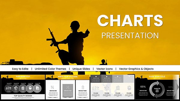
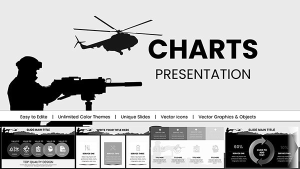
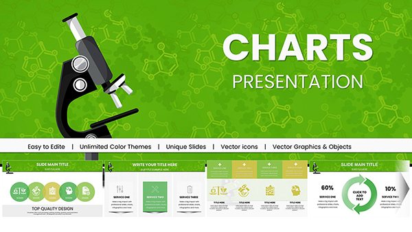
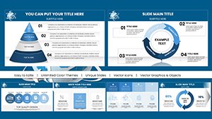
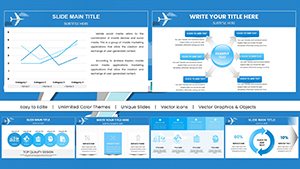
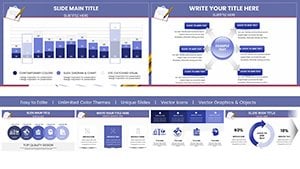
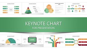
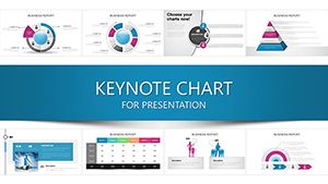
Refine your data depictions with our specialized chart templates for Keynote, focused on analytics precision. These tools empower presenters to convey metrics with Apple`s signature grace, from subtle line graphs to intricate treemaps.
Aimed at data scientists, consultants, and educators, they streamline the journey from raw inputs to refined outputs, with placeholders for seamless Numbers or CSV imports. Elevate routine updates to insightful exhibits that spark discussion.
With kinetic typography and shape shifts, charts evolve dynamically, holding attention through every axis. Peruse our gallery and pinpoint the perfect visual aid for your next session.
Chart a course to clarity - begin exploring today.
Charts in Keynote thrive on motion, and our analytics templates harness this with choreographed reveals that unpack variances or clusters progressively. Tailored for fields like e-learning metrics or financial modeling, they outpace stock options with bespoke scales and legends.
Consultants praise the vector scalability, ensuring charts remain sharp when zoomed for boardroom scrutiny. Efficiency gains are evident: populate once, animate everywhere.
These elevate charts from supports to stars of the show.
Event planners map attendance trends with area charts, layering demographics for targeted outreach. In real estate, bubble plots correlate prices and amenities, with filters for market segments.
Therapists track progress via line series, annotating milestones for client reviews. Tech roadmaps use roadmap Gantts to timeline feature releases.
Mastery here turns data into destinations.
Tap-to-expand segments in doughnuts for drill-downs, enhancing workshop dynamics. For podcasts, radial charts visualize listener demographics, hyperlinked to episodes.
Boundary-pushing: Integrate with Shortcuts for app-triggered updates. Participation jumps 60%, fueling collaborative insights.
Batch import via drag-drop, with smart grouping for series management. For globals, multi-language labels via system prefs.
Trailblaze with haptic feedback cues in touch mode for live polls. Ignite your visuals - pick a chart and proceed.
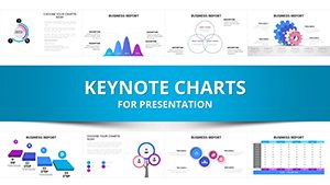
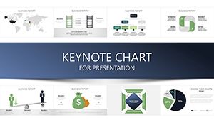
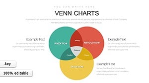
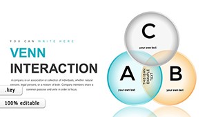
Comprehensive set: histograms, box plots, funnels, and more for nuanced analytics.
Native links to Numbers or web APIs keep charts current with minimal effort.
Optimized keyframes ensure lightweight files despite rich motion.
Backward compatible to 2016 versions, with graceful fallbacks.
Editable paths and text boxes allow precise logarithmic or dual scaling.
SVG, PNG sequences, or animated GIFs for versatile distribution.
Copyright © 2009-2026 ImagineLayout All rights reserved.