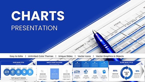
Agile PowerPoint charts are designed for teams that need to visualize sprint progress, backlog priorities, velocity trends, and delivery performance with clarity and precision. When standard shapes and generic graphs are not enough to communicate iterative workflows, these structured chart templates provide a professional framework for Scrum reporting, stakeholder updates, and continuous improvement reviews. Built specifically for Agile environments, these slides help product owners, Scrum masters, consultants, and project managers present data-driven insights in a format aligned with real sprint ceremonies and delivery cycles.


Agile teams operate in short cycles, where visibility and transparency are critical. Traditional PowerPoint charts often fail to reflect sprint cadence, backlog flow, or incremental delivery patterns. Agile PowerPoint charts solve this by offering pre-structured layouts tailored to sprint reviews, retrospectives, PI planning sessions, and stakeholder briefings.
Default column or line charts can show numbers, but they rarely reflect Agile logic. For example, a sprint burndown chart requires specific formatting to clearly show remaining effort against time. Velocity tracking needs comparative sprint blocks. Cumulative flow diagrams must display work-in-progress stages accurately. These templates provide that structure instantly, reducing manual formatting time and minimizing misinterpretation.
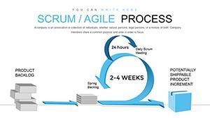
Agile methodologies vary, and reporting needs differ between Scrum teams, Kanban boards, and scaled Agile programs. This category exists specifically to support iterative project environments rather than generic business analytics.
Use burndown charts to present remaining effort during sprint reviews. Burnup variations help illustrate scope change alongside completed work, making them ideal for stakeholder transparency.
Velocity charts allow teams to forecast realistically and identify performance patterns over multiple iterations. Capacity planning visuals help demonstrate allocation versus delivery during planning sessions.
Cumulative flow diagrams visualize bottlenecks across workflow stages. These charts are especially useful for Kanban teams and operational units seeking process optimization.
Agile chart templates are not limited to software development. Marketing departments use sprint charts for campaign cycles. Product teams present roadmap increments. Consulting firms deliver Agile transformation reports to enterprise clients. Educational institutions teaching project management use these visuals to explain iterative delivery models clearly.
Leadership requires concise performance summaries. Agile charts can consolidate sprint metrics into executive dashboards, translating operational data into strategic insights.
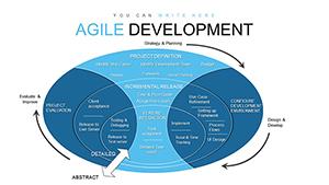
Unlike generic data visualization slides, Agile charts are process-specific. They reflect iterative workflows, team velocity, backlog refinement, and incremental delivery. While general charts focus on broad analytics, this category supports decision-making inside sprint cycles and product development environments. The structure aligns with Agile terminology and reporting rhythms.
To maximize clarity, present one primary metric per slide during sprint reviews. Highlight trends instead of isolated data points. Use consistent sprint intervals for comparison. Keep annotations concise to avoid clutter. Always connect the visual insight to a next action, such as capacity adjustment or backlog reprioritization.
Manually building sprint charts every two weeks consumes valuable time. These templates allow teams to focus on analysis instead of formatting. Fully editable elements ensure flexibility while maintaining professional design consistency across Agile presentations.
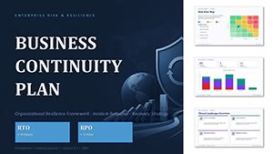
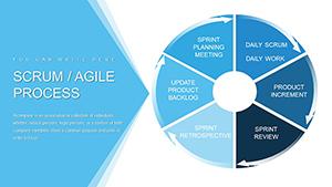
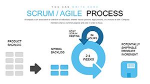
This category includes sprint burndown charts, burnup charts, velocity tracking visuals, cumulative flow diagrams, backlog prioritization charts, and capacity planning slides tailored for Agile teams.
Yes. The templates support Scrum sprint reporting, Kanban workflow visualization, and hybrid Agile frameworks used in scaled or enterprise environments.
All charts are fully editable in PowerPoint. You can adjust sprint durations, story points, capacity figures, and performance metrics according to your team’s data.
Scrum masters, product owners, Agile coaches, consultants, project managers, marketing teams, and educators use these templates to present iterative progress and performance insights.
Copyright © 2009-2026 ImagineLayout All rights reserved.