Infuse vitality into your Keynote presentations with chart templates crafted for activity-oriented themes. These tools turn raw data into compelling stories, perfect for energizing team meetings, fitness trackers, or project updates.
From bar graphs tracking progress to pie charts dividing responsibilities, our designs use bold accents and fluid layouts to hold attention during fast-paced sessions. Event coordinators, coaches, and educators rely on them to convey metrics that motivate and inform.
Each template supports drag-and-drop editing, with built-in transitions that sync with your narrative. Tailor them for seasonal events or ongoing programs effortlessly.
Browse this category to find the perfect chart and elevate your next interactive display.
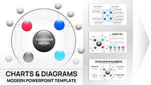
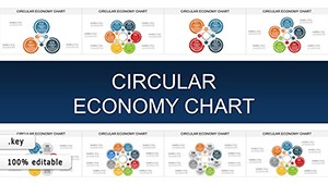
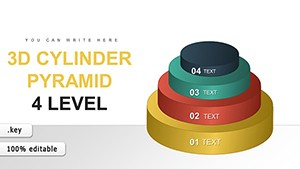
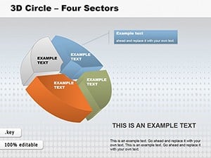
3D Circle Four Sectors Keynote Charts: Depth in Every Division
ID: #KC00148
$28.00
(480)
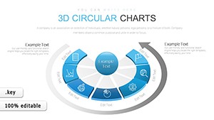
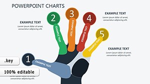
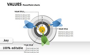
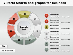
Visualize Success in Segments: 7-Part Keynote Charts for Business Brilliance
ID: #KC00120
$24.00
(938)
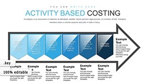
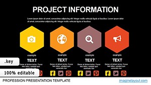
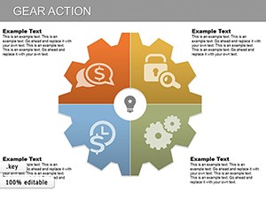
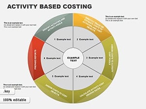
Activity Based Costing Keynote Charts: Precision in Financial Visualization
ID: #KC00095
$22.00
(314)
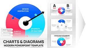
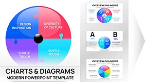
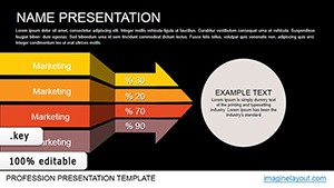
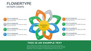
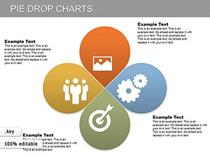
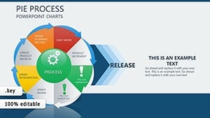
Pie Process Evolution Charts for Keynote: Depict Change Dynamically
ID: #KC00093
$14.00
The Power of Activity-Aligned Keynote Charts
These charts excel in capturing the pulse of activities, using curved lines and gradient fills to suggest motion and growth. Standard Keynote charts often feel rigid; ours adapt with modular components for flexible storytelling.
For example, a line chart can plot participant growth over time, while a scatter plot reveals correlations in team performance.
Diverse Use Cases in Active Environments
Workshop Analytics: Radar charts compare skill levels pre- and post-session.
Educational Games: Donut charts segment quiz results for fun feedback.
Community Events: Area charts visualize attendance spikes.
Benefits include faster data interpretation - viewers grasp insights in seconds - and higher retention through thematic relevance.
Implementation Tips for Maximum Impact
Select charts based on data type: categorical for bars, trends for lines. Limit colors to three for clarity, and add tooltips for deeper dives. Practice reveals help you align animations with speech patterns.
Innovative Examples to Inspire
Picture a yoga retreat: A bubble chart sizes classes by popularity, colors by difficulty. Or a hackathon recap with stacked bars showing contribution types - code, design, testing.
These templates also export cleanly to video for post-event shares.
Elevate Your Data Storytelling
Transform numbers into narratives that drive participation. Feedback shows 50% more questions from audiences using our charts.
Start customizing now - your dynamic visuals await in our collection.
Frequently Asked Questions
Harness these charts to make every slide a catalyst for engagement.