Dive into our selection of PowerPoint chart templates crafted for accounting excellence. These tools help you distill intricate financial data into digestible, persuasive graphics that captivate audiences and support strategic conversations.
Perfect for CPAs, auditors, and finance teams, the templates offer a range of options from stacked area charts for trend analysis to radar charts for performance benchmarking. With built-in themes that align with corporate branding, you`ll produce slides that look executive-ready without starting from scratch.
Our designs emphasize clarity and precision, incorporating gridlines and legends that enhance comprehension. Whether illustrating tax implications or cash reserves, these charts make your points stick.
Begin your search in this category to discover templates that fit your specific accounting workflows. Integrate them effortlessly into Microsoft PowerPoint and watch your presentations gain authority.
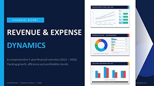


PowerPoint`s versatility shines in accounting when paired with specialized chart templates. For annual audits, waterfall charts effectively demonstrate profit adjustments, revealing how revenues and expenses net out. Sales teams in finance firms use funnel charts to track lead conversions from inquiries to closed deals, optimizing pipelines.
In board presentations, treemap charts visualize asset portfolios, with sizes reflecting values for quick hierarchy insights. Educational webinars on forensic accounting benefit from bubble charts correlating fraud risks with impact levels, making abstract concepts tangible.
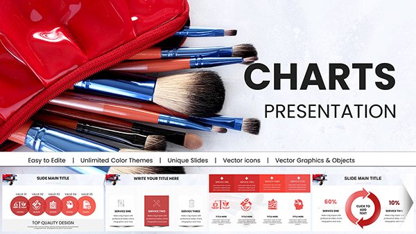
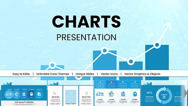
Default PowerPoint charts are functional but bland for high-stakes accounting. Our versions include advanced animations that build data points sequentially, preventing overload. Pre-formatted with financial icons - like ledgers or calculators - they add context without extra effort.
Unlike basics, these support dynamic linking to Excel for live updates, ensuring your slides reflect the latest figures. Scalable vectors maintain sharpness on any projector, a boon for conference rooms.
Picture a forecast slide: A standard line chart flattens trends, but our enhanced version layers confidence intervals, shading uncertainty areas to guide cautious decisions.
Our templates deliver value through modular components - swap axes or add trendlines with clicks. They promote best practices like consistent scaling across series for fair comparisons and minimalistic labels to reduce noise.
For innovation, blend charts with timelines for holistic views, such as expense evolution over quarters. Always preview in slideshow mode to fine-tune pacing, and embed notes for presenter cues.
Transform your next report - grab a template today and simplify complex finances.
Yes, use PowerPoint`s data link feature to pull from Excel, updating charts automatically on refresh.
Fully - adjust timing and effects via the animations pane for tailored emphasis.
Over 20, covering everything from histograms to sunbursts for diverse accounting needs.
Perfectly compatible with both Windows and Mac versions.
Yes, select templates include rotatable 3D views for deeper spatial analysis.
Absolutely; files are editable and royalty-free for internal use.
Don`t miss out - dive into the collection and chart your path to clearer communications.
Copyright © 2009-2026 ImagineLayout All rights reserved.