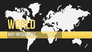
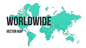
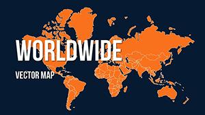
World Map PowerPoint Template Download Editable Slides


Type: PowerPoint Maps template
Category: World
Sources Available: .pptx
Product ID: PM00163
Template incl.: 10 editable slides
Transform Global Data Into Boardroom-Ready Cartography
Every quarter, I watch executives stumble through investor meetings with pixelated screenshots of web maps or crude clipart continents that undermine billion-dollar strategies. The Editable PowerPoint World Maps Template eliminates that credibility gap with ten precision-engineered slides designed for professionals who present international operations, market expansion plans, or cross-border analytics to decision-makers who demand visual clarity.
This isn't decorative geography. Each slide functions as a strategic canvas where you map supply chain vulnerabilities across Southeast Asia, illustrate franchise growth from Toronto to Tokyo, or demonstrate climate impact zones spanning the Sahara to Scandinavia. Built on vector foundations compatible with PowerPoint 2016 through the latest Microsoft 365 builds, plus native support for Google Slides and Keynote, these maps scale without degradation whether projected in conference rooms or viewed on mobile devices during airport layovers.
Unlike generic map clipart that forces you into awkward workarounds, this template anticipates real presentation scenarios. I've deployed variations of these slides in earnings calls where CFOs needed to spotlight emerging market revenue, regulatory briefings where legal teams traced compliance jurisdictions, and academic conferences where researchers correlated migration patterns with economic indicators. The difference between amateur geography and professional cartographic communication often determines whether your strategic recommendations get approved or shelved.
Slide Architecture: Ten Strategic Canvases for Global Narratives
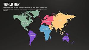
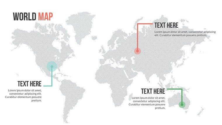
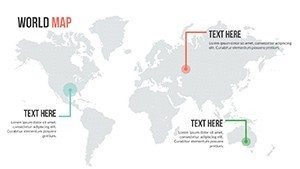
The foundation slide presents a full-world view using an equirectangular projection that balances shape accuracy with geographic familiarity. Unlike Mercator projections that distort polar regions into unusable space, this layout provides proportional representation crucial for honest data visualization. Color-coded continents arrive pre-formatted with editable fills, allowing you to instantly distinguish performance zones - shade North America green for growth markets, Europe amber for stabilization regions, and Asia red for expansion targets.
Three hemisphere-focused slides split global operations into manageable visual chunks. The Eastern-Western hemisphere divide proves invaluable when comparing American market penetration against European regulatory landscapes, while the Northern-Southern split serves sustainability reports that contrast developed nation emissions with developing country impacts. Each hemisphere includes granular country boundaries as separate PowerPoint objects, meaning you can isolate Indonesia from its neighbors or highlight the Baltic states without affecting surrounding territories.
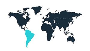
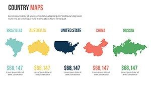
Regional spotlight slides zoom into specific continents with enhanced detail. The Asia-Pacific slide renders from Japan through Australia with sufficient resolution to mark individual cities - essential for logistics presentations mapping distribution hubs in Mumbai, Manila, and Melbourne. The Americas slide extends from Alaska's Aleutian chain to Patagonia's southern tip, accommodating both NAFTA corridor discussions and Latin American market analysis within one coherent frame.
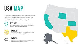
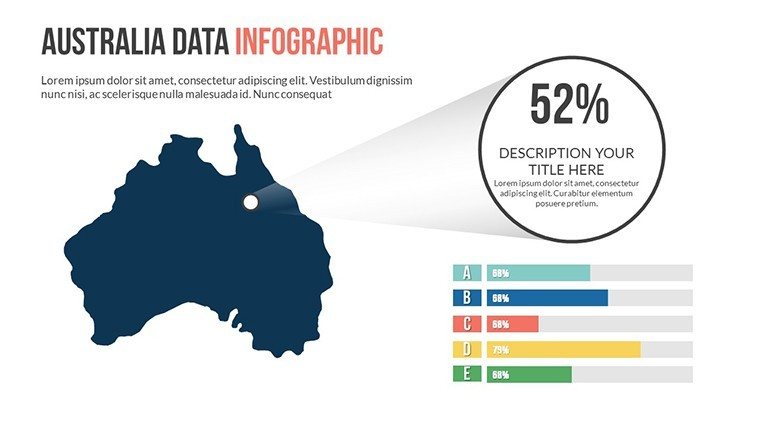
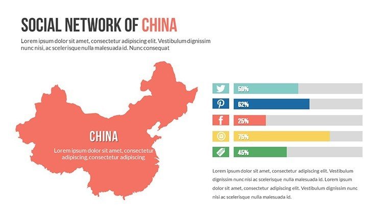
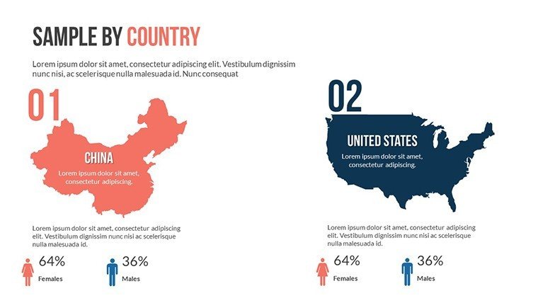
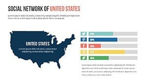
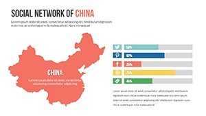
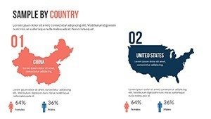
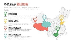
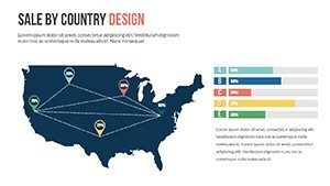
The China and USA dedicated slides acknowledge these economic powerhouses' outsized presentation frequency. China's provincial boundaries appear as distinct shapes, perfect for market penetration heatmaps showing coastal concentration versus inland opportunity. The USA slide includes state divisions and major metropolitan markers, supporting everything from electoral analysis to retail footprint visualization. I've used these country-specific layouts in competitive intelligence briefings where granular geographic precision separates actionable insights from vague generalizations.
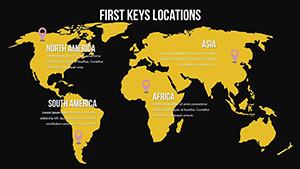
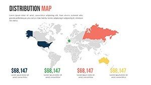
Two infographic-style slides integrate world maps with dashboard elements. One features circular statistic placeholders surrounding a central world view - ideal for quarterly reviews that pair global revenue figures with geographic distribution. The other arranges four smaller continental maps in a grid with dedicated text zones, supporting comparative analysis like "Europe Operations vs Asia Strategy" without cluttering individual maps. These hybrid layouts solve the perennial presenter dilemma of balancing geographic context with quantitative data.
Animation presets arrive configured but not overwhelming. Continent-by-continent reveals let you control narrative pacing during live presentations, while subtle glow effects on selected regions guide audience attention without cartoon-like distraction. I typically disable animations for printed materials but leverage them aggressively in webinars where sequential geographic storytelling maintains remote participant engagement across time zones.
Professional Deployment Across High-Stakes Business Contexts
Private equity firms conducting due diligence use these maps to visualize target company footprints during Monday morning deal team meetings. When evaluating a manufacturing acquisition, partners overlay production facilities, supplier concentrations, and customer geographies to identify operational risks that financial models miss. The ability to quickly recolor Chinese provinces based on regulatory exposure or mark Middle Eastern territories by geopolitical stability accelerates decision cycles that would otherwise drag through endless spreadsheet tabs.
Supply chain directors presenting to C-suites leverage the template to communicate vulnerability assessments. After the 2021 Suez Canal blockage and ongoing semiconductor shortages, boards demand geographic literacy about sourcing dependencies. I've watched operations VPs use these slides to trace component flows from rare earth mines in Australia through fabrication in Taiwan to assembly in Mexico, with each leg color-coded by risk severity. That visual immediacy drives approvals for diversification investments where narrative explanations fail.
Sales organizations planning territory expansions map rep coverage and pipeline concentration. A VP of Americas can delineate existing strongholds in Texas and California while highlighting underserved opportunities in the Pacific Northwest or Great Lakes region. International expansion discussions benefit from continent-scale views that position current European beachheads against untapped African markets, providing strategic context that raw sales figures obscure.
Nonprofit organizations reporting to donor coalitions demonstrate program reach and impact distribution. An education foundation might shade countries by student enrollment levels, instantly revealing whether their scholarships concentrate in South Asia or spread across three continents. Environmental groups tracking reforestation projects overlay restoration sites on biome maps, transforming abstract hectare counts into tangible geographic victories that motivate continued funding.
Integration into Existing Presentation Workflows
My standard workflow begins with exporting regional data from Salesforce or Tableau into Excel, then using PowerPoint's native data linking to populate map colors. The template's countries arrive as individual shape objects with consistent naming conventions - "France" not "FR" or "French Republic" - so VLOOKUP formulas map cleanly without debugging naming mismatches. A dashboard showing Q3 revenue by country refreshes the map instantly when underlying data updates, eliminating manual recoloring that introduces errors during deadline crunches.
For teams collaborating across locations, uploading the template to SharePoint or Google Drive maintains formatting fidelity that email attachments often corrupt. I recently supported a consultant toggling between London and Singapore offices; she'd sketch initial strategy in Google Slides during client workshops, then polish animations and brand colors back in desktop PowerPoint without redrawing maps from scratch. That flexibility prevents the vendor lock-in plaguing specialized mapping software.
Advanced users embed these maps into master slide decks that standardize corporate reporting. A quarterly business review template might reserve slide seven for geographic performance, with the world map preloaded and data fields ready for finance teams to populate. This systematization ensures every division presents market updates in comparable formats, allowing executive teams to spot geographic trends across business units that individualized map styles would obscure.
Compatibility extends beyond Microsoft's ecosystem. Keynote users importing the PPTX file retain all vector qualities and animations, though I recommend checking custom fonts if your organization uses proprietary typefaces. Google Slides cloud deployment works seamlessly for remote teams, though complex animations may simplify - test before that investor roadshow. The sixteen-by-nine aspect ratio matches modern displays and projectors, avoiding the letterboxing that plagues older four-by-three templates.
Real-World Scenarios from Consulting Frontlines
A SaaS founder preparing for Series B fundraising needed to demonstrate international traction to Bay Area venture partners skeptical of non-US revenue. We used the hemisphere slides to contrast American early adopter concentration against emerging European enterprise deals, with pipeline arrows flowing from Nordic capitals toward Mediterranean markets. That geographic diversification narrative - impossible to convey through spreadsheet tabs - directly addressed investor concerns about customer concentration risk, contributing to an oversubscribed round.
An energy company's investor relations team faced quarterly earnings pressure to explain upstream asset performance amid volatile commodity prices. Rather than drowning analysts in well-by-well data, they color-coded production basins across Texas, North Dakota, and Alberta by profitability breakeven, with the USA slide providing instant visual clarity on which regions drove margin. Post-call feedback highlighted those maps as the presentation's most valuable component for understanding operational resilience.
A university advancement office courting alumni donations for a global scholarship fund mapped recipient distributions across five continents. By shading countries by student count and adding callout boxes with individual success stories, they transformed abstract philanthropy into tangible human impact. Giving increased twenty-three percent year-over-year, with major donors citing the geographic visualization as confirmation their contributions reached underserved regions rather than concentrating in familiar territories.
A government trade office promoting export opportunities to domestic manufacturers used the template during industry association roadshows. They overlaid tariff-free zones in Southeast Asia and marked emerging middle-class markets in Sub-Saharan Africa, giving small business owners concrete geographic targets for international expansion. Follow-up surveys indicated the visual approach reduced intimidation around foreign markets compared to text-heavy trade reports that overwhelmed non-expert audiences.
Strategic Advantages Across Diverse Industry Verticals
Financial Services and Investment Banking: Analysts presenting cross-border M&A opportunities map acquirer headquarters against target footprints to visualize strategic fit. Currency exposure discussions overlay forex volatility zones, helping treasury teams articulate hedging strategies. Portfolio managers demonstrate geographic diversification to satisfy risk committees nervous about regional concentration in emerging markets.
Pharmaceutical and Medical Device Companies: Regulatory affairs teams track approval status by jurisdiction during pipeline reviews, using color codes for approved-green, submitted-yellow, and planning-red markets. Clinical trial coordinators map enrollment sites to demonstrate geographic diversity that regulators increasingly scrutinize. Market access strategists overlay pricing and reimbursement landscapes to identify launch sequence priorities.
Technology and Software Enterprises: Product managers present feature adoption rates by region to prioritize localization investments. Infrastructure teams map data center locations and network latency zones for capacity planning discussions. Partnership teams illustrate ecosystem coverage, marking integration partners by geography to identify white space opportunities in underserved continents.
Higher Education and Research Institutions: Admissions offices visualize international student recruitment pipelines, identifying growth markets and declining feeder countries. Research administrators map collaborator networks for grant applications that increasingly reward international cooperation. Alumni relations track donor concentrations to target reunion events and giving campaigns to high-density geographic clusters.
Consumer Goods and Retail Organizations: Brand managers present market penetration by country to justify expansion budgets. Store operations teams map existing locations against demographic opportunity zones. E-commerce divisions overlay shipping fulfillment coverage with delivery time heatmaps, identifying infrastructure gaps that constrain growth in otherwise promising territories.
Transportation and Logistics Providers: Network planners visualize route structures and hub connectivity during capacity reviews. Business development teams map competitor footprints to identify underserved corridors for new service launches. Sustainability officers trace carbon footprint by shipping lane, supporting decarbonization roadmaps that require geographic precision about emissions sources.
Comparative Analysis: Template Value Versus Alternative Approaches
| Evaluation Criteria | Editable PowerPoint World Maps Template | Building Maps from Scratch in PowerPoint | Screenshot from Google Maps or Web Tools |
|---|---|---|---|
| Initial Setup Time | Under five minutes to customize colors and add data labels | Multiple hours tracing borders and matching projections accurately | Seconds to capture but lacks editability for data visualization |
| Data Integration Capability | Direct Excel linking with conditional formatting for real-time updates | Possible but requires extensive manual shape naming and formula setup | None - static image requires recreation when data changes |
| Professional Appearance | Vector precision maintains quality at any resolution or projection size | Achievable but demands advanced PowerPoint skills and design sensibility | Pixelation and compression artifacts undermine credibility in formal settings |
| Customization Flexibility | Individual country shapes allow selective coloring, labeling, and animation | Complete control but exponentially time-intensive to modify compositions | Locked image prevents any adaptation to changing presentation needs |
| Cross-Platform Compatibility | Seamless migration between PowerPoint, Keynote, and Google Slides | Custom builds often break when transferred between software ecosystems | Universal image format but sacrifices all interactive and editable benefits |
| Reusability Across Projects | One-time purchase enables unlimited presentations without recreation | Extreme effort makes recreation tempting despite time investment | Each new presentation requires fresh screenshot and re-annotation |
The efficiency equation becomes obvious when factoring presenter hourly rates. A strategy consultant billing four hundred dollars per hour who spends six hours building custom maps from scratch burns twenty-four hundred dollars in opportunity cost - one hundred twenty times the template investment. Even internal corporate presenters justify the purchase within a single high-stakes deck where professional cartography separates strategic recommendations from amateur hour.
Frequently Asked Questions
Can I customize individual countries with different colors to show varying data ranges like revenue tiers or risk categories?
Absolutely - each country exists as a separate PowerPoint shape with independent fill controls. Select any nation and apply solid colors, gradients, or pattern fills to create choropleth maps that visualize quantitative data ranges. For complex datasets, I typically establish a five-color scheme representing quintiles, then use Excel-linked conditional formatting to automate color assignments based on your data tables. This approach transforms static geography into dynamic business intelligence that updates when underlying metrics change, perfect for quarterly reviews where regional performance shifts.
How does this template handle presentations that focus on specific regions rather than global overviews?
The ten-slide collection includes dedicated continent and country-specific layouts that provide enhanced detail for regional deep-dives. The Asia-Pacific slide, for instance, renders with sufficient granularity to mark individual cities across Southeast Asian nations, while the USA slide includes state boundaries for domestic market analysis. You can also copy any region from the global view, paste into a new slide, and scale up for custom zoom effects. I frequently create hybrid decks that open with worldwide context then drill into regional specifics using this multi-scale approach.
What's the learning curve for someone without advanced PowerPoint skills to effectively use these maps?
Basic customization - changing colors, adding text labels, and inserting simple data callouts - requires only standard PowerPoint familiarity achievable in under ten minutes. The template's intuitive structure groups related elements, so selecting "Asia" automatically captures all Asian countries for unified formatting. Advanced features like Excel data linking or sophisticated animations demand intermediate skills, but the maps deliver value even at beginner proficiency levels. I've successfully trained client marketing coordinators with minimal presentation experience to produce professional geographic visualizations within a single afternoon workshop.
Does the template support animation sequences that reveal countries or regions progressively during live presentations?
Yes - the slides arrive with optional animation presets that stage continent or country reveals in logical geographic sequences, controllable via your standard PowerPoint animation pane. You can adjust timing, add entrance effects like fade or wipe, and synchronize map reveals with narration beats. For webinars spanning multiple time zones, I configure builds that spotlight each region as I discuss it, maintaining remote audience engagement better than static full-world dumps. Animations also disable cleanly for printed handouts or PDF exports where motion serves no purpose.
Are there any compatibility issues when sharing these maps with team members using different PowerPoint versions or alternative software?
The template works seamlessly across PowerPoint 2016 through current Microsoft 365 versions, Google Slides, and Keynote with full vector fidelity retained. Older PowerPoint iterations like 2013 may experience minor animation simplification but preserve core map structures and data. When collaborating with Google Slides users, upload the PPTX file directly to Drive - it converts while maintaining editable country shapes, though complex gradients may flatten. I recommend establishing one authoritative version in your organization's primary platform, then exporting static PDFs for stakeholders using incompatible systems.
Can I integrate these maps with external data sources like CRM systems or business intelligence platforms for automated updates?
Definitely - PowerPoint supports Excel data linking where map colors refresh automatically when source spreadsheets update. Export regional metrics from Salesforce, Tableau, or Power BI into Excel, establish the link to your map template, and configure conditional formatting rules that translate data ranges into color schemes. This creates live dashboards where monthly performance updates flow directly into your presentation maps without manual recoloring. I've implemented this for clients running recurring board meetings, where financial analysts simply refresh Excel connections the morning of presentations to reflect current quarter data across geographic visualizations.
Secure this essential cartographic toolkit and elevate every global business discussion from abstract concepts to geographic clarity that drives decisions. Download now and transform your international strategy presentations.