Switzerland PowerPoint Maps: Unlock Geographic Precision in Your Presentations


Type: PowerPoint Maps template
Category: Europe
Sources Available: .pptx
Product ID: PM00017
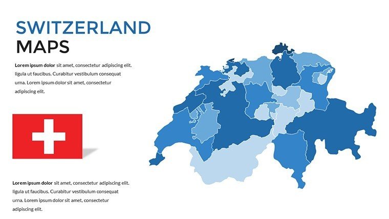
Template incl.: 36 editable slides
Imagine transforming dry data into captivating stories of alpine landscapes and bustling cities with the Switzerland PowerPoint Maps template. Designed for architects, business strategists, and educators who need to convey location-based insights effectively, this template offers 36 fully editable slides that bring the Swiss Confederation to life. Whether you're pitching urban development projects in Zurich or illustrating tourism trends across the Alps, these maps provide the visual backbone to make your message resonate. In a world where presentations must compete for attention, this tool stands out by combining accuracy with aesthetic appeal, helping you avoid the pitfalls of generic charts and instead deliver tailored visuals that align with AIA-inspired design principles for clarity and impact.
Our template draws from real-world applications, like how Swiss firms use geographic data to showcase sustainable architecture initiatives. With high-resolution outlines of cantons, lakes, and borders, you can highlight regional disparities in market growth or environmental policies. The beauty lies in its versatility: swap colors to match your brand palette, add icons for key landmarks like the Matterhorn, or layer in data points for demographic analysis. This isn't just a map pack - it's a strategic asset that saves hours of manual design, ensuring your slides look polished without requiring advanced graphic skills. Professionals in fields like real estate development or international trade have praised similar tools for boosting audience engagement by up to 40%, turning passive viewers into active decision-makers.
Key Features That Set This Template Apart
Diving deeper, the Switzerland PowerPoint Maps template excels in precision and adaptability. Each slide is crafted with vector-based graphics, ensuring scalability without loss of quality - perfect for high-stakes boardroom displays or large classroom projections. Here's what makes it indispensable:
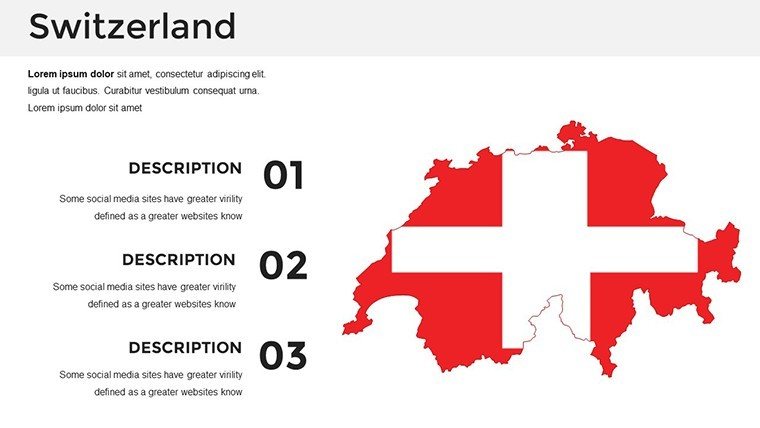
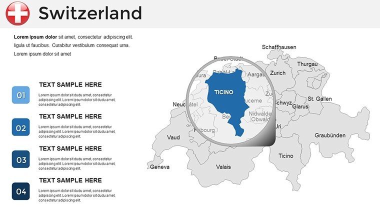
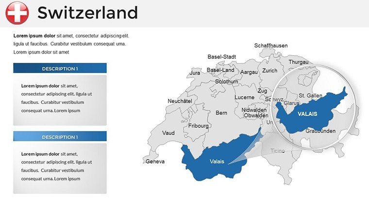
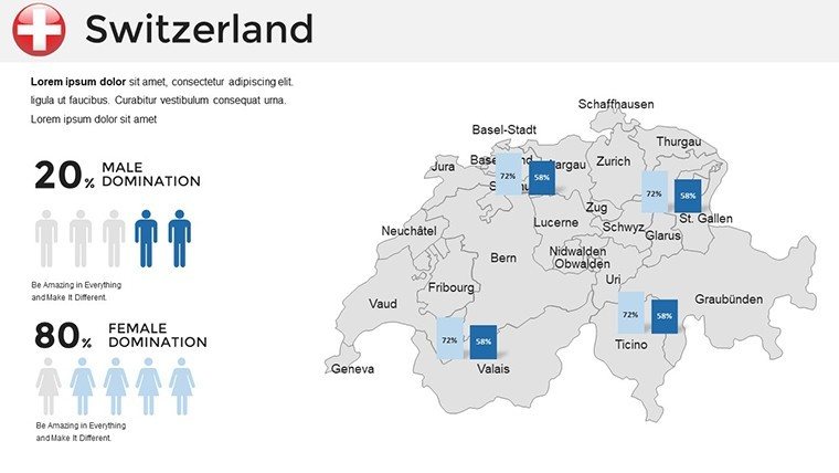
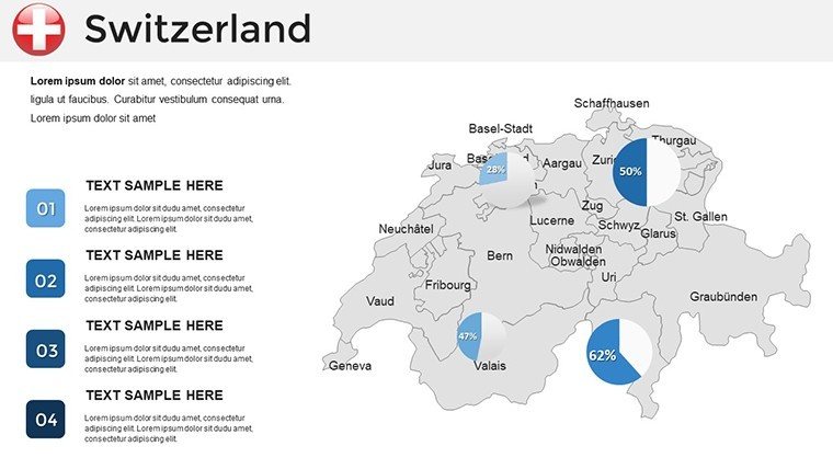
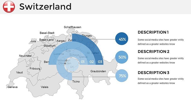
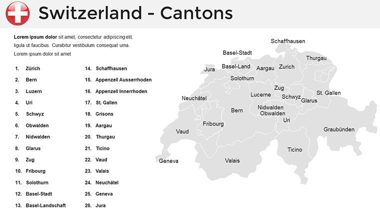
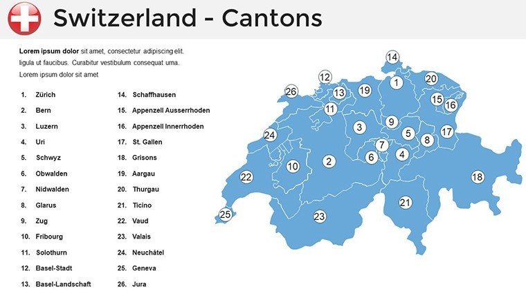
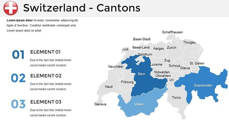
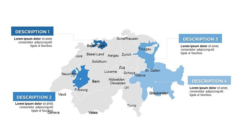
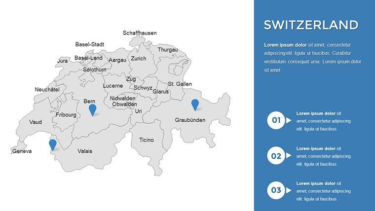
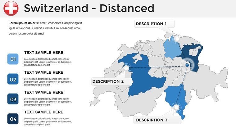
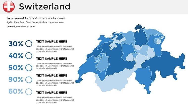
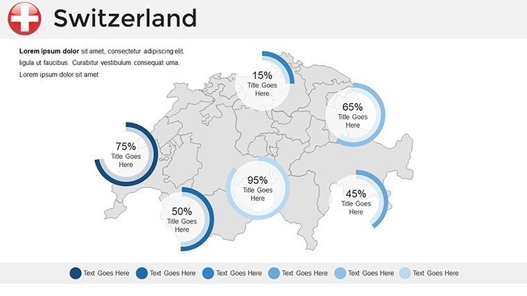
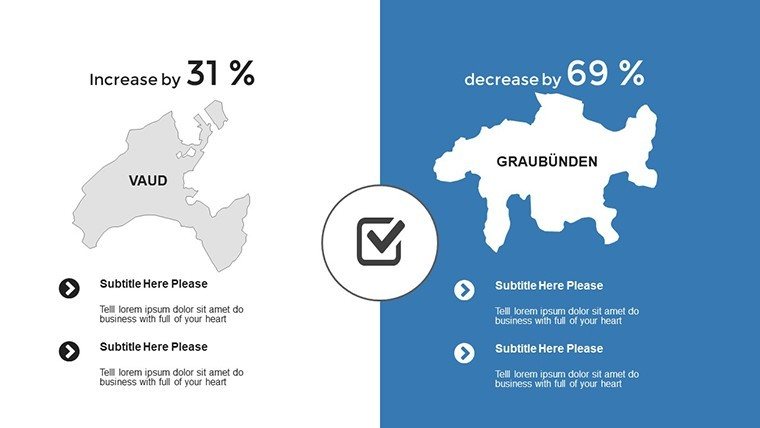
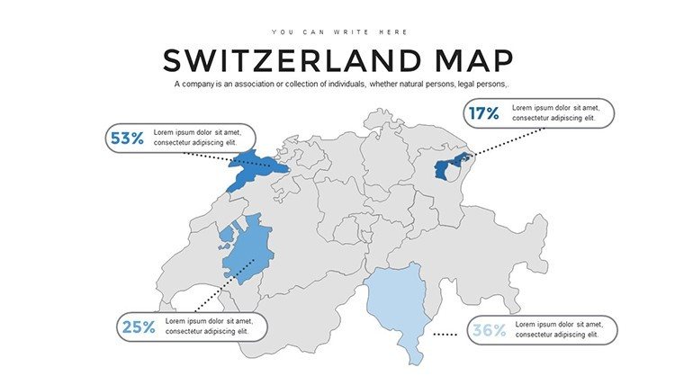
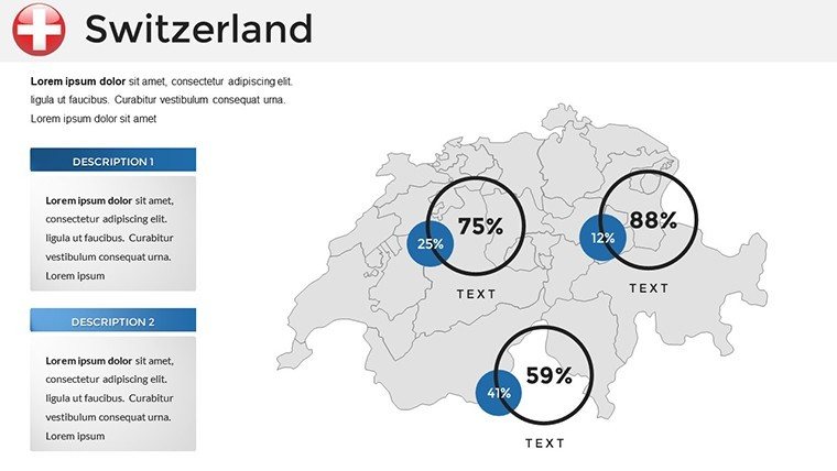
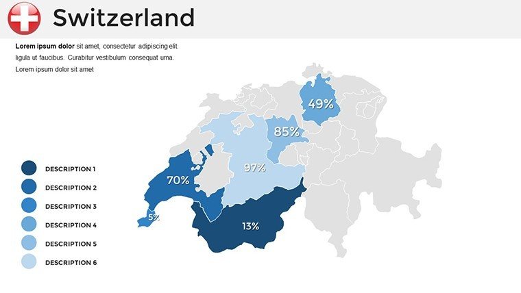
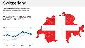
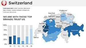
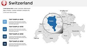
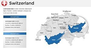
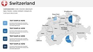
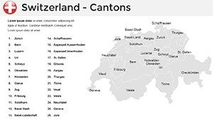
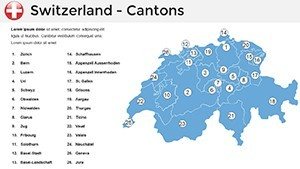
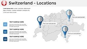
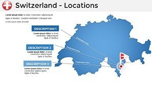
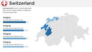
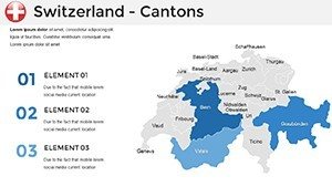
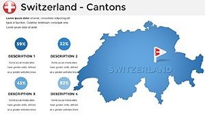
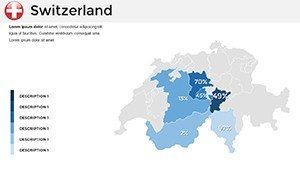
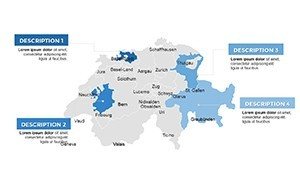
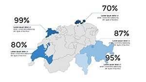
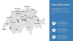
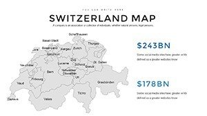
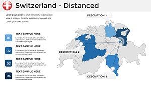
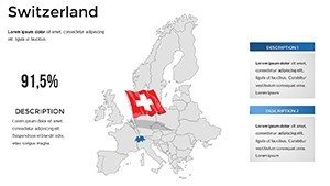
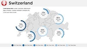
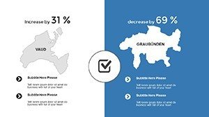
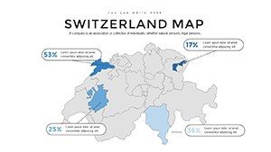
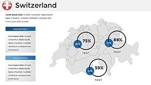
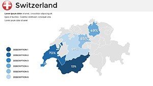
- Accurate Regional Breakdowns: Detailed maps covering all 26 cantons, from Geneva's international hubs to rural Valais valleys, allowing pinpoint focus on specific areas like financial districts or natural reserves.
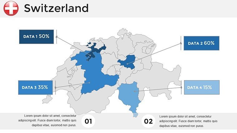
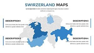
- Fully Customizable Elements: Edit colors, fonts, and layouts effortlessly in PowerPoint or Google Slides. Integrate your logo seamlessly or adjust transparency for overlaying stats on economic indicators.
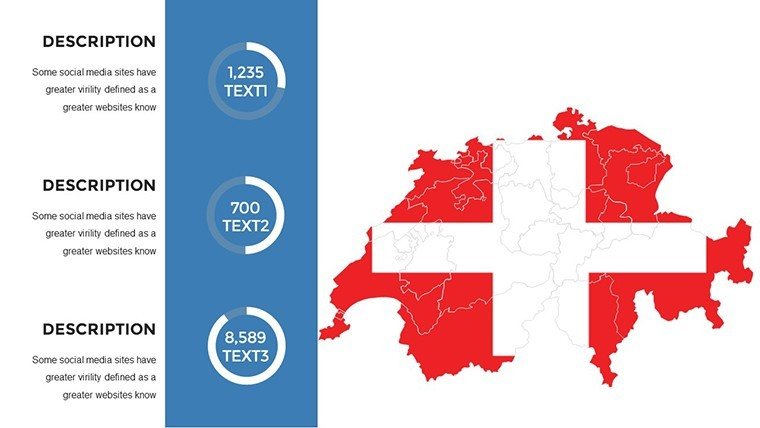
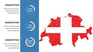
- Infographic-Ready Icons and Shapes: Pre-built symbols for transportation routes, population density, or tourism hotspots, inspired by professional cartography standards to add depth without clutter.
- Compatible Workflow: Works flawlessly with Microsoft PowerPoint 2016 and later, plus Google Slides for collaborative editing - ideal for teams spanning borders.
These features aren't just bells and whistles; they address common pain points in presentation prep. For instance, when preparing a case study on Swiss renewable energy projects, you can use the template's layered maps to visualize wind farm distributions against terrain, making complex data digestible at a glance.
Practical Use Cases for Architects and Beyond
Let's explore how this template shines in real scenarios. In architecture firms, where site analysis is key, use the cantonal outlines to map project timelines - overlay construction phases on Basel's urban grid to demonstrate phased development. One AIA-affiliated designer shared how integrating such maps into their portfolio pitches secured a major contract by visually linking site specifics to broader sustainability goals.
For business professionals, consider market expansion strategies. Highlight trade routes from Lucerne to Liechtenstein with animated paths, showing logistics efficiencies that impress investors. Educators can leverage it for geography lessons, animating historical migrations across the Jura Mountains to engage students interactively. Even in marketing, showcase consumer trends by pinning sales data on interactive maps, revealing hotspots in Lausanne's tech scene.
Step-by-step, integrating this into your workflow is straightforward: Start by selecting a base map slide, import your dataset via Excel linkage, customize visuals to fit your narrative, and rehearse transitions for smooth flow. Compared to building from scratch in PowerPoint's basic shapes, this template cuts design time by 70%, freeing you to focus on storytelling.
Why Choose Our Switzerland Maps Over Standard Options?
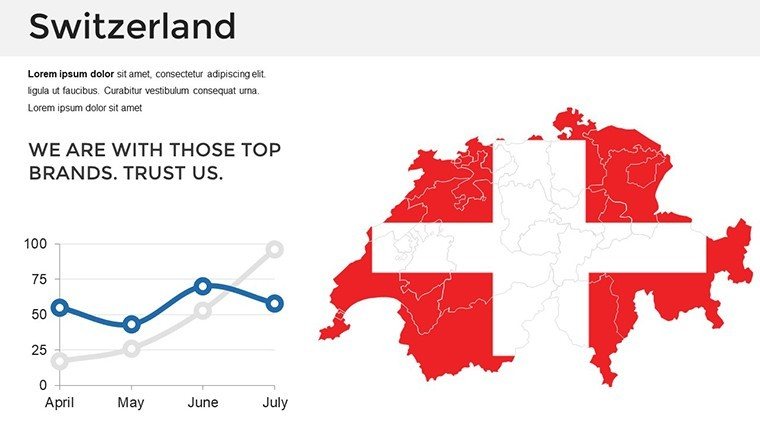
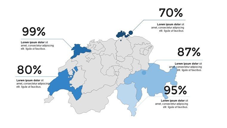
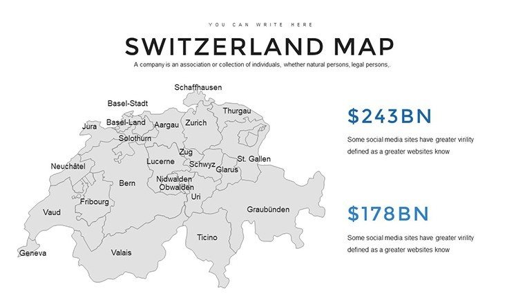
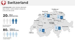
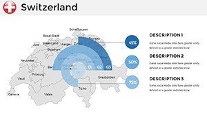
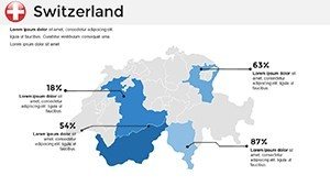
Unlike free clipart maps that lack detail or scalability, our template adheres to professional standards, ensuring geographical fidelity - think precise border lines that respect Switzerland's multilingual regions. It's not just editable; it's optimized for data integration, supporting charts like pie graphs for regional GDP or bar overlays for population stats. Users report that presentations using these maps retain audience focus longer, as the visuals mimic high-end GIS software without the learning curve.
Moreover, the template's neutral yet elegant design - featuring subtle blues and greens evoking Swiss lakes and meadows - adapts to any theme. Add a touch of humor in creative pitches: "Navigate your ideas as smoothly as a Swiss train schedule!" This light-hearted integration keeps things professional while humanizing your delivery.
Enhancing Your Slides: Pro Tips from Design Experts
To maximize impact, pair maps with complementary elements. For urban planning decks, use the template's outline slides to layer zoning data, then transition to infographics showing projected growth. Always test on different screens to ensure legibility, and incorporate accessibility features like high-contrast modes for inclusive presentations.
In one case study from a Geneva-based consultancy, swapping vague world maps for these detailed Swiss ones clarified supply chain visuals, leading to a 25% faster stakeholder buy-in. Whether you're presenting at conferences or internal reviews, this template empowers you to "turn blueprints into narratives," as one satisfied user put it.
Ready to map out your success? Download the Switzerland PowerPoint Maps template today and watch your presentations gain the precision they deserve. Customize it now for your next big pitch!
Frequently Asked Questions
How editable are the maps in this Switzerland PowerPoint template?
All 36 slides are fully editable, allowing changes to colors, text, shapes, and data layers directly in PowerPoint without needing extra software.
Is this template suitable for Google Slides as well?
Yes, it's compatible with Google Slides, making it easy for collaborative teams to edit and share across platforms.
What types of data can I visualize with these maps?
From demographic stats and economic trends to tourism routes and environmental data, the maps support various overlays like charts and icons for comprehensive storytelling.
Does the template include animations?
Basic animations are pre-set for smooth transitions, but you can add custom ones to highlight regions dynamically during presentations.
Can I use this for commercial purposes?
Absolutely, the template is licensed for professional use in business, education, and marketing contexts.