New York USA PowerPoint Maps: Masterful Tools for Empire State Storytelling


Type: PowerPoint Maps template
Category: North America
Sources Available: .pptx
Product ID: PM00127
Template incl.: 26 editable slides
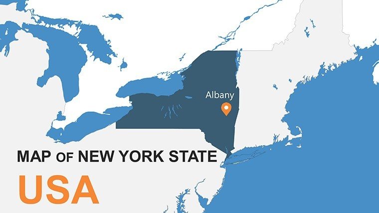
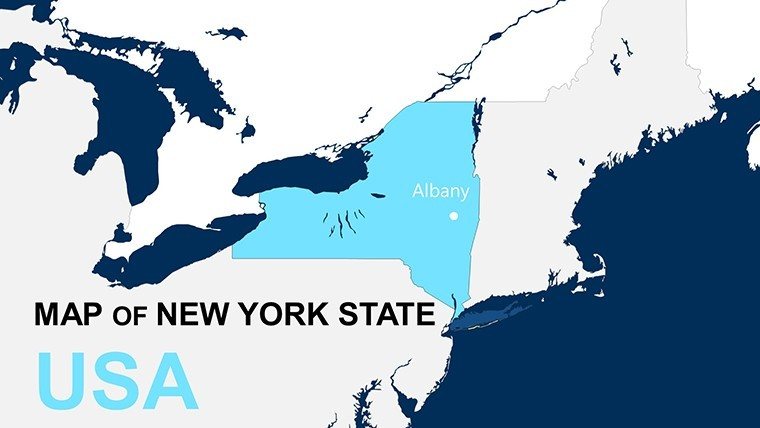
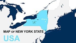
Navigating the intricate tapestry of New York's geography - from the skyscrapers of Manhattan to the vineyards of the Finger Lakes - requires presentation tools that match its vibrancy and complexity. Our New York USA PowerPoint maps template, complete with 26 editable slides, empowers professionals and educators to weave compelling tales through visuals. Whether charting financial districts in Wall Street pitches or exploring Adirondack ecology in classrooms, these maps offer unmatched detail and adaptability. Customize layouts to spotlight boroughs or upstate regions, infuse with data on population migrations, and blend in infographics for holistic views. Fully compatible with PowerPoint, it transcends ordinary slides by enabling layered analyses, like overlaying subway routes with economic indicators, to engage diverse audiences. Embrace this resource to articulate insights on topics from Broadway tourism to Hudson Valley agriculture, ensuring your presentations deliver the wow factor that New York's energy demands.
Harnessing Customization for Iconic New York Visuals
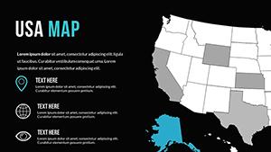
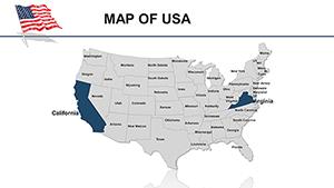
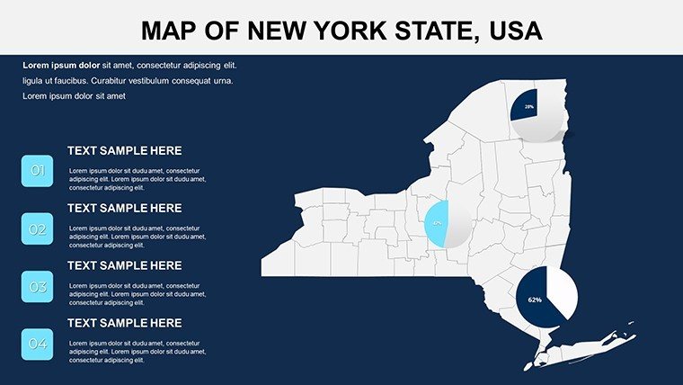
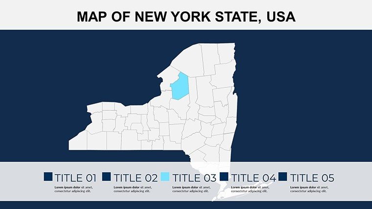
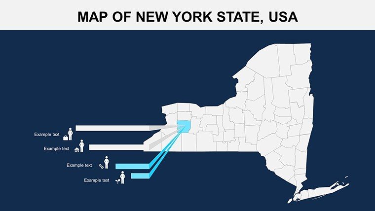
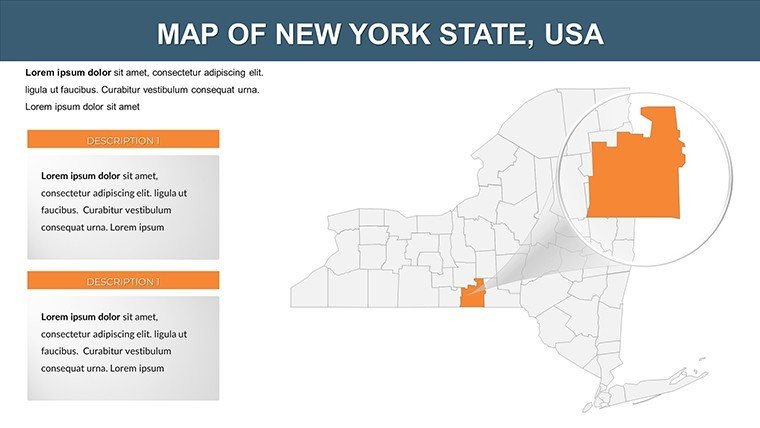
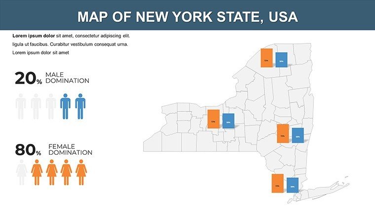
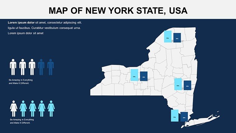
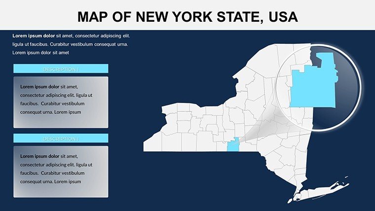
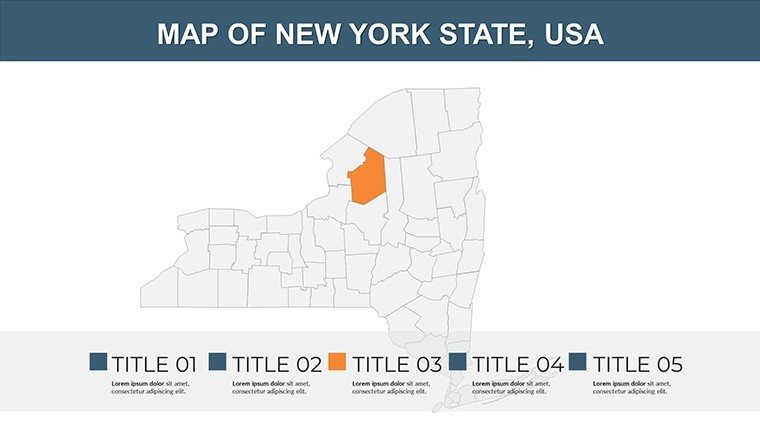
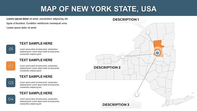
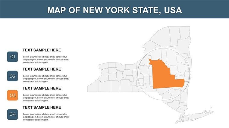
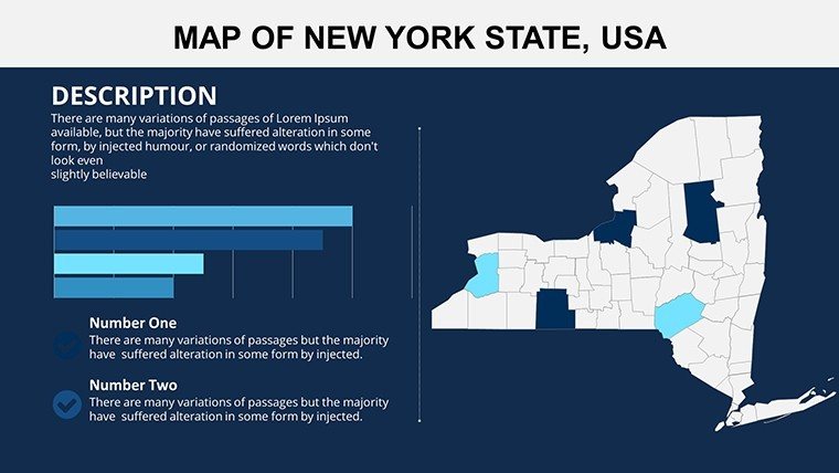
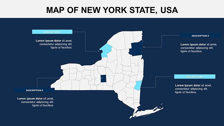
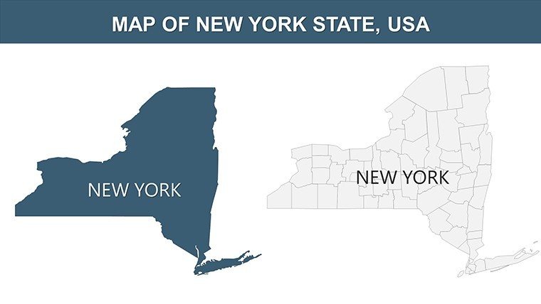
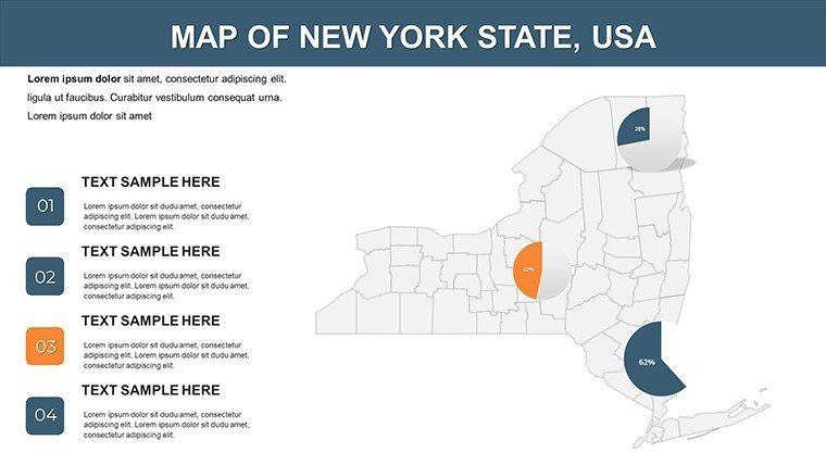
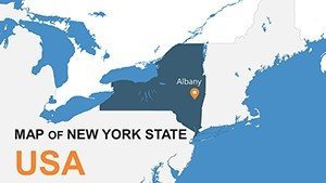
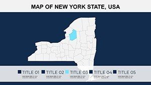
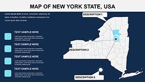
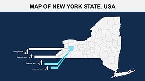
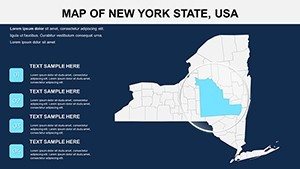
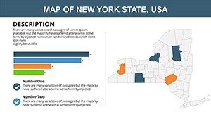
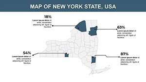
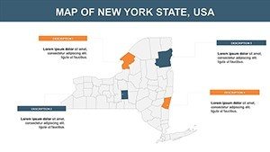
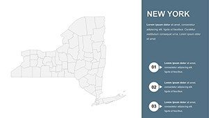
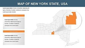
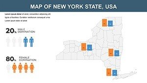
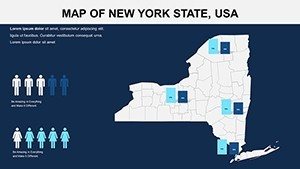
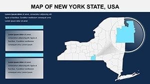
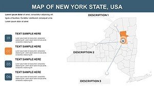
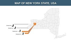
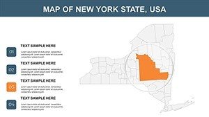
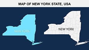
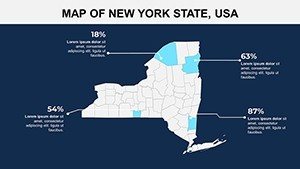
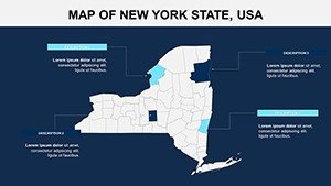
The template's strength emerges in its editable framework, allowing precise tailoring to New York's multifaceted landscape. Kick off with a statewide map encompassing 62 counties, then drill down to specifics like Queens' ethnic diversity or Buffalo's industrial revival. Adjust visuals with brand-aligned colors, add textual annotations for landmarks such as the Statue of Liberty, and incorporate dynamic elements like pie charts for sectoral breakdowns. This goes beyond static images, supporting hyperlinks to sources like the New York State Comptroller's reports for enhanced credibility. Perfect for fast-paced environments, it facilitates quick edits, such as animating growth patterns in the Tech Valley, making your content adaptable for virtual or in-person delivery.
Core Features Elevating Your Narrative
- Comprehensive Coverage: Detailed depictions of districts, demographics, and infrastructure, verified against official NYC GIS data.
- Engaging Customization: Modify fonts, colors, and layouts to suit themes, from corporate sleek to educational vibrant.
- Versatile Compatibility: Integrates smoothly with PowerPoint versions, promoting effortless team workflows.
- Visual Impact: High-quality graphics that present data clearly, avoiding clutter in dense urban mappings.
- Broad Licensing: Unlimited use for multiple scenarios, from seminars to marketing campaigns.
These attributes foster presentations that embody , leveraging authoritative data to build trust and authority.
Diverse Scenarios: Bringing New York to Life
A finance analyst might utilize the template to map investment hotspots in Brooklyn, layering bar graphs for real estate trends to woo investors. Educators could animate the Erie Canal's historical significance, integrating timelines for interactive student sessions aligned with Regents exams. In tourism, agencies might highlight routes through the Catskills, embedding visitor stats from I Love NY for promotional decks. Outperforming generic maps, this template allows granular focus, such as delineating NYC's five boroughs with cultural overlays. Drawing from successes like those at Empire State Development conferences, where visual aids have accelerated project approvals, it proves invaluable for persuasive communication.
Efficient Creation Pathway
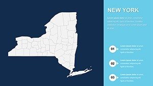
- Base Selection: Choose from overview or detailed slides to frame your content.
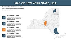
- Visual Refinement: Customize elements to emphasize points, like marking Central Park in green initiatives.
- Data Fusion: Add charts or links for enriched, multifaceted slides.
- Dynamic Touches: Implement animations for sequential storytelling.
- Polish and Present: Ensure cross-device compatibility for flawless execution.
Inspired by presentation luminaries like Garr Reynolds, this process emphasizes simplicity and audience connection.
Unmatched Advantages in a Competitive Landscape
Distinguishing itself from free alternatives plagued by inaccuracies, this template delivers professional polish with New York-specific fidelity. It's essential for industries like finance, where mapping Wall Street fluctuations can inform strategies, or education, visualizing immigrant waves. Users experience efficiency gains, per industry benchmarks, reallocating time to strategy. Consider a marketing firm mapping event venues for Fashion Week, using the tool to streamline planning and impress sponsors.
Tips from the field: Use consistent legends for navigation, cite NYC Open Data for reliability, and balance visuals with narrative for memorable impact.
Unleash New York's potential in your next presentation - claim this essential template and captivate with confidence.
Frequently Asked Questions
How versatile are the customization options?
Extremely, allowing full edits to colors, texts, and additions for personalized touches.
Is it optimized for large audiences?
Yes, high-res graphics shine on big screens or projectors.
Can I incorporate multimedia?
Sure, embed images or links seamlessly within maps.
What about updates for new data?
We offer revisions for significant changes, keeping your template current.
Does it include urban vs. rural distinctions?
Yes, with options to highlight contrasts like NYC versus Upstate.