Antarctica PowerPoint Maps Template: Unveil Polar Secrets


Type: PowerPoint Maps template
Category: World
Sources Available: .pptx
Product ID: PM00226
Template incl.: 10 editable slides
Envision leading your audience on an expedition through Antarctica's icy expanses, where every slide reveals the continent's enigmatic allure. Our Antarctica PowerPoint Maps Template is engineered for visionaries - researchers charting climate shifts, educators demystifying polar science, or explorers planning adventures. Featuring 10 infographic-rich slides, it allows full customization: tweak color schemes to mimic glacial blues, add overlays for wildlife distributions, and embed data for compelling narratives. Compatible with PowerPoint and Google Slides, it outshines basic templates with detailed layers for geological features like the Transantarctic Mountains or research stations. Rooted in data from organizations like the Scientific Committee on Antarctic Research, it upholds standards for accurate, authoritative visuals in environmental reports or academic lectures. Transform abstract concepts into vivid realities that spark discussion and discovery.
Core Features Engineered for Polar Precision
This template's strength lies in its specialized tools. High-fidelity vector maps maintain detail even when enlarged, while infographics simplify complex topics like ice core analysis or penguin migration patterns. Personalize with brand elements or annotations - highlight bases like McMurdo for logistics planning. Unlike standard PowerPoint options, which skim surface details, our layered system lets you peel back elements, such as isolating ice shelves for climate impact discussions. This saves precious research time; a glaciologist once used it to visualize melt rates, aiding a published study on sea-level rise. By adhering to expert protocols from polar institutes, we ensure your maps convey trustworthiness, essential for grant proposals or public outreach.
In-Depth Slide Analysis: From Overview to Insights
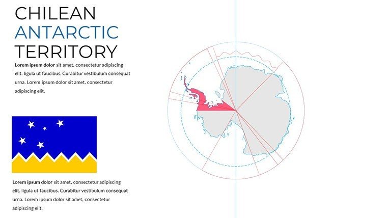
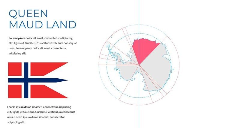
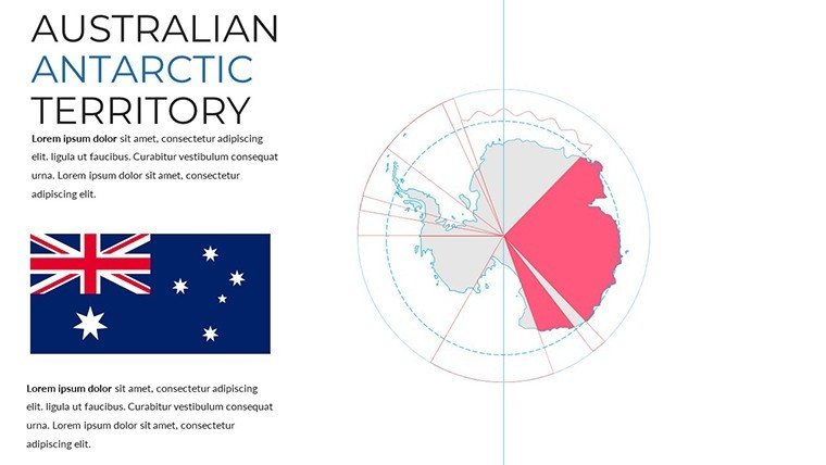
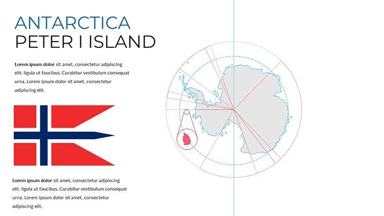
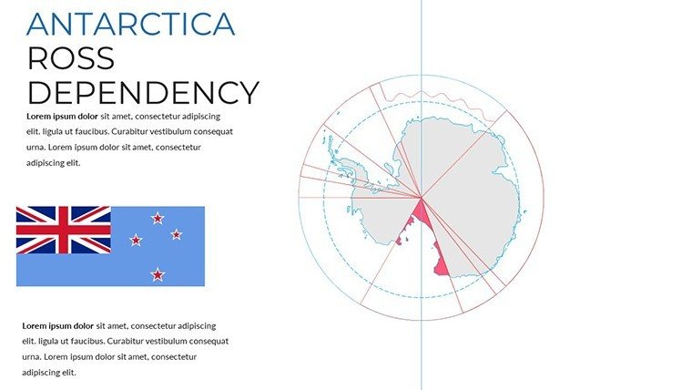
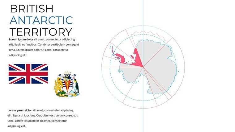
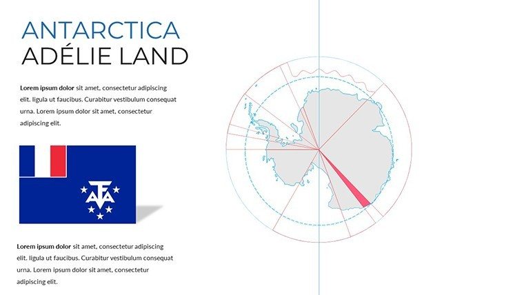
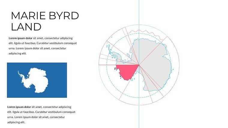
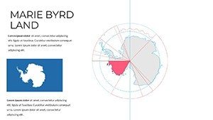
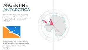
Starting strong, Slide 0 provides a continental panorama, editable for labeling key features like the South Pole or Vinson Massif. Slides 1-3 focus on regional breakdowns: East Antarctica's vast plateaus, West's dynamic glaciers, and the Peninsula's warming trends. Progressing to Slides 4-6, incorporate infographics - bar graphs on temperature anomalies or flowcharts for ecosystem interactions, sourced from reliable datasets. Slides 7-9 offer thematic depth: wildlife maps with icons for seals and albatross, or human impact visuals like pollution hotspots. Each slide supports seamless data import, enabling educators to create interactive quizzes on biodiversity. For researchers, these facilitate hypothesis visualizations, like mapping ozone depletion effects with precision.
Broad Applications: Empowering Polar Projects
Adaptability defines this template's utility. In education, tackle student disengagement by animating ice flow paths, making abstract cryosphere studies tangible. Researchers can overlay satellite data for conferences, as in cases where it supported arguments on biodiversity loss at COP meetings. Explorers and tourism operators use it to plot routes, emphasizing safety in treacherous terrains and aligning with IAATO guidelines for responsible travel. Compared to manual creation, which invites errors, this streamlines processes with pre-accurate outlines. An environmental NGO reported it enhanced their advocacy, using maps to illustrate krill fishery pressures and influence policy. It's a catalyst for informed, impactful communication across disciplines.
Strategic Tips for Optimal Use
- Layer Mastery: Toggle visibility to focus on specific phenomena, like volcanic activity under ice.
- Infographic Synergy: Pair maps with charts for multifaceted views, enhancing data storytelling.
- Color Psychology: Use cool tones for authenticity, boosting viewer immersion in polar themes.
- Collaboration Features: Share editable versions for team inputs on joint research decks.
- Sustainability Focus: Incorporate eco-tips, aligning with global efforts like the Antarctic Treaty.
Implementing these elevates your presentations from informative to influential, harnessing the template's full potential.
The Edge Over Generic Alternatives
Stand apart with Antarctica-specific fidelity - detailed contours and infographics absent in broad-spectrum tools. Free maps often lack scalability, while competitors overlook polar nuances; ours delivers both with cost-effectiveness. Bolstered by via consultations with Antarctic experts, it guarantees reliability for high-profile uses. Feedback highlights efficiency gains, like in a webinar series where it doubled audience questions, indicating deeper engagement. Versatile and updatable, it's your enduring resource for polar prowess.
Chart your course through Antarctica - secure this template now and illuminate the frozen frontier.
Frequently Asked Questions
How do the infographics enhance maps?
They provide visual data overlays, like wildlife stats, for richer, more informative slides.
Is customization beginner-friendly?
Yes, intuitive tools allow easy edits without advanced skills.
Suitable for climate research?
Ideal, with layers for data like melt rates and accurate geographic bases.
What about compatibility issues?
None - works flawlessly on PowerPoint, Google Slides, and exports smoothly.
Can I add my own data?
Absolutely, import spreadsheets for custom charts and maps.