Interrelationships Between Factors PowerPoint Charts Template: Map Connections Effortlessly


Type: PowerPoint Charts template
Category: Business Models, Tree, Arrows
Sources Available: .pptx
Product ID: PC00596
Template incl.: 18 editable slides
Navigating the web of influences in any project or analysis can be daunting, but our Interrelationships Between Factors PowerPoint Charts Template simplifies it all. This specialized tool, boasting 18 editable slides, is engineered for those who dissect complex systems - be it in business strategy, academic research, or healthcare planning. Picture transforming tangled cause-and-effect relationships into crystal-clear diagrams that reveal hidden patterns, much like how systems thinkers at MIT use similar models to solve real-world problems. Tailored for professionals seeking depth over superficiality, it tackles challenges like overlooked correlations that lead to flawed decisions. With charts inspired by proven methodologies such as fishbone diagrams and correlation matrices, this template empowers you to present interconnections with authority, fostering better understanding and collaborative insights. Whether unraveling market dynamics or environmental impacts, it turns data chaos into strategic clarity, drawing on principles from systems theory to enhance your presentations' effectiveness.
Essential Features for In-Depth Analysis
At the core of this template are features designed for precision and flexibility. The user-friendly interface lets you modify elements intuitively, ensuring your visualizations reflect nuanced insights without technical hurdles.
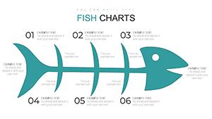
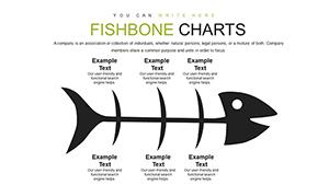
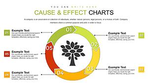
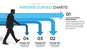
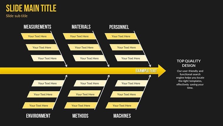
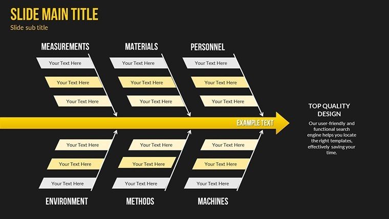
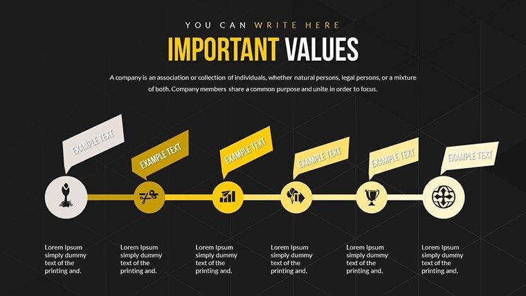
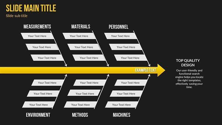
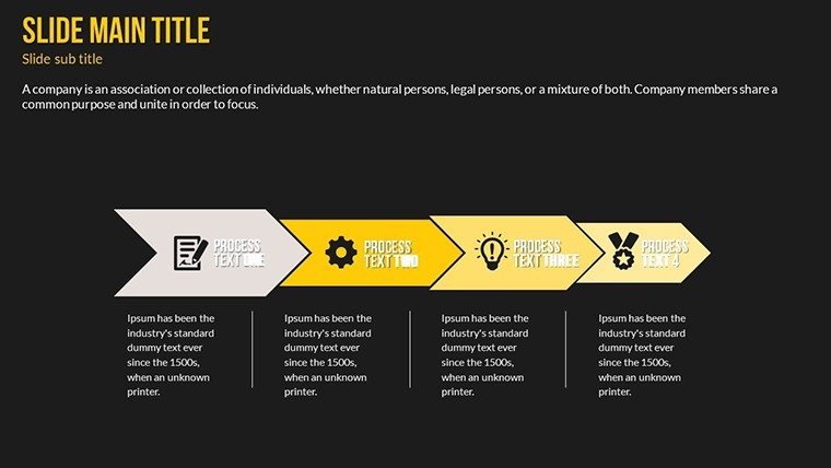
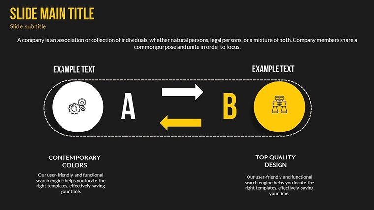
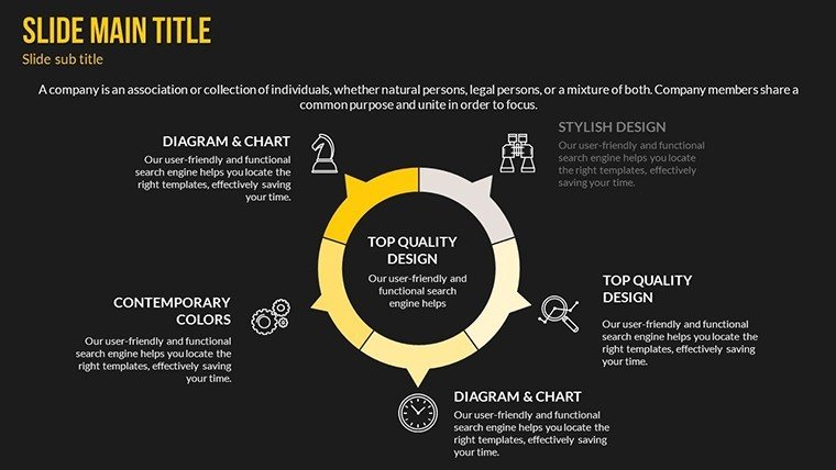
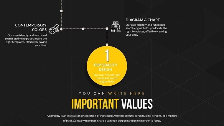
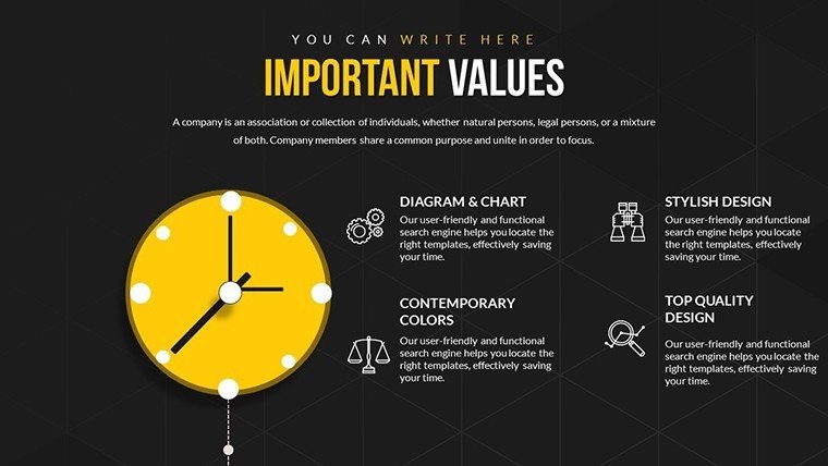
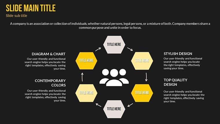
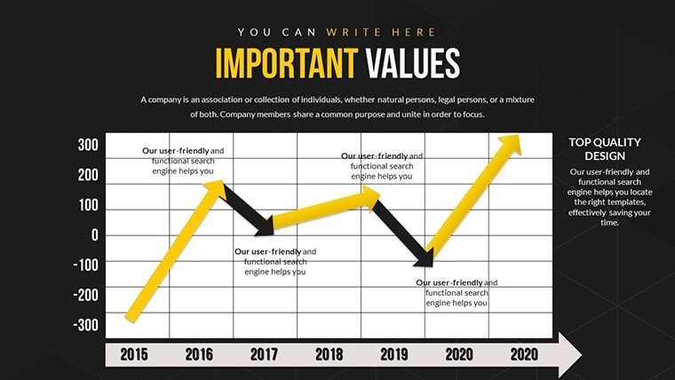
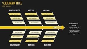
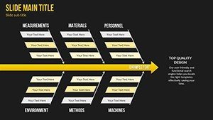
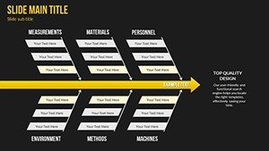
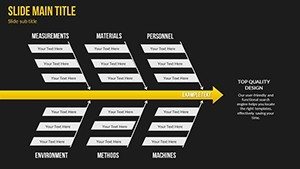
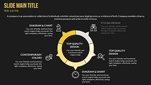
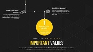
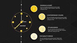
- Diverse Diagram Types: Cause-and-effect diagrams, correlation matrices, and influence maps to depict multifaceted relationships.
- Customization Depth: Alter colors, fonts, and data points to fit your narrative, with scalable vectors for high-quality outputs.
- Integrated Guidance: Built-in step-by-step customization tips, drawing from best practices in visual analytics.
- Cross-Platform Compatibility: Works flawlessly in PowerPoint, with export options for PDF or image formats.
- Engagement Tools: Subtle animations that trace connections, highlighting paths for audience focus.
These elements align with authoritative sources like the International Institute for Applied Systems Analysis, promoting rigorous yet accessible modeling.
Practical Applications Across Fields
This template excels in scenarios where understanding linkages is key. In business, use influence maps to show how economic factors affect sales, enabling teams to anticipate shifts - as seen in case studies from Harvard Business Review on supply chain resilience.
For researchers, correlation matrices can visualize variable interactions in studies, such as social sciences exploring poverty cycles, enhancing grant proposals with compelling evidence. Healthcare providers might map patient risk factors with cause-and-effect charts, improving treatment plans per guidelines from the World Health Organization.
Customizing for Maximum Impact: A Guided Approach
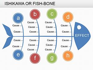
- Launch the template and choose a base diagram, like a fishbone for root cause analysis.
- Input your factors via editable text boxes, linking them with arrows to show directions of influence.
- Refine visuals: Apply color coding for positive/negative correlations, enhancing interpretability.
- Add data labels or tooltips for deeper dives during presentations.
- Test interactivity by simulating audience questions, adjusting for clarity.
- Finalize and share, perhaps integrating with tools like MindMeister for expanded mapping.
This methodical process mirrors agile frameworks, allowing iterative improvements for evolving insights.
Advantages Compared to Generic Charts
Standard PowerPoint tools often fall short in handling complexity, resulting in static, confusing visuals. Our template offers dynamic mapping that reveals interdependencies, such as in environmental impact assessments where arrows denote feedback loops - far superior for holistic views.
Users in education report better student engagement, with interactive elements fostering discussions on topics like climate change interconnections. In corporate settings, it supports decision trees for risk management, reducing errors as per Deloitte's analytics reports.
Expert Tips for Relationship Mapping
Elevate your use by starting with a central factor and branching out, a technique from mind mapping pioneers. Limit to 8-10 connections per slide to avoid overwhelm, per cognitive load theory. Incorporate real data from sources like Statista for credibility, and always include a legend for quick reference.
"This template clarified our project's interlinks like never before," notes a strategy consultant, underscoring its practical value.
Secure Your Template and Unlock Insights
Don't let complex relationships hinder your progress - grab this Interrelationships Between Factors template today. It's your key to insightful, professional presentations that drive informed actions. Start mapping and transform how you connect the dots.
Frequently Asked Questions
- What types of charts are included? Cause-and-effect, correlation matrices, and influence maps for comprehensive mapping.
- Can I edit the diagrams easily? Yes, with intuitive tools for colors, fonts, and connections.
- Is it suitable for research presentations? Perfect for visualizing variable links in academic and professional research.
- What format is the download? .pptx, compatible with most presentation software.
- Are there tips for beginners? Yes, included guides for effective customization.
- Can it handle large datasets? Designed for clarity with complex data, but best for focused visualizations.