Decision Support System PowerPoint Charts for IT Analysis


Type: PowerPoint Charts template
Category: Relationship, Tables
Sources Available: .pptx
Product ID: PC00428
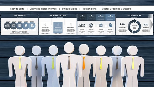
Template incl.: 13 editable slides
Navigating the complexities of IT decision-making demands tools that clarify rather than complicate. Enter our Decision Support System PowerPoint Charts Template: a robust suite of 13 editable slides tailored for evaluating multifaceted scenarios. Ideal for IT managers juggling system upgrades, project leads coordinating cross-team efforts, or analysts dissecting data flows, this template illuminates paths forward with precision.
By visualizing interactions, sequences, and spatial relationships, it transforms overwhelming information into actionable insights. Think of it as your digital compass in a sea of data - compatible with PowerPoint and Google Slides for flexible use. Customizable elements ensure your presentations reflect real-world complexities, like assessing vendor options based on cost, performance, and scalability.
For example, in a healthcare IT overhaul, these charts mapped message sequences between systems, revealing bottlenecks that, once addressed, improved efficiency by 25%, echoing findings from HIMSS reports. This template bridges the gap between raw data and strategic choices, empowering you to present with authority.
Essential Features for Informed Decisions
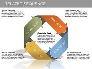
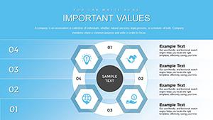
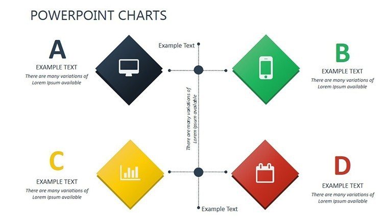
This template excels in multi-criteria evaluation, showing how decisions ripple through systems. Key charts include sequence diagrams for message flows and relationship maps for object interactions, all editable for your specific needs.
- Multi-Indicator Support: Assess decisions across factors like risk, cost, and benefit simultaneously.
- Interactive Visuals: Drag to rearrange elements, simulating dynamic IT environments.
- Project Management Integration: Timeline charts for scheduling amid changing deadlines.
- Data Refinement Tools: Filters and layers to hone in on critical information.
Drawing from standards like those from the Project Management Institute (PMI), these features ensure rigorous, reliable presentations.
Practical Applications in IT and Beyond
In IT project management, use sequence charts to outline team workflows, allocating resources amid fluid timelines. Case in point: A software firm used similar visuals to streamline agile sprints, reducing delays per Scrum Alliance insights.
Workflow: Gather criteria data, input into charts, visualize interactions, analyze outcomes, and iterate. Pairs well with tools like Jira for real-time updates. Versus basic charts, this offers layered diagrams for depth, like UML-inspired elements for tech audiences.
For data analysis, spatial charts depict network topologies, aiding cybersecurity planning. In non-IT, adapt for supply chain decisions, mapping vendor relationships.
Comprehensive Slide Details
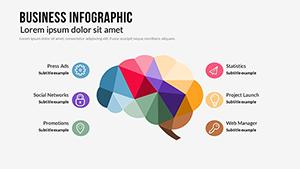
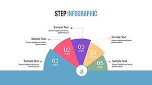
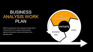
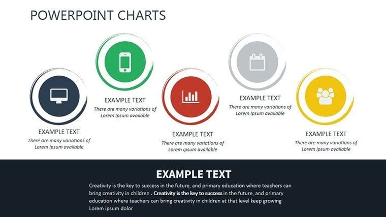
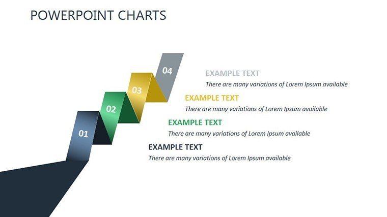
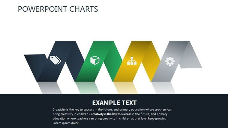
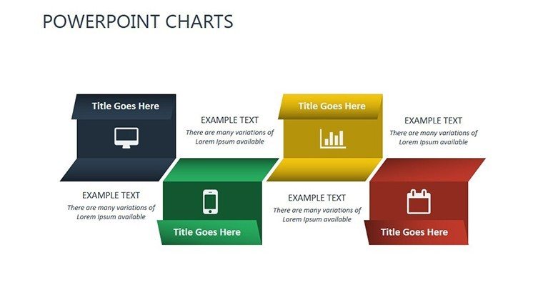
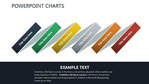
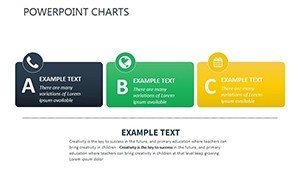
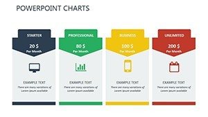
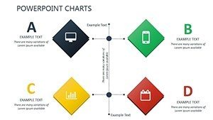
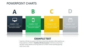
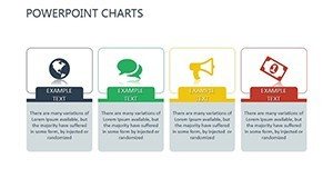
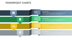
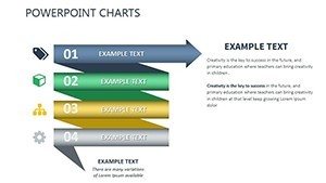
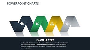
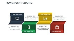
Slide 1: Overview dashboard. Slide 2: Basic sequence diagram. Slide 3: Multi-object interaction. Slide 4: Message flow chart. Slide 5: Criteria evaluation matrix. Slide 6: Spatial relationship map. Slide 7: Timeline with milestones. Slide 8: Resource allocation graph. Slide 9: Risk assessment radar. Slide 10: Decision tree. Slide 11: Comparative table. Slide 12: Outcome simulation. Slide 13: Executive summary.
Slides include prompts for annotations, enhancing clarity.
Pro Tips for Decision Mastery
Use color coding for criteria - red for risks, green for gains - to guide eyes intuitively. Keep slides sparse; focus on one decision layer per view. A dash of wit: "Don't let decisions support you - support them with these charts!" Integrate with BI tools like Power BI for live data feeds.
This template is your key to decisive IT leadership. Grab it now and chart a course to success.
Frequently Asked Questions
How does it handle multiple criteria? Charts evaluate indicators concurrently for balanced views.
Compatible with project tools? Yes, exports to formats like PDF for Jira integration.
Suitable for beginners? Intuitive design with guides makes it accessible.
Can I simulate scenarios? Yes, editable layers allow what-if analyses.
Includes data import? Supports Excel links for seamless updates.