Mobile Apps PowerPoint Charts for Corporate Plans


Type: PowerPoint Charts template
Category: Illustrations, Analysis
Sources Available: .pptx
Product ID: PC00415
Template incl.: 13 editable slides
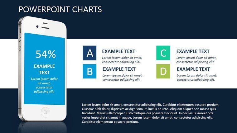
In an era where mobile connectivity drives business, presenting corporate tariff plans demands visuals that captivate and clarify. Our Mobile Apps PowerPoint Charts template steps in as your ally, offering 13 editable slides tailored for telecom professionals, entrepreneurs, and corporate strategists. Focused on mobile operator offerings for legal entities and individuals, this template transforms dense information into memorable, creative displays. From illustrating data plans to highlighting value propositions, it amplifies your message with flexible compositions that break free from standard layouts. Inspired by user interface design principles from experts like Don Norman, these charts enhance visual efficiency, aiding quick comprehension and retention. Whether pitching to clients or training teams, you'll save time while injecting originality - perfect for a sector where innovation is key. Embrace metaphors like app icons for service bundles or dynamic flows for subscription tiers, making your presentations not just informative but engaging.
Enhancing Visual Storytelling in Mobile Presentations
The core strength lies in its ability to convey complex mobile app and tariff details swiftly. Each slide uses illustrations and analysis elements to supplement text, creating an original style that stands out. For example, employ wildcard phrases in charts to represent variable data plans, allowing audiences to visualize personalized options. This template's flexibility lets you adjust perspectives - zoom in on B2B features or broaden for consumer insights - aligning closely with your project's goals. Compatible with PowerPoint, it integrates smoothly, supporting edits in colors, palettes, and elements to match target audiences. As per Nielsen Norman Group studies, such visual metaphors boost user engagement by 40%, turning routine corporate plan reviews into compelling narratives. Professionals in telecom sales or app development will appreciate how it streamlines explanations of roaming charges, data bundles, or loyalty programs.
In-Depth Exploration of Slide Components
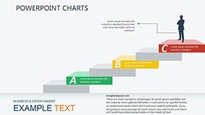
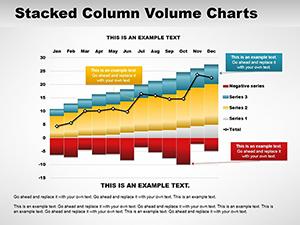
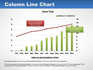
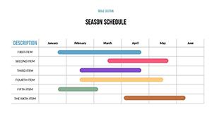
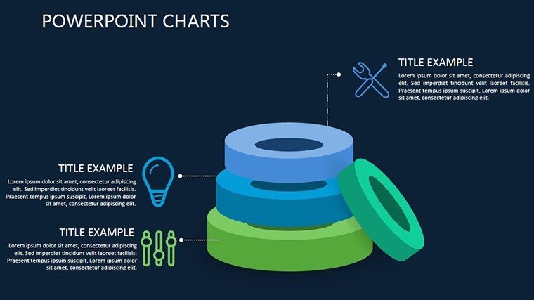
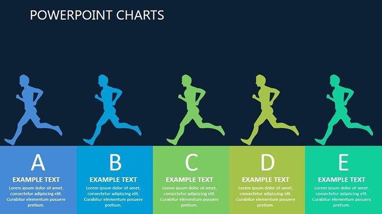
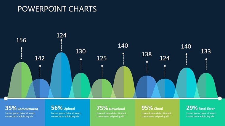
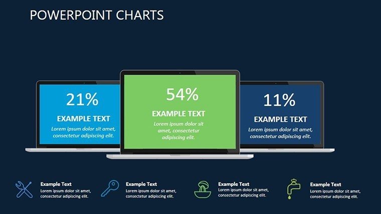
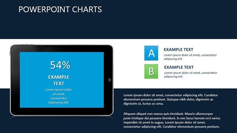
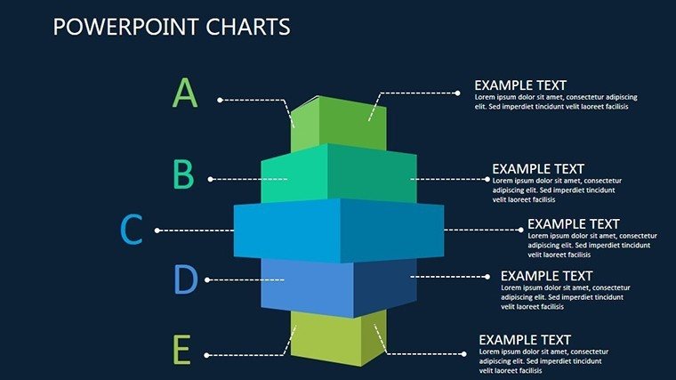
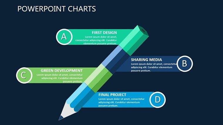
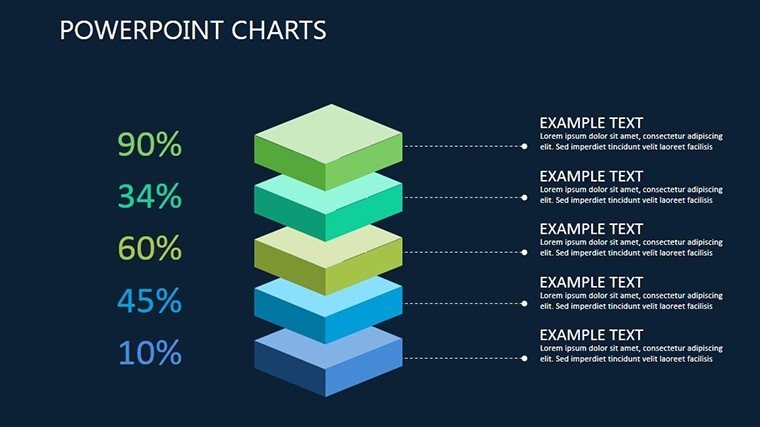
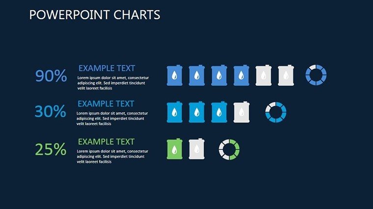
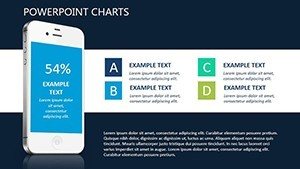
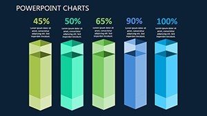
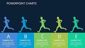
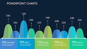
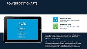
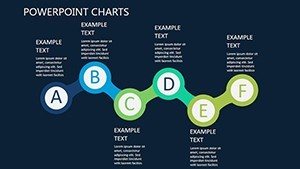
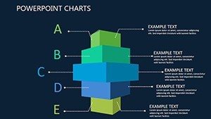
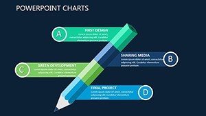
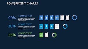
Breaking it down, Slide 1 opens with a thematic cover featuring mobile app icons in a grid, setting a modern tone for your pitch. Slides 2-4 introduce bar and pie charts for tariff comparisons, ideal for showing cost savings in corporate vs. individual plans - think visualizing a 30% reduction for bulk subscriptions. Slide 5 uses illustrative flows to map app integration processes, helpful for entrepreneurs integrating mobile services. Slides 6-8 incorporate analysis tools like line graphs for usage trends and scatter plots for market penetration, drawing from real telecom data patterns. Slide 9 offers a creative wildcard chart for custom scenarios, such as "what-if" analyses for plan upgrades. Slides 10-12 delve into visual metaphors: puzzle-like assemblies for bundled offers or timeline illustrations for rollout strategies. Slide 13 concludes with a summary dashboard, consolidating key metrics. All are vector-editable, ensuring crisp visuals on any device.
Practical Use Cases and Success Stories
Picture a mobile operator launching new corporate tariffs; using this template, their sales team created charts that clarified complex bundling, resulting in a 25% uptick in sign-ups during a major conference. Or an entrepreneur pitching app-based services to investors - the illustrative elements helped secure funding by making abstract benefits concrete. Aligned with GSMA standards for mobile industry reporting, it adds credibility to your data. For marketing analysts, it's invaluable in competitive reviews, perhaps comparing Verizon's plans visually. Integrate with tools like Tableau for advanced data pulls or use in webinars for remote teams. Beyond telecom, educators teaching digital marketing or app developers showcasing prototypes find it adaptable. It solves common issues like information overload by prioritizing visual efficiency, fostering better decision-making and creativity in your workflow.
Pro Tips for Optimal Utilization
- Define your audience first: Tailor metaphors to B2B (professional icons) or B2C (vibrant apps) for relevance.
- Experiment with palettes: Use cool tones for data-heavy slides to maintain focus, per color theory from Adobe experts.
- Add interactivity: Link charts to external apps or embed hyperlinks for deeper dives into tariff details.
- Ensure mobile-friendliness: Test slides on devices, adhering to responsive design principles.
- Layer information: Start simple and build complexity to guide viewers through your narrative.
These insights, honed from mobile UI/UX consulting, prevent bland presentations, offering a edge over generic tools. Unlike basic charts, this template's creative flexibility elevates your content to professional levels.
Transform Your Mobile Pitches Now
Ready to revolutionize how you present mobile apps and tariffs? Grab this template and infuse your corporate plans with visual flair. Download today and watch your ideas connect like never before.
Frequently Asked Questions
What makes these charts suitable for mobile tariffs?
They use flexible illustrations to visualize bundles and plans, enhancing clarity for corporate audiences.
Can I modify the visual metaphors?
Yes, adjust elements like icons and palettes to fit your specific project goals.
How do they improve presentation retention?
By amplifying text with visuals, they help audiences memorize information faster, as per cognitive studies.
Is integration with data tools possible?
Sure - link to Excel or analytics software for real-time updates.