Sustainable Development PowerPoint Charts Template: Visualize a Greener Future


Type: PowerPoint Charts template
Category: Analysis
Sources Available: .pptx
Product ID: PC00394
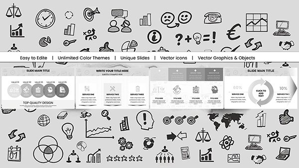
Template incl.: 9 editable slides
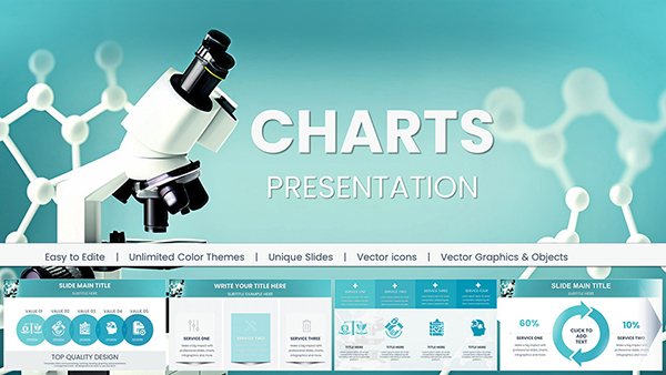
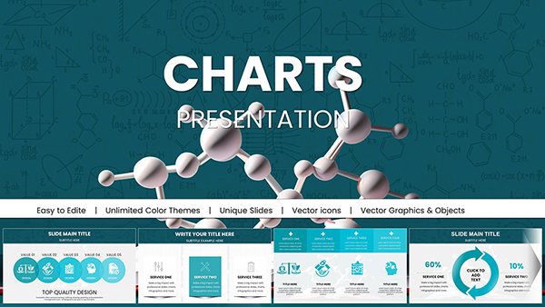
As global awareness of environmental challenges grows, professionals and educators alike need powerful tools to convey the urgency and potential of sustainable development. Picture this: turning intricate data on carbon footprints, renewable energy adoption, and social equity metrics into compelling visuals that inspire change. Our Sustainable Development PowerPoint Charts Template does just that, offering 9 editable slides tailored for impactful storytelling. Designed for environmental consultants, NGO leaders, policymakers, and teachers, it includes bar charts for impact comparisons, line graphs for trend analysis, pie charts for resource allocation, and stacked columns for multifaceted progress tracking. Fully compatible with PowerPoint and Google Slides, this template allows effortless customization of colors and fonts to align with your organization's branding. Whether presenting at a UN-aligned conference or in a classroom, it helps raise awareness and drive action. For example, organizations like the World Wildlife Fund (WWF) use similar visuals to advocate for conservation, demonstrating how data visualization can mobilize support. With this template, you'll not only save time but also amplify your message for a sustainable world.
Essential Features for Effective Sustainability Communication
At the heart of this template are features engineered to make complex sustainability data accessible. Each slide is optimized for clarity, with intuitive designs that guide viewers through key insights without confusion.
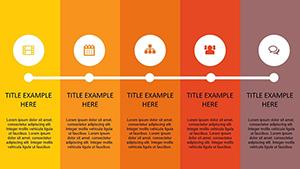
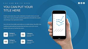
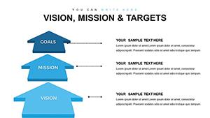
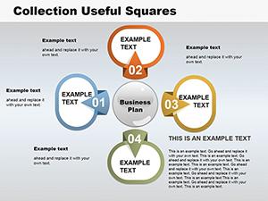
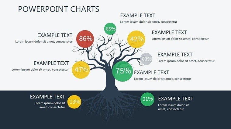
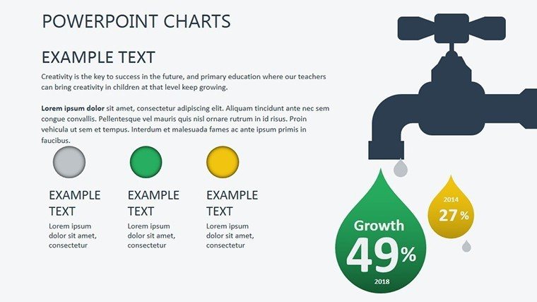
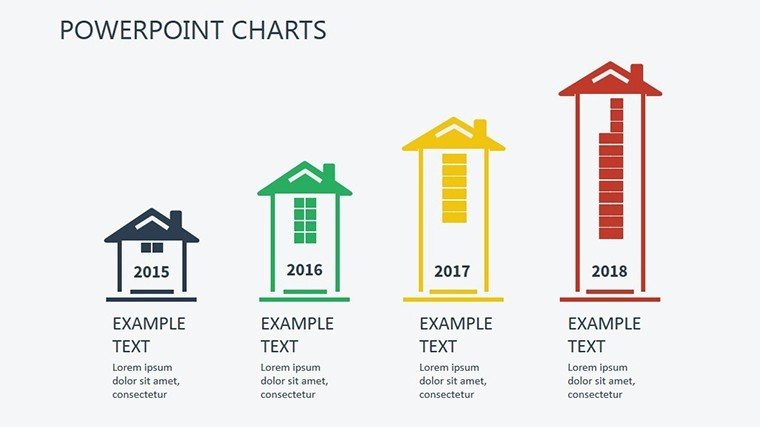
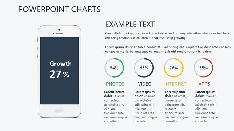
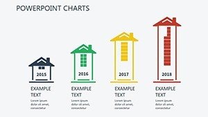
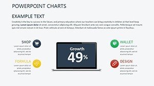
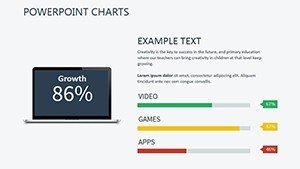
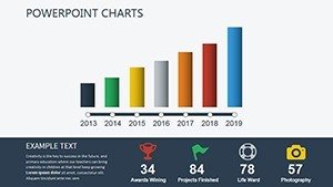
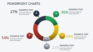
- Diverse Chart Types: From area charts showing cumulative emissions reductions to infographics depicting circular economy models, versatility is key.
- Customization Flexibility: Adapt visuals to reflect specific SDGs, such as Goal 13 (Climate Action), by tweaking elements to match real-time data from sources like the IPCC reports.
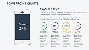
- Professional Aesthetics: High-quality designs ensure your presentations stand out, fostering credibility in high-stakes environments like corporate sustainability reports.
- Ease of Use: Built-in instructions and placeholders make it simple to integrate data, even for those new to advanced charting.
These elements draw from authoritative frameworks, like the United Nations' Sustainable Development Goals, ensuring your content aligns with global standards and enhances in your field.
Unlocking Benefits in Your Daily Work
The true power lies in the benefits this template delivers. In an era where sustainability reporting is mandatory for many businesses under frameworks like ESG (Environmental, Social, Governance), having ready-to-use charts streamlines compliance and communication. Educators can use it to engage students in discussions on topics like biodiversity loss, using pie charts to illustrate species distribution. A real-world case: A European energy firm utilized analogous templates to present their shift to renewables, securing investor funding by clearly showing projected CO2 savings. This not only boosts engagement but also positions you as a thought leader, with presentations that are both informative and inspiring. Compared to standard PowerPoint tools, this template offers themed icons, such as leaf motifs for eco-friendly themes, adding a unique touch that resonates with audiences committed to green initiatives.
Practical Use Cases and Implementation Strategies
Applying this template in real scenarios is straightforward and transformative. For instance, in a project proposal for urban green spaces, employ bar charts to compare before-and-after environmental impacts, emphasizing benefits like improved air quality. In policy briefings, line graphs can track progress toward net-zero targets, drawing from data like that in the Paris Agreement updates.
- Data Collection: Compile metrics from reliable sources, such as World Bank sustainability indicators.
- Slide Adaptation: Insert your figures into the charts, customizing scales for accuracy.
- Storytelling Enhancement: Weave narratives around the visuals, ending with calls to action like adopting sustainable practices.
For educators, integrate into lesson plans on global warming, using stacked charts to show contributions from various sectors. A notable example is how Greenpeace campaigns use visual data to influence public opinion, mirroring the template's potential. By incorporating these, your workflows become more efficient, allowing focus on innovation rather than design.
Expert Tips to Maximize Your Presentations
To truly shine, layer in advanced techniques. Start presentations with a compelling hook, like a pie chart revealing the disproportionate impact of climate change on vulnerable communities. Ensure inclusivity by following accessibility standards, such as alternative text for charts. Collaborate seamlessly in team settings, where multiple users can edit slides in real-time via Google Slides compatibility. In conferences, animate transitions to reveal data progressively, building suspense and retention. Drawing from sustainability experts like those at the Ellen MacArthur Foundation, emphasize circular economy visuals to advocate for waste reduction. This template isn't merely a tool - it's a catalyst for change, helping you craft messages that endure and effect real-world progress.
Embrace sustainable storytelling - download this template now and lead the charge toward a better planet.
Frequently Asked Questions
What types of data are best suited for this template?
It's ideal for environmental metrics, SDG progress, renewable trends, and social impact data, with charts adaptable to various datasets.
Can I customize the template for my brand?
Yes, fully editable colors, fonts, and layouts ensure it matches your branding perfectly.
Is it suitable for educational use?
Absolutely, educators can use it to teach sustainability concepts with engaging visuals.
How do I integrate external data?
Simply copy-paste from spreadsheets or link dynamically for updates.
Are there sustainability-specific icons included?
Yes, themed icons like recycling symbols enhance relevance and appeal.
What if I need support?
Download includes resources, and our team is available for assistance.