Criteria and Metrics PowerPoint Charts: Measure Your Architectural Mastery


Precision isn't just a virtue in architecture - it's the foundation of every successful build. Our Criteria and Metrics PowerPoint Charts template brings that rigor to your presentations with 13 meticulously designed, editable slides that turn raw data into revealing visualizations. For project managers juggling site constraints or principals evaluating bid criteria, this tool distills complexities like cost overruns and sustainability scores into charts that speak volumes, fostering decisions as informed as a structural review.
Compatible across PowerPoint versions and Google Slides, it draws from industry benchmarks like those in the AIA's Project Management Toolkit, ensuring your decks meet professional scrutiny. Whether dissecting RFP responses or monitoring LEED certifications, these slides empower you to present metrics with the clarity of a perfectly scaled model - elevating stakeholder buy-in from tentative to enthusiastic.
Recall firms like Skidmore, Owings & Merrill, who credit data-driven narratives for landing icons like the Burj Khalifa. This template equips you similarly, with bar graphs benchmarking material efficiencies or radar charts assessing design alternatives, all customizable to spotlight your firm's edge in adaptive, resilient planning.
Precision Tools: Essential Features for Data-Driven Design
Crafted with the architect's eye for detail, these 13 slides offer features that blend analytical depth with aesthetic appeal, making metric tracking as engaging as a walkthrough.
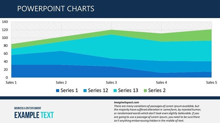
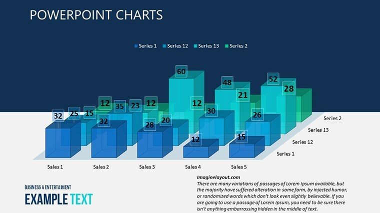
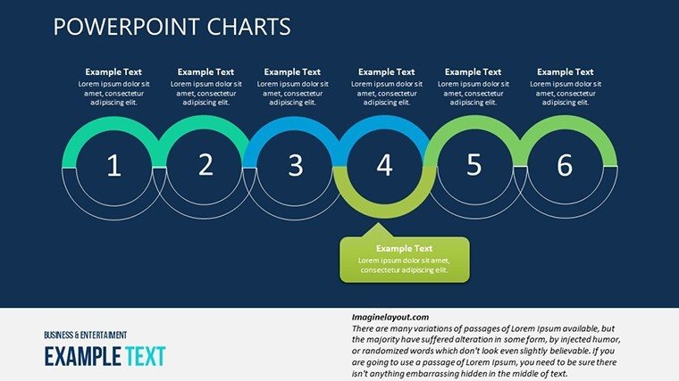
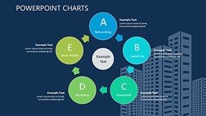
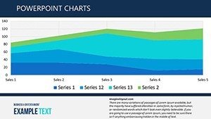
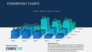
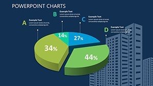
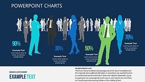
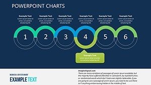
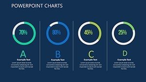
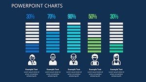
- Varied Chart Arsenal: Bar, line, and area graphs ready for KPI inputs - track progress against milestones like foundation pours or facade installations - with drag-and-drop editing for instant refinements.
- Brand-Synced Customization: Adjustable palettes from cool blues for engineering specs to warm accents for client-facing summaries, plus scalable icons for elements like rebar or solar panels.
- User-Centric Interface: Intuitive controls for filtering data sets, ensuring quick adaptations during on-the-fly revisions in team huddles.
Vector-based for flawless scaling, whether in 16:9 widescreen for boardrooms or 4:3 for legacy projectors, maintaining the sharp lines essential to architectural communication.
Advanced Options for Workflow Efficiency
Embed formulas for auto-calculations - e.g., variance between budgeted and actual sq ft costs - and link to external sheets for dynamic updates, mirroring BIM integration for holistic project oversight.
From Blueprint to Boardroom: Practical Use Cases
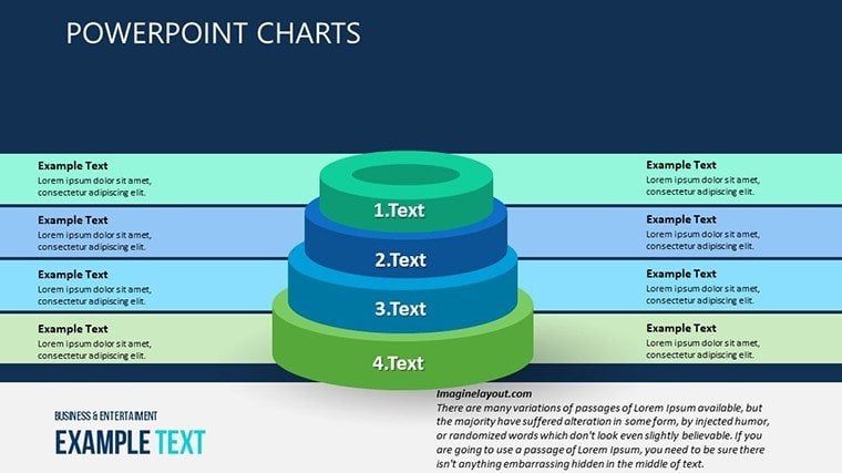
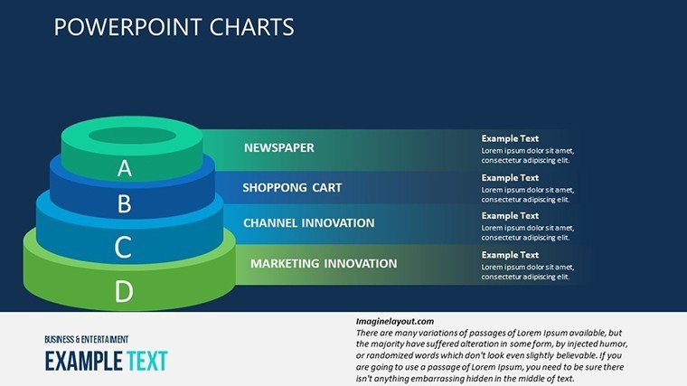
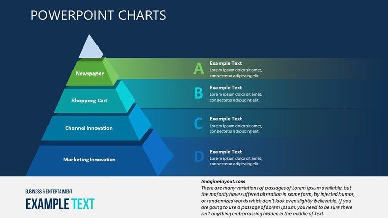
Picture a Chicago firm assessing urban infill proposals. They harnessed this template's pyramid charts to rank sites by criteria like zoning flexibility and transit access, layering metrics on environmental impact. The visual hierarchy clinched council approval, accelerating a $50M redevelopment - demonstrating how structured data can pave literal paths forward.
Implement it step by step:
- Define Evaluation Framework: Populate scorecard slides with weighted criteria, such as aesthetic integration (30%) and budget adherence (40%).
- Input Quantitative Data: Feed in figures from estimating software, customizing scales for granularity - like monthly vs. quarterly views on labor hours.
- Visualize Trade-Offs: Use combo charts to juxtapose options, highlighting sweet spots for value engineering.
- Collaborate and Refine: Share via cloud links, incorporating feedback to balance qualitative notes with hard numbers.
- Deliver Insights: Animate summaries for emphasis, concluding with recommendation slides that guide next actions.
In academia, professors at Columbia's architecture school employ it for studio critiques, quantifying design iterations to teach evidence-based refinement.
Beyond Basics: Why Pros Choose This Over Standard Tools
Native PowerPoint metrics? They're blunt instruments compared to this template's nuanced, pre-aligned designs that reduce formatting friction by 60%, according to productivity analyses from Microsoft. It adds layers like conditional formatting for at-risk indicators - red flags on delay-prone phases - turning passive reports into proactive dashboards.
Secure your edge in metrics mastery - download the Criteria and Metrics PowerPoint Charts template and build presentations as solid as your structures. Dive into 3D charts next.
Insider Strategies: Elevating Metric Presentations
Tip: Contextualize numbers with anecdotes - pair a cost overrun graph with a "lessons from the field" callout for relatability. Inject wit: "Metrics: Because 'Eyeballing It' Built That Leaning Tower." Ensure mobile-friendliness for site visits, exporting subsets for quick scans.
Don't just track - transform. Get started now and let data design your triumphs.
Frequently Asked Questions
What chart types are featured?
A mix including bars for comparisons, lines for trends, and radars for multi-criteria evaluations, all tailored for project metrics like timelines and compliance scores.
Can it handle large datasets?
Yes, with linked Excel support for thousands of rows, aggregating into summaries without performance lags.
Is customization beginner-friendly?
Absolutely - guided tooltips and one-click theme swaps make it accessible, even for non-designers in your firm.
Does it include instructions?
Built-in notes pane with tips, plus a starter guide slide for setup in under 10 minutes.
How does it ensure data accuracy?
Pre-embedded validation rules flag inconsistencies, aligning with quality controls in architectural documentation.