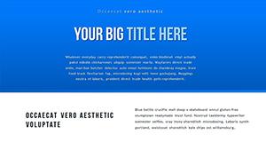
Analytical Reviews PowerPoint Charts Template


When faced with a sea of data - financial forecasts, market fluctuations, or operational metrics - the challenge isn't gathering info; it's making it sing. Our Analytical Reviews PowerPoint Charts for Presentation template steps in as your conductor, orchestrating 18 editable slides into symphonies of clarity. Aimed at finance whizzes, market analysts, and presenters juggling big datasets, it distills complexity into charts that communicate, convince, and convert, all while keeping your delivery smooth and your audience spellbound.
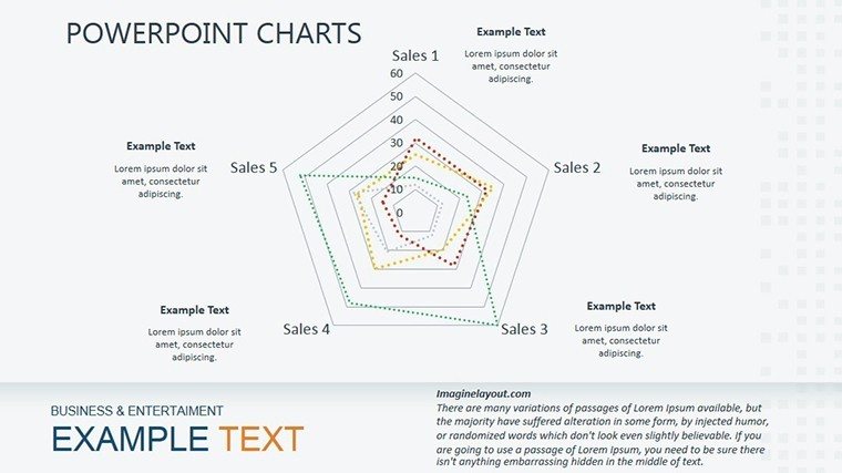
Core staples like bar charts for comparisons, sinuous lines for trends, and pie wedges for proportions form the backbone, but we've elevated them with smart infills, gradient fills, and hover-ready labels. Fully PowerPoint and Google Slides friendly, customization flows naturally: Paste in your figures, adjust axes, and voila - tailored visuals ready for prime time. It's the antidote to bland reports, injecting precision and panache into every review.
Take a market research firm in Chicago prepping a client pitch on consumer trends. Swapping in survey data to our line chart slide revealed seasonal spikes, while adjacent pies apportioned demographics - turning a 50-page report into a 10-slide triumph that won the contract. Moments like these underscore how targeted visuals bridge data to decisions, and this template is engineered for just that.
Building Blocks of Brilliant Reviews
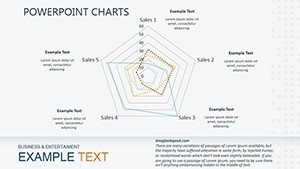
Editability reigns supreme: Modular components let you mix bars with lines for hybrid views, all scalable and source-linked for updates. Drawing from APA guidelines for visual aids, it ensures ethical representation - no misleading scales or cluttered axes - while prioritizing user comprehension.
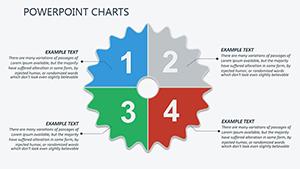
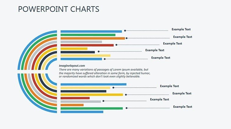
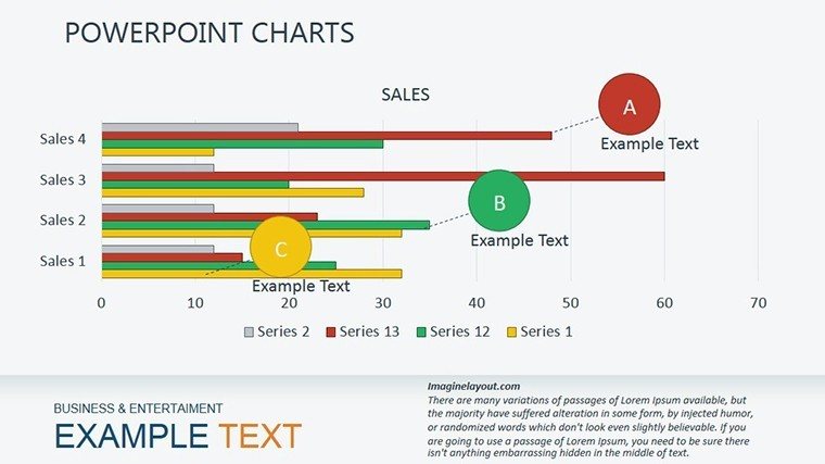
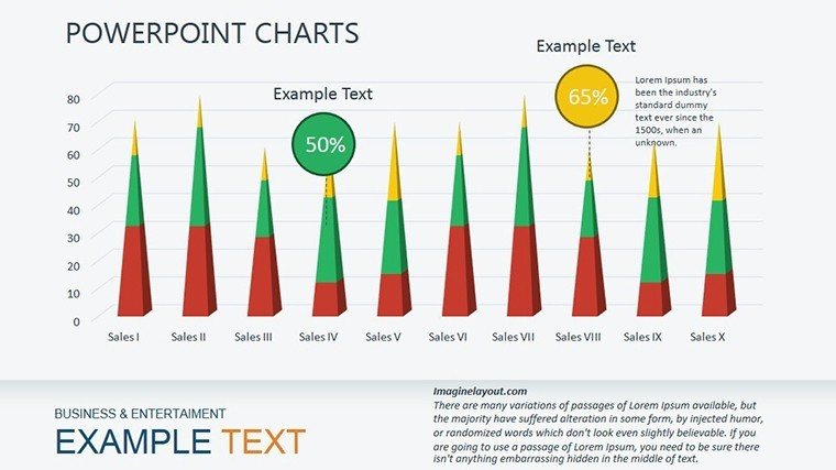
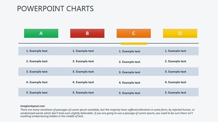
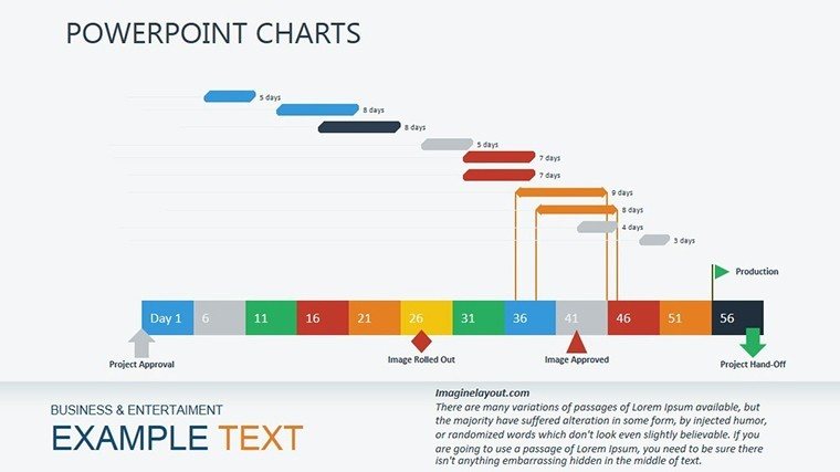
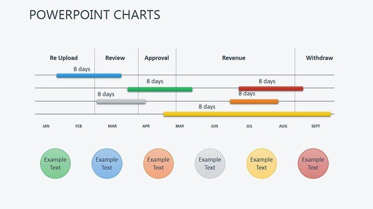
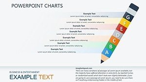
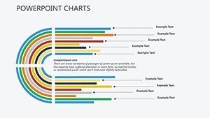
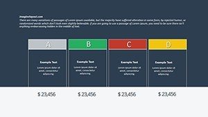
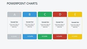
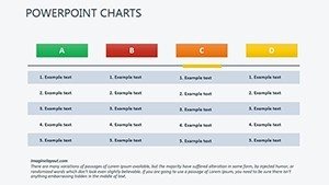
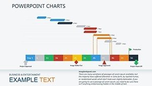
- Clustered Bars: Side-by-side for variance analysis, like budget vs. actuals in audits.
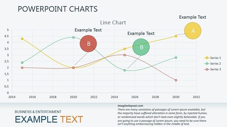
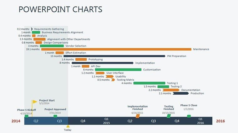
- Area Lines: Filled trends for cumulative effects, tracking market share erosion over time.
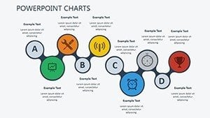
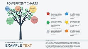
- Exploded Pies: Highlight outliers, such as niche segments driving unexpected growth.
Typography is crisp, colors harmonious - yet yours to remix for sector specifics, be it greens for eco-reports or reds for risk alerts. Transitions? Gentle wipes that mimic data flow, underscoring progression without fanfare.
From Boardroom to Breakout: Key Use Cases
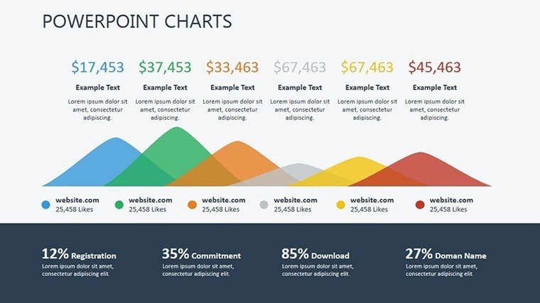
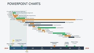
For finance pros, bar stacks dissect P&L statements, a bank in Sydney used them to layer expense categories, pinpointing cost leaks that saved millions annually. Market analysts favor line interpolations for predictive modeling, forecasting with confidence intervals that build trust.
Operational reviews benefit from pie integrations with tables, quantifying process efficiencies - a logistics company visualized route optimizations, streamlining ops and cutting fuel by 18%. Even sales teams adapt for pipeline funnels, where exploded segments flag stalled deals for intervention.
Surpassing Stock Chart Shortcuts
Elevates over default inserts with pre-vetted layouts that save reformatting time, plus embedded formulas for auto-calcs like percentages. Where basics falter on large audiences, ours scales narratives for intimacy or scale, per Toastmasters' engagement tactics.
- Data Sync: Excel bridges for real-time refreshes in dynamic environments.
- Print-Proof: High-DPI exports for handouts that match screen quality.
- Audit Trails: Change logs in notes for collaborative integrity.
Incorporate into routines: Sketch review goals, assign chart types, populate iteratively. Prompts in margins guide: "Elaborate: What does this bar's height imply for Q4?"
Tips to Tune Your Analytical Edge
Layer context with annotations - e.g., trend lines annotated with events like "Post-merger dip." Validate with peer reviews for bias checks. For virtual crowds, optimize for 16:9 ratios. In finance, align with IFRS visuals for global compliance.
Suitable for solos or squads, it empowers precise pitches that resonate, regardless of room size or stakes.
Chart Your Path to Persuasive Reviews
Cease settling for static stats - embrace dynamic depictions. Acquire the Analytical Reviews PowerPoint Charts Template and redefine how you unpack data. Immediate access post-download equips you to engage profoundly. Simplify the sophisticated, captivate consistently. Claim it today and let your reviews resonate.
Frequently Asked Questions
What types of charts are included?
Primarily bars, lines, and pies, with hybrids for versatile analytical needs.
How editable are the data elements?
Completely - update values, labels, and styles via intuitive placeholders.
Does it work for large audiences?
Yes, bold designs ensure visibility from afar, with scalable fonts.
Can I add custom animations?
Certainly, build on existing ones or create new via PowerPoint's timeline.
Is there support for trend forecasting?
Indeed, line charts include projection tools for forward-looking insights.