Sector Circle PowerPoint Charts Template - Download PPTX


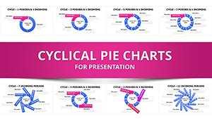
Picture this: You're in a high-stakes meeting, and your data needs to shine without confusion. Our Sector Circle PowerPoint Charts Template delivers exactly that, with 11 meticulously designed, editable slides focused on pie-style visualizations. Ideal for analysts, marketers, and executives, it turns raw percentages - be it market shares or budget breakdowns - into intuitive, eye-catching sectors. Forget cluttered spreadsheets; these charts emphasize proportions at a glance, helping you communicate categorical data like sales distributions or demographic splits effectively. Compatible with PowerPoint and beyond, it's your tool for presentations that persuade, whether in boardrooms or virtual calls, all while saving you design time.
Mastering Proportional Data with Ease
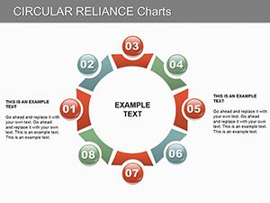
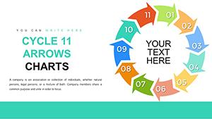
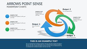
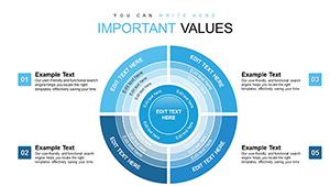
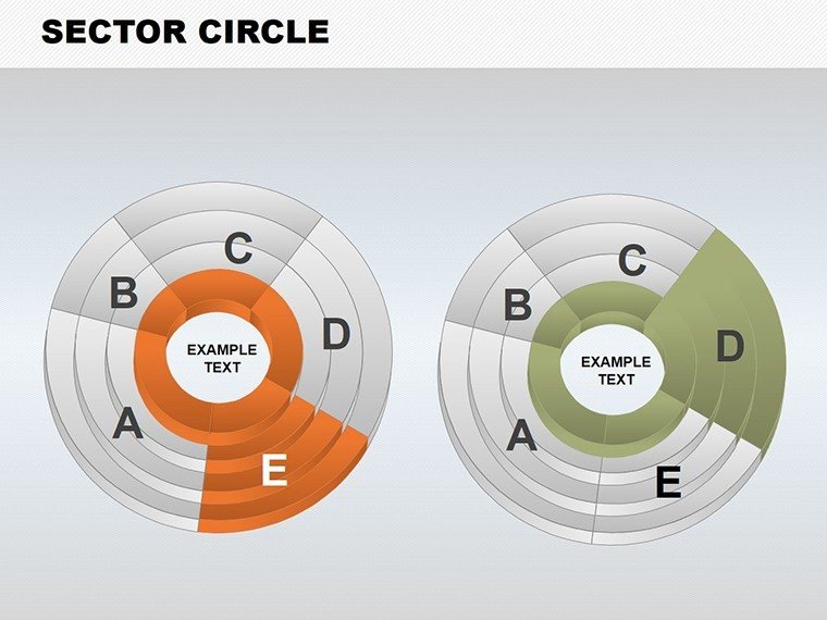
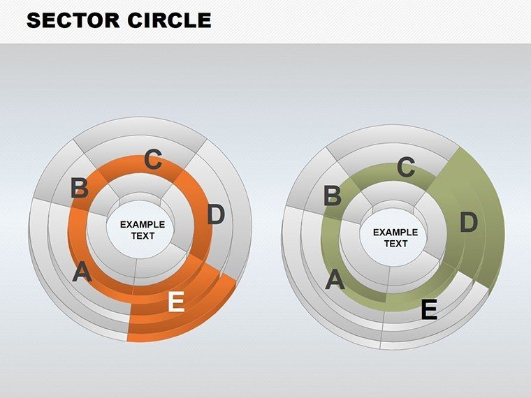
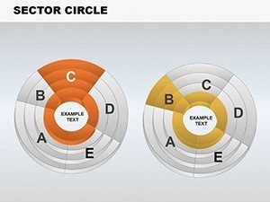
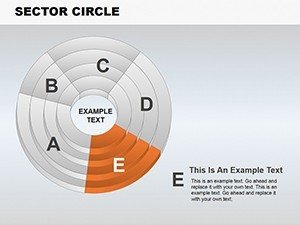
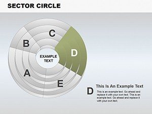
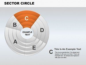
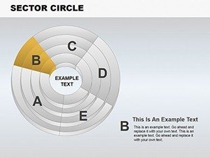
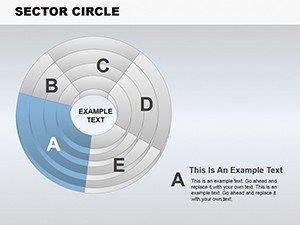
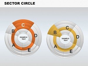
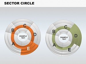
Sector circles, essentially enhanced pie charts, excel at showing 'part-to-whole' relationships. This template refines that by offering clean, distraction-free designs that prioritize your data's story. Customize sectors to reflect exact proportions, ensuring categories always sum to 100% for accuracy and trust. Business users appreciate how it simplifies complex breakdowns, like economic distributions, into digestible visuals.
Standout Features for Professional Polish
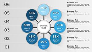
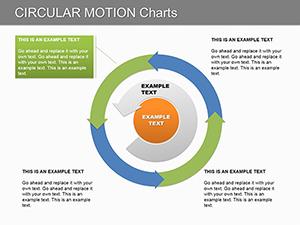
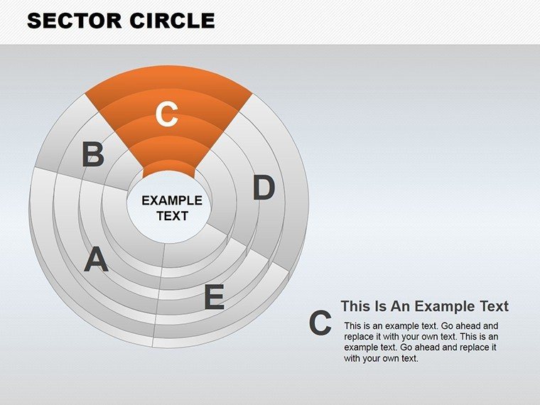
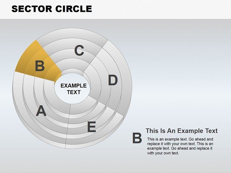
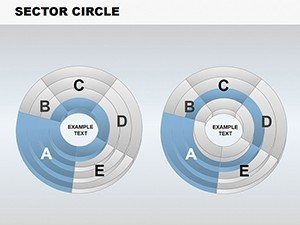
- Varied Designs: From basic pies to radial diagrams, choose layouts that fit your narrative.
- Effortless Customization: Alter colors, fonts, and sizes to align with your brand, with adjustable sectors for precise data rep.
- Professional Cleanliness: Minimalist aesthetics keep focus on insights, avoiding visual noise.
- Time-Saving Pre-Designs: Jumpstart your work, focusing on analysis over creation.
- Flexible Formats: .pptx ensures smooth use across platforms.
These elements draw from best practices where sorting slices descending aids quick identification of key contributors.
Versatile Applications Across Industries
From finance to education, this template adapts seamlessly. Marketers can visualize campaign performance, educators illustrate statistical concepts, and managers track project allocations - all with clarity that engages.
Step-by-Step: Crafting a Market Analysis Presentation
- Select a base slide: Choose a sector design that matches your data categories.
- Input data: Populate sectors with percentages, watching the chart auto-adjust.
- Customize visuals: Apply brand colors and labels for readability.
- Refine and present: Add annotations for emphasis, then export or share.
Such methods align with guides on pie chart usage, emphasizing logical ordering from largest to smallest. In business reports, this has led to better stakeholder understanding of metrics like profit margins.
Superior to Standard Tools: Why Choose This?
Basic PowerPoint pies often lack sophistication, but this template offers advanced options like exploded sectors for emphasis, outperforming generics in engagement. Users save time and elevate professionalism, with designs that avoid common pitfalls like distortion.
Pro Tips for Impactful Visuals
- Limit slices: Stick to 5-7 for clarity, combining smaller ones if needed.
- Use colors wisely: Contrast for distinction, but keep palettes professional.
- Label effectively: Attach percentages directly to slices for quick reads.
- Avoid 3D: Flat designs prevent misinterpretation of proportions.
These insights, from comprehensive guides, ensure your charts communicate with precision.
Transform Your Data Stories Now
Ready to make your proportions pop? This Sector Circle template is the key to visuals that inform and impress. Customize, present, and achieve results - start today and see the difference in audience response.
FAQ
What makes sector circles better than standard pies?
They offer cleaner designs and better customization for professional data rep.
Can I edit sector sizes?
Yes, fully adjustable to reflect your data accurately.
Is it suitable for educational use?
Absolutely, great for teaching stats and distributions.
How many slides are included?
11 editable slides with various designs.
Does it work with Google Slides?
Compatible via .pptx import for seamless use.