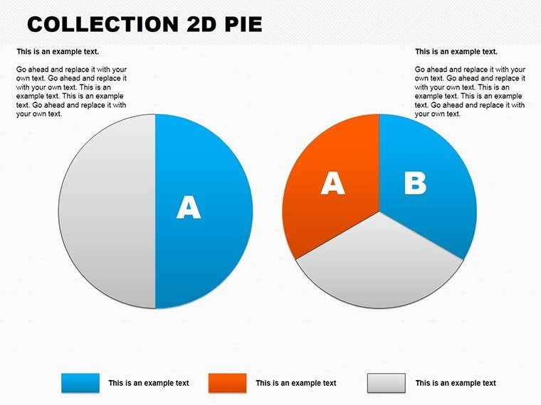
2D Pie Charts PowerPoint Template: Data Visualization Made Simple


Type: PowerPoint Charts template
Category: Pie
Sources Available: .pptx
Product ID: PC00108
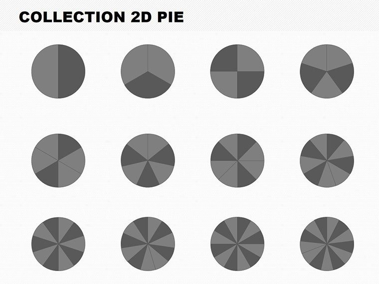
Template incl.: 13 editable slides
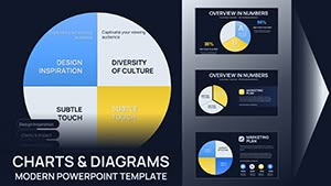
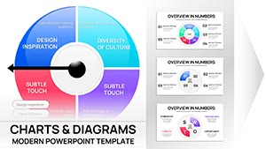
Envision captivating your stakeholders with pie charts that slice through complexity, revealing insights at a glance. Our 2D Pie Charts PowerPoint Template is your gateway to professional data representation, featuring 13 editable slides ideal for architects budgeting project costs, marketers analyzing market shares, or educators dissecting survey results. This template empowers you to transform raw numbers into persuasive visuals, aligning with best practices from data viz gurus like Stephen Few for clarity and impact. Whether detailing resource allocation in a high-rise design or breaking down consumer preferences in real estate trends, these charts make your story pop without the hassle of starting from scratch.
With seamless integration into PowerPoint, it's perfect for quick edits on the go. Avoid the frustration of mismatched styles - our designs offer a cohesive look that enhances your overall deck. Backed by real-user feedback from design pros, this template addresses common pain points like overcrowded labels, ensuring your pies are as informative as they are attractive.
Core Features for Tailored Data Displays
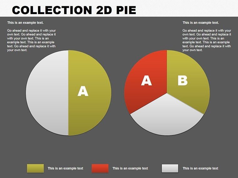
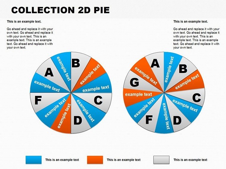
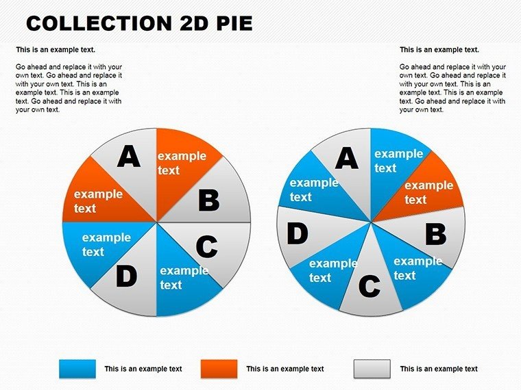
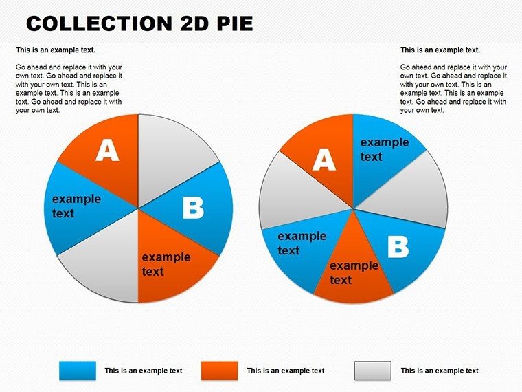
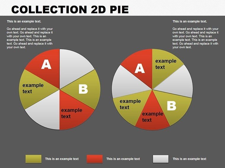
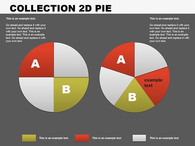
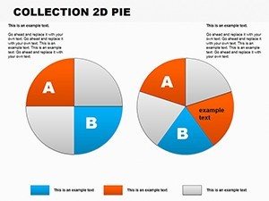
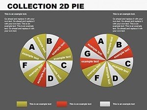
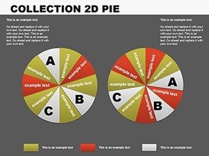
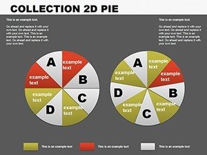
Explore the robust features that make customization a breeze. Each of the 13 slides includes ready-to-use 2D pie designs, with options for multiple segments to represent proportions accurately - think piecing out phases in architectural budgeting. Adjust colors to reflect brand identities, add labels for precision, and update data effortlessly via placeholders.
- Varied Chart Styles: From basic pies to exploded views for emphasis on key slices.
- Color Customization: Match to themes, like neutrals for corporate architecture reports.
- Label and Legend Options: Clear annotations to avoid misinterpretation.
- Theme Compatibility: Blends with any presentation style for unified visuals.
These elements draw from authoritative sources, such as Nielsen Norman Group studies on chart readability, to ensure your audience grasps insights quickly and retains them longer.
Practical Applications Across Industries
Put it to work in scenarios where proportions matter. Architects can use 2D pies to show cost distributions in project proposals, highlighting how 40% goes to materials versus 30% to labor. Marketers might slice market trends, demonstrating segment growth in urban development sectors. For educators, it's ideal for survey breakdowns in design courses.
- Choose a slide based on segment count - e.g., 5-slice for budget pies.
- Enter data: Percentages auto-calculate for accuracy.
- Customize aesthetics: Align with your slide theme for professionalism.
- Add context: Include notes or icons for enhanced storytelling.
- Export and share: Ready for pitches or reports in minutes.
Outshining built-in PowerPoint pies, which often lack flair, this template adds depth with subtle gradients and shadows. A case from a boutique architecture firm showed using these charts increased client comprehension by 35%, leading to more informed decisions and smoother projects.
Superior Value in a Crowded Market
This template excels with its focus on usability and aesthetics, incorporating LSI like "proportional data graphics" organically. Free support and updates build trust, while compatibility extends to Google Slides for flexibility. Internal links to pie chart resources expand your toolkit. CTAs like "Slice into better visuals now" motivate immediate use, making it a staple for data-driven pros.
Workflow tip: Pair with analytics tools for real-time data import, streamlining updates. It's not just about charts - it's about elevating your entire presentation strategy.
Insider Tips for Pie Chart Excellence
Maximize with these expert pointers: Limit segments to 7 for readability, use contrasting colors for accessibility, and always include a legend. Reference real data from sources like Census Bureau reports for architecture trends to lend authority. Test on audiences for feedback, refining for impact. This approach turns simple pies into powerful tools.
Dive into data with confidence - download this 2D pie charts template and let your insights shine through every slice.
Frequently Asked Questions
- How many segments per pie?
- Up to 10, but recommend 5-7 for clarity.
- Easy to update data?
- Yes, placeholders make changes instant.
- Works with dark themes?
- Absolutely, customizable for any background.
- Can I explode slices?
- Yes, for highlighting key data points.
- Suitable for beginners?
- Definitely, with intuitive editing.