Merging Pie Charts PowerPoint - Fully Editable


Type: PowerPoint Charts template
Category: Pie
Sources Available: .pptx
Product ID: PC00102
Template incl.: 9 editable slides
9 Diagrams in Merging Pie Layouts: Full Contents
9 fully editable diagrams come in the download.
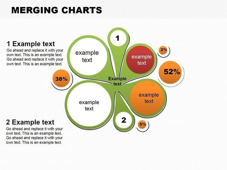
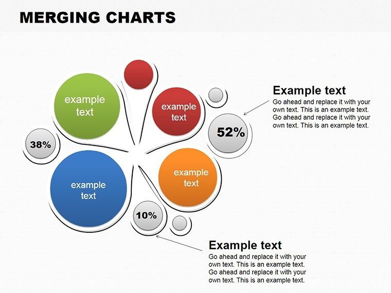
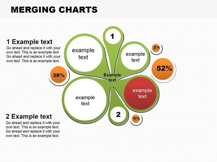
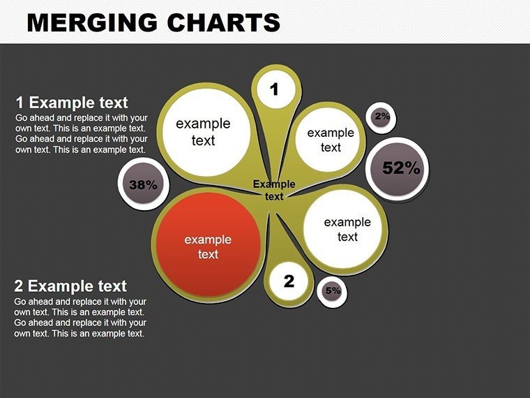
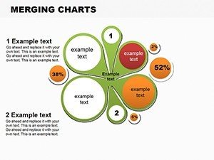
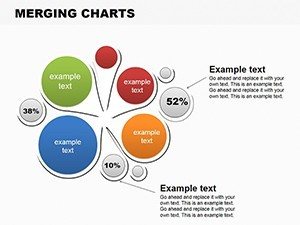
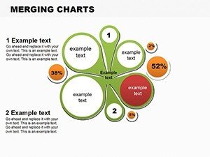
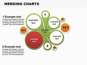
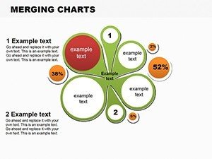
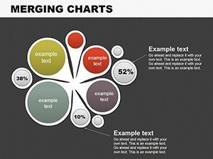
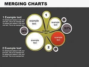
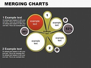
Each shows overlapping segments for complex datasets.
These layouts support combined analysis of two or three datasets at once.
The structure fits budget allocation alongside market share comparison in one view during strategy meetings.
The merging approach sets it apart from single-chart layouts by revealing intersection zones without extra slides. This enables clear communication in board briefings where data overlap matters most.
Key Specifications
| Feature | Details |
|---|---|
| Editable shapes | merging segments resize and recolor independently without breaking overlaps |
| Text placeholders | labels update across all nine slides instantly |
| Color theme adjustments | slide master palette applies to all zones and connectors |
| Diagram connectors | thin lines between overlaps adjust in weight and direction |
| Icon layers | icons replaceable in segment areas |
| Export options | .pptx for editing or PDF for distribution |
Typical Use Cases by Role
Financial Analyst in Market Research
A financial analyst at a consulting firm mapped overlapping revenue streams in a quarterly review. The merging pies clarified shared client segments across divisions. Deck preparation dropped from 3 hours to 45 minutes. The file was reused across three client reports by swapping color schemes only.
Project Manager in IT
A project manager in an IT company used the overlaps for resource allocation visuals during stakeholder alignment. Preparation time reduced to under 45 minutes. The same diagrams supported five consecutive briefings.
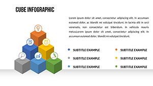
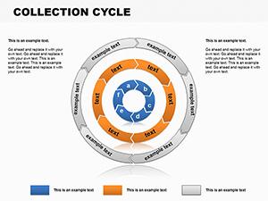
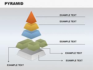
Consultants often pair these diagrams with a hierarchy visualization slide when structuring multi-tier strategy decks. Teams in sales presentations combine it with a process cycle diagram for investor decks.
Explore additional options in the pie powerpoint chart templates category.
Download the Merging Pie Charts PowerPoint Template
From Download to Final Deck
The workflow takes under 12 minutes for moderate skill users.
- Open the .pptx file in PowerPoint (1 minute)
- Replace placeholder text with your content (3 minutes)
- Adjust brand colors via the slide master (2 minutes)
- Edit diagram labels and connectors (4 minutes)
- Export as PPTX or PDF (1 minute)
Editing difficulty: Moderate.
Building From Scratch vs. Starting Here
Building equivalent merging pie diagrams from scratch takes over 90 minutes per slide. Manual alignment of overlaps often leads to misaligned zones on projection screens. This template provides ready structures so users focus on data only.
Labels sit outside the merging zones connected by thin lines. That placement maintains readability during live meetings without adding editing complexity.
The cost of not using a template includes lost time and inconsistent visual hierarchy in business presentations.
Download Now and Present with Confidence
Which PowerPoint versions are compatible?
The PPTX file opens in PowerPoint 2016, 2019 and Microsoft 365 on Windows and Mac systems. Slide master access works fully in all listed versions. Users on older versions may need to update for full color theme adjustments. The file format compatibility ensures no conversion issues during editing.
How do I change the color scheme?
Open the slide master view in PowerPoint. Select the color palette and update the theme colors. The changes apply automatically to all nine merging pie diagrams. Save the file and the new scheme appears in every slide.
What license is included?
The purchase allows use in client work and internal business presentations. Resale or sublicensing of the template itself is not permitted. The license covers unlimited projects within one organization. Download once and apply across multiple decks.
Is there a free version?
No free version is listed on the page. The paid download provides the complete set of 9 merging pie diagrams in PPTX format. All editable elements and connectors are included. This single purchase covers the full package.
What file formats are provided?
The download contains a single PPTX file. It opens directly in PowerPoint for editing. PDF export is possible after customization. No additional formats like JPG are included.
What is the refund policy?
Refunds are available within 14 days if the template does not open correctly in supported PowerPoint versions. The request must include proof of incompatibility. No refunds after successful download and editing. The policy ensures buyer protection for technical issues only.