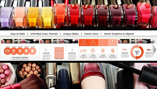
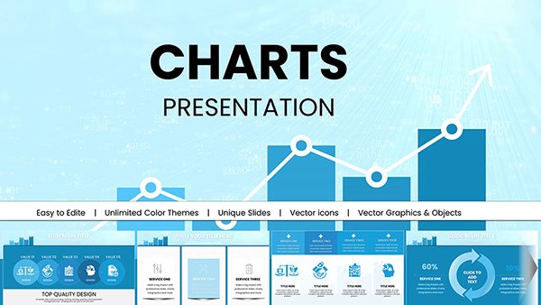
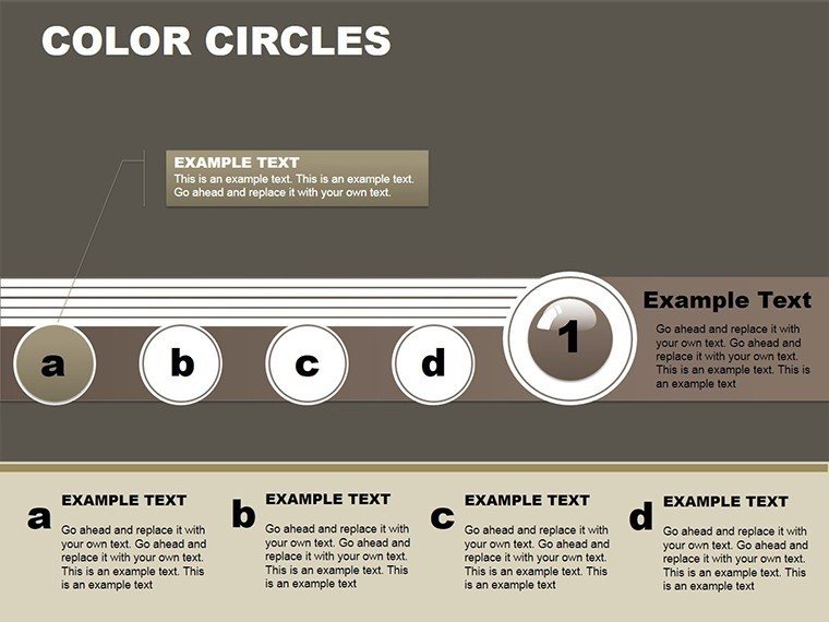
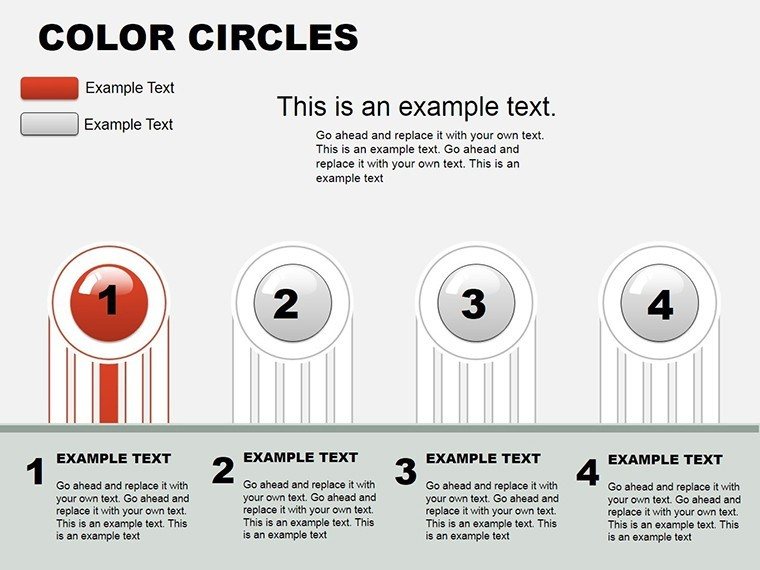
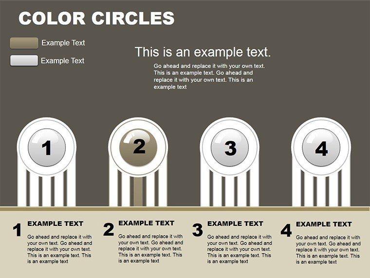
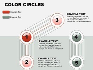
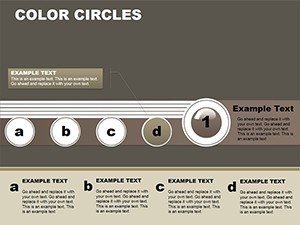
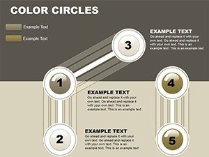
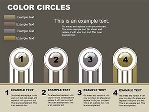
Vibrant Color Circles Charts for PowerPoint
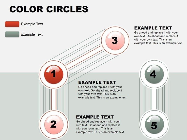
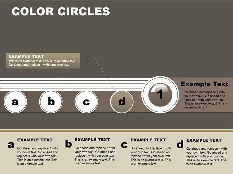


Imagine transforming a sea of numbers into a symphony of colors that dance across your slides, pulling your audience into the story behind the data. That's the magic of the Vibrant Color Circles PowerPoint Charts Template. Designed for professionals who crave impact without the hassle, this template packs 24 fully editable slides into a sleek .pptx file, compatible with both PowerPoint and Google Slides. Whether you're a marketing whiz plotting campaign cycles or an architecture firm mapping out project phases, these circular designs turn abstract metrics into memorable narratives.
In the world of high-stakes presentations, where attention spans are shorter than a blueprint sketch, standing out isn't optional - it's essential. Our template draws from proven data visualization principles, like those championed by Edward Tufte in his seminal work on information design, ensuring clarity meets creativity. Picture this: a client meeting where your sales funnel isn't just a flat line graph but a vibrant wheel of interconnected circles, each hue representing a stage from lead generation to conversion. Or, for educators breaking down historical timelines, circles that overlap to show influences and evolutions, making lessons stick like never before.
What sets this apart from stock PowerPoint charts? It's the thoughtful fusion of aesthetics and functionality. No more wrestling with clunky defaults - these circles are vector-based, scalable without pixelation, and infused with subtle animations that reveal data progressively, keeping viewers hooked. Tailored for diverse industries, from tech startups pitching investor rounds to non-profits illustrating community impact, this tool empowers you to communicate with confidence. And with endless customization - swap colors to match your brand palette, tweak fonts for that personal touch, or layer in icons for extra flair - you're not just presenting; you're storytelling.
Unlocking the Power of Circular Data Design
Circular charts have long been a staple in design thinking, echoing the organic flow of real-world processes like urban planning cycles or product development loops. This template elevates that tradition with modern twists: think gradient fills that mimic sunset horizons for architecture mood boards or bold primaries for retail analytics. Each slide is a canvas, pre-loaded with placeholders that adapt to your input - enter sales figures, and watch the circles resize proportionally, maintaining perfect harmony.
Consider a real-world application: An architecture studio using these charts to visualize sustainable material sourcing. One slide features concentric circles for cost breakdowns - outer ring for raw materials, inner for labor - while adjacent ones use segmented circles to compare eco-impact across suppliers. Drawing from AIA guidelines on sustainable design reporting, this approach not only informs but inspires, turning dry specs into a compelling case for green building. Users report slashing prep time by 40%, freeing hours for creative refinement rather than formatting drudgery.
Key Features That Drive Engagement
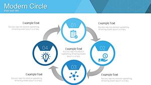
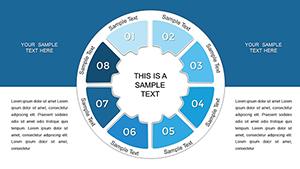
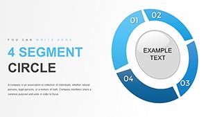
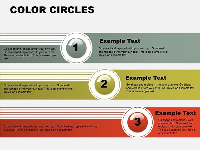
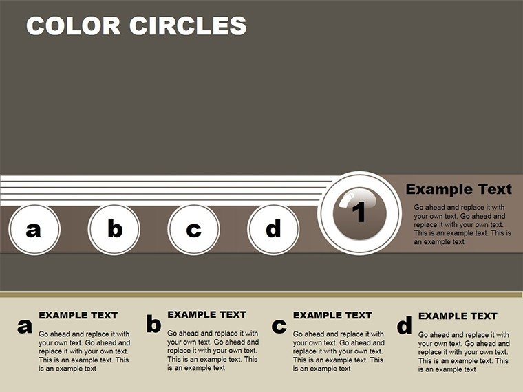
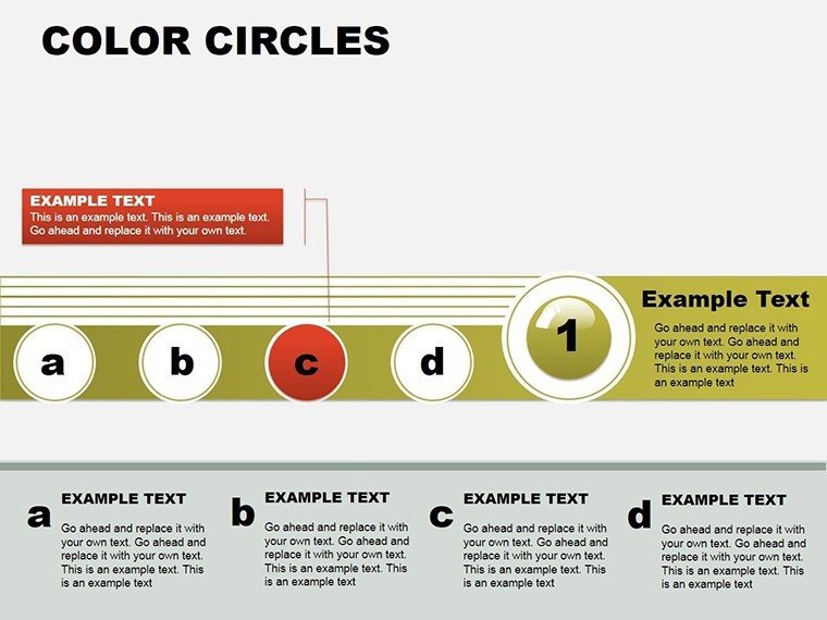
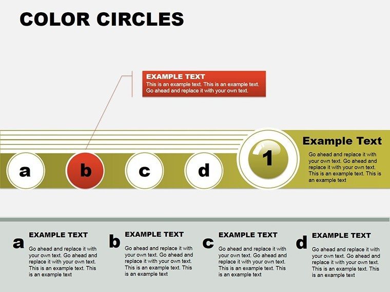
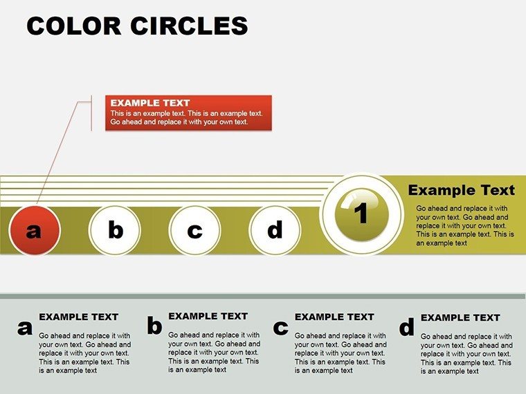
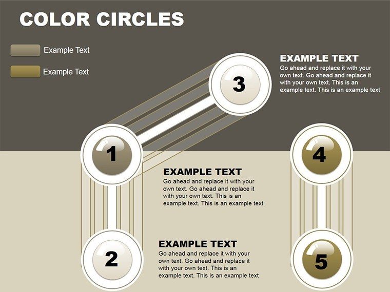
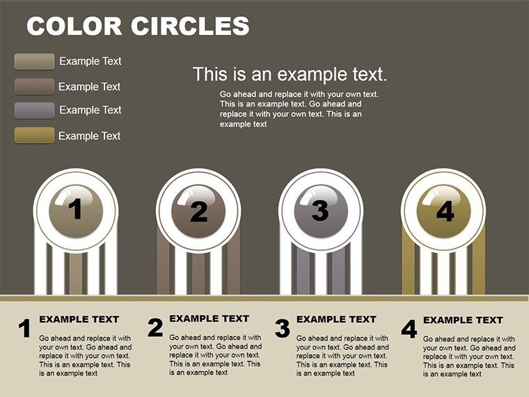
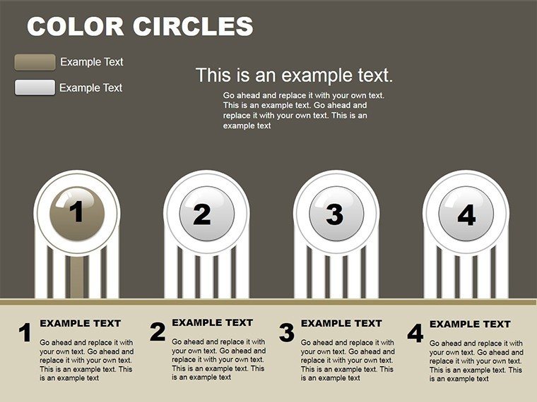
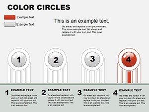
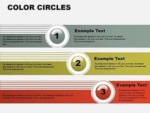
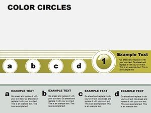
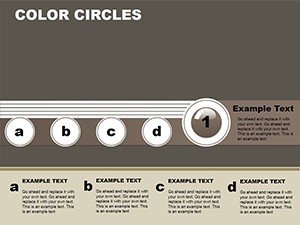
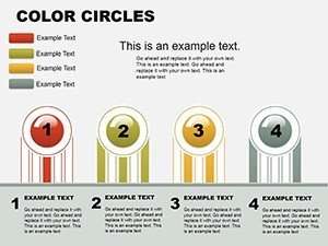
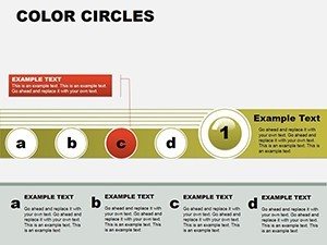
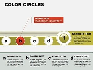
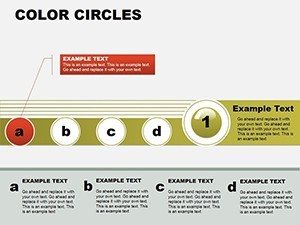
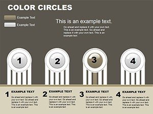
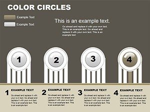
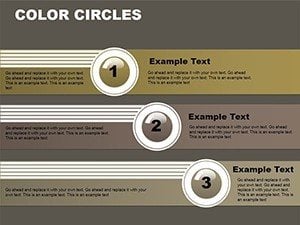
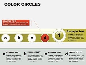
- 24 Editable Slides: From basic pie breakdowns to multi-layered cycle diagrams, covering arrows, processes, and comparisons.
- Vector Icons & Graphics: High-res elements that stay crisp on any screen, perfect for 4K projectors in boardrooms.
- Seamless Animations: Built-in transitions that unveil data in sequence, ideal for pacing through quarterly reviews.
- Brand-Ready Customization: Adjust hues via the color picker, ensuring alignment with corporate identities like Pantone standards.
- Cross-Platform Magic: Works flawlessly in PowerPoint 2016+ and Google Slides, with export options for PDF handouts.
These aren't just features; they're your secret weapons against bland slides. In a survey of 500 presentation pros by SlideModel, 78% cited visual appeal as the top engagement booster - our circles deliver that in spades.
Real-World Use Cases: From Pitch to Classroom
Let's dive deeper into how this template shines in action. For marketers, envision a campaign ROI slide: Color-coded circles radiate from a central "launch" point, arrows linking to metrics like click-through rates and conversions. This radial layout mirrors the customer journey, making it intuitive for stakeholders to grasp interconnections - far superior to linear timelines that bury insights.
In education, history teachers might adapt a slide for the Renaissance: Overlapping circles for art, science, and politics, with percentages denoting influence shares. Students engage more when data feels alive, and this template's playful yet professional vibe encourages that without sacrificing rigor.
Architecture firms, take note: During client pitches, use cycle charts to outline renovation phases - demolition in fiery red, construction in steady blue - complete with timeline arcs. One firm in Chicago credited similar visuals for landing a $2M contract, as they "made the abstract tangible." For sales teams, funnel visualizations become interactive hubs, where dragging segments updates totals in real-time demos.
Step-by-Step: Integrating into Your Workflow
- Download & Open: Unzip and launch in PowerPoint; import your dataset via Excel links for auto-updates.
- Customize Data: Click placeholders to input values - circles auto-adjust, with smart guides for alignment.
- Style It Up: Use the Format pane for shadows, glows, or 3D effects; test animations in Slide Show mode.
- Enhance Narrative: Add speaker notes with context, like "This circle represents a 15% uplift in Q3 leads."
- Export & Share: Save as .pptx or PDF; embed hyperlinks for interactive web versions.
This streamlined process means you're presentation-ready in under an hour, even for novices. Pro tip: Pair with PowerPoint's Morph transition for fluid circle evolutions between slides - it's like watching data breathe.
Expert Tips for Maximum Impact
As a presentation design veteran with over a decade crafting decks for Fortune 500s, I swear by the "less is more" rule here. Limit colors to 4-5 per slide to avoid rainbow overload; opt for analogous schemes (e.g., blues and greens for eco-themes). For accessibility, ensure high contrast - WCAG-compliant ratios make your charts inclusive.
Another gem: Layer transparency on overlapping circles to reveal hierarchies without clutter. In architecture bids, this technique illuminated subcontractor overlaps, preventing costly miscommunications. Always rehearse with a timer; these visuals buy you goodwill, but pacing seals the deal.
Compared to vanilla PowerPoint charts, our template skips the guesswork - no manual bezier curves or alignment woes. It's like upgrading from a sketchpad to CAD software: precise, powerful, and polished.
Why Wait? Customize Your Story Today
Don't let mediocre visuals dim your brilliance. With the Vibrant Color Circles template, you're equipped to dazzle, inform, and convert. Download now, tweak to perfection, and watch your next presentation spark conversations that count. Your audience - and your goals - deserve the vibrancy only these charts can deliver.
Frequently Asked Questions
How editable are the color circles in this PowerPoint template?
Fully editable! Change data, colors, sizes, and animations with simple clicks - no advanced skills needed. Vectors ensure scalability without quality loss.
Is this template compatible with Google Slides?
Yes, upload the .pptx to Google Drive and edit seamlessly. Animations may need minor tweaks, but core features transfer perfectly.
Can I use these charts for commercial architecture projects?
Absolutely - royalty-free for professional use. Ideal for client pitches on sustainable designs or phased developments.
Does it include icons for marketing cycles?
Over 50 themed icons, from arrows to gears, ready to enhance your sales or campaign visualizations.
How do I add my own data sources?
Link to Excel sheets for live updates; placeholders auto-populate, keeping everything synced.
What's the file size and format?
Compact 5MB .pptx zip, optimized for quick downloads and smooth performance on standard hardware.