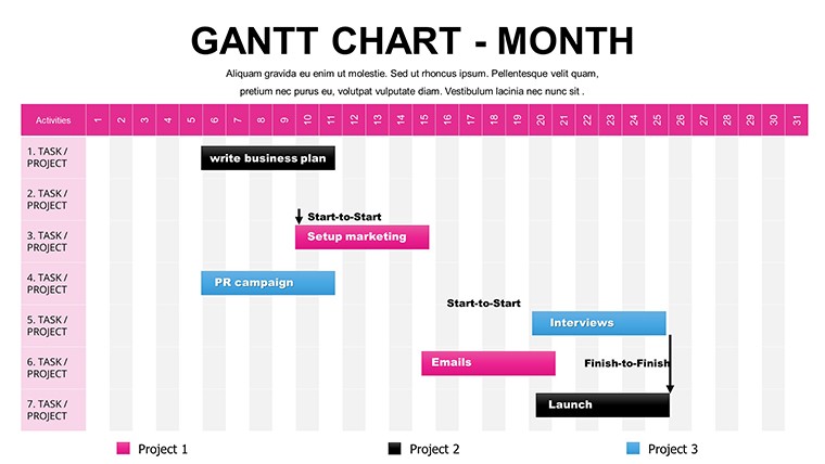
Free Monthly Gantt Charts PowerPoint Template


Type: PowerPoint Charts template
Category: Free Templates, Tables
Sources Available: .pptx
Product ID: PC00066
Template incl.: 12 editable slides
In high-stakes project environments, where timelines stretch across months and stakeholders demand absolute clarity, nothing derails confidence faster than a cluttered or static schedule. This free monthly Gantt chart PowerPoint template delivers the precision I rely on when building decks for enterprise project reviews and investor updates - a clean, dynamic framework that turns complex multi-month plans into compelling visual stories that drive alignment and decisions.
With 12 fully editable slides, it provides the structure needed to map tasks, dependencies, and progress at a monthly scale, without overwhelming details that belong in daily trackers. I've used similar layouts to secure buy-in from C-suite executives on multi-quarter initiatives, where every bar and arrow reinforces accountability and foresight.
Core Layouts and Design Elements That Drive Impact
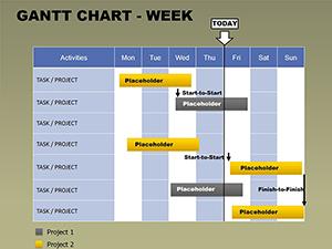
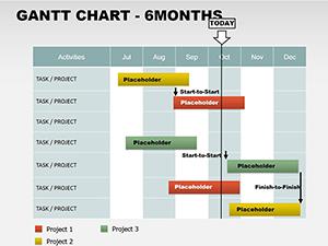
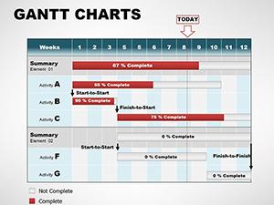
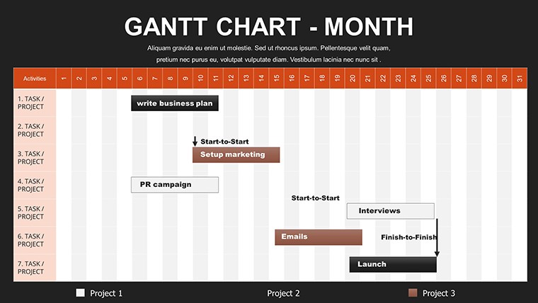
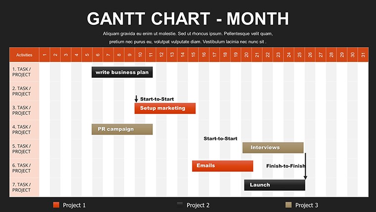
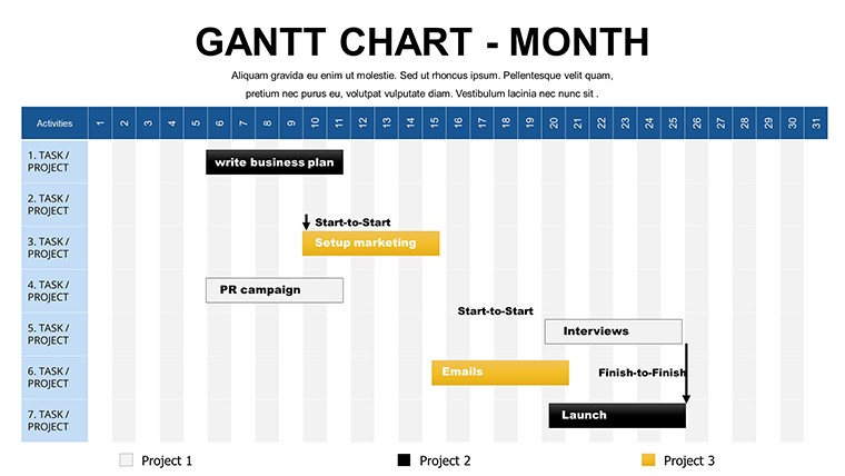
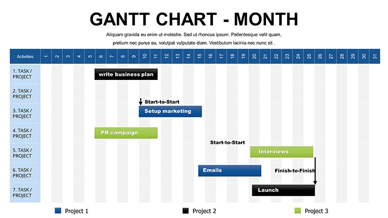
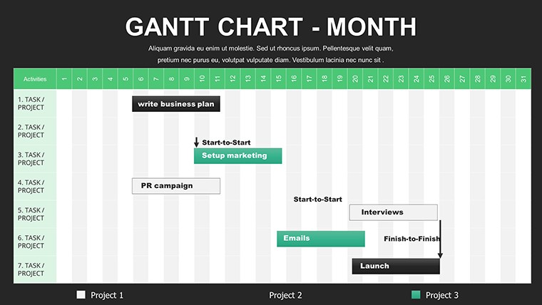
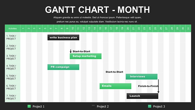
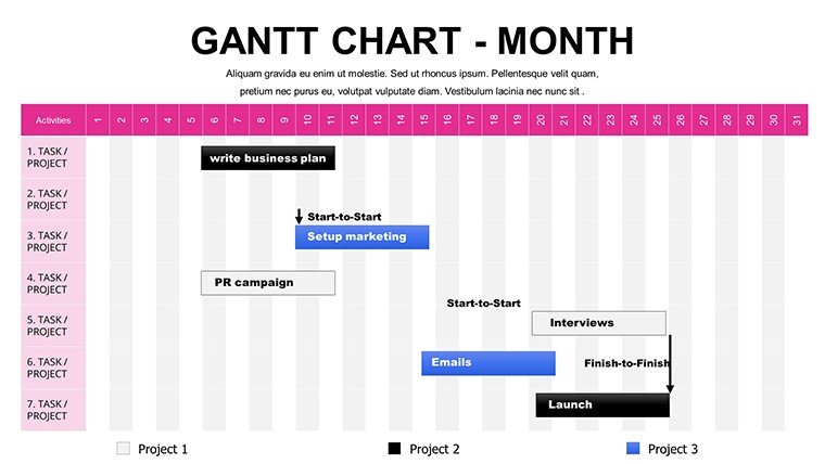
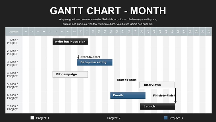
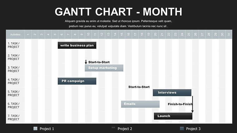
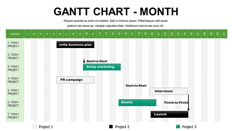
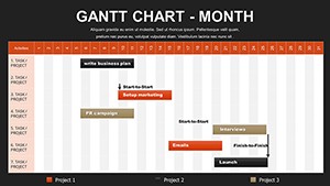
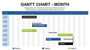
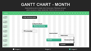
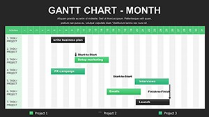
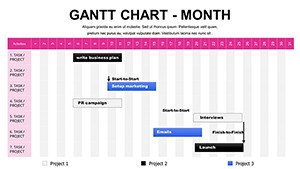
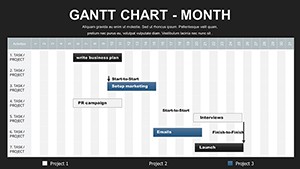
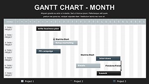
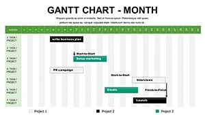
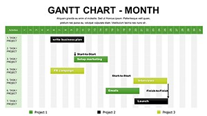
The template centers on expandable horizontal bars positioned against a monthly timeline grid, allowing tasks to span weeks or entire quarters while maintaining readability.
- Primary timeline slides: Feature a horizontal axis divided into months, with color-coded bars that extend dynamically based on start and end dates you input.
- Milestone markers: Diamond-shaped icons snap to specific dates, highlighting key deliverables like phase completions or regulatory approvals.
- Dependency arrows: Curved connectors that automatically reposition when tasks shift, preventing the manual rework I often see in basic charts.
- Progress shading: Gradient overlays on bars to show completion percentages at a glance.
- Supporting elements: Side panels for task owners, resource notes, and risk flags, plus integrated icon sets for visual distinction.
All elements use subtle gradients and professional typography that adapt seamlessly to your brand colors in minutes.
Real-World Applications in Professional Settings
When presenting to government oversight committees on infrastructure projects spanning fiscal years, this monthly view keeps focus on strategic checkpoints rather than daily noise.
In consulting engagements, I've deployed these slides to outline client transformation roadmaps - discovery in month one, pilot in months two through four, full rollout thereafter - making abstract phases tangible for executive sponsors.
Product leaders use it for roadmap presentations to investors, showing feature releases tied to revenue milestones across quarters. Enterprise teams track compliance initiatives, while educators map multi-semester research programs with clear handover points.
Seamless Integration Into Your Presentation Workflow
This template fits directly into standard workflows: export data from project tools like Microsoft Project or Excel, paste into the embedded tables, and watch bars populate automatically thanks to pre-built formulas.
Compatible with PowerPoint 2016 and later, Google Slides, and Keynote via import. Editing requires no advanced skills - adjust durations by dragging bar ends, recolor entire schemes with one click, or duplicate slides for alternative scenarios.
In tight deadline situations, this automation saves hours compared to manual drawing, letting you focus on narrative and insights.
Download this monthly Gantt chart template today and transform your next long-term planning session into a masterclass in clarity.
Scenario-Based Examples From Actual Decks
A technology founder I worked with used the core timeline to illustrate platform development phases to venture partners - backend build in months 1-3, beta testing 4-6, market launch 7-9 - with dependencies clearly linking funding gates to deliverables.
In corporate strategy sessions, quarterly business reviews feature these charts to align department heads on cross-functional initiatives, color-coding ownership and flagging potential bottlenecks early.
Research directors present grant proposals with multi-year timelines, using milestones to justify budget allocations phase by phase.
Comparison: This Template vs Alternative Approaches
| Aspect | This Monthly Gantt Template | Default PowerPoint Charts | Building From Scratch | Dedicated PM Software Exports |
|---|---|---|---|---|
| Automation Level | Dynamic dependencies and progress updates | Static shapes only | Hours of manual alignment | Overly detailed for presentations |
| Presentation Readiness | Clean, executive-friendly aesthetics | Basic and generic | Inconsistent formatting | Technical appearance |
| Customization Speed | Minutes to brand and adjust | Limited options | Time-intensive | Restricted by tool |
| Monthly Focus | Optimized scaling and readability | Daily/weekly bias | Hard to balance | Often too granular |
Industry-Specific Use Cases
Finance: Audit and compliance schedules across fiscal periods.
Technology: Agile release trains mapped to quarterly objectives.
Healthcare: Clinical trial phases with regulatory milestones.
Education: Academic program development over semesters.
Marketing: Integrated campaign rollouts with content calendars.
Consulting: Engagement timelines from assessment to value realization.
Ready to bring professional-grade timeline visualization to your next presentation? Get instant access to this free monthly Gantt chart PowerPoint template and start building timelines that command attention and respect.
Frequently Asked Questions
How do I update task durations in this monthly Gantt chart template?
Simply edit the start and end dates in the data table on each slide - the bars extend automatically, and any connected dependencies adjust in real time. This eliminates manual resizing and keeps everything aligned.
Can I add more than 12 months to the timeline?
Yes, duplicate the core timeline slide and extend the grid manually or link additional tables. The design scales cleanly for 18-24 month views common in strategic planning.
Does this work for showing resource allocation alongside tasks?
Absolutely - dedicated columns allow assignment of owners and workload indicators, with optional swimlanes to group by team or department for clearer resource visibility.
Is it compatible with Google Slides?
The .pptx file imports smoothly into Google Slides, retaining most automation. Minor formula adjustments may be needed, but layout and visuals remain intact.
How do I highlight critical path items?
Use the built-in color coding options to bold or shade critical tasks, or add custom arrow thickness to dependencies that form the critical chain.
Can I include percentage complete indicators?
Each bar supports progress overlays - input completion percentages in the data table, and gradient fills update automatically to show advancement visually.