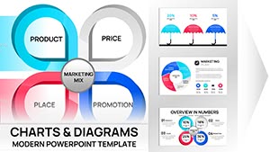
Pie Charts PowerPoint Template for Analysis


In my years crafting decks for C-level executives, I've learned that nothing clarifies proportional data like a sharp pie chart. This collection template addresses the frustration of generic visuals that fail to engage during critical investor pitches, offering 12 meticulously designed slides that make percentages pop without clutter. Professionals across sectors rely on it to distill complex breakdowns into digestible stories, saving hours while boosting audience retention.
Whether you're an analyst parsing market shares or a consultant outlining resource allocations, this tool ensures your message lands with precision. Its focus on analysis-driven designs means you can highlight trends and variances effortlessly, turning raw numbers into strategic narratives. I've used similar setups in quarterly reviews to drive home budget distributions, and the impact is always immediate.
In-Depth Look at Each Slide in the Collection
This template's strength lies in its variety, allowing you to choose the right format for your data's story. Each slide is built with placeholders for labels, percentages, and icons, making customization straightforward. Let's break it down slide by slide to show how it fits real-world needs.
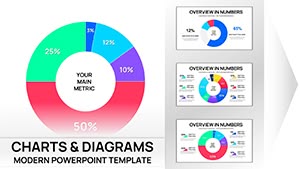
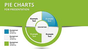
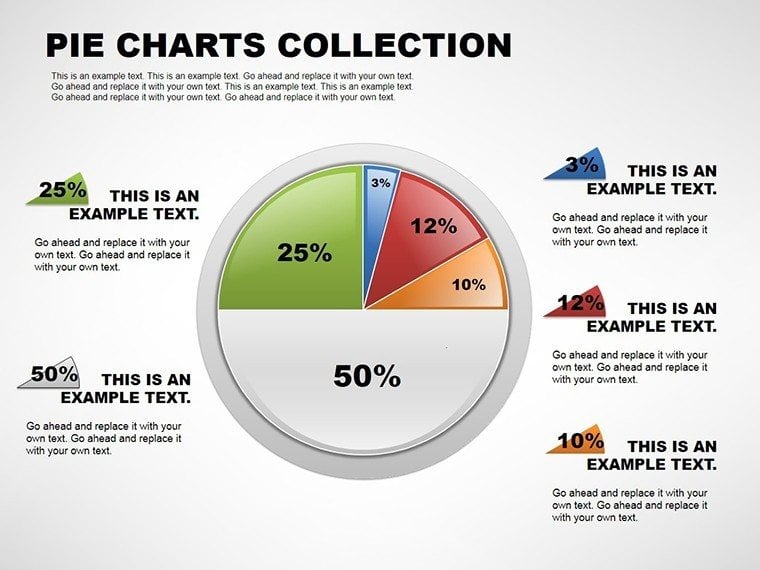
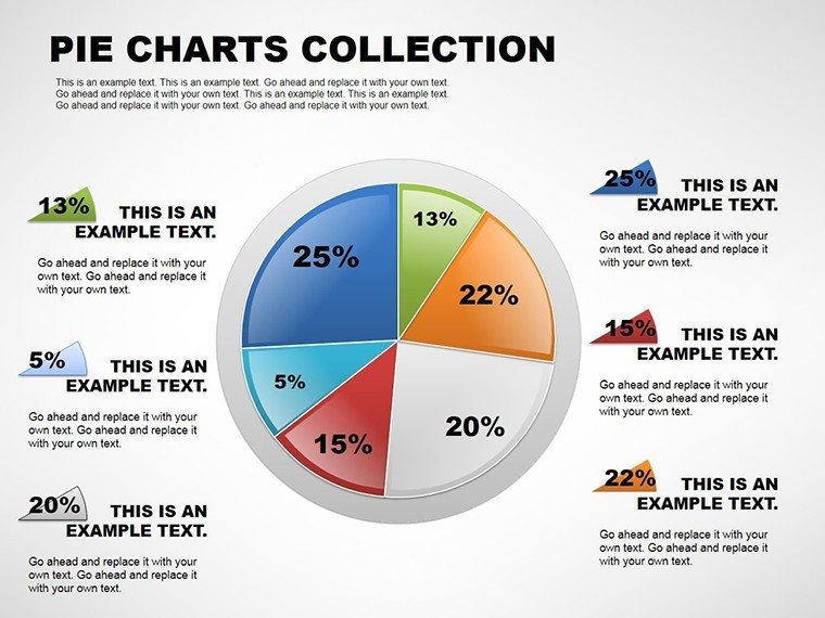
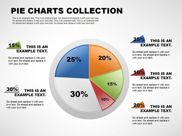
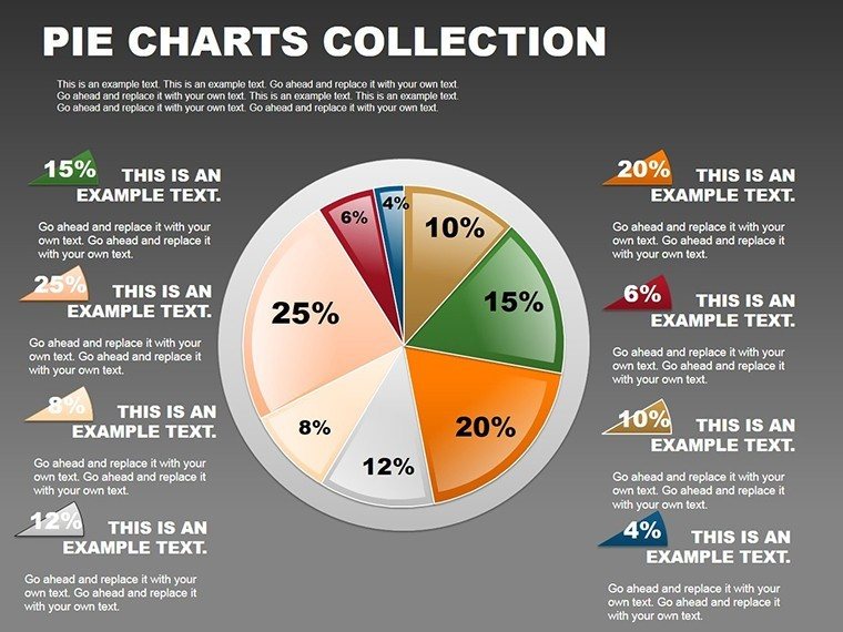
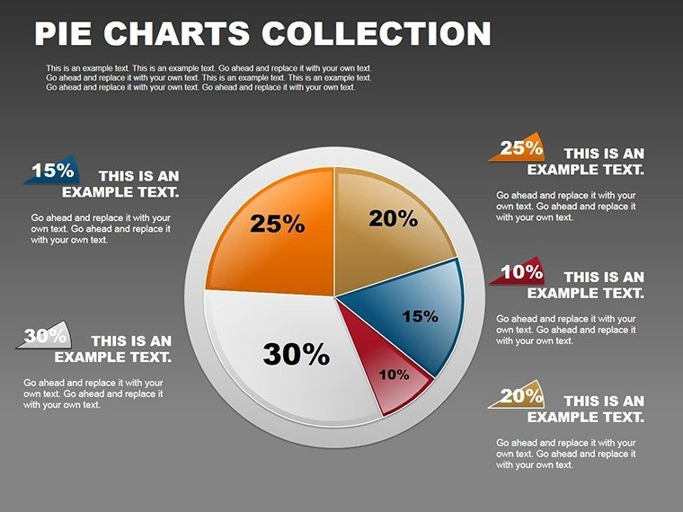
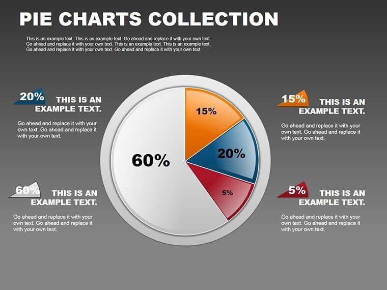
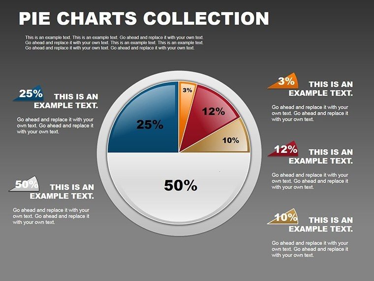
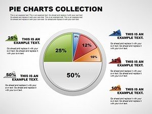
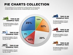
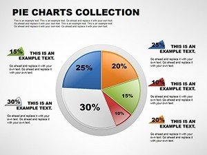
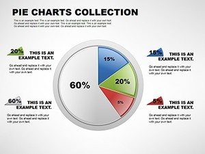
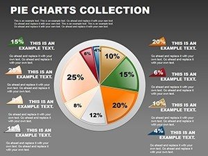
Slide 1: Classic Pie Chart Layout
Perfect for straightforward proportion displays, this slide features even segments with automatic percentage calculations. Add your data to the center legend, and use contrasting colors to emphasize dominant shares. Ideal for showing sales distributions in team updates.
Slide 2: Exploded Pie View
Highlight a key segment by pulling it out from the whole, drawing eyes to critical insights like underperforming categories. Customize explosion distance and add annotations for context. Great for investor decks focusing on growth areas.
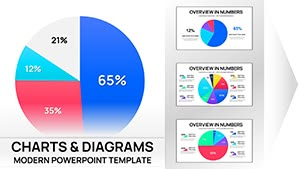
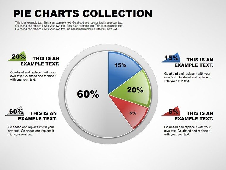
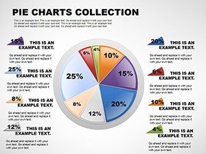
Slide 3: Doughnut Chart Variant
With a hollow center for summary text or icons, this design layers additional info without overcrowding. Adjust ring thickness and integrate trends lines for dynamic analysis. Useful in educational sessions explaining layered budgets.
Slide 4: 3D Pie Representation
Add depth for a more engaging visual, with rotatable angles to avoid distortion. Embed icons in slices for thematic relevance. Suited for government reports on resource splits.
Slide 5: Nested Pie Structure
Show hierarchies by nesting smaller pies within larger ones, ideal for multi-level data like departmental expenses within overall costs. Fine-tune radii and colors for clarity.
Slide 6: Icon-Integrated Pie
Replace plain labels with relevant icons to make abstract data relatable, such as gears for operational shares. Scale icons proportionally and animate for reveal effects.
Slide 7: Trend-Enhanced Pie
Overlay arrows or lines to indicate changes over time, turning static pies into narrative tools. Customize line styles for emphasis in strategy sessions.
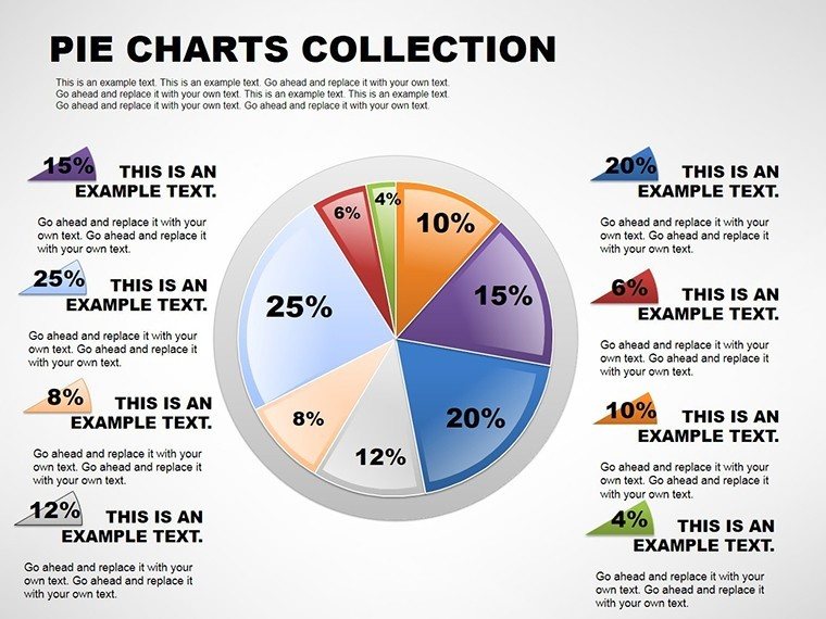
Slide 8: Multi-Arc Pie Design
Divide the circle into arcs for non-traditional breakdowns, with flexible angle adjustments. Add legends below for detailed explanations.
Slide 9: Animated Segment Build
Progressive reveals build suspense, animating slices one by one. Control timing to sync with your script in live presentations.
Slide 10: High-Contrast Accessibility Pie
Designed with color-blind friendly palettes, ensuring all viewers grasp the data. Test contrasts and add text alternatives.
Slide 11: Legend-Focused Layout
Position legends prominently for quick reference, with sortable options. Integrate with Excel links for live updates.
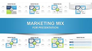
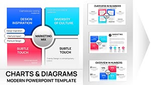
Slide 12: Composite Pie Overview
Combine elements from prior slides for a custom mashup, tailoring to unique analysis needs.
Professional Applications of This Pie Chart Template
In board meetings, I've deployed these slides to dissect revenue streams, helping executives spot inefficiencies at a glance. For investor pitches, the exploded views underscore potential returns, making pitches more persuasive. Quarterly reviews benefit from doughnut variants that layer forecasts over current data, facilitating informed discussions.
Educators use nested designs to teach fractional concepts in lectures, while trainers incorporate animations in workshops to maintain engagement. Government bodies apply 3D pies in policy briefs to illustrate funding allocations clearly.
Integrating This Template into Your Workflow
This template slots seamlessly into your existing process, compatible with PowerPoint 2016 and later, Keynote, and Google Slides. Start by importing your data from Excel, then tweak colors and fonts to match your brand in minutes. The editable nature means no starting from scratch, cutting prep time by half in my experience with enterprise teams.
For collaborative edits, share via cloud drives without format loss. Add animations for virtual meetings to keep remote audiences focused.
Real-World Presentation Scenarios Using This Template
- Consultants: In strategy decks, use exploded pies to highlight client pain points and proposed solutions.
- Managers: During project reviews, doughnut charts reveal resource utilization patterns.
- Educators: Conference talks employ nested pies to break down research methodologies.
- Founders: Investor decks feature 3D views to showcase market opportunity slices.
- Analysts: Data reports use trend-enhanced pies for variance analysis.
Comparing This Template to Other Options
| Aspect | This Template | Default PowerPoint/Keynote | Building from Scratch | Alternative Solutions |
|---|---|---|---|---|
| Variety of Styles | 12 specialized pie variations | Basic pie only | Unlimited but time-consuming | Limited to 5-10 in most packs |
| Customization Ease | Fully editable in seconds | Moderate, clunky interfaces | Complete control, high effort | Varies, often restricted |
| Time Savings | Hours saved per deck | Minimal | None | Some, but less focused |
| Professional Polish | High-quality, analysis-optimized | Generic | Depends on skill | Good but not tailored |
Download this template to experience the difference in your next presentation.
Industry-Specific Use Cases
- Finance: Portfolio breakdowns using nested pies for asset classes.
- Technology: Market share analyses with exploded views.
- Healthcare: Resource allocation in research grants via doughnut charts.
- Education: Curriculum distributions in academic planning.
- Marketing: Campaign ROI segments with icon integrations.
- Consulting: Client budget splits in proposal decks.
Start elevating your data stories with this specialized tool today.
Frequently Asked Questions
How do I customize the pie segments in this template?
Simply select the chart, enter your data in the linked sheet, and adjust colors or labels via the format pane. It's designed for quick edits, ensuring brand alignment without advanced skills. Compatible across platforms for consistent results.
Is this template suitable for Google Slides?
Yes, import directly into Google Slides with full editability. Animations and designs transfer smoothly, ideal for collaborative teams. Test in your environment for any minor adjustments.
What data types work best with these pie charts?
Proportional data like percentages or fractions shine here, such as market shares or budget allocations. Avoid large datasets; aim for 5-7 segments max per chart for clarity.
Can I add animations to the slides?
Absolutely, each slide supports built-in animations for segment reveals. Use PowerPoint's animation tools to time them with your narrative, enhancing engagement in virtual meetings.
Does it support live data links?
Yes, link to Excel for automatic updates. This keeps your analyses current during iterative reviews, a feature I've relied on in client sessions.