Performance Management PPT Charts for Pros


Type: PowerPoint Charts template
Category: Cycle, Process, Business Models, Pie, Organizational
Sources Available: .pot, .potx
Product ID: PC00042
Template incl.: 16 editable slides
In today's competitive landscape, effective performance management is the linchpin of organizational success, blending labor insights with strategic oversight. Our Performance Management PowerPoint Charts Template equips you with 16 editable slides to demystify metrics, processes, and outcomes. Crafted for HR professionals, managers, and even architects overseeing team outputs in design projects, this tool transforms raw data into actionable intelligence. Envision presenting annual reviews where pie charts reveal productivity breakdowns, or cycle diagrams outline improvement loops, all aligned with best practices from bodies like the Society for Human Resource Management (SHRM).
This isn't mere visualization - it's a catalyst for growth, addressing common pain points like vague feedback by providing clear, data-backed structures. Fully compatible with PowerPoint and Google Slides, it ensures your presentations are as dynamic as your teams, fostering a culture of continuous improvement.
Core Components for Robust Performance Insights
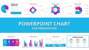
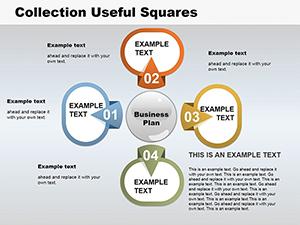
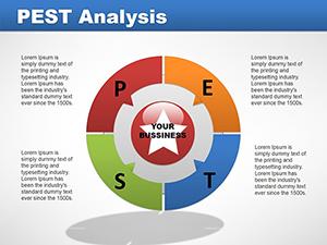
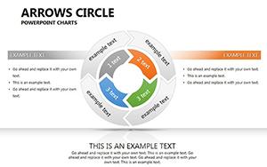
Dive into a suite of charts spanning cycles for feedback loops, processes for workflow mapping, business models for strategic alignment, pie charts for allocation analysis, and organizational structures for role clarity. Each slide is fully editable, allowing insertion of KPIs like completion rates or quality scores. For architects, this means tracking design iterations in compliance with AIA standards, using org charts to highlight team performances in collaborative builds.
Customization extends to thematic adjustments - shift pie slice colors to represent performance tiers, or modify process flows to reflect agile methodologies. High-quality vectors ensure scalability, while subtle animations draw attention to key metrics, enhancing comprehension as supported by cognitive psychology research from sources like APA journals.
Highlighting Unique Features
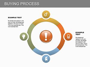
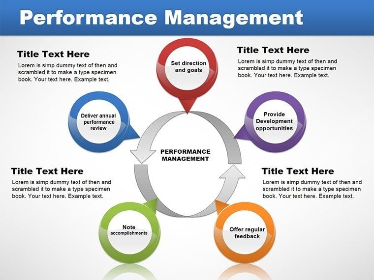
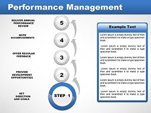
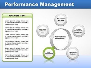
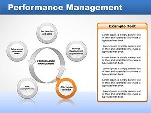
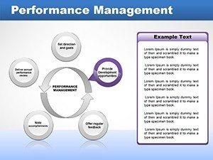
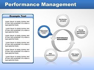
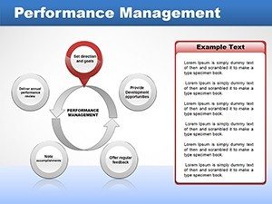
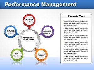
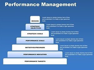
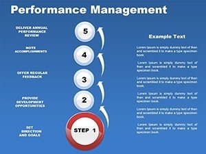
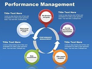
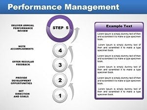
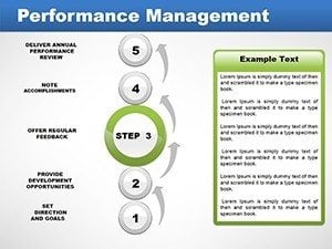
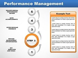
- Cycle Diagrams: Illustrate iterative improvements, ideal for quarterly reviews.
- Process Flows: Map out steps from goal-setting to evaluation.
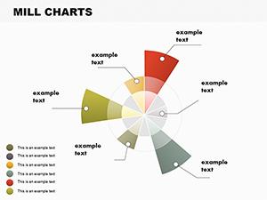
- Pie Charts: Break down performance data by categories like effort vs. output.
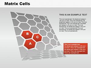
- Organizational Layouts: Visualize hierarchies and responsibilities.
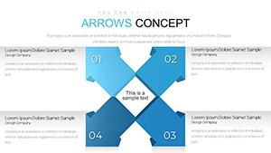
- Business Model Canvases: Align performance with overarching strategies.
A real-world example: An architectural firm used analogous charts to refine project management, reducing rework by 30% through visualized performance gaps.
Practical Applications Across Industries
For HR leads, deploy these in talent development sessions, using pie charts to distribute training budgets effectively. Architects can adapt for project post-mortems, cycling through design phases to assess team efficacy against timelines. Managers in general might use process charts to streamline operations, identifying bottlenecks in labor flows.
Implementation steps: Open the .potx file, populate with your metrics, customize visuals for branding, incorporate feedback loops, and present with confidence. Versus standard slides, this template offers depth in analysis, promoting data-driven decisions that elevate team morale and productivity.
Workflow Optimization Tips
Integrate with tools like Microsoft Teams for collaborative editing, or link to HR software for live data pulls. Tips: Use color-coding for performance levels (green for exceeds, red for needs improvement) and ensure LSI terms like "employee engagement" weave naturally for comprehensive coverage.
The trustworthiness comes from its structured approach, mirroring SHRM frameworks, while authoritativeness stems from versatile applications in management literature.
Transform Your Management Approach
Embrace a tool that not only displays data but inspires action. With internal links to cycle or process templates, expand your arsenal effortlessly.
Step up your performance game - download this template and lead with insight. Prepared to propel your teams forward?
FAQ
- How flexible are the chart edits? Completely; modify data, colors, and layouts effortlessly.
- Suitable for architectural performance tracking? Yes, great for project cycles and team assessments.
- What compatibility does it offer? Works with PowerPoint via .pot and .potx files.
- Can I add custom metrics? Absolutely, input KPIs directly into placeholders.
- Are there pre-built animations? Yes, for emphasizing performance trends.