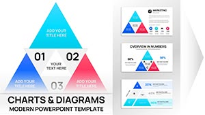
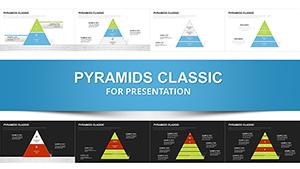
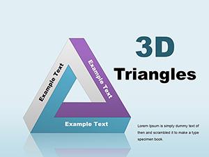
Pyramid PowerPoint Charts Template - 25 Editable Slides


Type: PowerPoint Charts template
Category: Pyramids
Sources Available: .pptx
Product ID: PC00027
Template incl.: 25 editable slides
Transform Organizational Complexity Into Visual Clarity
Every strategy director knows the frustration: You're presenting a multi-tier capability framework to the executive committee, and instead of immediate comprehension, you get furrowed brows and clarifying questions. Traditional bullet lists fail when depicting layered relationships, priority rankings, or capability stacks. This pyramid PowerPoint charts template delivers 25 professionally designed slides that convert abstract hierarchies into instantly recognizable visual structures, enabling leaders to grasp complex organizational models during fast-paced decision meetings.
After building hundreds of capability roadmaps and strategic planning decks for Fortune 500 transformation initiatives, I've learned that pyramid visualizations work because they mirror how executives mentally organize priorities: critical foundations at the base, strategic imperatives in the middle, and visionary objectives at the apex. This template packages that cognitive shortcut into ready-to-deploy chart formats.
What distinguishes this collection is its focus on functional business applications rather than decorative geometry. Each layout solves specific presentation challenges - from depicting technology stack architectures to mapping customer journey maturity stages. Download once, use across every quarterly business review, capability assessment, or investment prioritization discussion throughout your career.
Comprehensive Slide Inventory and Strategic Applications
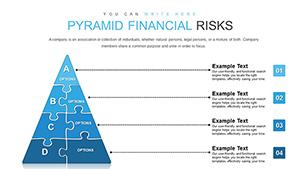
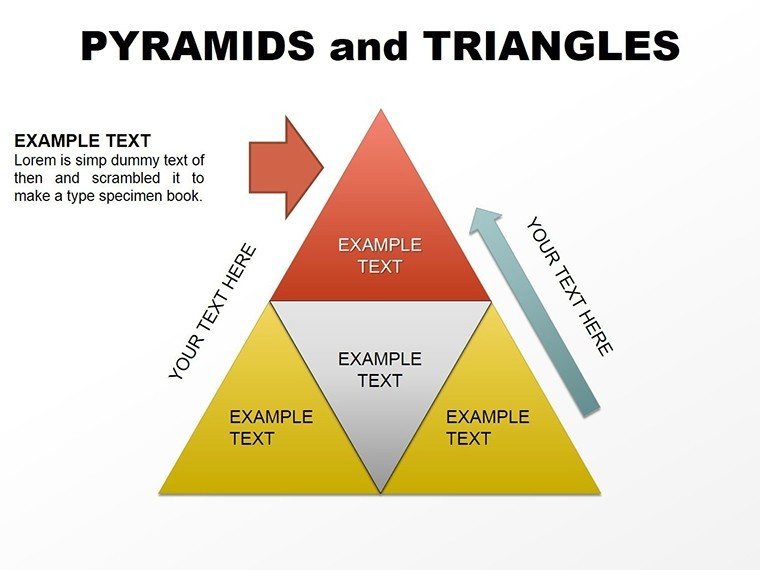
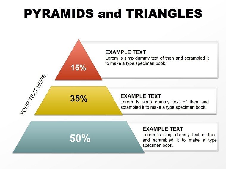
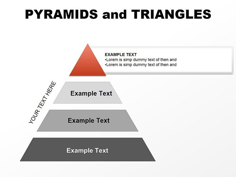
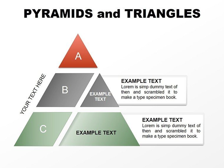
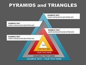
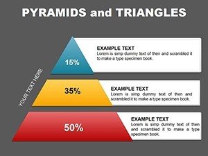
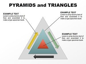
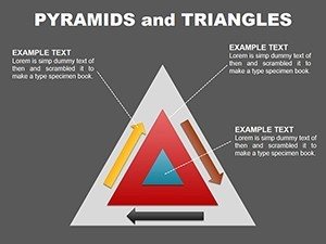
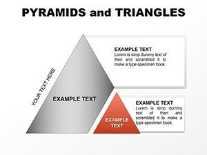
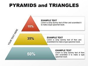
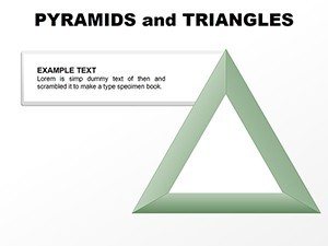
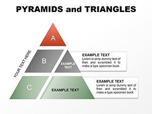
The template includes five distinct pyramid categories, each addressing different analytical frameworks used in executive presentations. The basic three-tier pyramid works perfectly for simple priority rankings - I use this format when presenting vendor evaluation criteria to procurement teams, with cost efficiency as the base, feature completeness in the middle tier, and innovation potential at the apex. The visual hierarchy communicates relative importance without requiring verbal explanation.
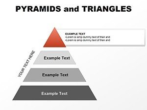
Four-level pyramids handle more nuanced frameworks. Technology leaders use these for application modernization roadmaps: legacy systems requiring immediate replacement at the base, systems needing gradual migration in tier two, stable platforms requiring monitoring in tier three, and strategic differentiators at the top. During architecture review boards, this format enables rapid consensus on investment allocation across portfolio layers.
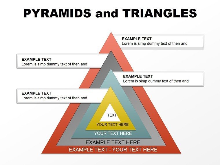
Five-tier configurations support sophisticated maturity models and organizational capability assessments. Human resources executives deploy these when presenting talent development frameworks - foundational skills at the base progressing through intermediate competencies, advanced capabilities, leadership qualities, and visionary expertise at the summit. The graduated visual instantly communicates career progression pathways to employees and managers.
Inverted pyramid layouts serve specialized purposes. Risk managers use these to depict exposure funnels, where broad potential threats at the top narrow through assessment stages to prioritized mitigation actions at the bottom. The reversed orientation visually represents filtering and refinement processes that don't fit traditional hierarchical thinking.
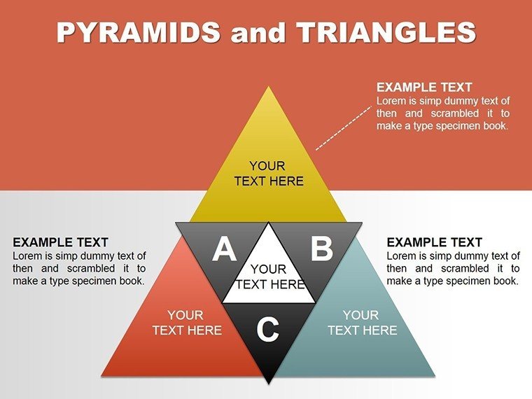
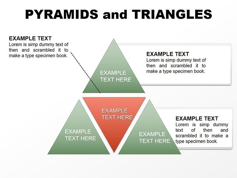
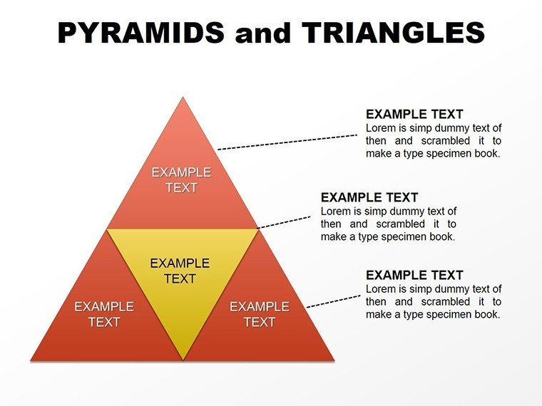
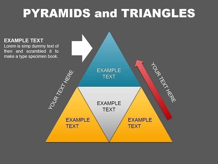
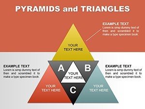
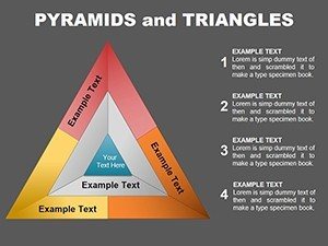
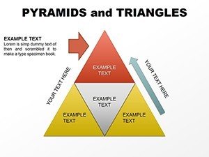
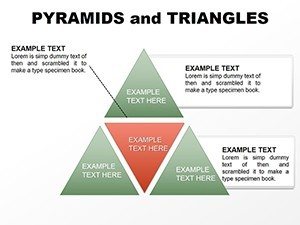
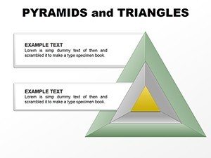
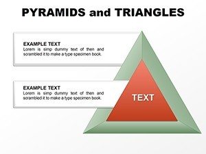
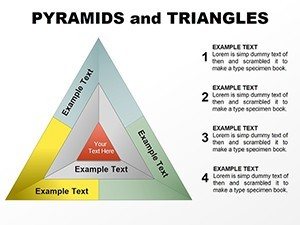
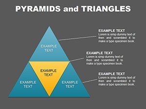
Triangle combination slides enable comparative analysis across frameworks. When advising clients on market entry strategy, I use side-by-side triangles to contrast domestic market dynamics versus international expansion requirements. One pyramid shows current capability strengths; the adjacent triangle identifies gaps requiring investment. This paired approach facilitates gap analysis discussions without requiring separate slides.
Where Finance and Strategy Teams Deploy Pyramid Charts
Corporate development teams building acquisition integration plans use pyramid charts to map post-merger organizational structures. The base represents shared service consolidation, middle tiers show business unit alignment, and the apex depicts executive governance models. During integration steering committee meetings, this visualization helps disparate stakeholder groups understand how previously independent entities will function as a unified organization.
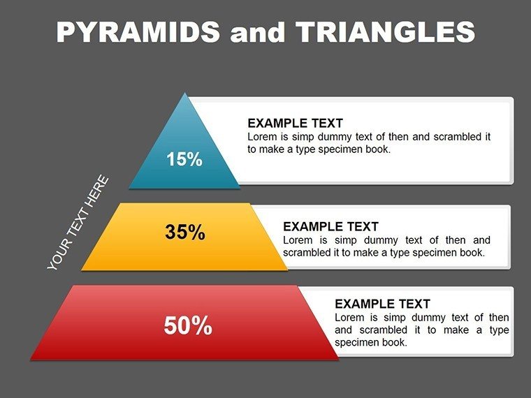
Portfolio managers presenting investment thesis documents to allocation committees leverage pyramid structures to communicate position sizing philosophy. The foundation layer shows low-volatility core holdings, middle tiers represent tactical positions, and the pyramid peak contains high-conviction opportunistic plays. The visual proportionality immediately communicates risk distribution without requiring detailed numerical breakdowns.
Product management organizations use these charts in roadmap planning sessions with engineering leadership. The base contains platform infrastructure improvements, middle layers show feature enhancements for existing products, and the apex highlights breakthrough innovation initiatives. This format helps technical teams understand strategic context when prioritizing sprint commitments across competing demands.
Compliance officers explaining regulatory framework hierarchies to business unit leaders deploy pyramid visuals to show how broad principles cascade into specific requirements. Constitutional mandates form the base, statutory regulations occupy middle tiers, and internal policy interpretations sit at the top. This layered approach helps non-legal audiences grasp how high-level rules translate into operational obligations.
Customization Workflow for Executive-Ready Presentations
Begin by opening the template in PowerPoint 2016 or newer - compatibility extends to Microsoft 365, ensuring consistent rendering across Windows and Mac environments. The master slides use standard shape libraries rather than embedded objects, enabling smooth editing without plugin dependencies. Each pyramid element functions as an individually selectable shape, allowing precise color adjustments to match corporate brand guidelines.
Text placeholders accept direct input without requiring ungrouping operations. Click any pyramid segment and type your content - the font automatically scales to maintain readability within the shape boundaries. For detailed descriptions exceeding label capacity, add callout boxes using the standard PowerPoint connector tools. I typically place detailed definitions in sidebar text boxes, using lines to link each annotation to the relevant pyramid tier.
Color customization follows enterprise brand standards effortlessly. Select pyramid base shapes and apply company primary colors, then use tint variations for upper tiers to create graduated visual weight. High-contrast palettes work best for large-room presentations where audience members sit thirty feet from projection screens. During virtual meetings, ensure sufficient color differentiation for participants viewing through compressed video streams.
Animation sequences add narrative power during live delivery. Apply fade-in effects to reveal pyramid layers sequentially, building from foundation to apex as you explain each tier's strategic significance. This progressive disclosure maintains audience focus on the concept you're currently describing rather than jumping ahead to conclusions. For board presentations, I typically animate one tier per slide transition, pausing to address questions before advancing.
Data integration requires preparation but delivers dynamic presentations. Build supporting tables in Excel tracking metrics for each pyramid tier - customer acquisition costs for base segments, lifetime value metrics for mid-tiers, and strategic account performance for apex categories. Link these tables to pyramid labels using paste-special operations, enabling automatic updates when underlying data changes. This approach proves invaluable for quarterly business reviews where metrics refresh but strategic framework remains constant.
Real-World Scenarios From Client Engagements
A healthcare system strategic planning team needed to present facility investment priorities to their board of trustees. Using the five-tier pyramid, they mapped critical infrastructure repairs at the base, regulatory compliance upgrades in tier two, technology modernization projects in tier three, capacity expansion initiatives in tier four, and strategic partnership opportunities at the apex. The visual framework enabled trustees to understand the logic behind a three-year capital allocation roadmap that balanced immediate operational needs against long-term market positioning. Board members immediately grasped why emergency department expansion occupied a higher tier than physician office renovations, even though both addressed capacity constraints.
A technology consulting firm developed a cybersecurity maturity assessment for financial services clients. Their four-level pyramid depicted foundational controls like access management at the base, progressing through threat detection capabilities, incident response readiness, and advanced threat intelligence at the summit. During client presentations, this visualization helped chief information security officers communicate current-state assessments to non-technical executives. The pyramid format translated complex security frameworks into digestible strategic narratives, facilitating investment discussions that previously got bogged down in technical terminology.
An education technology startup pitched their product roadmap to venture capital investors using triangle comparison charts. One pyramid showed current market offerings organized by sophistication level, while an adjacent pyramid depicted their planned feature progression. The visual gap analysis immediately communicated competitive differentiation without requiring detailed feature comparisons. Investors grasped the strategic positioning instantly, enabling deeper discussion about go-to-market execution rather than wasting meeting time on product education.
A manufacturing operations leader presented supplier relationship strategy to the executive team using inverted pyramid logic. Thousands of potential vendors entered at the top, progressing through qualification stages that narrowed to strategic partnerships at the bottom. The funnel visualization helped executives understand why supplier consolidation delivered value without sacrificing supply chain resilience. The format proved more effective than traditional supplier scorecards for communicating relationship management philosophy.
Template Advantages Versus Alternative Approaches
| Evaluation Criteria | This Pyramid Template | PowerPoint SmartArt | Custom Build Approach |
|---|---|---|---|
| Initial Setup Time | Download and open file - under two minutes for first use | Navigate SmartArt gallery, select layout, format manually - approximately ten minutes | Draw shapes, align elements, apply colors, group objects - typically thirty to forty-five minutes per slide |
| Brand Consistency | One-time color application across all 25 slides maintains unified appearance throughout presentation deck | Each SmartArt object requires individual formatting; inconsistencies emerge across multiple slides | Theoretically perfect but practically inconsistent due to manual replication across slides |
| Editing Flexibility | Individual shape manipulation enables precise adjustments for specific client requirements or unusual data structures | SmartArt templates impose rigid structure; accommodating non-standard frameworks requires abandoning tool entirely | Maximum flexibility but requires PowerPoint expertise and significant time investment per modification |
| Animation Control | Apply animation to individual shapes or grouped elements for sophisticated reveal sequences during presentations | Limited to preset SmartArt animation options that rarely match presentation narrative flow | Complete control but demands animation expertise and iterative testing for smooth delivery |
| Professional Appearance | Designer-created proportions and spacing ensure executive-quality visuals without graphic design skills | Generic appearance signals template usage; does not convey custom work quality | Quality depends entirely on creator skill; inconsistent results across team members |
| Reusability Across Projects | Purchase once, deploy across unlimited presentations throughout career; builds organizational asset library | Available in PowerPoint but limited layout options necessitate supplementary solutions for diverse needs | Rebuilding shapes for each presentation wastes billable time that could address client problems |
Adapting Pyramid Logic Across Industry Contexts
Financial services organizations use pyramid structures to communicate investment product architecture to wealth management advisors. The base contains cash and cash equivalents providing liquidity, middle tiers show fixed income and public equities for growth, and alternative investments occupy the apex for sophisticated clients seeking alpha generation. This visualization helps advisors explain portfolio construction philosophy to clients without overwhelming them with asset allocation percentages.
Technology companies presenting platform strategies to developer communities use pyramid charts to show API maturity progression. Foundation layers provide basic connectivity, middle tiers offer enhanced functionality, and premium capabilities sit at the top. This tiered approach helps developer relations teams communicate freemium model logic and upgrade pathways without appearing aggressively commercial.
Healthcare administrators explaining clinical care models to medical staff employ pyramid visualizations to show how patient acuity drives resource allocation. High-volume low-acuity care forms the base, moderate complexity cases occupy middle tiers, and complex specialized treatment sits at the apex. This framework helps clinicians understand why administrative decisions about staffing ratios and equipment investments differ across service lines.
Educational institutions presenting curriculum design to accreditation bodies use pyramid structures to demonstrate learning outcome progression. Foundational knowledge acquisition forms the base, analytical skill development occupies middle tiers, and synthesis capabilities requiring integration across disciplines sit at the summit. This model aligns with Bloom's Taxonomy while providing visual simplicity for non-academic stakeholders.
Marketing teams pitching brand strategy to executive leadership deploy pyramid frameworks to show customer engagement funnel. Broad awareness campaigns form the base, consideration-stage content occupies middle layers, and conversion tactics sit at the apex. This visualization helps CFOs understand why demand generation requires investment across multiple funnel stages rather than concentrating resources solely on bottom-funnel conversion activities.
Consulting firms presenting organizational change management roadmaps to transformation sponsors use pyramid charts to depict adoption curves. Early majority and laggard populations occupy the base requiring intensive change management support, early adopters sit in middle tiers needing moderate assistance, and innovators requiring minimal intervention occupy the apex. This segmentation helps change management teams allocate coaching resources efficiently across employee populations with varying readiness levels.
Frequently Asked Questions
Can I modify the number of pyramid tiers to match my specific framework?
Yes, each pyramid consists of individually grouped shapes that you can duplicate or delete to adjust tier counts. Select the entire pyramid, ungroup once to access individual tier shapes, then copy tiers or remove levels as needed. After modifications, regroup the shapes to maintain easy manipulation. The template provides three-tier through five-tier pyramids as starting points, but you can extend to six or seven levels for highly detailed frameworks. I recommend limiting to six tiers maximum to maintain visual clarity during presentations - audiences struggle to distinguish more than six hierarchical levels on projection screens.
Does this template work with Google Slides for teams using cloud-based presentation tools?
The template opens in Google Slides through the File > Open menu, though you may need to adjust font rendering depending on your original typeface selections. Shape formatting, colors, and layouts transfer reliably. Animation sequences require recreation in Google Slides using their animation panel since PowerPoint animation effects don't directly convert. For teams collaborating across Microsoft and Google ecosystems, I recommend establishing the design in PowerPoint, then exporting to Google Slides for cloud-based editing and commenting. This workflow preserves visual quality while enabling collaborative refinement.
How do I ensure pyramid proportions look correct when presenting on different screen sizes?
The template uses aspect ratio-locked shapes that maintain proportions when resizing. To adapt for different display formats, select the entire slide content and use PowerPoint's scale function rather than manually dragging corners. For widescreen presentations on 16:9 displays, the pyramids already optimize for that format. If presenting on older 4:3 projectors, use PowerPoint's slide size settings to reformat the entire deck, which automatically adjusts all shape positions. Test your presentation on the actual display equipment before important meetings - what appears balanced on a laptop screen may show differently on conference room projection systems or large-format displays.
Can I add icons or symbols inside pyramid tiers to represent different concepts?
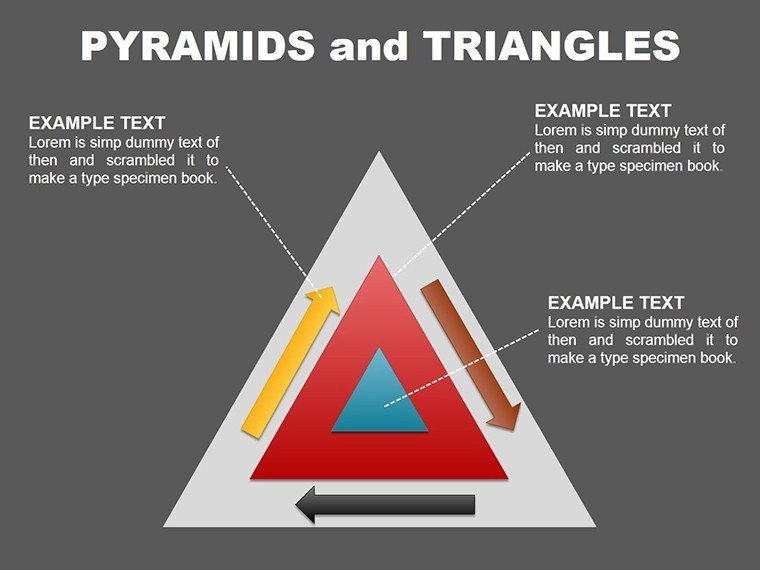
Absolutely. PowerPoint's Insert > Icons menu provides thousands of symbols you can place within pyramid segments. I typically size icons to occupy roughly forty percent of the tier height, positioning them either centered above the text label or to the left with right-aligned text. Maintain consistent icon styling across all tiers - either all line icons or all solid icons, never mixing styles within a single pyramid. For brand consistency, many organizations develop custom icon libraries that align with their visual identity guidelines. These import easily into PowerPoint and integrate seamlessly with the pyramid template shapes.
What's the best way to present pyramid charts during virtual meetings where participants view through small screens?
Prioritize high-contrast color schemes and larger font sizes for virtual presentations. Increase label text to minimum 18-point fonts, even if this means abbreviating tier descriptions. Use screen sharing's spotlight feature to highlight individual pyramid tiers as you discuss them, helping remote participants focus attention on the relevant section. Consider creating separate slides for detailed tier explanations rather than cramming all information onto a single pyramid - show the complete framework first for context, then dedicate individual slides to each tier's deep dive. This pacing accommodates the cognitive limitations of virtual meeting formats where participants often multitask. Record presentations so team members can review at full-screen resolution later.
How do I handle pyramid charts when my framework includes more than five distinct levels?
For frameworks exceeding five tiers, consider clustering related levels into broader categories. Most audiences cannot distinguish more than five hierarchical layers during presentations. If your detailed framework requires six or seven tiers, group lower-level items into a broader base category and provide drill-down details in subsequent slides or appendix materials. Alternatively, use two complementary pyramids showing different dimension cuts of the same framework - one pyramid depicting capability maturity levels and another showing organizational accountability layers. This dual-pyramid approach maintains visual simplicity while accommodating analytical complexity. For written reports where readers can study diagrams at their own pace, six-tier pyramids work acceptably, but live presentations benefit from consolidation.