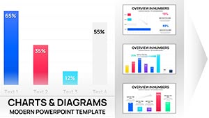
3-D Clustered Column Chart PowerPoint Template - Editable Charts for Financial Reports


When your CFO asks you to compare Q3 revenue across four regions, or your board wants to see actual vs. budget spending by department, flat data tables don`t create clarity. This 3-D clustered column chart PowerPoint template transforms multi-variable data into visual comparisons executives grasp in seconds. Each chart is fully editable - paste your quarterly results, adjust category labels, update legend entries, and present with confidence in under 15 minutes.
Designed for financial analysts, department heads, and strategy consultants who present comparative performance data weekly. The 3-D perspective adds depth that helps audiences distinguish between data series without squinting at color legends. Works seamlessly in PowerPoint, Google Slides, and Keynote.
What`s Included in This Clustered Column Template
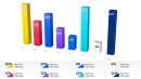
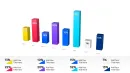
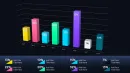
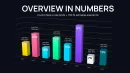
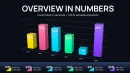
This template provides multiple 3-D clustered column layouts optimized for different comparison scenarios. You get charts for comparing 2 - 5 data series across categories, time-based comparisons showing quarterly or monthly trends, and variance analysis layouts that display planned vs. actual performance side by side. All charts use vector graphics that resize without pixelation and maintain clarity on projection screens.
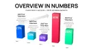
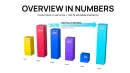
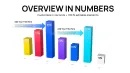
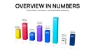
Each layout includes editable axis labels, customizable data series colors, adjustable grid lines, and formatted value labels. The 3-D clustering arranges columns in depth, making it visually obvious which bars belong to which data series. Column spacing is pre-calibrated to prevent visual overlap while maximizing data density on each slide.
Professional Use Cases for 3-D Clustered Column Charts
Quarterly Financial Reviews: Present revenue, expenses, and profit margin across Q1 through Q4. Finance teams use clustered columns to show three metrics simultaneously - executives can spot which quarter had strong revenue but weak margins, or identify seasonal patterns across multiple financial indicators without flipping between slides.
Regional Performance Comparisons: Display sales results across North America, EMEA, and APAC regions for multiple product lines. Sales VPs show these charts in territory reviews when they need leadership to understand which products perform best in which markets. The 3-D clustering makes regional differences immediately visible.
Budget vs. Actual Analysis: Compare planned spending against actual expenditures across departments. CFOs present these in board meetings when explaining budget variances - the side-by-side columns make it obvious which departments overspent and which came in under budget without requiring numerical explanation.
Product Line Performance Tracking: Show units sold, revenue, and profit contribution for each product category over six months. Product managers use these charts in strategy meetings to justify resource allocation decisions - visual comparison reveals which products deserve continued investment versus which need repositioning.
Workforce Analytics: Display headcount, hiring rate, and attrition percentage across five business units. HR leaders present these in executive reviews to show staffing trends - clustered columns reveal whether growing divisions are hiring fast enough or if high-attrition teams need retention initiatives.
How to Customize This Template in Your Workflow
PowerPoint Editing (10-Minute Workflow): Open the template and click any chart. Right-click and select "Edit Data" - an Excel-style spreadsheet opens showing sample values. Replace category names in the first column (e.g., Q1, Q2, Q3, Q4). Update data series in subsequent columns (Revenue, Expenses, Profit). The chart redraws automatically with correct proportions and labels. Change column colors by clicking a data series, then selecting your brand palette from the format menu.
Google Slides Adaptation: Upload the PowerPoint file to Google Drive and open with Google Slides. Charts convert automatically while maintaining 3-D formatting. Click the chart, select the three-dot menu, choose "Open source," and a Google Sheets window appears. Edit category labels and data values directly - changes reflect immediately in the chart. Adjust colors through the chart style menu.
Keynote Compatibility: Import the template into Keynote and charts preserve their 3-D structure. Select the chart, click "Edit Chart Data" in the Format panel, and update values in Keynote`s data editor. The clustered column arrangement stays intact. Modify axis labels by clicking directly on axis text. Change series colors independently through the chart inspector.
Pro tip: When comparing more than three data series, use contrasting colors with different brightness levels. This helps audiences distinguish between similar columns even if color differentiation is subtle on certain projectors.
Real-World Presentation Scenarios
Board Meeting Financial Update: Your board asks how Q4 performed compared to prior quarters across revenue, operating expenses, and net income. You open this template, input actual figures for all four quarters and three metrics, and adjust the y-axis to show millions of dollars. During the presentation, the board immediately sees that Q4 revenue exceeded Q3 but expenses also increased - prompting questions about margin compression. The clustered columns facilitated that insight without requiring a verbal explanation of the data.
Sales Kickoff Territory Comparison: You`re presenting to 200 sales reps showing how each region performed against quota last year. You create a chart with four regions as categories and two data series: Actual Sales and Quota Target. You color actual sales in brand blue and quota in gray. During the presentation, reps from underperforming regions instantly see the gap between their blue bars and gray targets. The visual accountability happens in real-time - no one needs to ask which territories missed quota.
Product Strategy Review with Investors: Investors want to understand which product lines drive growth. You build a chart showing three products across four quarters with revenue as the metric. Product A shows steadily increasing column heights quarter over quarter. Product C shows declining columns. Investors immediately ask about your strategy for Product C without you highlighting the trend verbally - the 3-D clustered format made the pattern obvious.
Department Budget Planning Session: Six department heads are negotiating next year`s budget allocation. You display a chart showing this year`s budget, this year`s actual spending, and proposed next year`s budget for each department. Marketing shows they stayed under budget this year (actual column shorter than budget column) and requests a 20% increase next year. Operations overspent by 15%. The visual comparison anchors the budget negotiation - everyone references "the gap between the columns" when making their case.
Template Chart Variations and Audience Impact
| Chart Layout | Best For | Audience Reaction |
|---|---|---|
| 3-D Clustered Columns (2 Series) | Budget vs. actual, planned vs. achieved | Executives instantly spot variance gaps |
| 3-D Clustered Columns (3 Series) | Revenue, cost, profit comparisons | CFOs see relationship between metrics |
| 3-D Clustered Columns (4-5 Series) | Regional performance across product lines | Sales leaders identify top/bottom performers |
| Time-Series Clustered Columns | Quarterly trends, monthly progressions | Boards recognize seasonal patterns |
| Clustered Columns with Trend Lines | Historical performance plus projections | Investors evaluate growth trajectory |
Industry Applications
Financial Services: Compare loan portfolio performance across commercial, residential, and consumer segments over four quarters. Risk committees review these charts when assessing portfolio concentration - clustered columns reveal whether one segment is growing too fast relative to others.
Healthcare Administration: Display patient volume, average length of stay, and readmission rates across hospital departments. COOs present these in quality improvement meetings to identify which departments need process interventions - visual comparison makes outliers obvious.
Manufacturing Operations: Show production output, defect rates, and overtime hours across three production facilities over six months. Plant managers use these charts in continuous improvement reviews to benchmark facility performance and share best practices from top performers.
Retail & E-Commerce: Compare in-store sales, online sales, and mobile app sales across product categories. Merchandising teams present these in omnichannel strategy sessions to understand where customers prefer to buy different product types.
Technology & SaaS: Display new customer acquisition, expansion revenue, and churn by customer segment. Customer success leaders show these charts in retention strategy meetings - clustered columns reveal which segments have strong acquisition but high churn, indicating onboarding problems.
When to Use Clustered Columns vs. Other Chart Types
Use 3-D clustered columns when: You need to compare 2 - 5 related metrics across multiple categories, your audience needs to see relative differences between data series instantly, and you have fewer than 8 category groups. Clustered columns excel when comparing performance across divisions, time periods, or scenarios where side-by-side visual comparison drives decision-making.
Avoid clustered columns when: You have more than 5 data series (creates visual clutter), you`re showing part-to-whole relationships (use stacked columns or pie charts instead), or you need to emphasize cumulative totals rather than individual comparisons. If categories have dramatically different scales (e.g., comparing revenue in millions vs. headcount in hundreds), use separate charts or a dual-axis layout.
Download this template if you regularly present comparative financial data, performance metrics, or variance analysis to executives. Each chart is ready for immediate data input - no design skills required.
Frequently Asked Questions
How do I add my own data to these clustered column charts?
Click any chart, right-click, and select "Edit Data." A spreadsheet window opens showing sample categories and data series. Replace category labels in column A (e.g., Q1, Q2, Q3). Update data series in columns B, C, D with your actual values. The chart redraws automatically with correct column heights and groupings. You can add or remove data series by inserting or deleting spreadsheet columns - the chart adjusts the number of clustered columns per category automatically.
What`s the maximum number of data series I should include?
Limit to 3 - 4 data series maximum for executive presentations. More than 4 series creates visual complexity that slows comprehension. If you need to show 6+ metrics, split them across two separate charts or use a different visualization like a heatmap table. In board meetings, decision-makers should grasp your comparison in under 10 seconds. Each additional data series adds cognitive load - prioritize the metrics that matter most for the decision at hand.
Can I customize colors to match corporate branding?
Yes. Click any column in a data series, and all columns in that series become selected. Choose your brand color from the format menu or enter a custom hex code. Repeat for each data series. For visual clarity, use contrasting colors with different brightness levels - this ensures columns remain distinguishable even on lower-quality projectors. Many teams save a branded version of the template with preset colors, then duplicate and update data for each new presentation.
Will this work for year-over-year comparisons?
Absolutely. Use categories for time periods (2022, 2023, 2024) and data series for metrics you`re tracking (Revenue, Expenses, Profit). The clustered layout makes it visually obvious whether metrics improved or declined each year. Executives can spot multi-year trends without studying numbers - if revenue columns increase in height year over year while expense columns remain flat, margin expansion becomes visually apparent. This works especially well in annual reports and investor presentations where historical performance context matters.
How does the 3-D perspective help with data interpretation?
The 3-D depth creates visual separation between clustered columns, making it easier for audiences to distinguish which columns belong to which data series. On flat 2-D charts, closely spaced columns can blur together, especially on projection screens viewed from the back of a conference room. The 3-D effect adds a spatial dimension that helps the eye track individual series across categories. However, avoid excessive 3-D rotation - the template uses subtle depth that enhances readability without distorting data proportions.
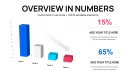
Should I include data labels on each column?
It depends on your audience and presentation context. For board meetings where executives want precise numbers, add data labels showing exact values on top of each column. For high-level strategy presentations where trends matter more than specific figures, omit labels to reduce visual clutter and let column height convey the story. A good rule: if your audience will ask "what`s the exact number," include labels. If they just need to see which metric is higher, let the columns speak for themselves. You can toggle data labels on or off through the chart format menu.