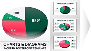
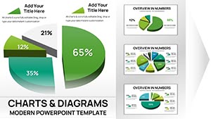
3-D Pie PowerPoint Charts - Fully Editable, Ready for Board Meetings


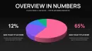
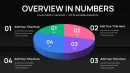
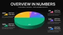
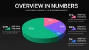
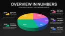
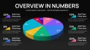
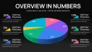
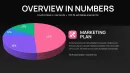
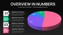
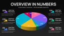
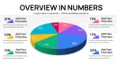
Transform your numerical insights into visually engaging presentations with our 3-D Pie PowerPoint Charts. Perfect for executives, analysts, and project managers, this template helps you communicate complex data clearly in board meetings, investor presentations, and internal reviews.
Feature / Slide Breakdown
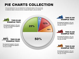
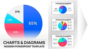
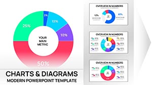
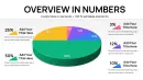
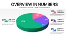
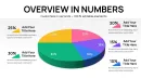
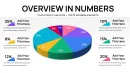
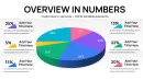
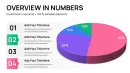
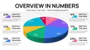
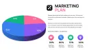
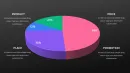
- Multiple 3-D pie chart variations for detailed data segmentation
- Editable colors, labels, and data points for quick customization
- High-resolution graphics optimized for presentations and reports
Professional Use Cases
- Board meetings: Showcase quarterly financial distribution or departmental budget allocation.
- Investor updates: Highlight market share or revenue contribution per product line.
- Team reviews: Visualize progress across multiple projects for clear stakeholder understanding.
Workflow Integration
Easily compatible with PowerPoint, Keynote, and Google Slides. Edit chart data directly or link to live Excel/Sheets datasets for dynamic updates. Apply custom branding colors and fonts to match your corporate identity.
Real-World Presentation Scenarios
Use this template when preparing quarterly board reports, investor pitch decks, or internal strategy meetings. Quickly adjust chart segments to reflect revenue shifts or project status without redesigning slides from scratch.
Internal Comparison Table
| Slide Type | Audience | Outcome |
|---|---|---|
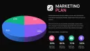
| 3-D Pie with Labels | Executives & Investors | Quick comprehension of revenue splits |
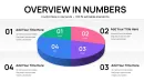
| Exploded Pie Variant | Team Reviews | Highlight key segments for action |
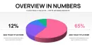
| Percentage-focused Pie | Board & Financial Analysts | Clear visual of contribution per category |
Industry Applications
Finance, marketing, operations, and product management teams can all leverage these charts for meaningful visual storytelling. Ideal for quarterly reporting, budget allocation, market analysis, and performance tracking.
Frequently Asked Questions
When should I use this template?
Use for board meetings, investor presentations, and team reviews. Avoid for narrative-heavy or non-data-focused slides.
How do I edit the charts?
Edit directly in PowerPoint, Keynote, or Google Slides. Adjust labels, values, and colors, or link to Excel/Sheets for dynamic updates.
Will executives understand this chart?
Yes. The 3-D visualization simplifies complex data, making it easy for decision-makers to grasp key insights quickly.
Can I customize colors and branding?
Absolutely. Fully editable colors, fonts, and labels let you align charts with corporate branding.