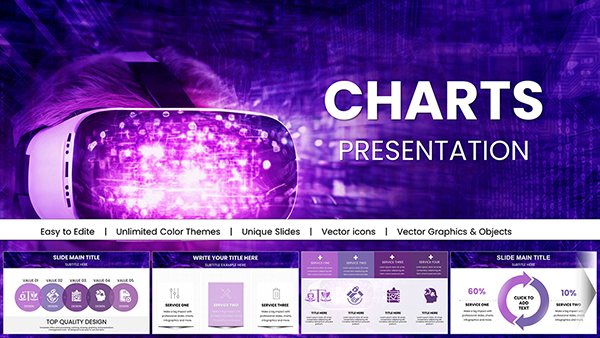
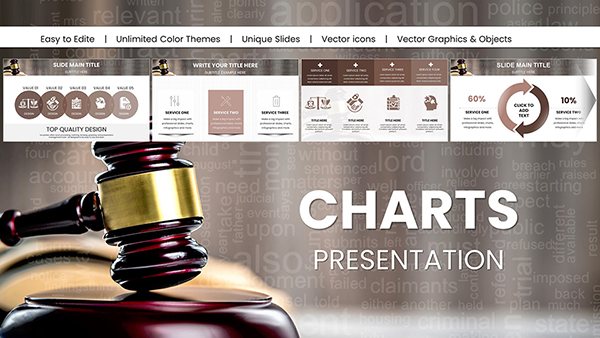
Analytical Trend PowerPoint Charts: Decode Data with Precision


In today's data-saturated landscape, discerning trends isn't optional - it's essential for informed decision-making. Our Analytical Trend PowerPoint Charts Template equips you with 59 editable slides to uncover patterns and forecast futures, perfect for business analysts, educators, and researchers. Featuring process mappings and analytical graphs like lines for time-series or scatters for correlations, this tool draws from methodologies in publications like the Journal of Business Analytics. Overcome the frustration of murky data presentations; instead, deliver crystal-clear visuals that spotlight key insights. A tech firm in Silicon Valley leveraged similar templates to identify market shifts, pivoting strategies and gaining a 15% revenue edge. Fully compatible with PowerPoint and Google Slides, it fits seamlessly into your analytical arsenal, enabling quick iterations and collaborative reviews. Embark on a journey where data doesn't overwhelm but enlightens, turning numbers into narratives that propel progress and innovation.
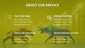
Core Features Driving Analytical Excellence
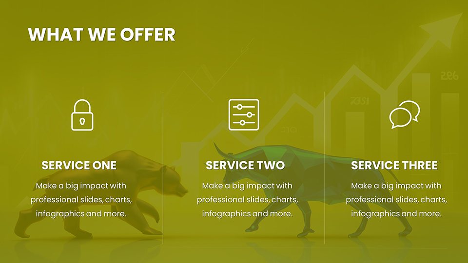
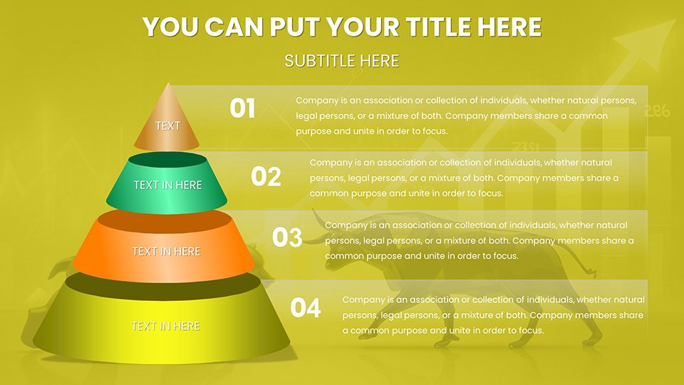
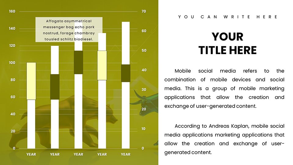
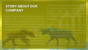
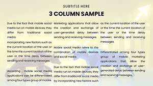
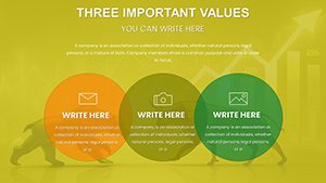
Analysis demands accuracy, and this template provides it through specialized charts. Process slides outline workflows, while analysis tools like bar graphs compare metrics or pie charts segment data. Customization is king - tweak axes, legends, and themes to suit your dataset's story. Benefits include streamlined reporting, reducing prep time by half, and enhanced comprehension for non-experts. In an educational context, professors use these to teach statistical trends, aligning with curricula from institutions like MIT. The user-friendly design ensures accessibility, with drag-and-drop elements that prevent errors. Moreover, high-resolution exports maintain quality in prints or shares, upholding professional standards. This isn't just a template; it's a catalyst for deeper insights, backed by design principles that prioritize clarity over clutter.
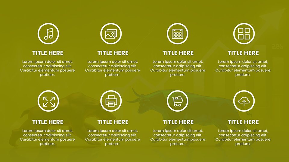
Highlighting Template Essentials
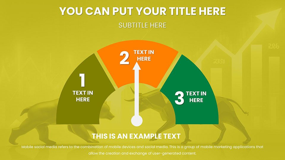
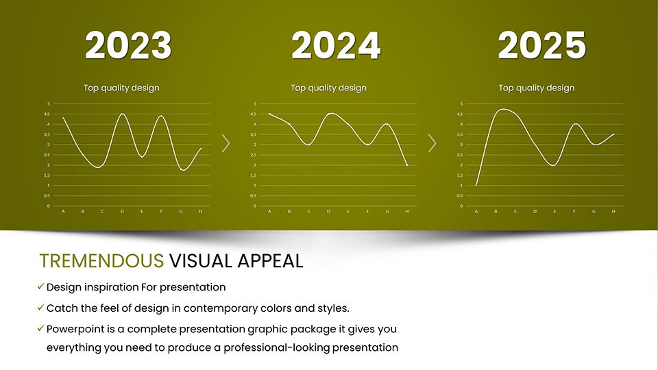
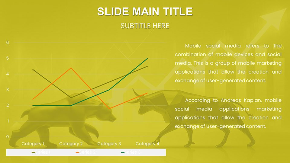
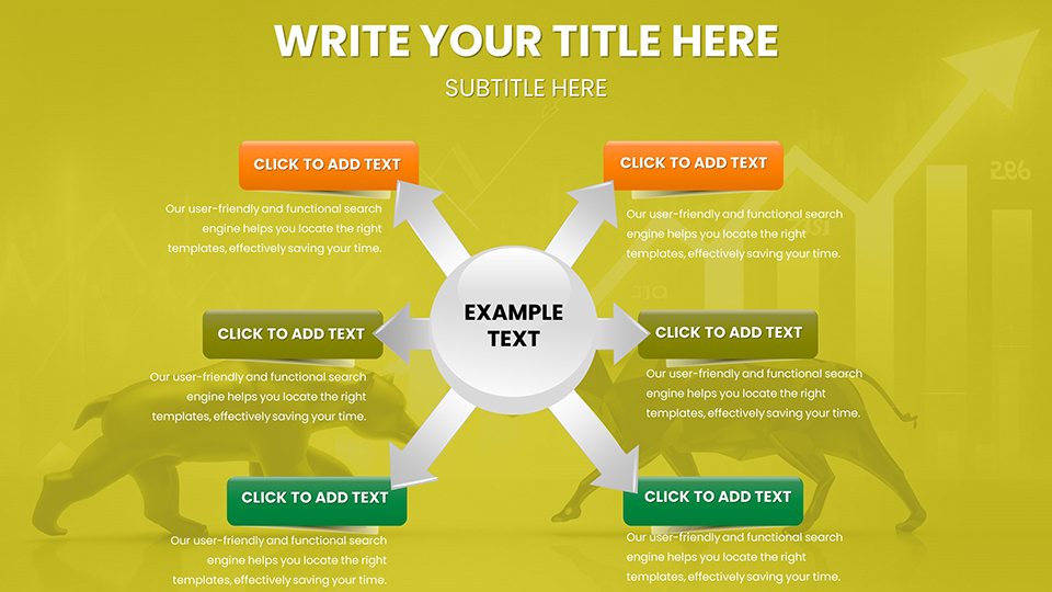
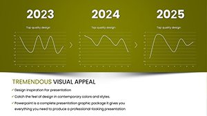
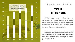
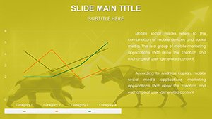
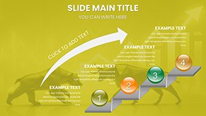
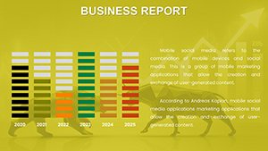
- Trend Line Graphs: Track variables over time, ideal for sales forecasts or economic indicators, with smoothing options for noise reduction.
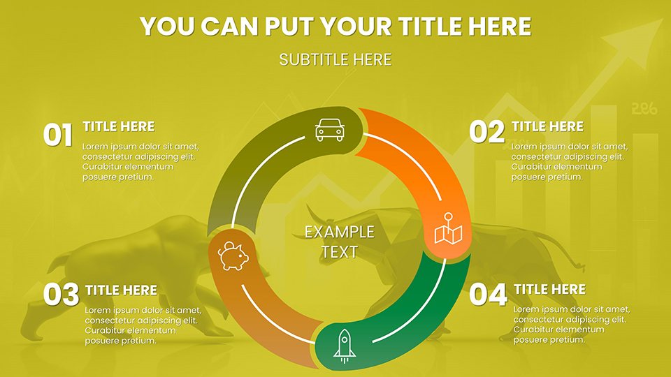
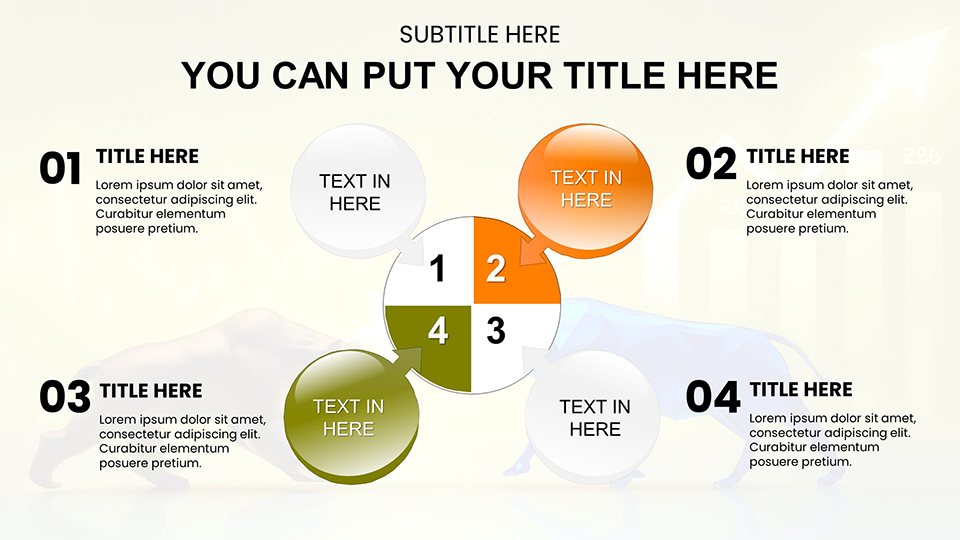
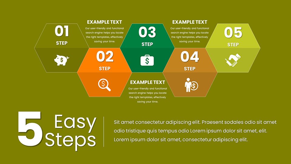
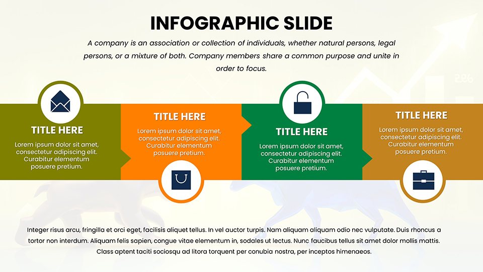
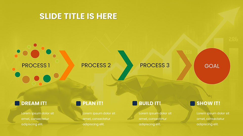
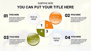
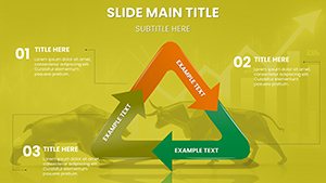
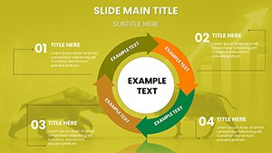
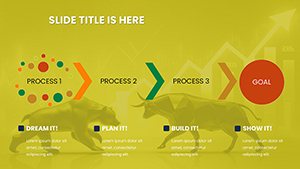
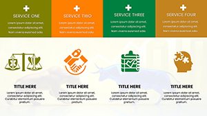
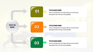
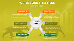
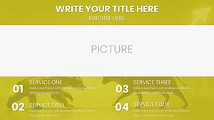
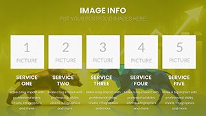
- Process Flowcharts: Map sequences in operations, highlighting bottlenecks for efficiency gains.
- Scatter Plot Analytics: Reveal relationships between variables, supporting regression insights.
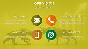
- Color-Coded Customization: Adjust palettes for data emphasis, ensuring accessibility for color-blind viewers.
- Integrated Tips: Built-in guidance on best practices, like avoiding chartjunk per Edward Tufte's principles.
These components empower users to craft presentations that not only present data but persuade with evidence-based arguments.
Applied Scenarios: Turning Trends into Triumphs
Imagine dissecting quarterly reports where a trend chart exposes growth plateaus, guiding strategic adjustments. This template excels here, aiding executives in boardrooms or researchers in labs. For educators, it simplifies complex datasets in lectures, as evidenced by improved student outcomes in data science courses. A healthcare analyst's win: Using scatter plots, they correlated patient data trends, optimizing resource allocation. Workflow: Import raw data, select chart types, customize visuals, and iterate based on feedback. Versus vanilla PowerPoint, this offers advanced scaling and layering for multifaceted analyses. In remote settings, Google Slides integration facilitates global teamwork, ensuring trends are shared without loss. Ultimately, it's about harnessing data's power to forecast and innovate, with visuals that build credibility and drive action.
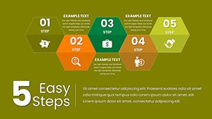
Analytical Workflow Optimization
- Initiate Download: Access the template and load your dataset promptly.
- Select Chart Styles: Choose from trends or processes to match your analysis needs.
- Refine Data Points: Input values and adjust for accuracy using smart tools.
- Enhance Visuals: Apply themes and annotations for contextual depth.
- Present Insights: Export and share, ready for impactful delivery.
Flex this for rapid prototypes or in-depth studies, echoing approaches in leading analytics firms like Gartner.
The Trusted Choice for Data-Driven Decisions
Reliability defines great tools, and with 900+ ratings, this template earns it through robust features like vector scalability and error-proof editing. Outshining basics, it includes trend forecasting extensions for predictive visuals. Researchers appreciate alignment with standards from the American Statistical Association. A case: An e-commerce team spotted seasonal trends, boosting inventory planning. Secure your analytical advantage - download now and decode tomorrow's opportunities.
Frequently Asked Questions
- How do I handle large datasets in these charts?
- Slides support Excel imports for seamless integration, with auto-scaling to manage extensive data without clutter.
- Is it compatible with advanced analytics software?
- Yes, export/import capabilities work with tools like Tableau for hybrid workflows.
- Can charts include predictive elements?
- Built-in trend lines allow basic forecasting, extendable with custom formulas.
- What if I'm new to data visualization?
- Embedded tutorials guide you, making complex trends accessible.
- Are updates available?
- Yes, periodic enhancements ensure compatibility with latest PowerPoint versions.