Pro Chemical & Biochemical Education PowerPoint Charts


Type: PowerPoint Charts template
Category: Relationship, Graphs, Illustrations
Sources Available: .pptx
Product ID: PC01062
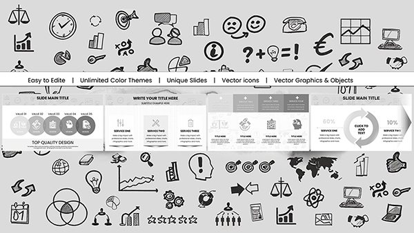
Template incl.: 59 editable slides
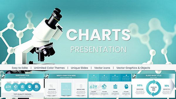
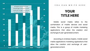
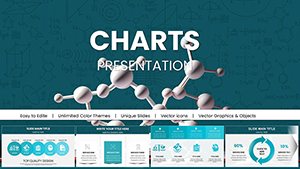
Welcome to a world where complex chemical structures and biochemical pathways come alive in your presentations. Imagine captivating your audience - whether it's a classroom of eager students or a conference room full of seasoned researchers - with visuals that not only inform but inspire. Our Education Chemical and Biochemical PowerPoint Charts template is designed precisely for that purpose. With 59 fully editable slides, this .pptx-compatible collection empowers you to convey intricate concepts like enzyme kinetics, molecular models, and periodic table analyses with unparalleled precision and flair.
As an educator or scientist, you know the challenge of distilling dense information into digestible formats. This template addresses that head-on by offering stunning, professionally crafted charts that enhance retention and understanding. Drawing from real-world applications, such as visualizing metabolic pathways in a biology lecture or presenting research on protein folding at a symposium, these slides integrate seamlessly into your workflow. Compatible with Microsoft PowerPoint and Google Slides, they ensure flexibility across platforms, allowing you to focus on your message rather than technical hurdles.
Key Features That Set Our Charts Apart
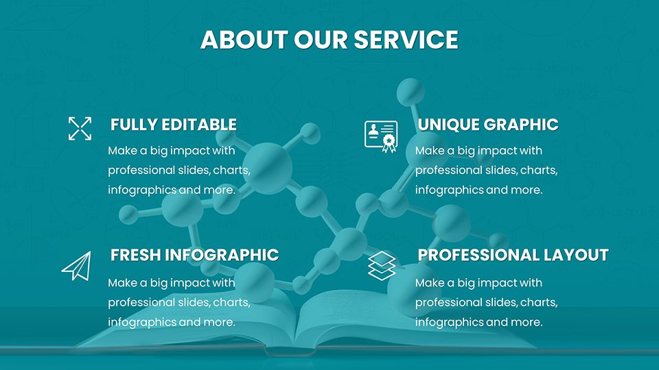
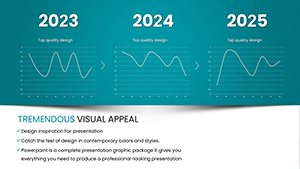
Delve into the core elements that make this template a must-have for anyone in the chemical and biochemical fields. First, the stunning visuals are not just eye-catching; they're engineered for educational impact. Each chart incorporates high-resolution graphics that adhere to scientific accuracy, much like those used in peer-reviewed journals from organizations such as the American Chemical Society (ACS). For instance, our molecular structure diagrams allow for easy manipulation of bonds and atoms, helping you demonstrate concepts like stereochemistry without resorting to clunky drawings.
Next, versatile customization stands out as a game-changer. Adjust colors to match your institution's branding, tweak fonts for readability, or rearrange layouts to fit your narrative flow. This isn't generic software; it's a toolkit tailored for precision. Consider a case where a university professor customizes a biochemical pathway chart to highlight glycolysis steps, adding annotations that align with curriculum standards from the National Science Education Standards. Such adaptability ensures your presentations are as unique as your insights.
Data accuracy and clarity form the backbone of effective communication in science. Our charts prioritize this by using scalable vectors that maintain sharpness at any zoom level. Whether plotting reaction rates or comparing elemental properties, you'll avoid the pitfalls of distorted data often seen in basic PowerPoint tools. A real-world example: Researchers at biotech firms like Genentech have used similar visuals to pitch innovative therapies, where clear data representation secured funding by making complex pharmacokinetics accessible to non-experts.
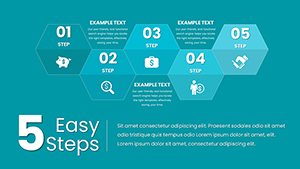
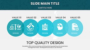
The wide variety of charts covers everything from basic organic chemistry illustrations to advanced topics like proteomics. This breadth means you won't need multiple templates - everything is here. User-friendly downloads provide instant access, bypassing lengthy setups. Simply download, open in PowerPoint, and start editing. For those in fast-paced environments, like lab meetings or virtual webinars, this efficiency is invaluable.
Detailed Slide Breakdown
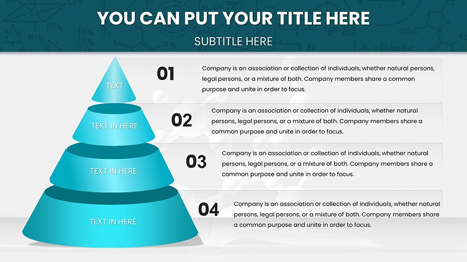
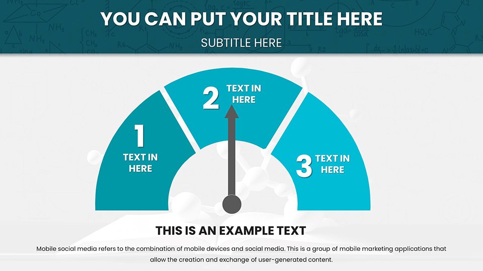
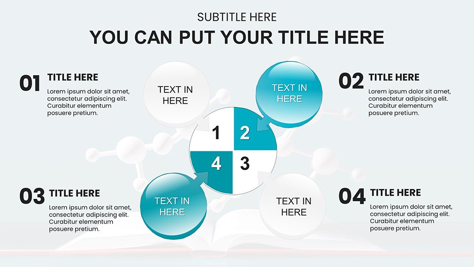
Let's explore what you'll find across the 59 slides. Slides 1-10 focus on foundational elements, including customizable periodic tables and atomic structure diagrams. These are ideal for introductory lessons, where you can insert real data from sources like the PubChem database to show elemental properties dynamically.
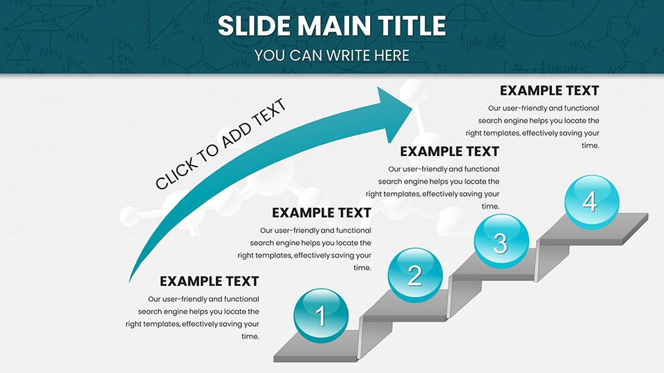
Moving to slides 11-25, biochemical pathways take center stage. Visualize processes like the Krebs cycle with interactive flowcharts that allow clicking through stages. Add your own data points, such as enzyme inhibition rates, to create a narrative that builds understanding step by step. In a practical application, a high school teacher might use these to prepare students for AP Biology exams, incorporating quiz elements for reinforcement.
Slides 26-40 delve into molecular modeling. Here, 3D-like representations help explain concepts like DNA replication or protein-ligand interactions. Customize with colors to differentiate functional groups, drawing from expert practices in computational chemistry software like PyMOL.
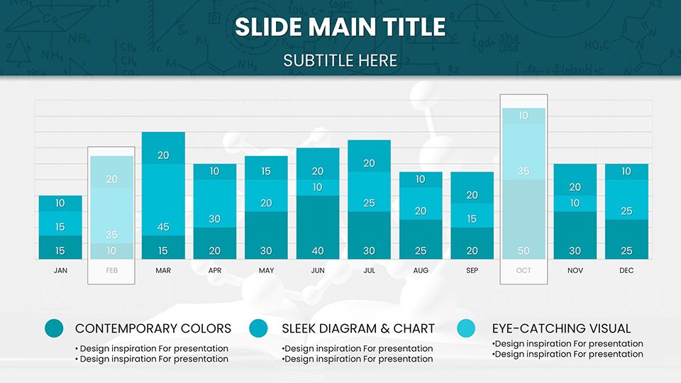
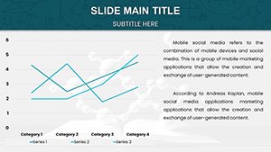
The remaining slides (41-59) offer advanced analytics, such as kinetic graphs and spectroscopy charts. These are perfect for research presentations, where you can input experimental data to showcase trends. For example, a graduate student defending a thesis on catalytic reactions could use these to plot rate constants, impressing committees with professional-grade visuals.
Real-World Applications and Use Cases
This template shines in diverse scenarios. For educators, it's a boon in creating lectures that stick. Picture a college professor using a customized enzyme kinetics chart to explain Michaelis-Menten equations, leading to higher student engagement as measured by post-lecture surveys.
Researchers benefit by presenting findings at conferences like those hosted by the Biochemical Society. A slide series on signal transduction pathways could highlight novel discoveries, using embedded icons for receptors and messengers to clarify mechanisms.
Students and scholars find value in seminar preparations. Building a presentation on green chemistry principles becomes effortless, with charts illustrating sustainable reaction designs that align with UN Sustainable Development Goals.
Professionals in industry, such as pharmaceutical developers, can use these for internal reports. Visualizing drug metabolism data helps teams collaborate, reducing miscommunication and accelerating project timelines.
To integrate into your workflow: Start by selecting a base slide, import your data via Excel links if needed, customize aesthetics, and rehearse. Tips include using consistent color schemes for thematic unity and adding animations sparingly to emphasize key points without overwhelming.
Why Choose This Over Basic PowerPoint?
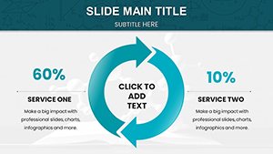
Basic PowerPoint charts often fall short in scientific contexts - lacking depth and flexibility. Our template outperforms by offering themed icons specific to chemistry, like beakers and flasks, which add context without extra effort. Compared to free alternatives, it provides error-free, high-fidelity designs that save hours of troubleshooting.
Value props abound: Time savings mean more focus on research; enhanced visuals lead to better audience feedback; and compatibility ensures no platform barriers. Subtle CTAs throughout encourage action: Ready to visualize your next breakthrough? Customize these charts today.
In conclusion, elevate your chemical and biochemical communications with this indispensable tool. Unlock the potential of your data and ideas - download now and transform how you present science.
Frequently Asked Questions
- How editable are the charts?
- Fully editable - adjust every element from colors to data points using standard PowerPoint tools.
- Is it compatible with Google Slides?
- Yes, upload the .pptx file directly for seamless use.
- Can I use these for commercial presentations?
- Absolutely, ideal for professional and academic settings alike.
- What file format is provided?
- .pptx, ensuring broad compatibility.
- Are there tutorials included?
- Basic instructions are embedded; advanced tips available on our site.