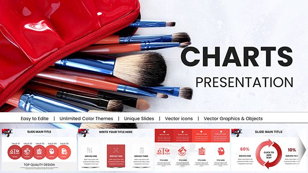
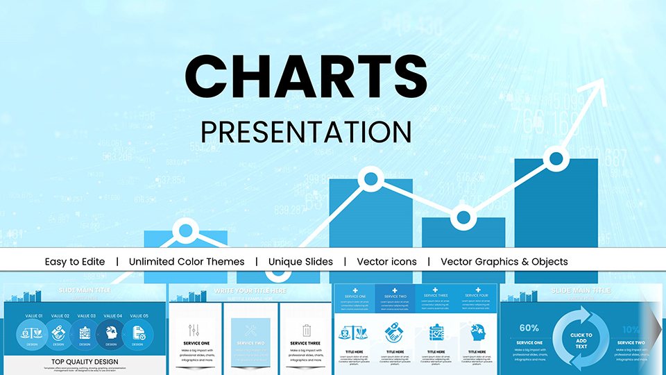
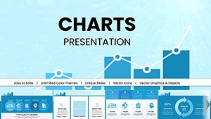
Analytical Graphics PowerPoint Charts: Master Data Visualization


Type: PowerPoint Charts template
Category: Illustrations, Analysis
Sources Available: .pptx
Product ID: PC00971
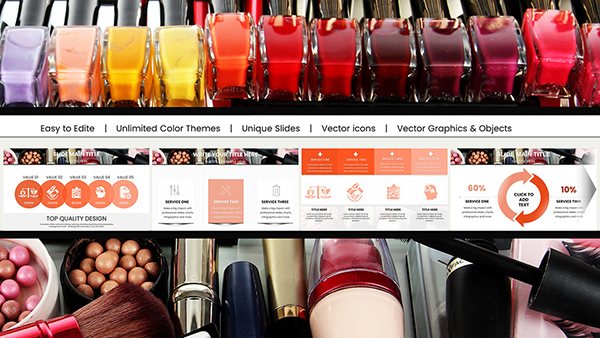
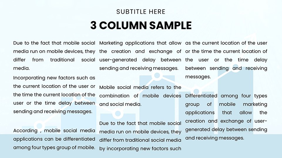
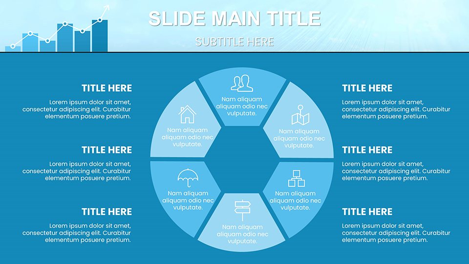
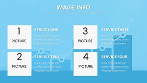
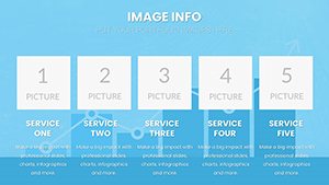
Template incl.: 59 editable slides
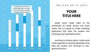
In today's data-saturated business landscape, turning spreadsheets into strategic insights is a game-changer. Our Analytical Graphics PowerPoint Charts template equips analysts, marketers, and executives with tools to do just that. Featuring 59 editable slides, this collection focuses on precision and clarity, ideal for presenting KPIs, trend analyses, or forecasting models. Inspired by real applications, like how companies such as Google use advanced visuals in their quarterly earnings calls to simplify complex metrics, this template helps you communicate effectively. Whether dissecting sales data or evaluating market risks, these charts streamline your process, saving valuable time. Fully compatible with PowerPoint and Google Slides, it's designed for seamless integration into your workflow. Explore how this can turn your next report from mundane to memorable, fostering better decision-making across teams.
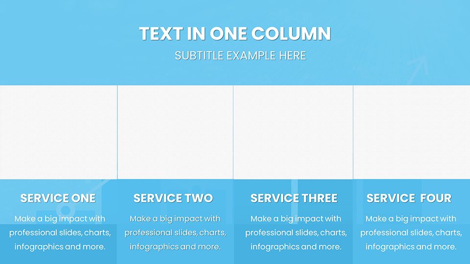
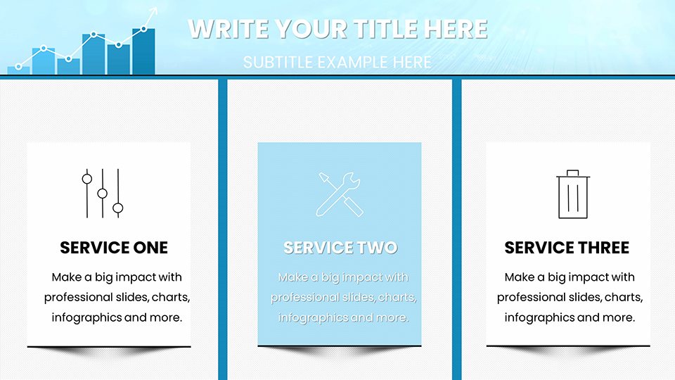
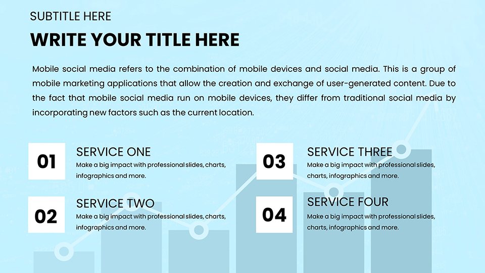
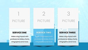
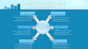
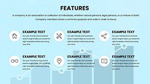
Essential Features for Data-Driven Success
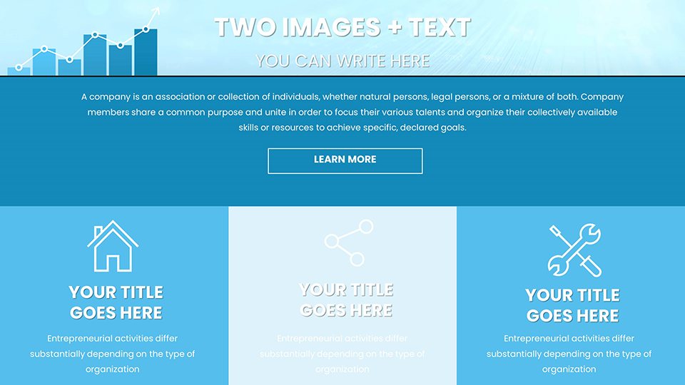
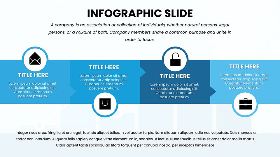
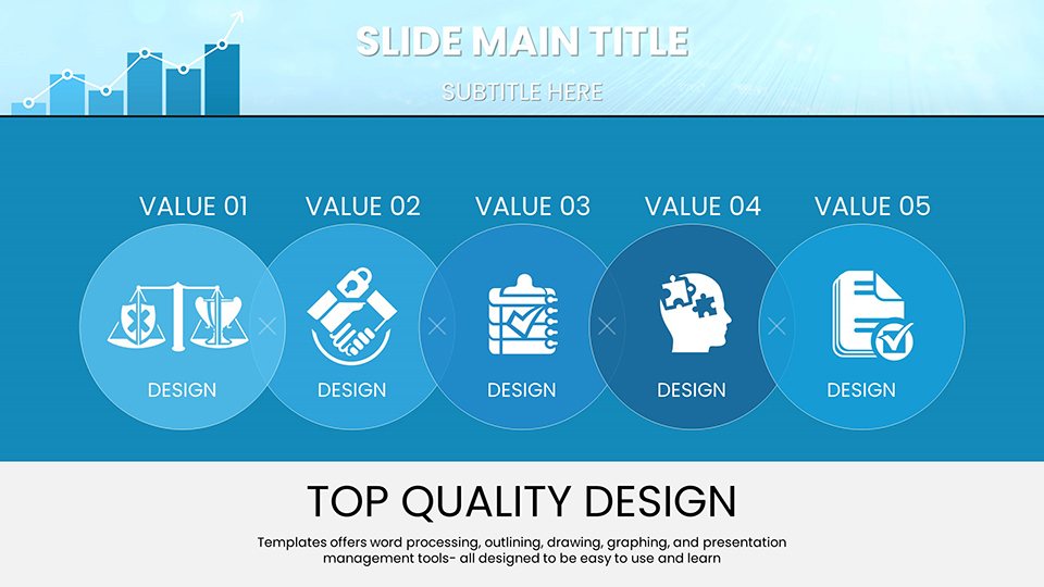
This template excels in providing sophisticated yet user-friendly elements, with a clean design palette that emphasizes readability. High-quality vectors ensure scalability, perfect for both digital and print outputs.
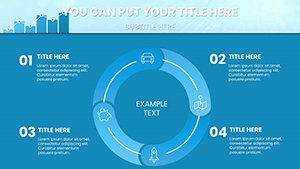
Advanced Chart Types for In-Depth Analysis
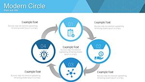
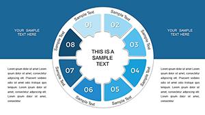
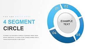
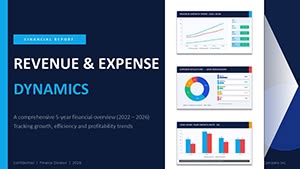
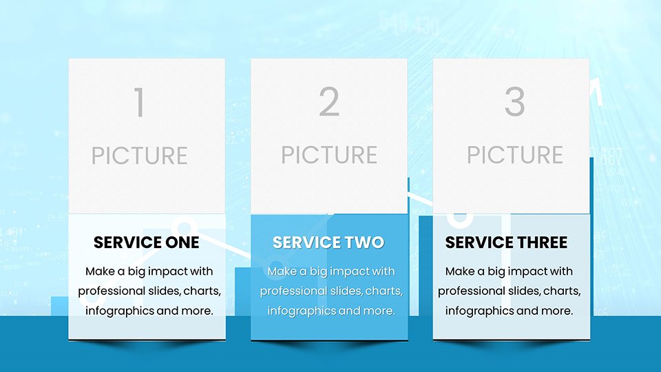
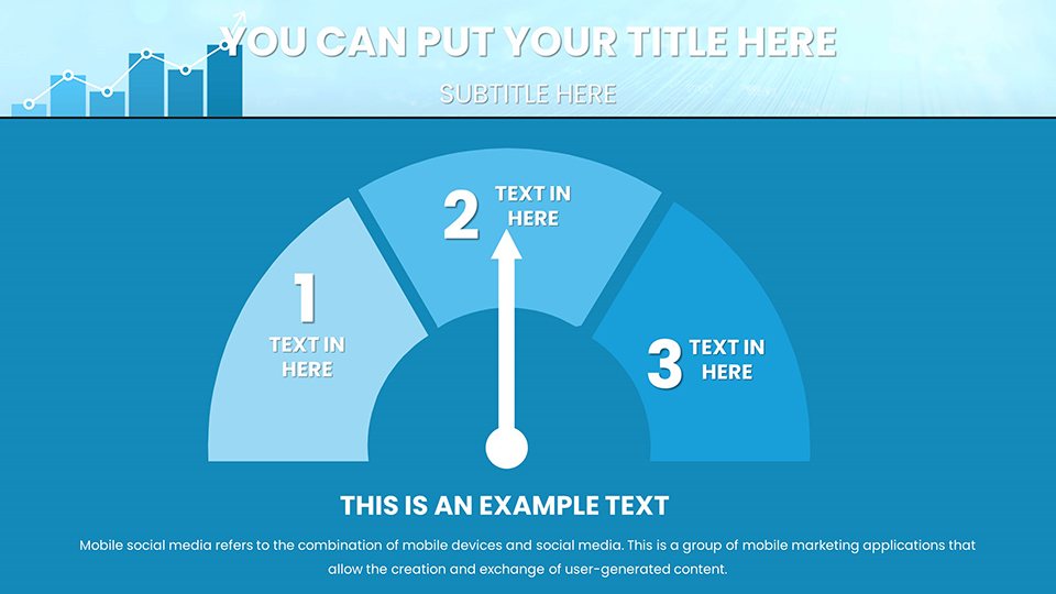
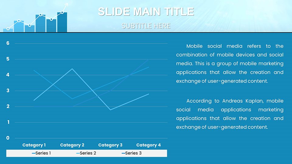
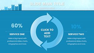
Dive into a variety of charts tailored for analytics: scatter plots for correlation studies, heat maps for pattern recognition, and funnel charts for conversion tracking. Each is fully customizable - update values, tweak axes, or apply filters to highlight outliers. Drawing from best practices in data visualization, as outlined by the Data Visualization Society, these tools help avoid common pitfalls like misleading scales.
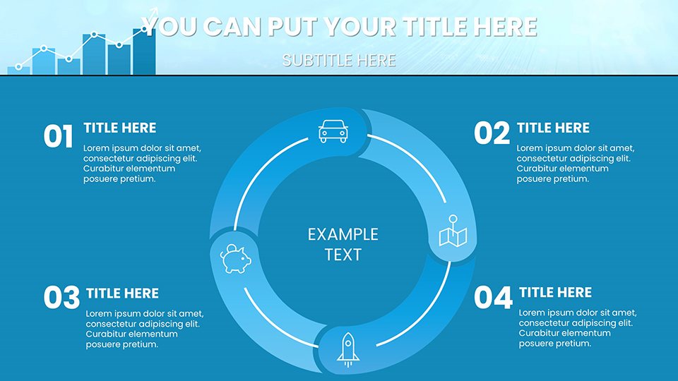
- Dashboard Layouts: Combine multiple charts into interactive overviews for executive summaries.
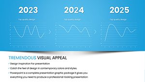
- Trend Lines: Forecast future performance with built-in regression tools.
- Comparative Bars: Side-by-side views for benchmarking against competitors.
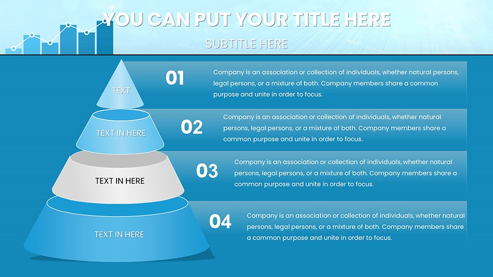
- Pivot Tables: Dynamic data summaries that adapt to your inputs.
Benefits for Analysts and Teams
Addressing the challenge of data overload, this template reduces preparation time by offering pre-formatted options. Unlike standard PowerPoint features, which require manual adjustments, this provides analytical depth with minimal effort. Users often see improved audience comprehension, as evidenced by studies from Harvard Business Review on effective data presentations.
Practical Use Cases in Business Analytics
Apply this template in diverse scenarios, from financial audits to marketing campaigns. For instance, a retail chain might use bubble charts to visualize product performance by region, leading to targeted inventory decisions. In tech firms, it's invaluable for agile retrospectives, charting sprint velocities.
- Crafting a Performance Report: Begin with an overview slide, add detailed charts for metrics, and conclude with actionable insights.
- Market Research Presentations: Use radar charts to compare feature sets across products.
- Risk Assessment Meetings: Employ waterfall charts to break down variance factors.
Workflow tip: Import data from Excel, customize visuals, and rehearse with built-in transitions for smooth delivery.
Expert Tips for Analytical Excellence
Enhance impact by using contrasting colors for emphasis and annotations for clarity. Inject a touch of wit, like labeling a peak as "our Everest moment," to humanize data-heavy slides. Grounded in principles from Stephen Few's "Show Me the Numbers," these strategies ensure your analytics resonate.
Standing Out in the Analytics Tool Market
This template differentiates itself with focused analytical features, outperforming broad-spectrum options. Feedback highlights its role in securing project approvals through clearer communications.
Empower your data stories now - download and analyze with confidence.
Frequently Asked Questions
How do I import data into these charts?
Copy from Excel or CSV and paste directly; the charts auto-update.
Are advanced formulas supported?
Yes, integrate Excel-like functions for real-time calculations.
Suitable for non-technical users?
Absolutely, with intuitive interfaces and tutorials included.
Can I add custom branding?
Easily apply logos, fonts, and colors throughout.
What about collaboration features?
Works great in shared environments like OneDrive or Google Drive.
Refund policy if not satisfied?
We offer a satisfaction guarantee; contact support for details.