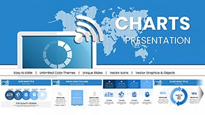
Market Share & Distribution Chart - PowerPoint Template


Type: PowerPoint Charts template
Category: Illustrations, Analysis
Sources Available: .pptx
Product ID: PC00958
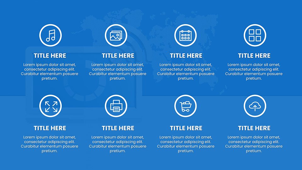
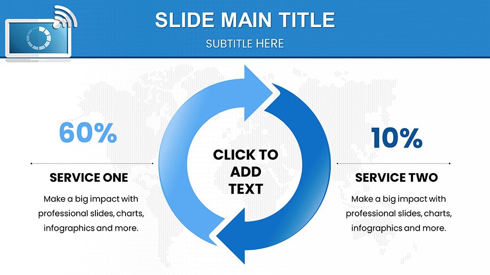
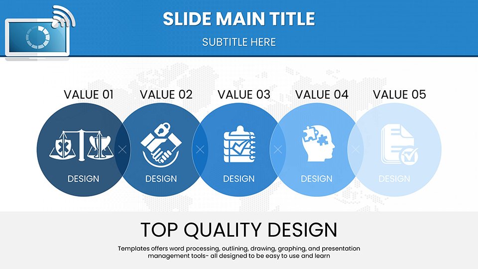
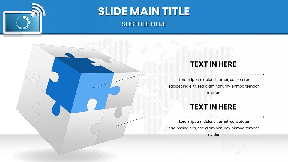
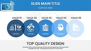
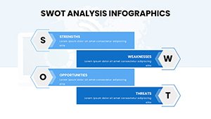
Template incl.: 59 editable slides
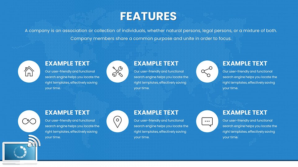
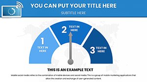
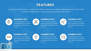
Make your key metrics impossible to ignore. When you need to show parts of a whole - such as market share, budget allocation, or demographic splits - standard pie charts often feel outdated and imprecise. This Market Share & Distribution Chart Template elevates your data visualization. It is designed to highlight specific segments (the "slice" that matters) while maintaining a clean, modern aesthetic. Perfect for marketing directors and financial planners, this template turns simple percentages into a bold statement about dominance, opportunity, or allocation.
Strategic Use Cases
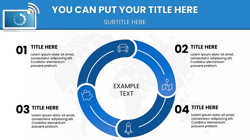
Use this template when the relationship between the parts and the whole is the main story.
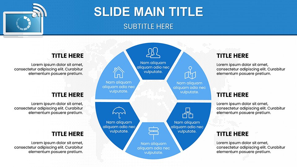
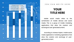
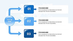
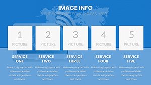
- Market Penetration: visually demonstrating your company's slice of the Total Addressable Market (TAM).
- Budget Allocation: Breaking down marketing spend across different channels (e.g., Digital vs. Print vs. Events).
- Demographic Analysis: Showing the split of your customer base by age, region, or industry vertical.
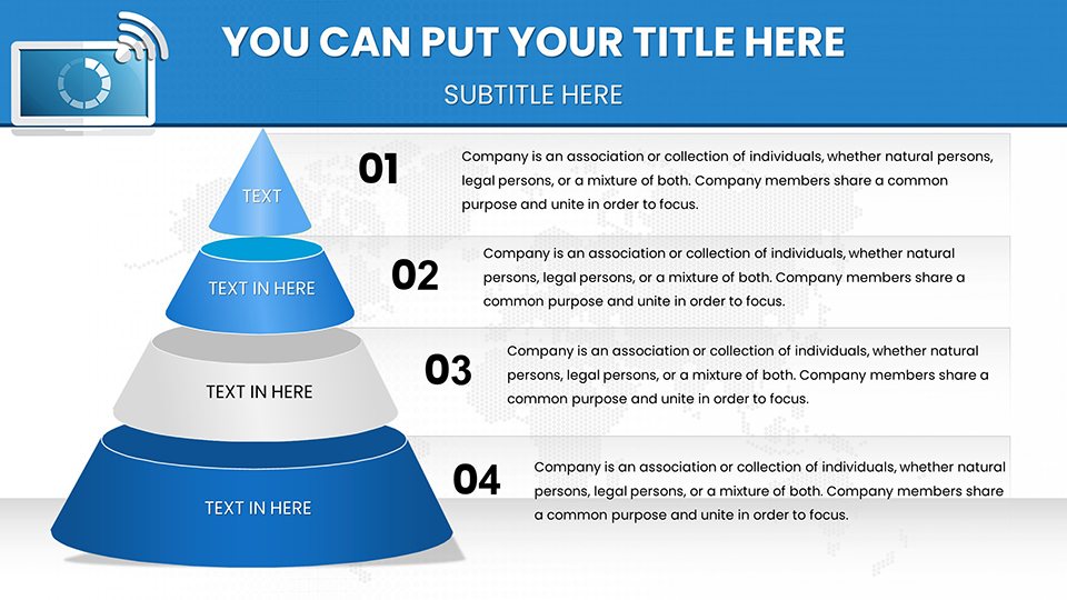
Editing & Customization Workflow
This template is built to be "board-ready" in minutes.
- Data-Driven Segments: Adjusting the size of the slices is done via the embedded Excel sheet. Right-click "Edit Data" and type your percentages; the graphic updates instantly.
- Smart Callouts: The text labels and leader lines are pre-positioned to avoid overlap. You don't need to manually align text boxes; the layout is optimized for legibility.
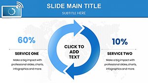
- Focus Effects: You can easily "explode" (pull out) a specific slice of the chart to draw the audience's eye to a particular data point, such as your company's growth area.
Real-World Example: The Budget Defense
Imagine you are defending next year's budget to the CFO. You need to justify why 40% of the budget is going to R&D. A simple list of numbers is dry. Using this distribution chart, you can visually weight the R&D section, color-coding it to stand out against administrative costs. This visual cue psychologically reinforces the importance of that investment, making your argument more persuasive without saying a word.
Visualization Comparison
| Attribute | Standard Pie Chart | This Distribution Template |
|---|---|---|
| Readability | Often cluttered with labels | Clean, leader-line optimized |
| Impact | Passive data display | Active data highlighting |
| Style | Default Office look | Modern infographic style |
Industry Applications
Marketing: Channel mix performance. Investment Banking: Portfolio diversification breakdown. Public Sector: Government spending distribution.
Visualize Your Market Share
Frequently Asked Questions
What happens if my percentages don't equal 100%?
The chart engine will automatically calculate the proportion of each value relative to the total sum. However, for clarity, we recommend ensuring your data sums to 100% when using part-to-whole charts.
Can I change the color scheme to grayscale?
Yes. This is vital for printed handouts. You can switch the color palette to grayscale in the "Design" tab, or manually recolor segments to varying shades of grey to maintain contrast.
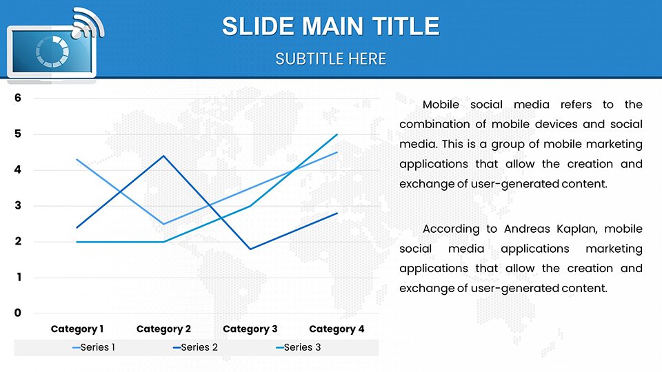
Is this better than a bar chart?
It depends on the goal. If you are comparing size relative to a whole (e.g., 25% of the market), this template is superior. If you are comparing distinct values over time, a bar chart might be better.