Cycles Solutions Infographic: PowerPoint Charts for Architectural Innovation


Type: PowerPoint Charts template
Category: Cycle
Sources Available: .pptx
Product ID: PC00901
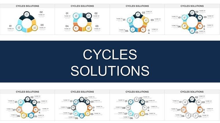
Template incl.: 29 editable slides
Imagine standing in a bustling design studio, surrounded by blueprints and stakeholder notes, grappling with the endless loop of building code revisions that threaten to derail your latest sustainable high-rise project. As an architect, you've felt the frustration of recurring hurdles - delays from regulatory feedback loops, material sourcing inefficiencies, or client revision cycles that seem to circle back without resolution. That's where our Cycles Solutions PowerPoint Charts Presentation steps in as your visual lifeline. This 29-slide template isn't just a collection of graphs; it's a strategic toolkit designed to map out, dissect, and conquer those persistent cycles in architecture workflows.
Crafted for forward-thinking architects, project leads, and design firms, this infographic-driven template turns abstract problems into actionable narratives. With its clean, modular layouts featuring interconnected arrows and cycle diagrams, you'll effortlessly illustrate how targeted interventions - like phased compliance checks or iterative prototyping - break free from stagnation. Whether you're prepping for an AIA panel discussion or a client pitch for urban redevelopment, these charts elevate your presentations from dry data dumps to compelling stories of progress. And the best part? Every element is fully editable in PowerPoint or Google Slides, so you can infuse your firm's branding with ease, swapping earthy tones for vibrant accents that echo your project's ethos.
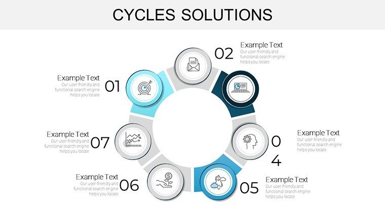
At its core, this template shines in demystifying complexity. Picture a slide where a looping cycle graphic breaks down a typical architecture feedback loop: from initial sketches to code review, revisions, and approval. Overlay icons for pain points - like a red flag for zoning snags - and green checkmarks for solutions, such as BIM-integrated simulations. This isn't generic clipart; it's purpose-built for the built environment, drawing on real-world insights to ensure relevance. For instance, in schematic design phases, where visual mock-ups are key to client buy-in, these charts solve the common pitfall of miscommunication by providing crystal-clear progress trackers.
Unlocking Key Features: What Makes These Cycle Charts Stand Out
Dive deeper, and you'll discover a treasure trove of features tailored for architectural storytelling. Our template boasts 29 meticulously designed slides, each optimized for high-impact visuals without overwhelming your audience.
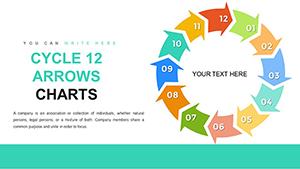
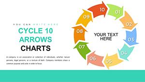
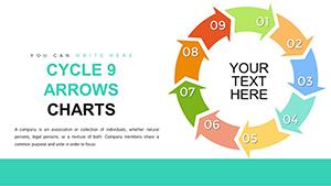
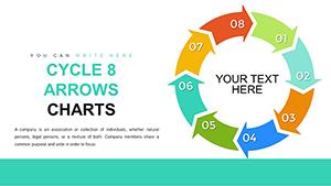
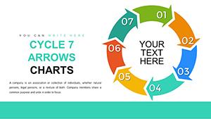
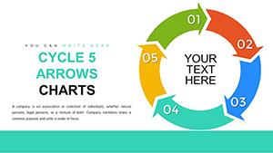
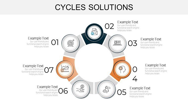
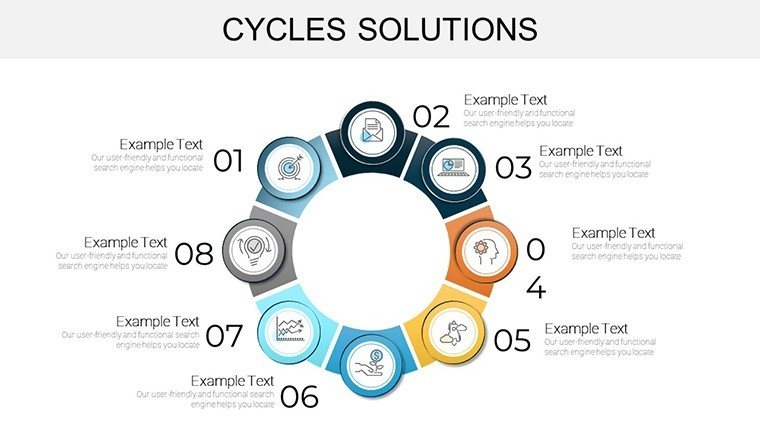
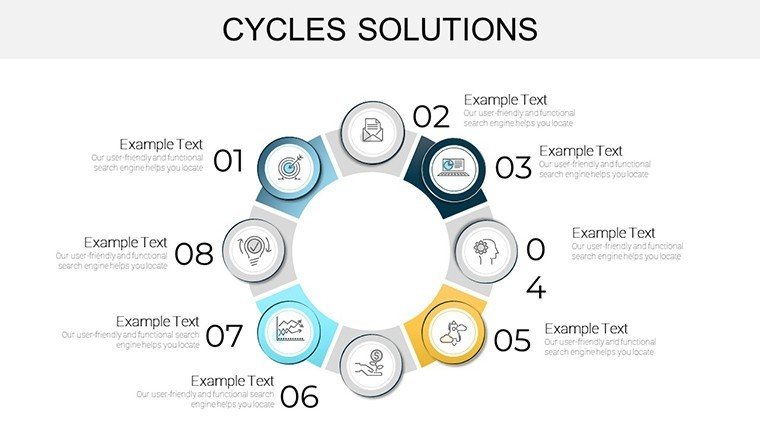
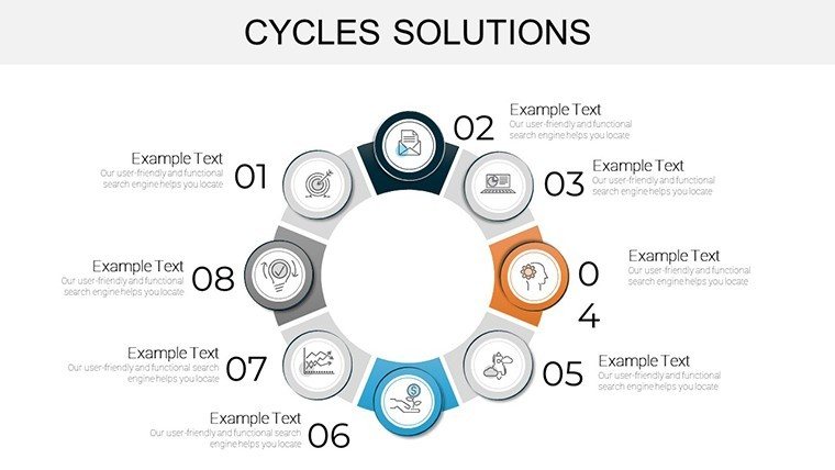
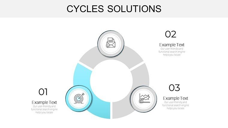
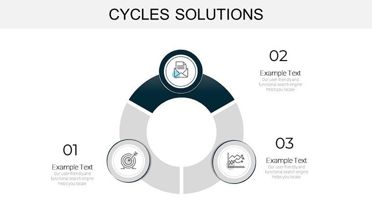
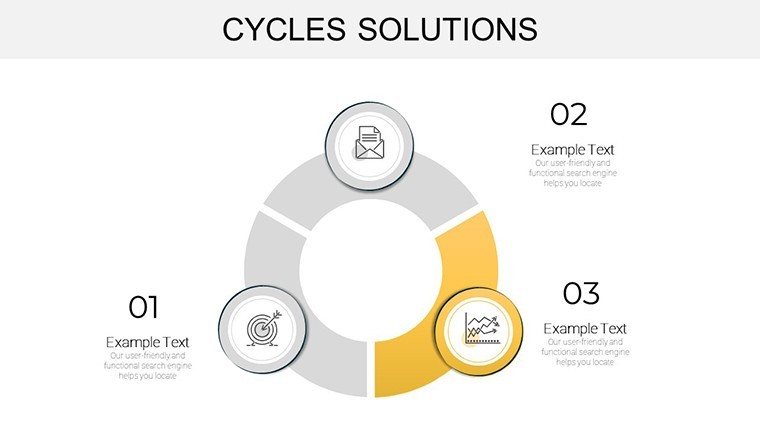
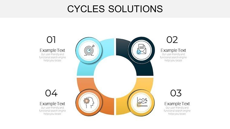
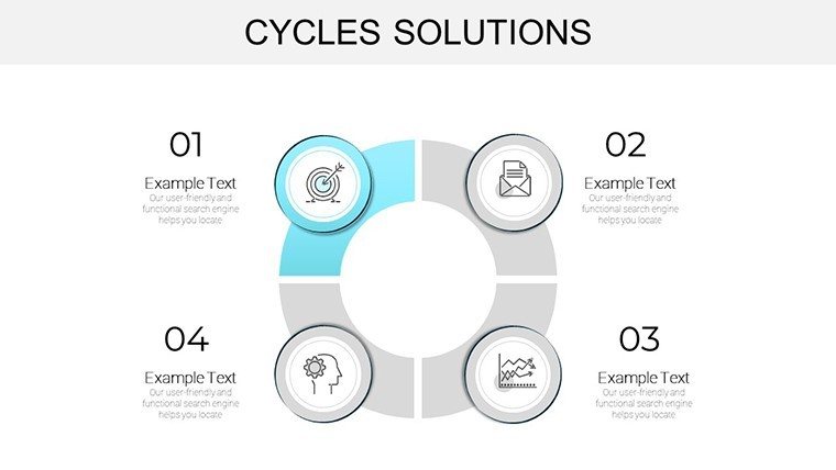
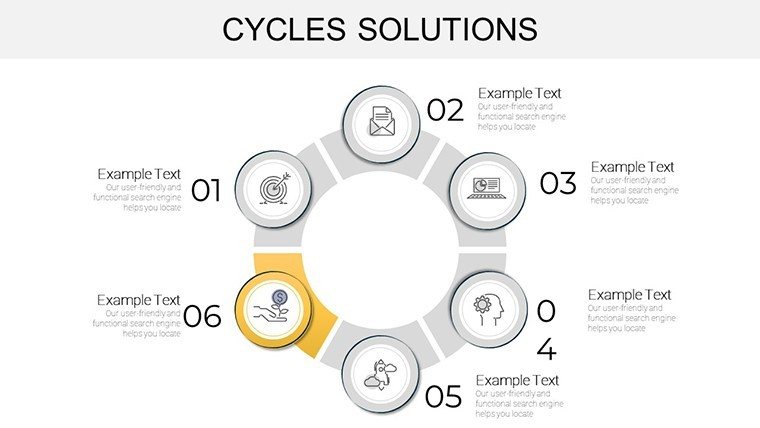
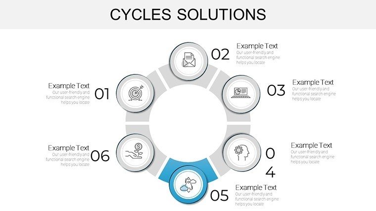
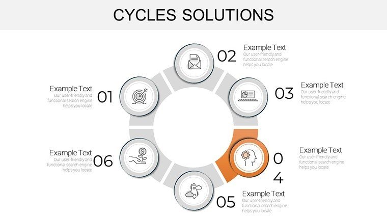
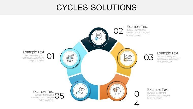
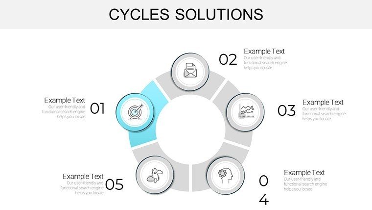
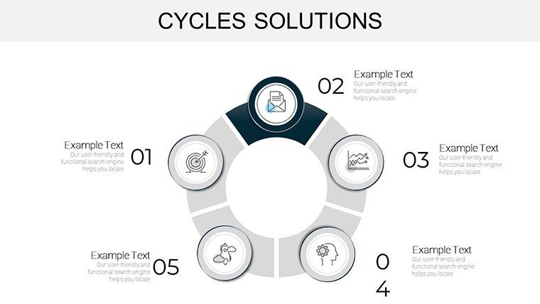
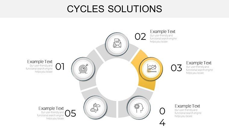
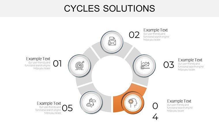
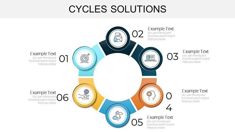
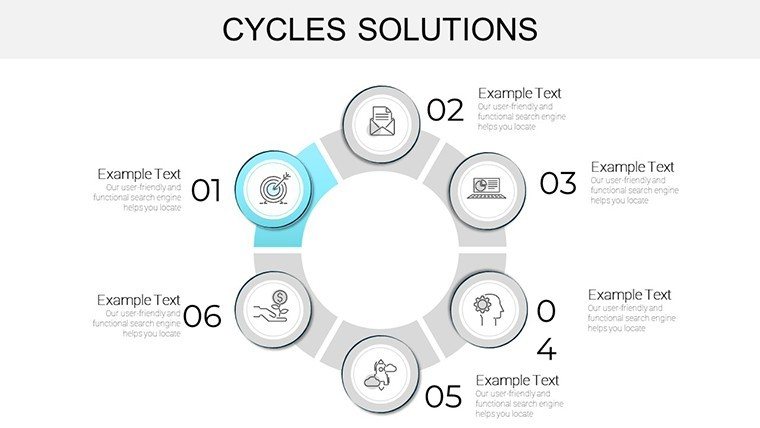
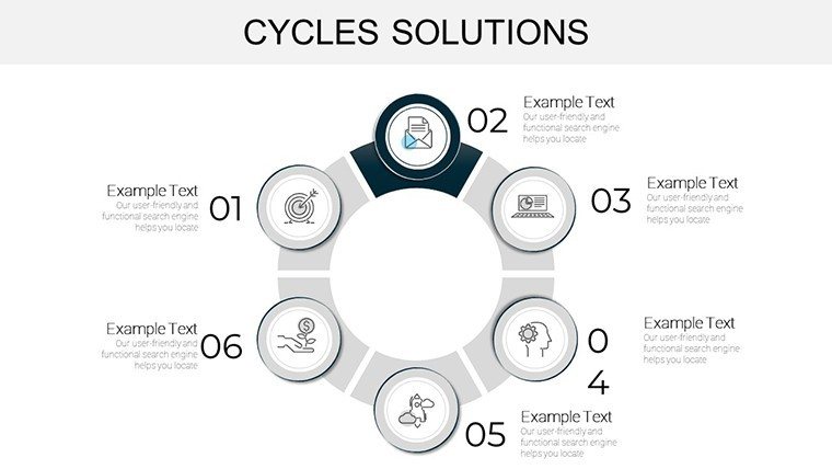
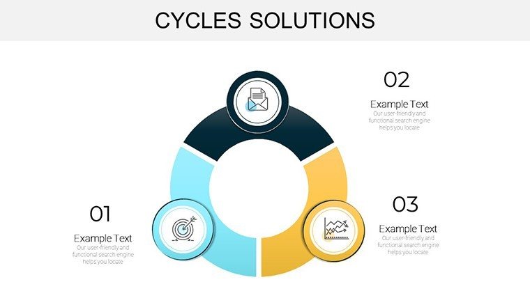
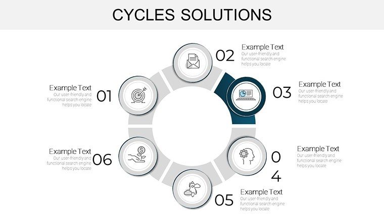
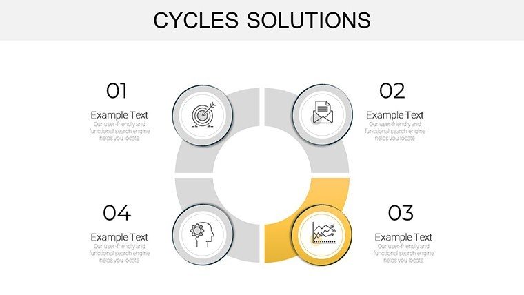
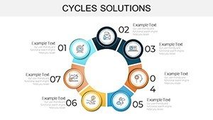
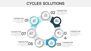
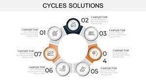
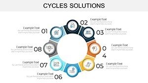
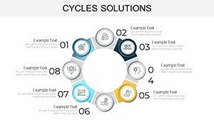
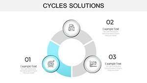
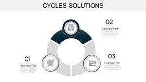
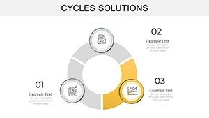
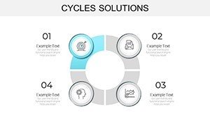
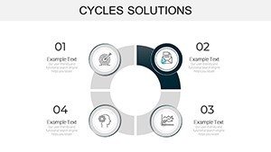
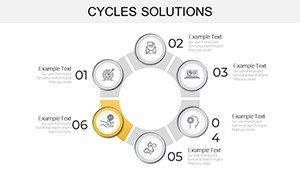
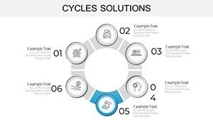
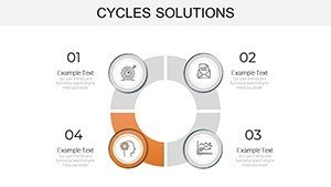
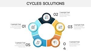
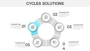
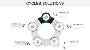
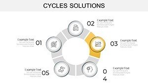
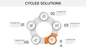
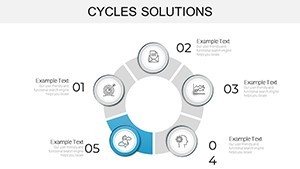
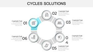
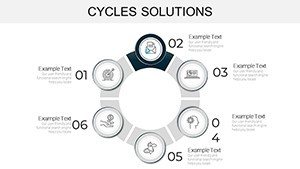
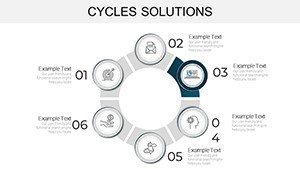
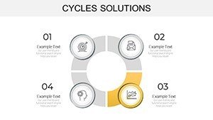
- Modular Cycle Diagrams: Five variations of looping structures, from simple 4-stage cycles to multi-layered spirals, perfect for depicting iterative processes like sustainable material reuse loops.
- Customizable Icons and Graphics: Over 50 architecture-themed icons - think hard hats, blueprints, and eco-symbols - that snap into place, ensuring your charts resonate with industry pros.
- Data-Integrated Charts: Bar graphs, pie charts, and timelines embedded within cycles, allowing seamless import of metrics like cost overruns or timeline variances from Excel.
- Color-Coded Solutions Framework: Intuitive palettes (blues for planning, greens for execution, oranges for interventions) that guide the eye and reinforce problem-solving themes.
Compared to stock PowerPoint charts, which often feel clunky and disconnected, this template's cohesive design ensures every slide flows like a well-orchestrated symphony. No more wrestling with misaligned elements; SmartArt enhancements and vector graphics keep everything crisp, even on large conference screens.
Slide-by-Slide Spotlight: Building Your Narrative
Let's break it down: Slide 1 kicks off with a panoramic overview cycle, ideal for setting the stage in your intro - "The Recurring Challenges in Modern Architecture." By Slide 10, you're into solution mapping, using a radial chart to branch out strategies for code complexity management.
Real-World Applications: From Studio to Site
In practice, this template transforms how architects tackle thorny issues. Take a mid-sized firm handling a mixed-use development in a historic district. Recurring permitting delays were eating into budgets - until they deployed our cycle charts in a stakeholder workshop. The visual breakdown of the approval loop highlighted bottlenecks, leading to a 25% faster permitting process through preemptive code visualizations. It's not theory; it's proven in the field, much like how interactive tools aid in navigating building code intricacies during design sprints.
Another powerhouse use case: Educational seminars for emerging architects. Use the template to chart career development cycles, from internship loops to licensure hurdles, incorporating tips like leveraging AIA resources for smoother transitions. Or, in sustainability pitches, map material lifecycle cycles to advocate for circular practices, turning data into persuasive advocacy.
- Client Pitches: Customize a 7-slide subset to showcase how your solutions disrupt negative cycles, boosting win rates.
- Team Workshops: Facilitate brainstorming with editable whiteboards-style cycles, fostering collaborative problem-solving.
- Report Generation: Export insights to PDF for quarterly reviews, with embedded charts that update dynamically.
Integrate it into your workflow by pairing with tools like Revit exports - drop in 3D render data to supercharge your cycles. The result? Presentations that not only inform but inspire action, positioning your firm as a thought leader in resilient design.
Pro Tips for Maximizing Impact in Architectural Presentations
To truly elevate your game, consider these insider strategies. First, layer in animations sparingly - fade-ins on solution arrows build suspense without distracting. Second, align with AIA standards by citing metrics from verified sources, adding that layer of trustworthiness. Third, test on varied devices; our responsive layouts ensure scalability from laptops to projectors.
Don't overlook accessibility: Add alt text like "Architecture cycle chart showing code review loop solutions" to thumbnails for inclusive reach. And for a touch of flair, weave in subtle humor - caption a stubborn cycle with "When codes loop like a bad plot twist."
Ready to break your own cycles? Download the Cycles Solutions template now and watch your presentations cycle up to legendary status.
Frequently Asked Questions
Q1: How editable are the cycle charts in this PowerPoint template?A: Fully editable - tweak colors, text, data, and layouts in PowerPoint or Google Slides without design skills needed.
Q2: Can I use this for non-architecture projects, like general business cycles?A: Absolutely, though optimized for design pros; adapt icons for broader applications like marketing funnels.
Q3: What file formats are supported?A: Native .pptx for PowerPoint; easily converts to Google Slides or Keynote.
Q4: Are there animations included?A: Yes, subtle builds for cycles; customize or remove as needed.
Q5: How does it integrate with data tools like Excel?A: Seamless - link charts directly for real-time updates.