Venn Diagram PowerPoint Charts - Editable PPTX | ImagineLayout


Type: PowerPoint Charts template
Category: Venn
Sources Available: .pptx
Product ID: PC00873
Template incl.: 39 editable slides
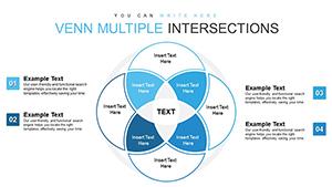
39 Venn Diagrams: What You Get
39 editable Venn diagrams come in the PPTX download.
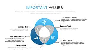
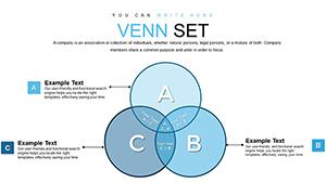
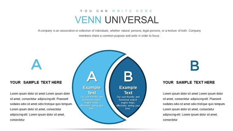
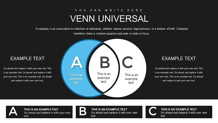
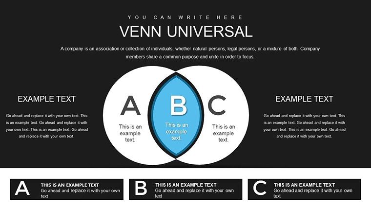
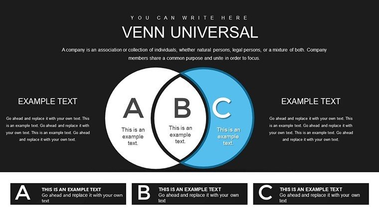
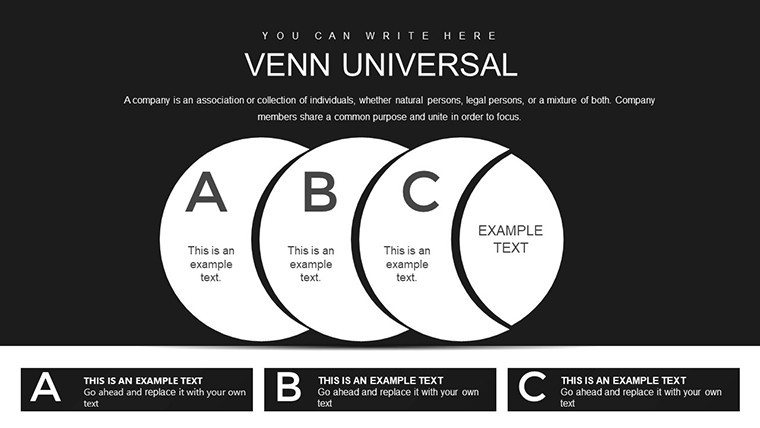
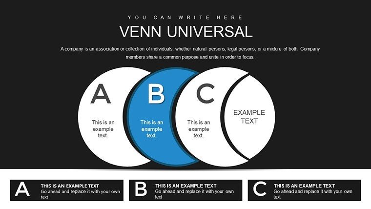
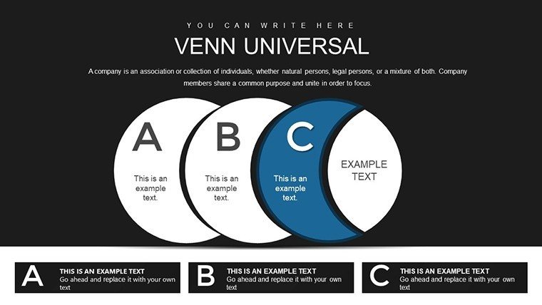
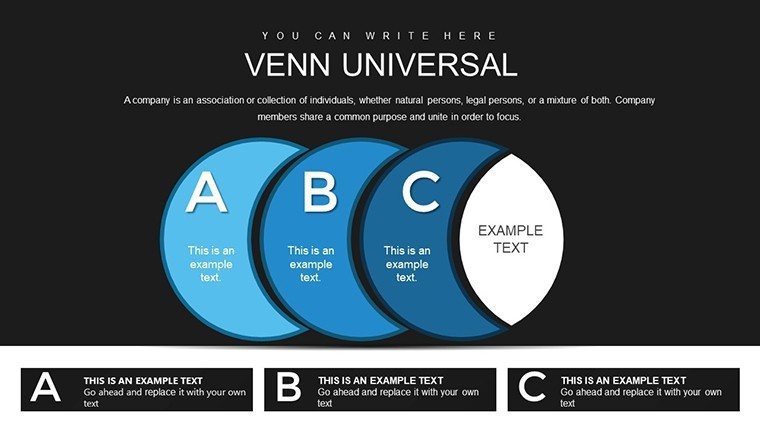
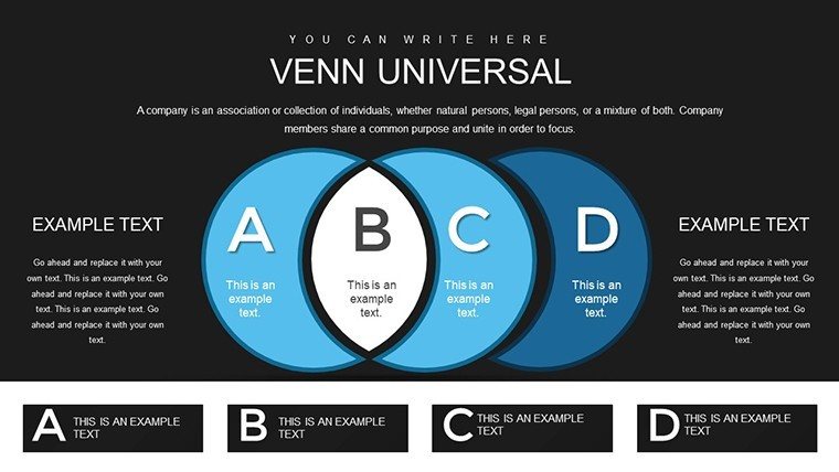
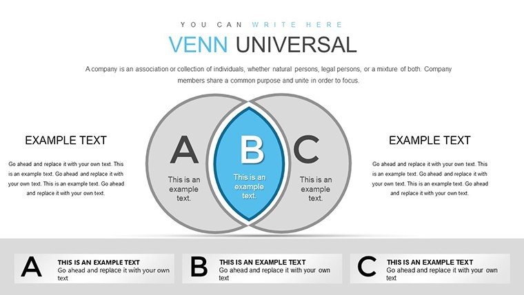
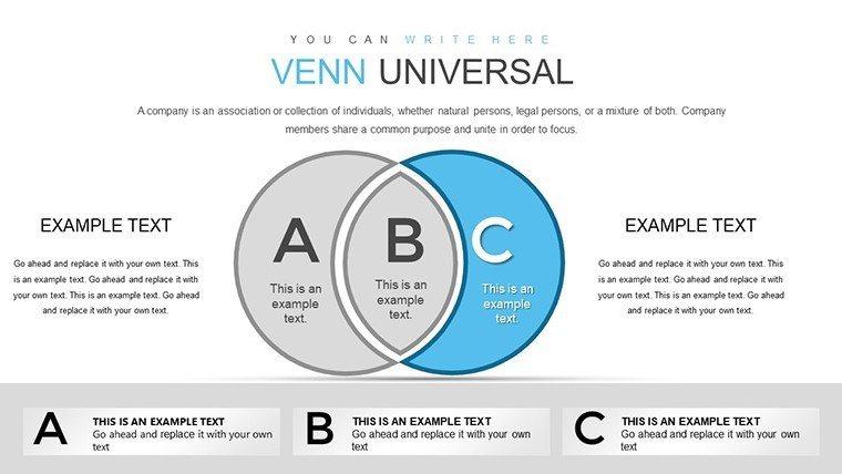
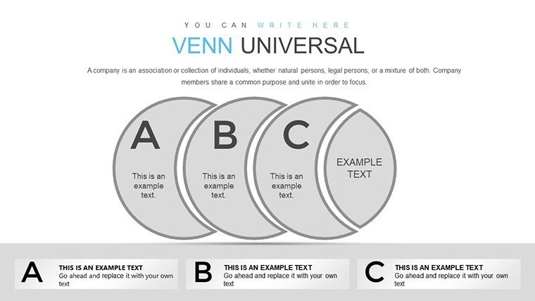
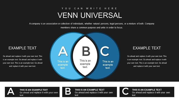
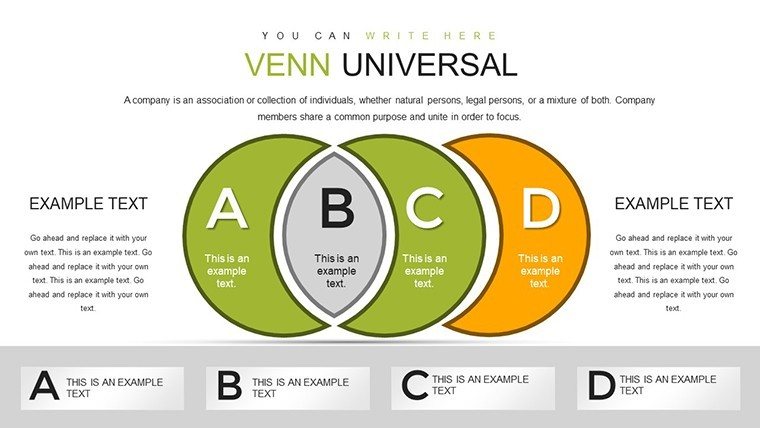
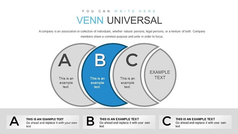
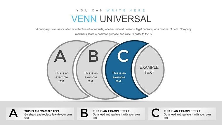
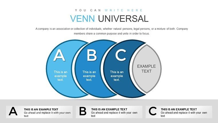
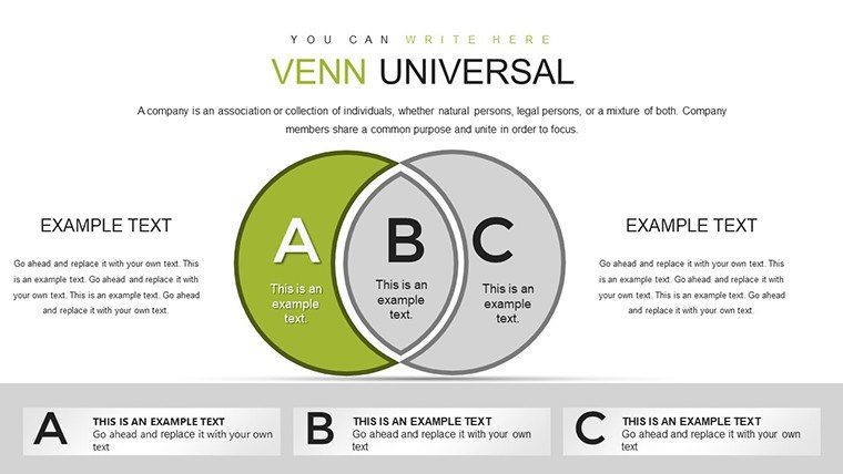
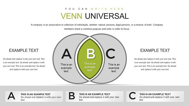
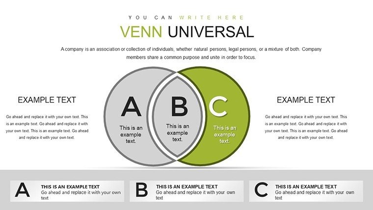
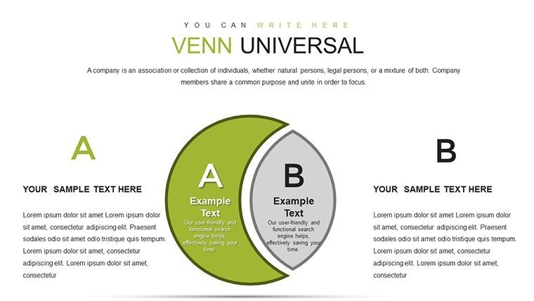
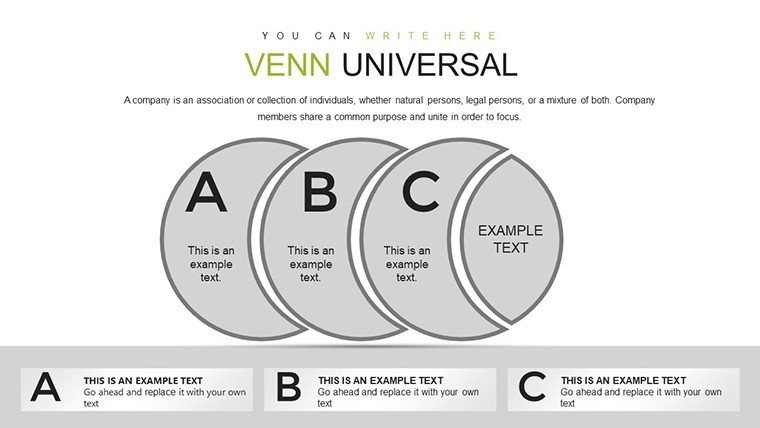
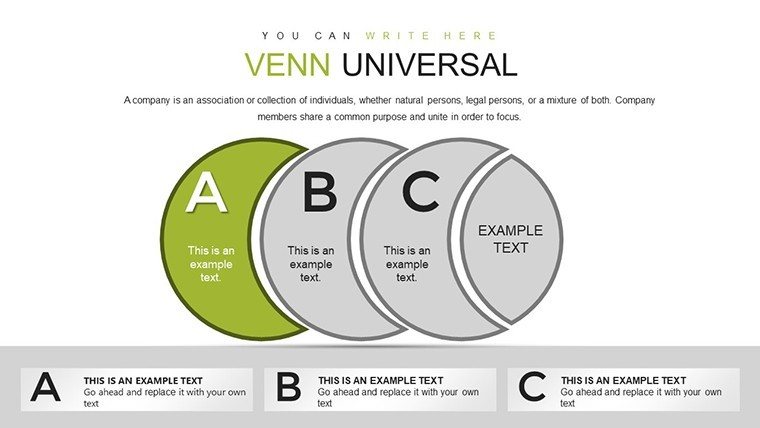
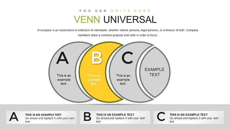
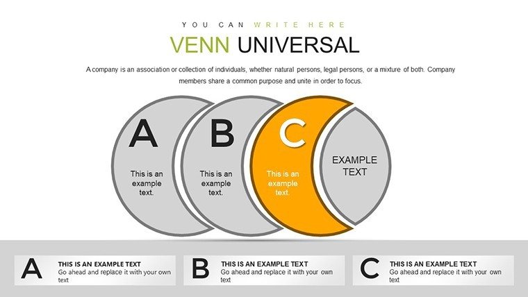
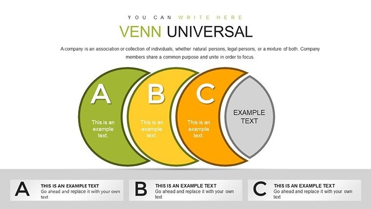
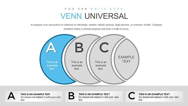
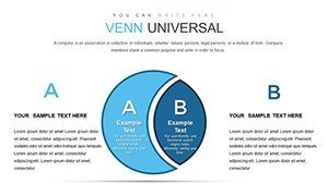
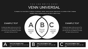
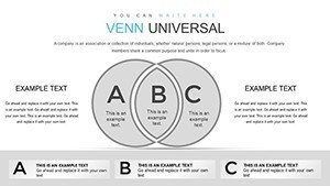
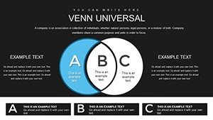
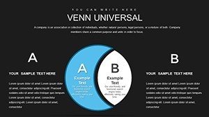
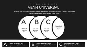
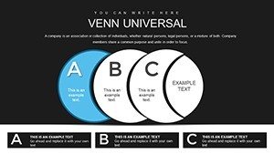
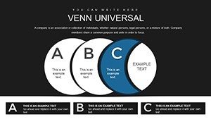
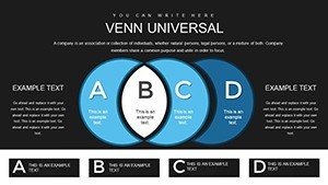
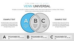
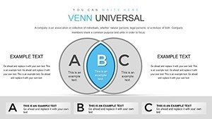
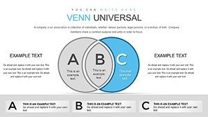
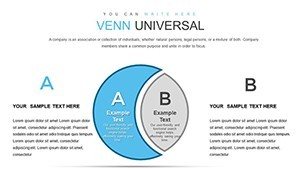
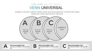
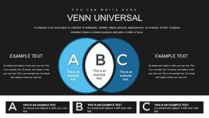
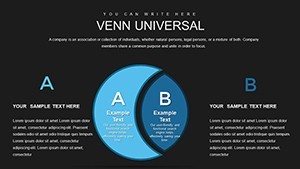
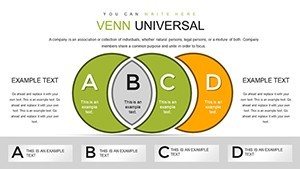
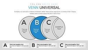
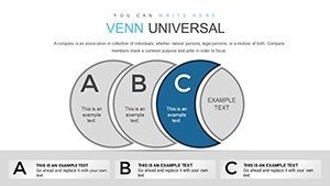
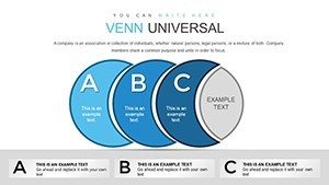
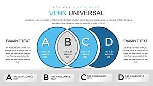
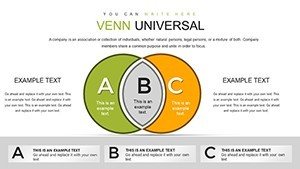
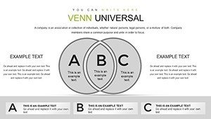
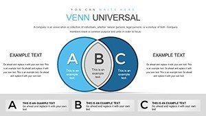
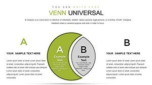
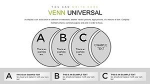
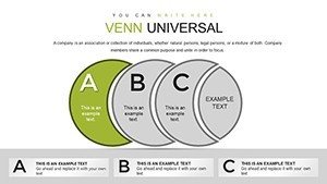
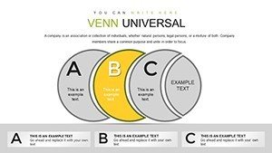
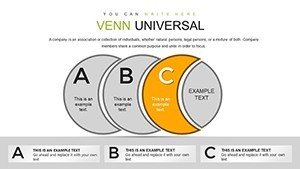
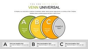
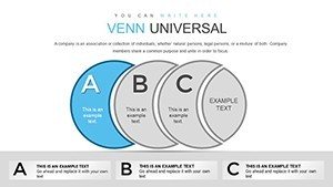
Layouts display set overlaps and intersections through zone segmentation by color contrast in business presentation contexts.
This template differs from hierarchy or cycle sets by focusing on intersection areas with clear boundary lines as one specific visual characteristic.
It fits set analysis tasks in market segmentation because the overlap visualization reveals shared capabilities faster than text tables.
The single purchase covers all 39 slides with full editing access.
Format and Compatibility Details
| Feature | Details |
|---|---|
| Slides included | 39 Venn diagrams |
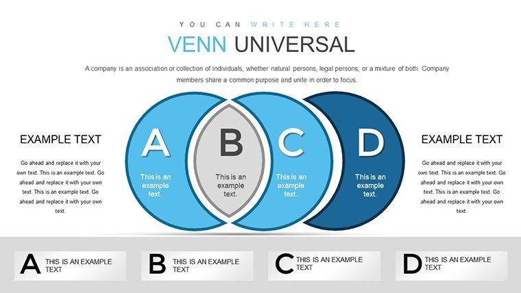
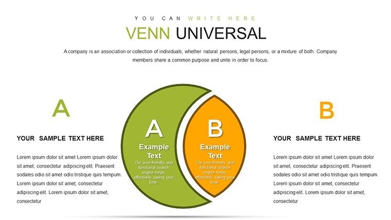
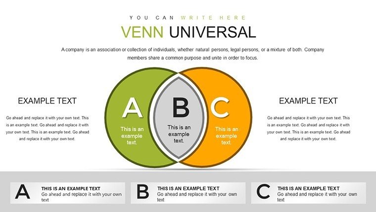
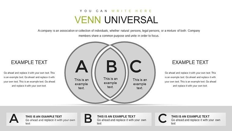
| Diagram categories | two-set to four-set overlaps |
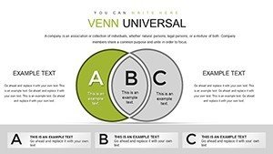
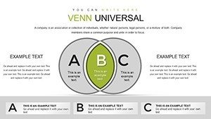
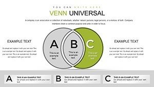
| Editable shapes | circles resize and recolor independently |
| Text placeholders | labels update without regrouping |
| Color theme adjustments | slide master palette updates zones |
| Diagram connectors | no connectors needed for overlaps |
| Aspect ratio | 16:9 |
Typical Use Cases by Role
Strategic analysts in consulting firms map market segments.
They adapt overlaps for three client proposals and cut preparation from three hours to forty five minutes.
Marketing leads in consumer goods reuse the same Venn file across five quarterly briefings by changing color contrast and maintain consistent layout composition.
Analysts pair these with intersection overlap diagrams for deeper connections.
Secure the full set of 39 Venn diagrams for your next analysis session.
How to Make It Yours in Under 20 Minutes
Editing difficulty: Moderate.
1. Open the .pptx file in PowerPoint (1 minute).
2. Replace placeholder text with your content (3 minutes).
3. Adjust brand colors via the slide master (2 minutes).
4. Edit overlap labels (4 minutes).
5. Export as PPTX or PDF (1 minute).
The Cost of Not Using a Template
Building equivalent Venn diagrams from scratch requires two hours per slide for circle alignment alone.
Intermediate design skill is essential to balance zone segmentation.
Many presentations overcrowd intersections making information spacing hard to read on screens.
This layout keeps overlaps clean with external labels preserving readability in live meetings.
Strategic teams reference venn-powerpoint_chart-templates or set relationship diagrams for variations.
Which PowerPoint versions does the template support?
The PPTX opens in PowerPoint 2016 and later versions including 2019 and Microsoft 365. Mac versions work as well. Earlier versions may need import but editable shapes and diagram connectors stay functional. Always verify compatibility on your system before large edits.
How do I change the color scheme?
Open the slide master view and update the theme colors once. All 39 diagrams receive the new palette through color theme adjustments automatically. No manual recoloring of each overlap zone is required. The change takes under two minutes in any strategy meeting preparation.
What license terms apply for client work?
The single purchase permits use in paid client work and internal business presentation. You can modify diagrams for board briefing or investor deck needs. Resale of the file or diagrams as templates is not allowed. Sublicensing remains prohibited under the terms.
What file format is provided?
Only the PPTX format is included and opens directly in PowerPoint. No additional formats such as Keynote or JPG appear in the download. Export options remain available after edits via diagram connectors and text placeholders. The file size supports quick transfer for quarterly review preparation.
Does the template include animation support?
No built-in animations exist in the 39 slides. You can add standard PowerPoint entrance or emphasis effects to editable shapes afterward. Removal of any added animation requires only the animation pane. This keeps focus on visual hierarchy without extra complexity.
What differences exist between free and paid versions?
The page does not detail any free version. The paid purchase delivers the complete 39 editable slides in one PPTX file. Full access to all diagram categories and color theme adjustments becomes available immediately. No limited slide count or watermarks appear in the paid tier.