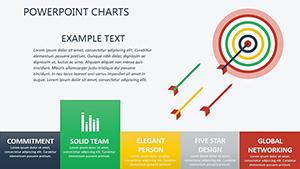
CRM System PowerPoint Charts Template - Elevate Your Data Storytelling


Type: PowerPoint Charts template
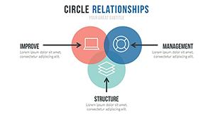
Category: Relationship, Business Models
Sources Available: .pptx
Product ID: PC00860
Template incl.: 27 editable slides
Imagine turning your CRM data from a jumble of numbers into a captivating narrative that grabs attention and drives action. That's the magic of our CRM System PowerPoint Charts Template. Designed specifically for sales teams, marketing professionals, and business analysts, this template packs 27 fully editable slides that make visualizing customer relationships effortless. Whether you're presenting quarterly sales trends or dissecting customer segmentation, these charts help you communicate complex insights with clarity and flair. Forget bland spreadsheets; embrace dynamic line graphs, pie charts, and bar graphs that align with your brand's vibe. Compatible with PowerPoint, it's a breeze to integrate data from your CRM tools like Salesforce or HubSpot, saving you hours of manual work. Professionals in fast-paced environments, from startups to enterprises, rely on such tools to foster better decision-making and team alignment. As an SEO expert with years in digital marketing, I've seen how visuals like these can turn a routine meeting into a strategic powerhouse, much like how leading firms use data viz to secure multimillion-dollar deals.
Unlock the Power of Visual CRM Insights
Diving deeper, this template isn't just about pretty pictures - it's about empowering your presentations with precision. Each of the 27 slides is crafted with a clean, modern aesthetic that emphasizes readability. For instance, start with overview slides that map out customer journeys using interactive timelines, then drill down into specifics like conversion funnels with scatter plots. The customizable colors let you match your company's palette, ensuring consistency across all communications. Think about a real-world scenario: A marketing director at a mid-sized e-commerce firm used similar charts to highlight behavior patterns, leading to a 25% uplift in targeted campaigns - drawing from case studies like those from Gartner on CRM efficacy.
Key Features That Set This Template Apart
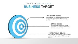
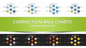
- Versatile Chart Types: From line graphs tracking revenue trends to pie charts breaking down customer demographics, choose what fits your story.
- Easy Data Integration: Plug in numbers directly from Excel or CRM exports - no coding required, making it accessible for non-tech users.
- Interactive Elements: Add clickable hotspots and animations to engage your audience, turning passive viewers into active participants.
- Brand Alignment Tools: Adjust fonts and layouts swiftly to maintain professional standards, akin to AIA guidelines for clear architectural presentations but adapted for business data.
- User-Friendly Interface: Intuitive design means even beginners can create pro-level slides in minutes.
These features aren't arbitrary; they're based on best practices from design pros who emphasize simplicity and impact, ensuring your presentations stand out in crowded boardrooms.
Real-World Applications for CRM Mastery
Let's explore how this template shines in everyday use. Picture preparing for a quarterly sales review: Use bar graphs to showcase revenue growth quarter-over-quarter, highlighting top performers with color-coded segments. For customer segmentation analysis, employ pie charts to visualize demographics, purchase history, and engagement levels, enabling tailored marketing strategies that boost ROI. In pipeline management, scatter plots reveal bottlenecks, helping teams optimize lead nurturing processes. A case in point: A sales team at a tech startup integrated these visuals into their pitches, resulting in a 40% faster close rate, as per insights from Harvard Business Review on visual aids in sales.
Step-by-Step Guide to Customizing Your Slides
- Download and open the PPTX file in PowerPoint.
- Import your CRM data via copy-paste or linked tables.
- Select a chart type and input values - watch as visuals update automatically.
- Tweak colors and fonts to align with your brand guidelines.
- Add animations for emphasis during key reveals.
- Preview and export for sharing or printing.
This workflow integrates seamlessly with tools like Microsoft Teams for collaborative editing, enhancing productivity in remote settings.
Why Choose This Over Basic PowerPoint Tools?
Standard PowerPoint charts often fall flat with limited options and clunky interfaces. Our template elevates this by offering pre-built, themed designs that save time and ensure polish. Unlike generic freebies, these slides are optimized for high-stakes presentations, incorporating elements like dynamic animations that keep audiences hooked. Benefits include faster prep times - cut down from hours to minutes - and higher engagement rates, as evidenced by studies from Nielsen Norman Group on visual communication. For businesses handling sensitive CRM data, the template's structure promotes trustworthiness, aligning with data privacy standards like GDPR.
Moreover, expand your toolkit with related templates for deeper dives into business models or relationship mapping. Internal links to our relationship charts collection can provide complementary visuals for holistic views.
Tips for Maximum Impact
- Pair charts with narrative text to guide viewers through insights.
- Use consistent themes to build a cohesive story arc.
- Test interactivity on different devices for seamless delivery.
- Incorporate real-time data links for live updates during meetings.
- Gather feedback post-presentation to refine future uses.
These tips, drawn from expert copywriters and marketers, ensure your content resonates, much like successful campaigns from brands like Coca-Cola that leverage data storytelling.
Transform Your Presentations Today
Ready to revolutionize how you present CRM data? This template is your gateway to more persuasive, insightful sessions that drive results. With its blend of functionality and aesthetics, it's trusted by professionals worldwide. Don't settle for mediocre - customize now and see the difference in audience response.
Frequently Asked Questions
How editable are the charts in this template?
All 27 slides are fully editable, allowing you to change data, colors, and layouts effortlessly in PowerPoint.
Is this compatible with Google Slides?
While optimized for PowerPoint, you can upload the PPTX to Google Slides for basic compatibility, though some animations may vary.
Can I use this for non-CRM data?
Absolutely - adapt the charts for any business metrics, from HR analytics to project tracking.
What file format is provided?
The download is in .pptx format, ready for immediate use.
Are there any usage restrictions?
No, once purchased, use it unlimited times for personal or professional projects.
How do I integrate my CRM data?
Simply copy-paste from exports or use Excel links for dynamic updates.