Promo code "00LAYOUTS"
Editable Multi-Metric Dashboard Chart for PowerPoint
Type: PowerPoint Charts template
Category: Cycle
Sources Available: .pptx
Product ID: PC00771
Template incl.: 24 editable slides
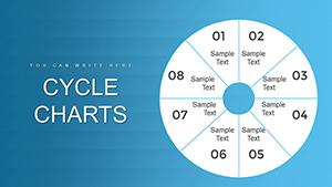
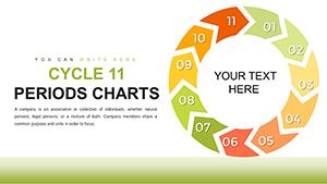
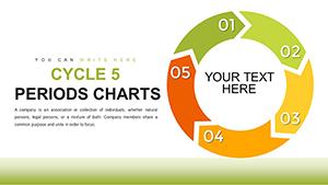
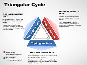
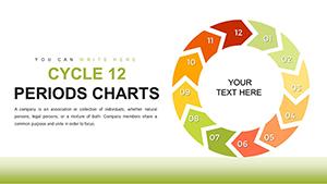
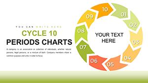
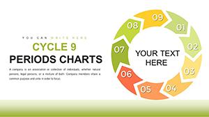
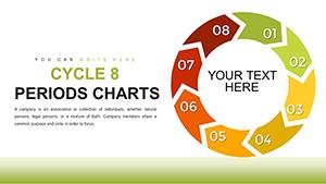
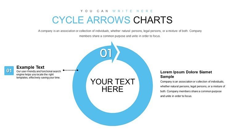
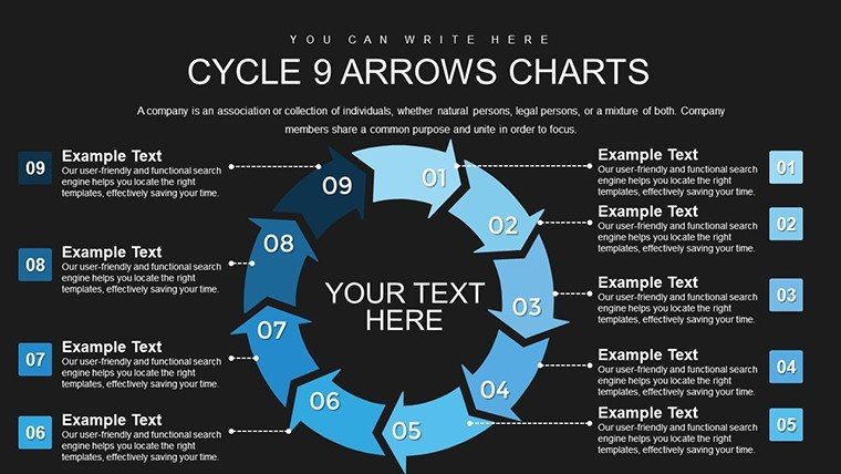
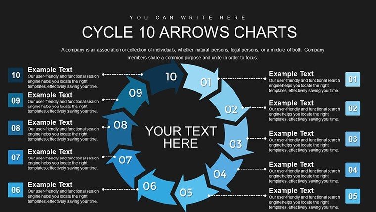
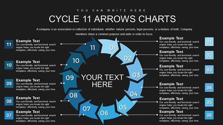
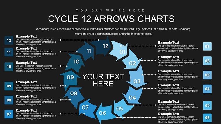
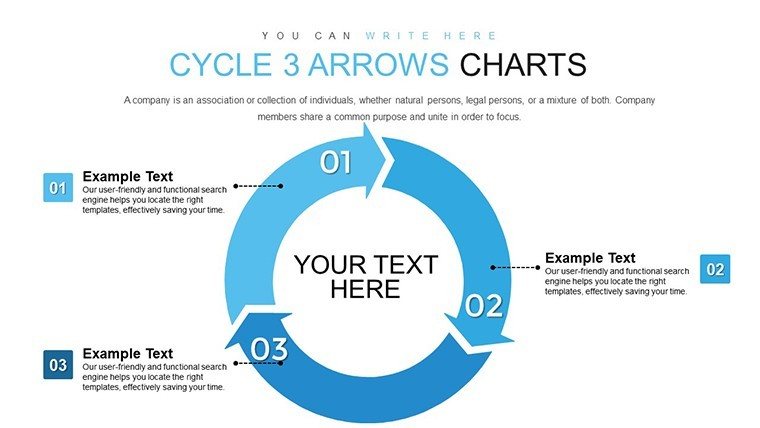
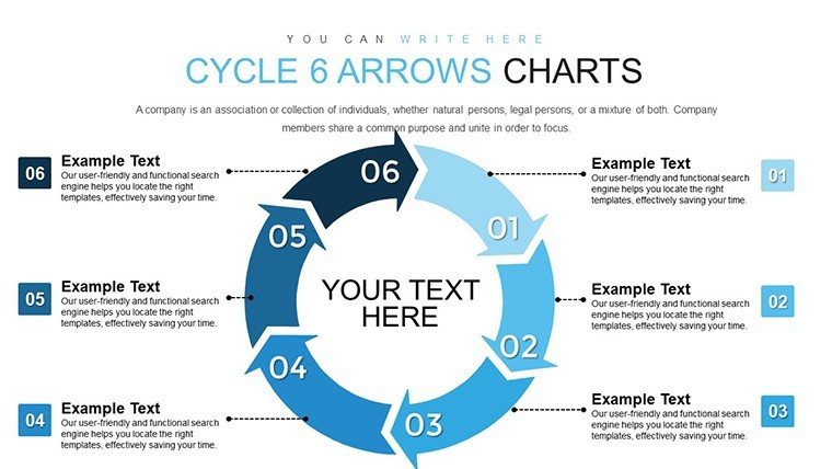
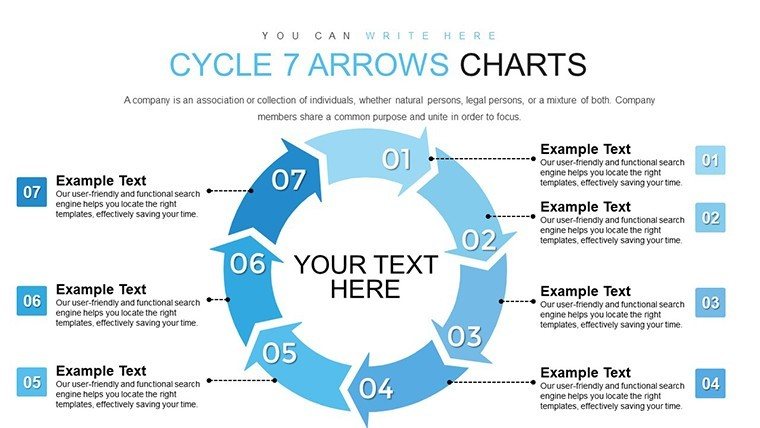
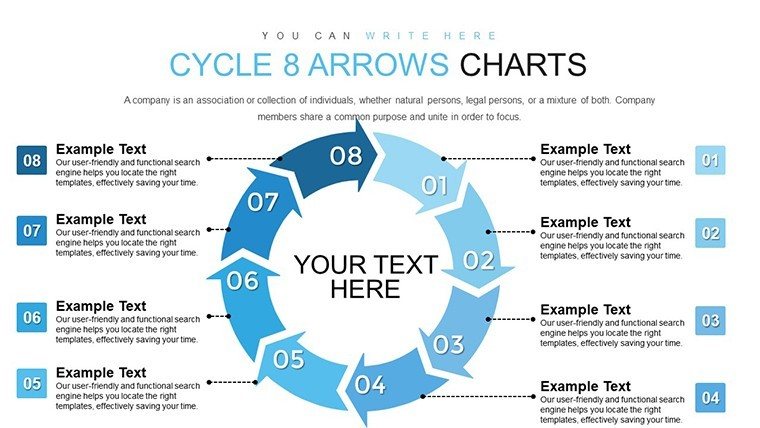
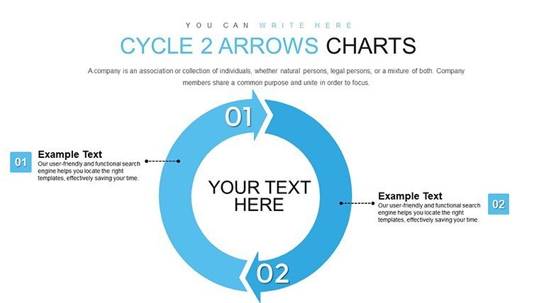
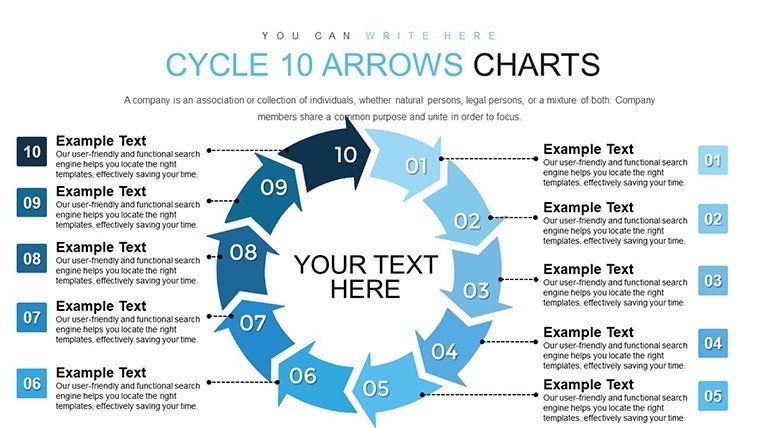
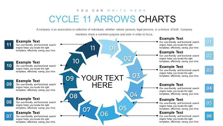
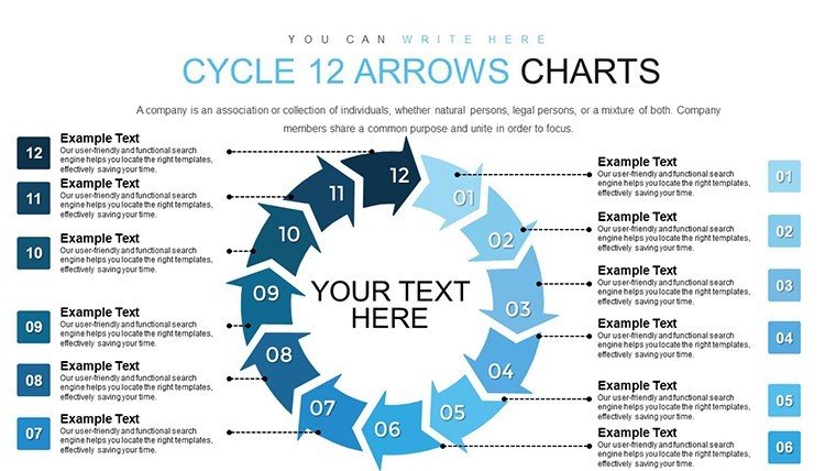
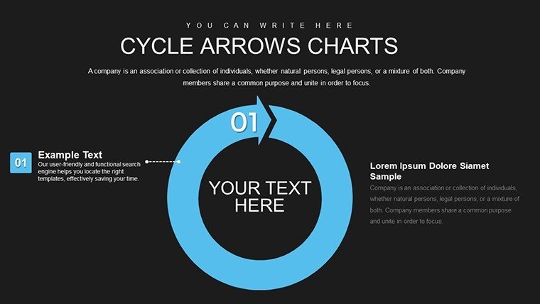
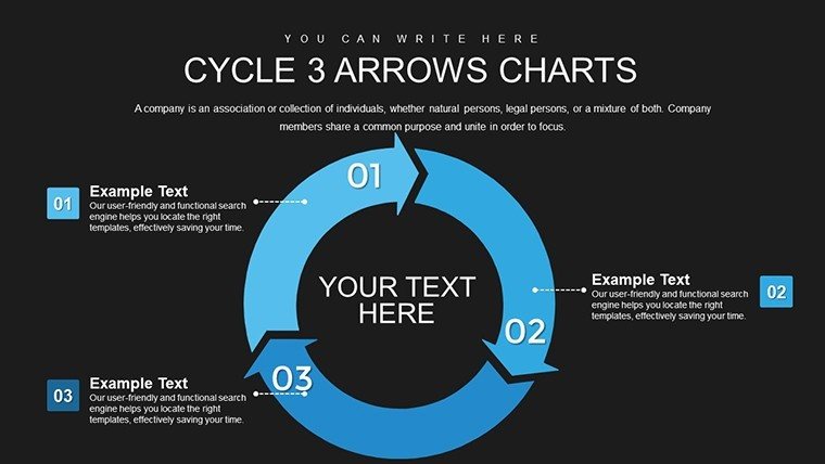
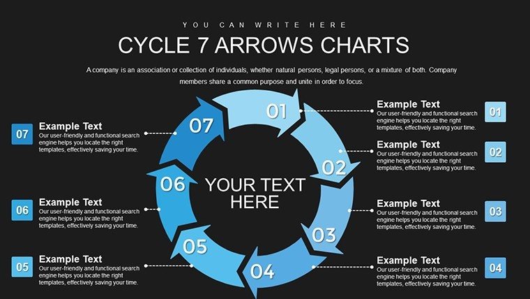
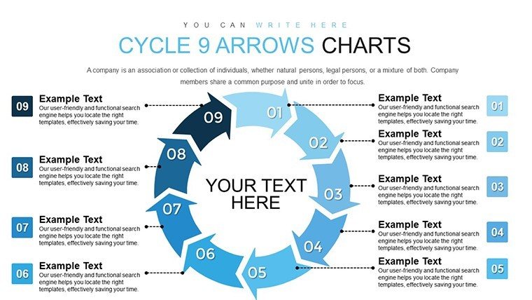
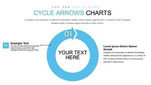
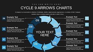
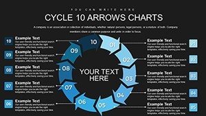
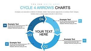
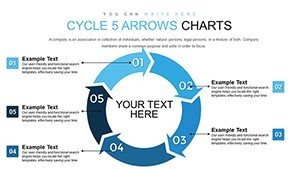
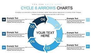
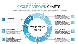
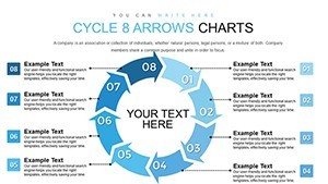
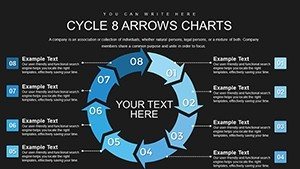
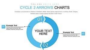
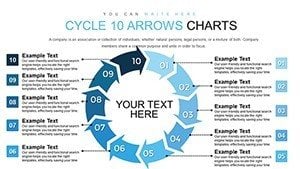
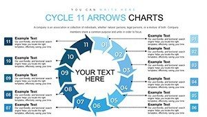
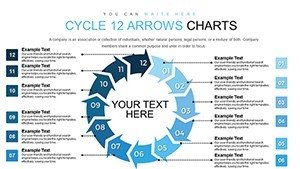
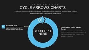
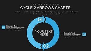
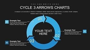
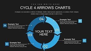
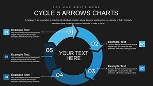
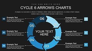
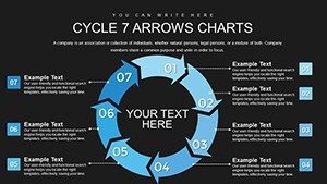
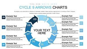
Multi-Metric Dashboard Chart Template for PowerPoint and Google Slides
Executive teams demand dashboards that consolidate scattered metrics into a single, scannable view - no scrolling, no clicking through tabs, no hunting for context. This multi-metric dashboard chart template delivers exactly that: a unified layout where sales figures, conversion rates, customer retention scores, and operational KPIs coexist in structured panels. Designed for monthly business reviews, investor updates, quarterly board meetings, and performance tracking sessions, this template eliminates the friction between data collection and strategic discussion.
Every chart panel is fully editable - swap out metric names, adjust target thresholds, update values, and apply your brand colors without leaving PowerPoint. The template supports PowerPoint 2016 and newer, Keynote, and Google Slides, ensuring compatibility across Mac, Windows, and cloud-based workflows. Download the file, open it in your preferred platform, and start customizing immediately - no plugins, no macros, no external dependencies.
Dashboard Components Engineered for Clarity
The template organizes metrics into modular panels - each panel displays a KPI name, current value, target benchmark, and visual indicator showing whether performance is on track, ahead, or lagging. Gauge charts, progress bars, and trend arrows provide instant status reads without requiring numerical literacy. A color-coded traffic light system - green for exceeding targets, yellow for approaching thresholds, red for underperformance - accelerates comprehension during fast-paced presentations.
You can configure up to eight metric panels on a single slide, balancing detail with readability. Each panel includes editable labels for metric names, time periods, and comparison contexts like "vs. last quarter" or "vs. target." Shape groupings let you rearrange panel positions, resize individual components, and maintain alignment automatically using PowerPoint's built-in distribution tools.
Professional Use Cases That Drive Accountability
CFOs use this dashboard to present financial health snapshots - revenue growth, gross margin, operating cash flow, and days sales outstanding - giving boards a complete fiscal picture in seconds. CMOs track marketing funnel efficiency by displaying website traffic, lead generation rates, cost per acquisition, and marketing qualified lead conversion, revealing bottlenecks and optimization opportunities.
Operations directors monitor production metrics like throughput, defect rates, on-time delivery percentages, and inventory turnover, identifying process deviations before they escalate into shipment delays. Customer success teams present retention rates, net promoter scores, churn percentages, and average resolution times, connecting support quality to revenue outcomes.
Workflow Integration for Real-Time Reporting
Pull metric values from your CRM, ERP, or analytics platform - Salesforce, HubSpot, Google Analytics, Tableau - and paste them directly into the dashboard template. Update values weekly, monthly, or quarterly without rebuilding the slide layout. For automated workflows, export data snapshots to Excel, then copy-paste into the template's text fields, preserving number formatting and decimal precision.
Save the customized dashboard as a PowerPoint master slide within your corporate template library. Each reporting cycle, duplicate the master, update metric values, and append it to your executive deck. This approach ensures visual consistency across reports while eliminating redundant design work. Teams using Google Slides can upload the PPTX file and edit collaboratively, with all stakeholders viewing live updates during review sessions.
Real-World Scenarios Where Dashboards Accelerate Decisions
Monthly leadership meetings: A COO opens the session with a dashboard showing safety incidents, employee turnover, training completion rates, and operational cost variance. The visual summary frames the agenda - leaders immediately see which areas require deep dives and which are performing as expected.
Investor roadshows: A startup CEO presents growth metrics - monthly recurring revenue, user acquisition cost, lifetime value ratios, and burn rate - in a single dashboard slide. Investors assess unit economics and scalability potential without flipping through spreadsheets or requesting supplemental data.
Client QBRs: An agency account manager displays campaign performance across paid search, display advertising, email marketing, and social media. The dashboard reveals which channels deliver ROI and which need budget reallocation, supporting data-driven recommendations within the meeting.
Comparison Table: Dashboard Template vs. Spreadsheet Screenshots
| Factor | Dashboard Template | Excel Screenshots |
|---|---|---|
| Visual Hierarchy | Designed for presentation; key metrics highlighted with icons and color | Dense grid layout; audiences must parse rows and columns under time pressure |
| Update Speed | Change values in labeled text fields; formatting stays intact | Screenshot, crop, paste; repeat for every metric change |
| Stakeholder Engagement | Visual indicators trigger immediate questions about red/yellow zones | Numbers blur together; requires verbal explanation to highlight issues |
| Brand Alignment | Customizable colors, fonts, and logos match corporate identity | Generic Excel styling; branding limited to slide background |
| Reusability | Save as master slide; populate with new data each period | Recreate screenshots every reporting cycle; no template reuse |
Industry Applications for Multi-Metric Dashboards
SaaS companies: Product managers display user engagement metrics - daily active users, feature adoption rates, session duration, and support ticket volume - identifying friction points in the product experience and prioritizing feature roadmaps.
Logistics firms: Fleet managers track delivery completion percentages, fuel cost per mile, vehicle utilization rates, and driver safety scores, optimizing routes and reducing operational expenses through data visibility.
Hospitals: Quality improvement teams monitor patient wait times, bed occupancy rates, medication error incidents, and patient satisfaction indices, ensuring clinical standards and regulatory compliance in a single view.
E-commerce platforms: Growth teams present conversion rates, cart abandonment percentages, average order values, and return rates, diagnosing checkout friction and guiding A/B testing priorities.
Nonprofits: Development directors show donor retention rates, fundraising costs, grant application success rates, and program reach metrics, demonstrating impact to board members and major donors.
Customization Strategies for Maximum Readability
Limit each dashboard slide to six to eight metrics - more than that overwhelms audiences and dilutes focus. Prioritize metrics that directly influence quarterly goals or board-level decisions. Use consistent icon styles across panels; mixing flat icons with 3D graphics creates visual noise. Apply a neutral background color - light gray or white - so metric panels stand out without competing for attention.
When presenting to technical audiences, include sparklines or mini trend charts within each panel, showing three to six months of historical context. For executive audiences, strip out historical trends and display only current values versus targets - they want yes/no answers, not analytical deep dives. Always label units clearly: percentages, dollar amounts, days, counts - ambiguity erodes trust in data accuracy.
This multi-metric dashboard template transforms fragmented reporting into cohesive strategic conversations, making performance tracking effortless and accountability visible. Download now and turn your next business review into a decision-making session, not a data-reading exercise.
Frequently Asked Questions
Can I link this dashboard to live data sources like Google Sheets or Excel?
PowerPoint and Google Slides do not support real-time data connections natively. However, you can use paste-link in PowerPoint to connect Excel ranges, so updates in Excel refresh when you reload the presentation. For Google Slides, copy data from Sheets and paste it into text fields; changes require manual refresh but preserve formatting.
How do I add or remove metric panels from the dashboard?
Select an existing metric panel by clicking on it, then copy and paste to create duplicates. To remove a panel, select all shapes within that panel and delete. Use PowerPoint's alignment and distribution tools under the "Arrange" menu to maintain even spacing after adding or removing panels.
Does the template include instructions for changing gauge chart values?
Yes, gauge charts use grouped shapes with editable arc segments. Select the gauge, ungroup the shapes if needed, and adjust the colored arc length to reflect the new metric value. Text boxes within each gauge display the numerical value - click and type to update. Detailed instructions are included in the template notes section.
Can I use this template for weekly status reports or only monthly reviews?
The dashboard adapts to any reporting frequency. Change the time period labels from "Monthly" to "Weekly" or "Quarterly" by editing the text fields. The visual structure remains effective whether you update metrics daily, weekly, or annually - frequency depends on your organizational cadence and data availability.
Is the template compatible with older PowerPoint versions like 2013 or 2010?
The template is optimized for PowerPoint 2016 and later due to advanced shape formatting and grouping features. If you open it in PowerPoint 2013 or 2010, most elements will display correctly, but some gradient effects or shape alignment may require manual adjustment. Upgrading to a current version ensures full compatibility and editing flexibility.
Can I share this template with my team or clients after purchase?
You may use the template in presentations for your team or clients, including embedding it in decks you deliver. However, you cannot redistribute the template file itself as a standalone product or share it in template libraries. Each user who wants to edit the source file should purchase their own license.
