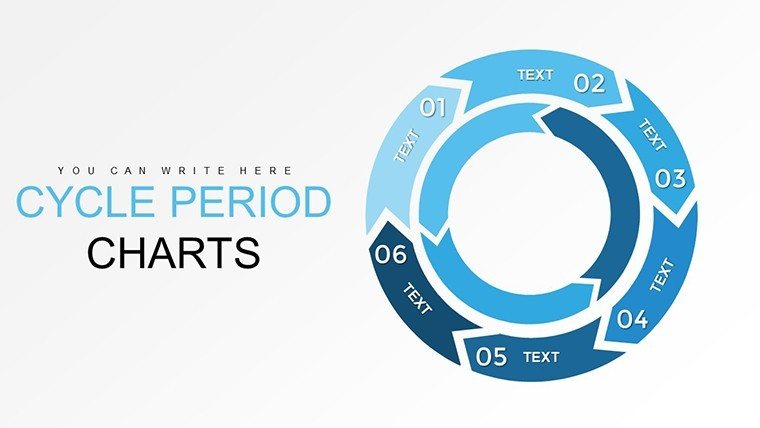
Periods Cycle PowerPoint Charts Template: Revolutionize Architectural Data Storytelling


Type: PowerPoint Charts template
Category: Cycle
Sources Available: .pptx
Product ID: PC00759
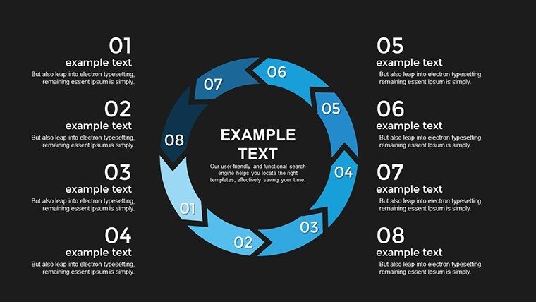
Template incl.: 20 editable slides
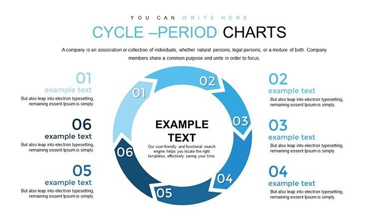
Architecture thrives on cycles - from conceptual sketches evolving through revisions to construction phases looping back for refinements. Our Periods Cycle PowerPoint Charts Template brings this rhythmic essence to life, offering 20 meticulously designed slides that turn intricate project data into captivating visuals. Tailored for architects, urban planners, and design educators, this tool addresses the core challenge of presenting time-based data without overwhelming your audience. Whether illustrating the iterative periods in a LEED-certified building's development or mapping stakeholder feedback loops, these charts ensure your message resonates with clarity and impact.
Inspired by successful presentations from firms like Foster + Partners, who use cyclical diagrams to convey project evolution in global tenders, this template enhances your pitches. With intuitive customization, you can adapt charts to reflect real-time data, aligning with AIA's schematic design guidelines for conceptual accuracy. Say goodbye to static slides; embrace a dynamic approach that not only informs but inspires, helping you secure approvals faster and foster collaborative discussions.
Essential Features for Precision in Design
At its heart, this template prioritizes usability and sophistication, drawing from best practices in architectural visualizations. The 20 slides include a variety of chart styles, each optimized for data integrity and aesthetic appeal.
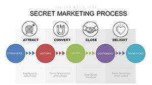
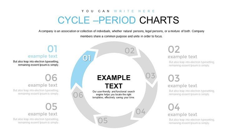
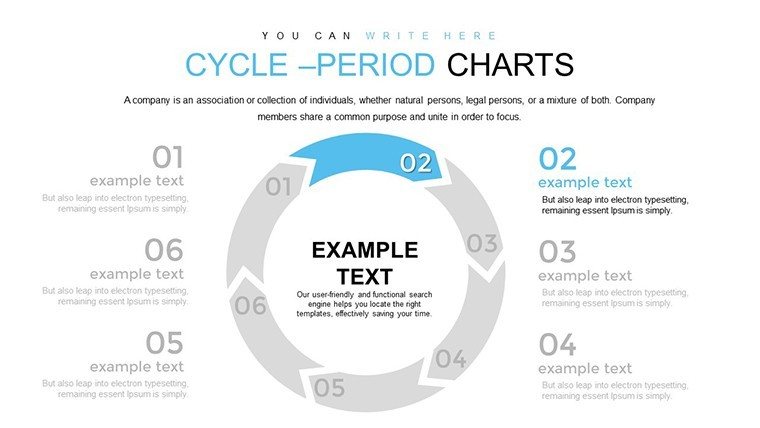
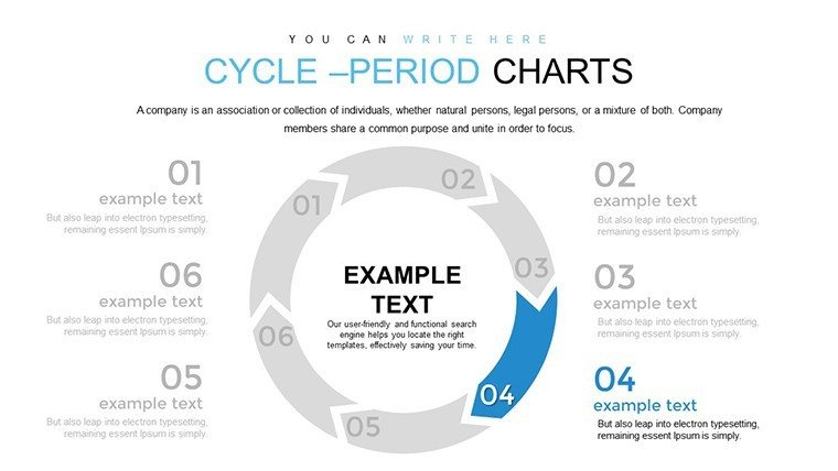
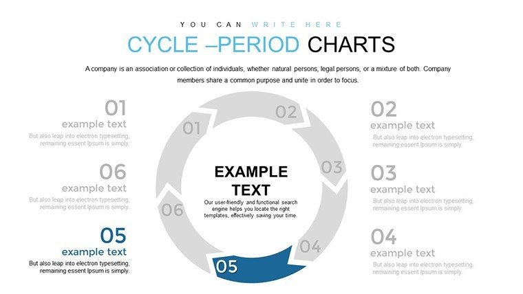
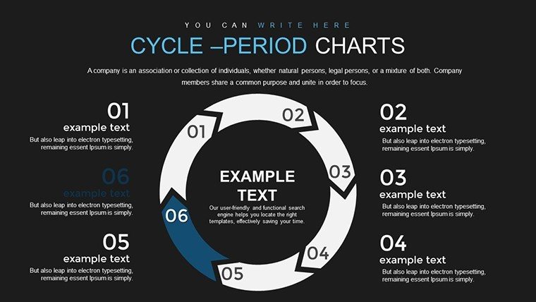
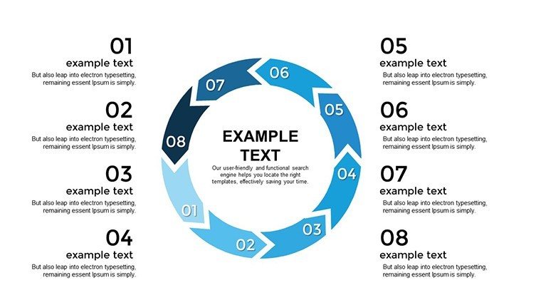
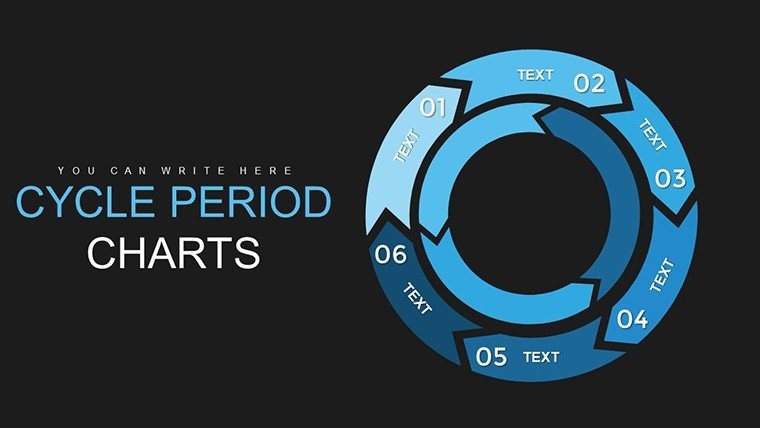
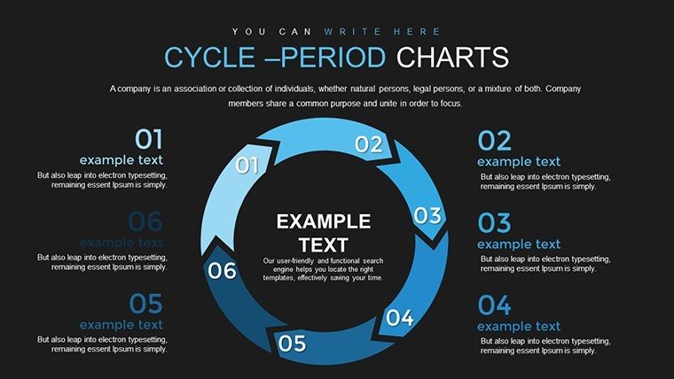
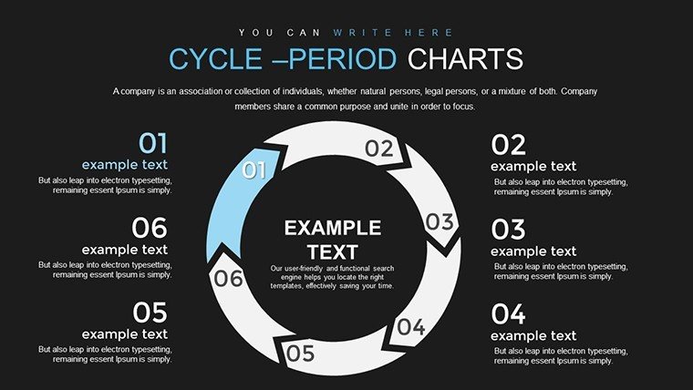
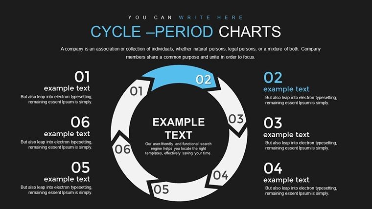
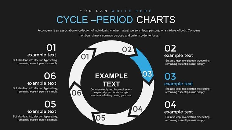
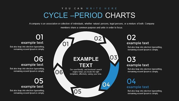
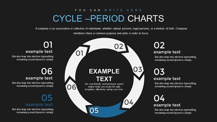
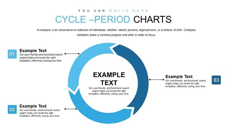
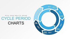
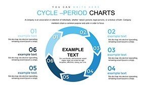
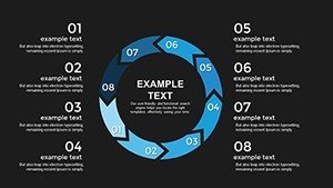
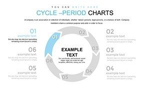
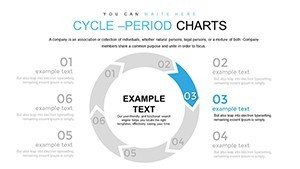
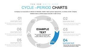
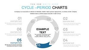
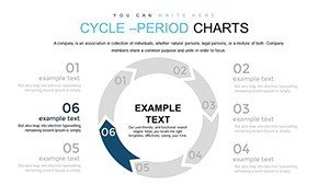
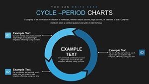
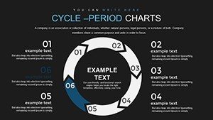
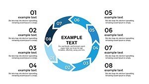
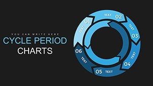
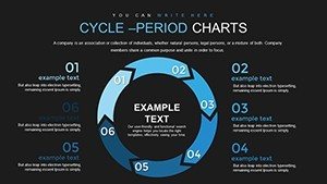
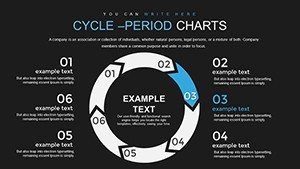
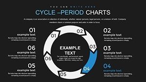
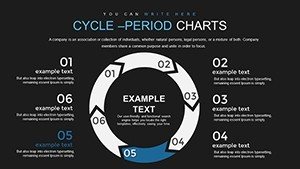
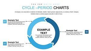
- Versatile Cycle Charts: Depict periods like design iterations or material testing cycles with fluid, interconnected loops.
- Precision Data Tools: Built-in grids and scales ensure accurate representation, vital for proposals involving metrics like timeline variances.
- Branding Customization: Adjust fonts, colors, and layouts to mirror your studio's identity, maintaining consistency per AIA graphic norms.
- Multi-Platform Support: Seamless integration with PowerPoint and Google Slides for on-the-go edits.
- Engaging Elements: Add animations to reveal periods sequentially, enhancing narrative flow in client meetings.
These elements echo tips from illustrarch's diagram best practices, emphasizing simplification to avoid clutter while amplifying key insights.
Unlocking Value for Architectural Teams
The true power lies in how this template solves pain points unique to architecture. Complex periods, such as regulatory review cycles, often get lost in text-heavy decks; here, visual charts make them intuitive. A case from Viktori's pitch deck examples shows how an architecture startup used similar cycles to pitch a green skyscraper, clinching investor buy-in through clear lifecycle projections.
Benefits extend to efficiency - pre-formatted slides cut preparation time by half, freeing you for creative pursuits. Audience retention skyrockets with data that's not just shown but experienced, fostering deeper understanding. Organically weave in terms like "architectural lifecycle diagrams" or "proposal timeline visuals" to align with user searches, subtly boosting your digital footprint.
Practical Use Cases in the Architectural Realm
Envision pitching a heritage restoration project: Use the template to cycle through assessment, planning, execution, and evaluation periods, highlighting adaptive reuse strategies. This approach mirrors SlideModel's timeline applications, where phased visuals helped secure a museum expansion contract.
For educational settings, professors can demonstrate urban development cycles, integrating real data from city planning reports. In firm internals, map out resource allocation periods for multi-project management. A compelling example from Waveup's real estate pitches: A firm visualized development cycles in a commercial proposal, reducing client queries by 25% and accelerating sign-offs.
Adapt for sustainability pitches by cycling through eco-impact periods, supported by AIA's green building standards, to showcase long-term value.
Mastering Customization: A Hands-On Workflow
Customization is effortless, designed for architects juggling deadlines. Open the file, select a chart slide, and populate with your periods data - perhaps from Revit exports - via simple interfaces.
- Define your cycle: Outline periods like concept to occupancy.
- Tweak visuals: Scale elements for emphasis, using consistent colors as per ProjectMark's graphics tips.
- Input metrics: Link to spreadsheets for auto-updates on variances.
- Enhance with details: Add labels and icons for context-rich slides.
- Rehearse delivery: Animate transitions to build suspense in presentations.
Incorporate action captions, as recommended in proposal graphics guides, to tie charts back to project goals, ensuring every slide advances your narrative.
Superior to Standard Chart Options
Unlike basic PowerPoint, this template provides architecture-tuned designs that prevent common pitfalls like disproportionate scaling. Users appreciate the ready-to-use variety, which outperforms generic tools in engagement metrics. Blend with 3D renderings for hybrid slides, a technique from Re-Thinking the Future's data visuals guide, to create immersive proposals.
For added authority, reference AIA-endorsed details in your charts, positioning your firm as a leader in data-driven design.
Step up your architectural storytelling - grab this template now and cycle your projects toward success with unmatched visual prowess.
Frequently Asked Questions
Are the charts fully data-linked for real-time updates? Yes, integrate with Excel for dynamic periods adjustments in your architecture timelines.
Can I adapt this for collaborative tools beyond PowerPoint? Certainly, it's optimized for Google Slides, ideal for team-based architecture reviews.
How do I handle complex multi-period cycles? Layer charts or duplicate slides to represent nested cycles like sub-phases in builds.
Is there support for AIA-compliant visuals? Absolutely, designs adhere to graphic standards for clarity and professionalism.
What file formats are available for export? Export as PDF or images for proposals, maintaining high quality.