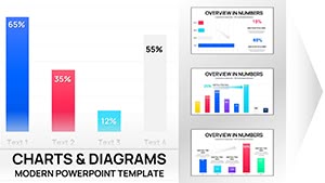
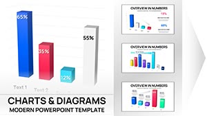
Professional Column Chart PowerPoint Template - Fully Editable & Instant Download


Type: PowerPoint Charts template
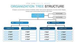
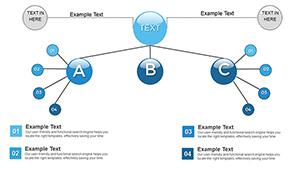
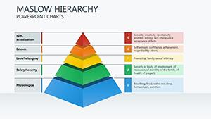
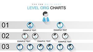
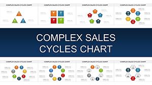
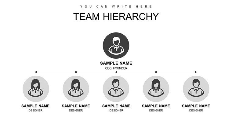
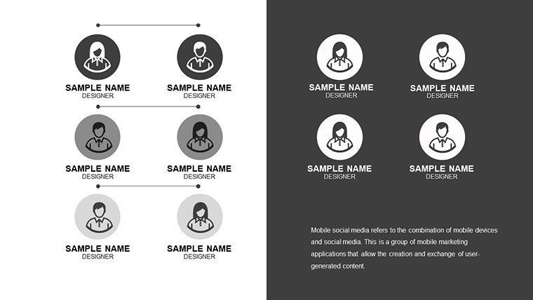
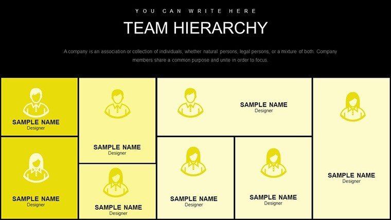
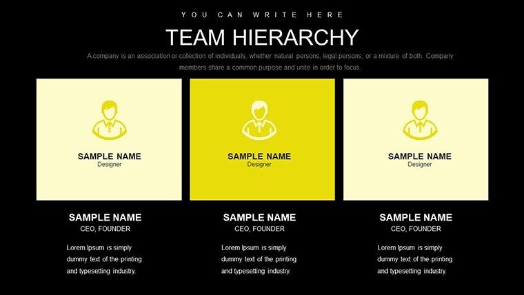
Category: Organizational, Tree
Sources Available: .pptx
Product ID: PC00741
Template incl.: 36 editable slides
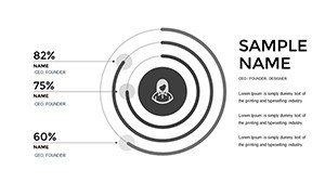
Present categorical data with clear visual hierarchy that makes comparisons immediate and insights obvious. This professional column chart PowerPoint template provides a sophisticated vertical bar structure where differences in magnitude are instantly apparent, helping audiences identify top performers, trends, and outliers within seconds.
Essential for business professionals who need to compare departments, products, regions, or time periods with precision and visual impact.
Key Features
- Clean vertical column layout with strong visual hierarchy
- Professional color palette and labeling system
- Fully editable bars, data labels, axes, and legends
- Multiple chart variations for different data volumes
- High-resolution design optimized for professional presentations
Benefits of Effective Column Charts
Column charts excel at showing discrete category comparisons where relative size matters most. This template ensures your data speaks clearly, allowing stakeholders to focus on analysis rather than interpretation. The professional design enhances credibility and helps maintain audience attention during data-heavy presentations.
Well-executed column charts accelerate understanding and support faster, more confident decision-making.
Professional Use Cases
Sales Reporting: Compare revenue across products, regions, or sales teams to identify top performers and growth opportunities.
Department Performance: Present KPI achievement levels across different business units for leadership reviews.
Market Analysis: Display market share distribution among competitors or category preferences among customer segments.
Survey Results: Visualize response distributions or satisfaction ratings across multiple questions or demographics.
How to Customize Your Column Chart
Input your data directly into the chart - the columns update automatically with accurate scaling. Adjust bar colors for emphasis or branding, modify axis labels for clarity, and add data labels for precision. The template maintains professional proportions and alignment throughout customization.
For best results, limit categories to 8–10 for optimal readability and use contrasting colors to highlight key data points.
Frequently Asked Questions
Can I change the chart from columns to bars (horizontal)?
Yes, PowerPoint allows easy rotation of the chart type from column to bar with a single click while preserving your data and formatting.
How many data series can the chart support?
The template supports multiple data series for grouped or stacked column comparisons, depending on your specific presentation needs.
Are data labels and gridlines customizable?
Yes, all elements including data labels, gridlines, axes, and legends are fully editable for complete control over appearance and emphasis.
Will the chart scale properly with large numbers?
Yes, the template uses dynamic axis scaling that automatically adjusts to accommodate your data range while maintaining clear proportions.
Can I add trendlines or target markers?
Yes, PowerPoint's built-in chart tools allow easy addition of trendlines, error bars, or reference lines directly to the template.