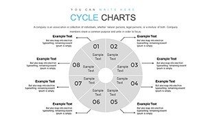
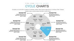
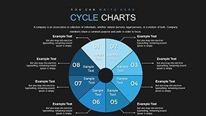
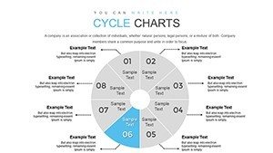
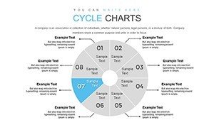
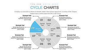
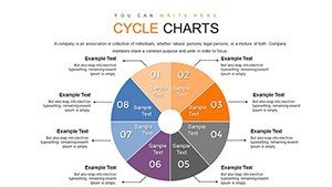
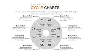
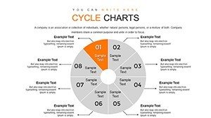
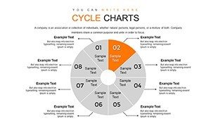
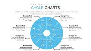
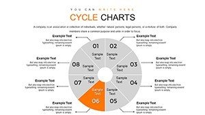
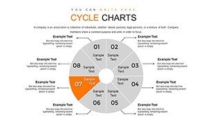
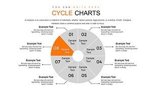
8 Segment Cycle PowerPoint Charts Template


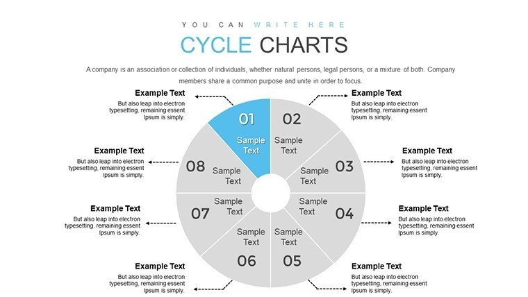

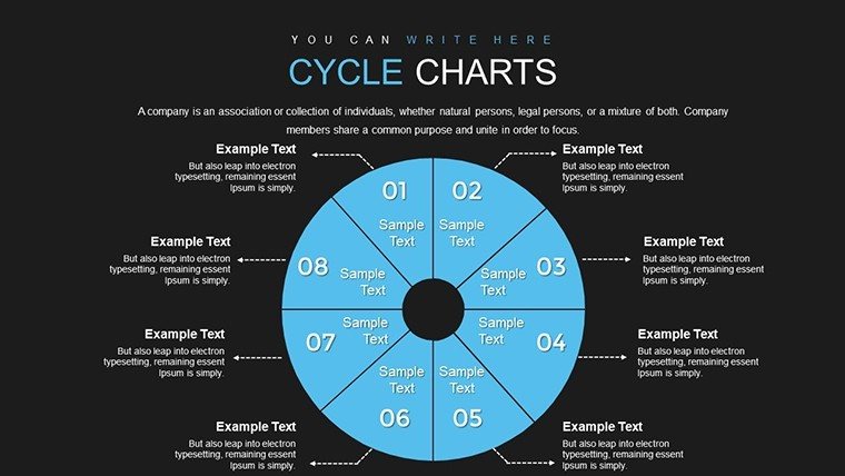
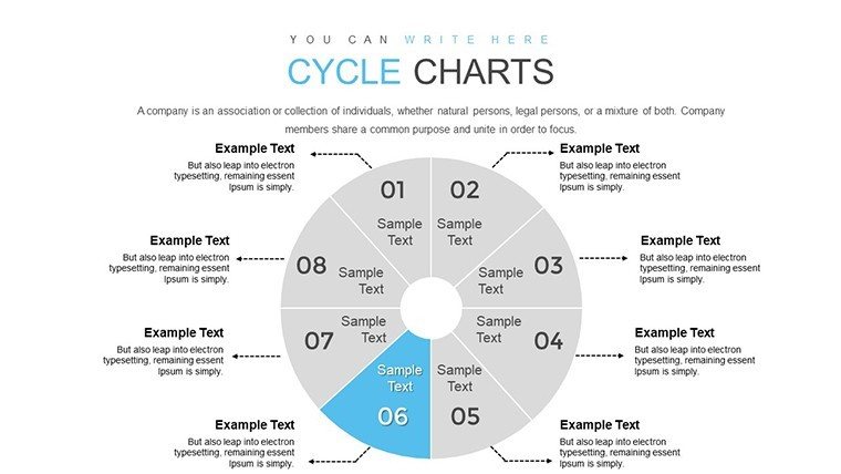
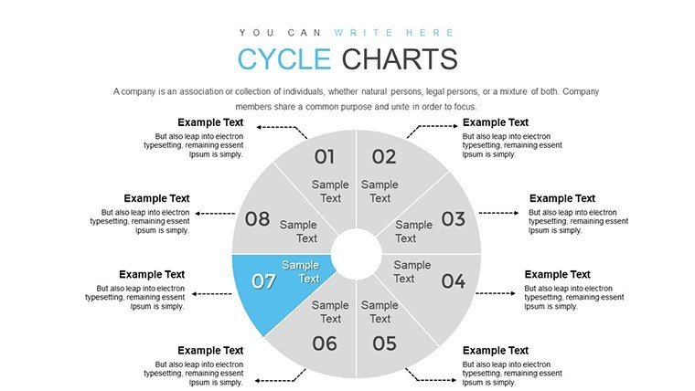
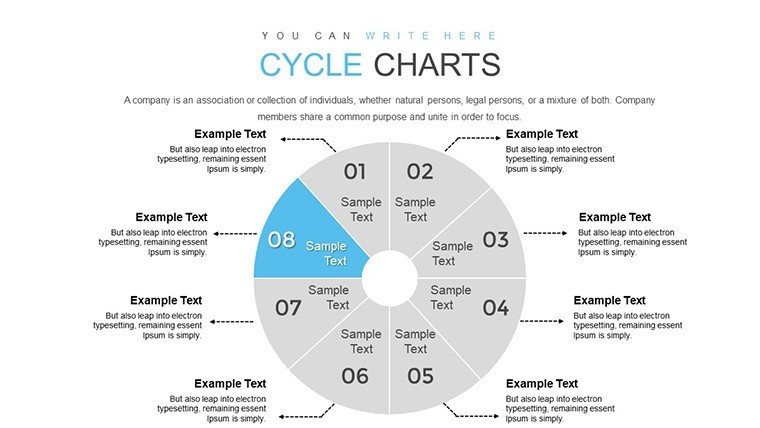


When processes loop and data interconnects, standard slides fall short - enter our 8 Segment Cycle PowerPoint Charts template, a powerhouse for visualizing multifaceted cycles. Boasting 34 editable slides, this tool specializes in 8-segment diagrams, perfect for breaking down complex workflows into digestible parts. Aimed at professionals, educators, and marketers, it turns abstract concepts into tangible visuals, fostering deeper understanding and retention.
Envision mapping out a product lifecycle in a strategy session: Each segment represents a phase, from ideation to launch, with seamless transitions that guide your narrative. Crafted with input from design experts adhering to principles like those in Edward Tufte's data visualization theories, this template ensures minimalism meets maximum impact, avoiding the overload common in amateur presentations.
Standout Features for Seamless Customization
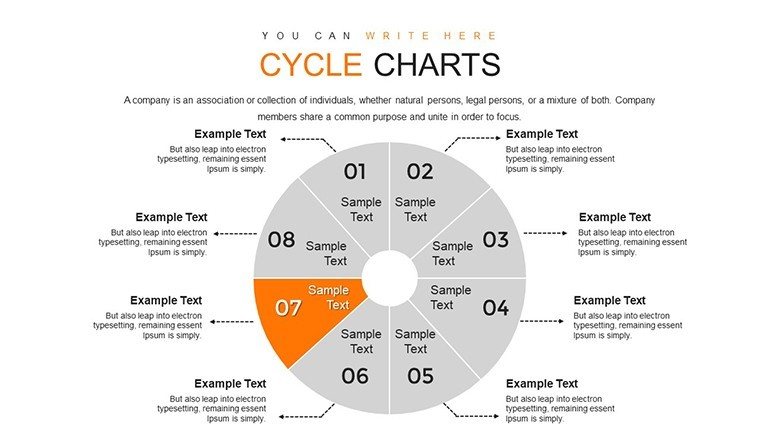
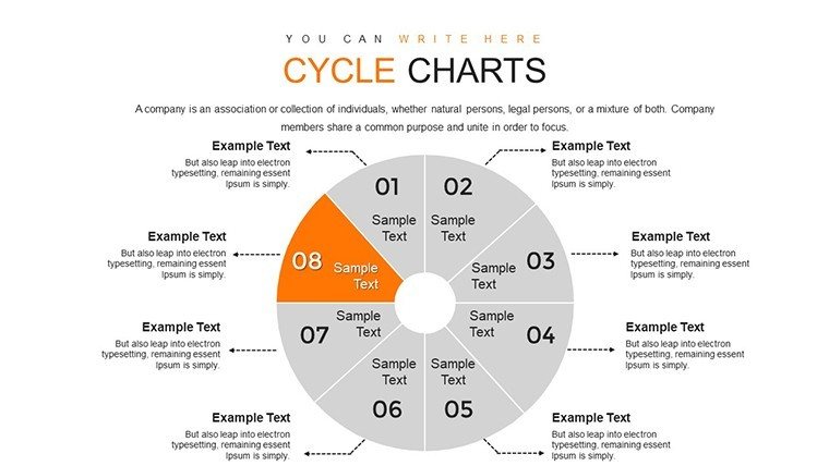
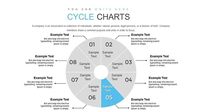
Customization is key here, with vector graphics allowing infinite scaling. The 8-segment cycles adapt to your data, whether color-coding for priority or labeling for clarity. Unlike basic cycle tools in PowerPoint, which limit segments, this offers flexibility for detailed breakdowns, enhancing professionalism.
From my experience as a marketing analyst, such templates have revolutionized client reports, where pie integrations within cycles provide hybrid views - think segmenting market feedback loops. This builds authority, as visuals align with trusted methodologies from sources like the Project Management Institute (PMI).
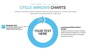
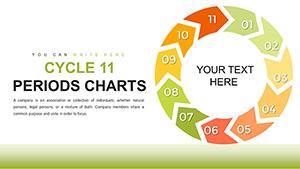
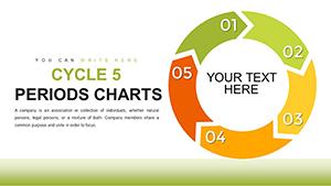
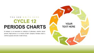
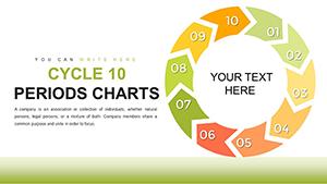
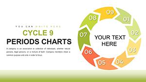
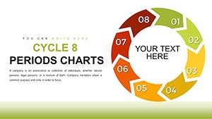
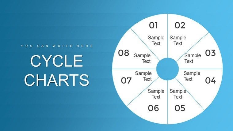
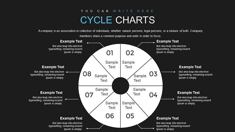
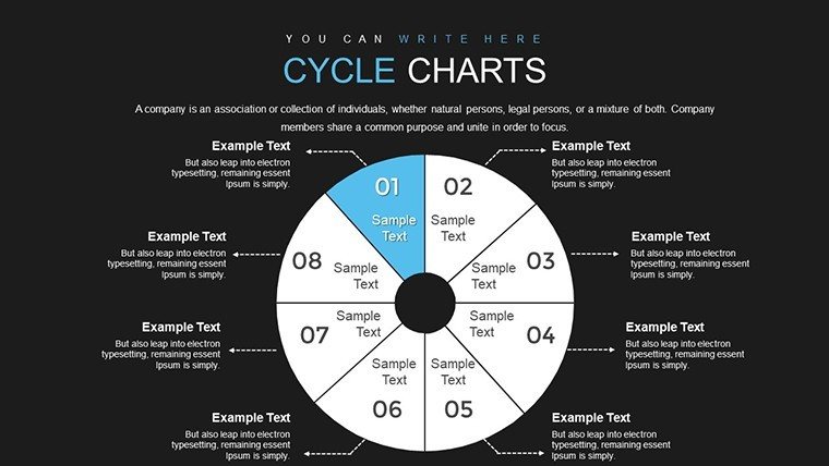
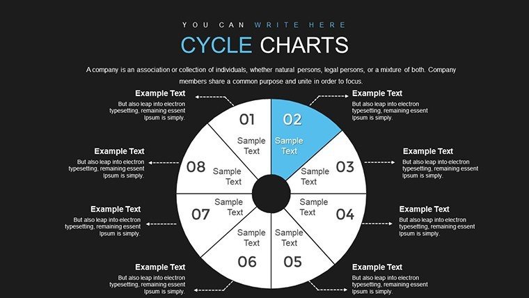
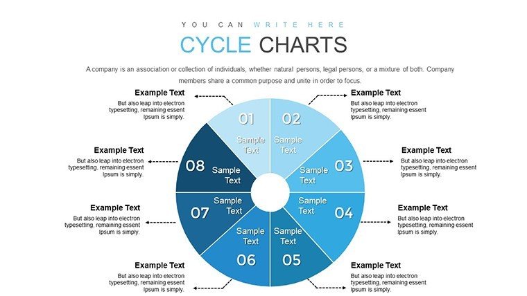
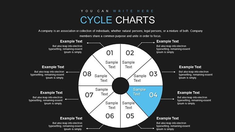
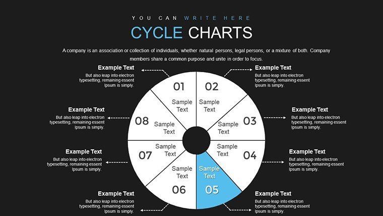
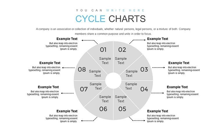
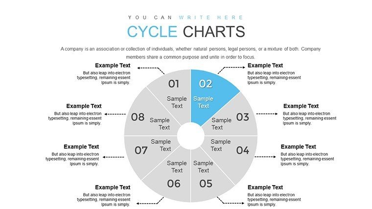
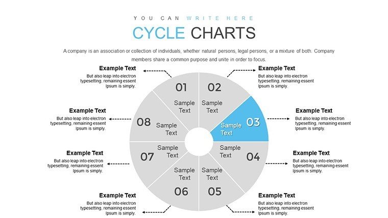
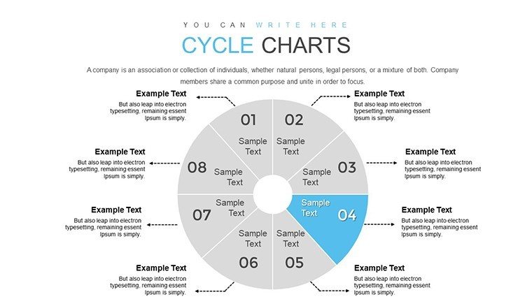
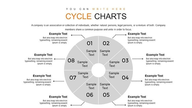
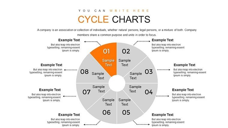
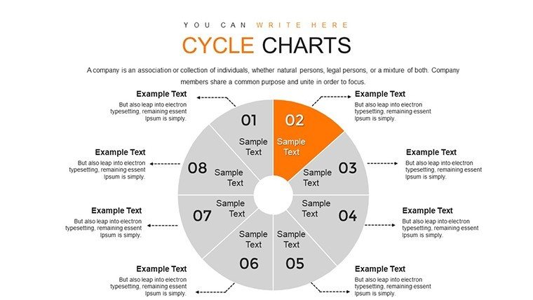
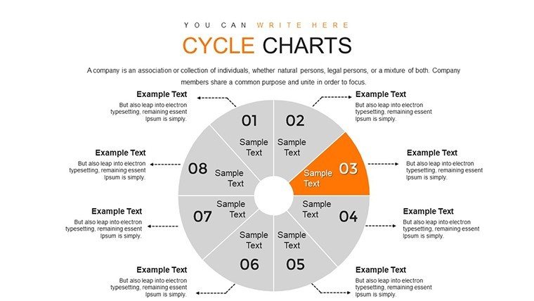
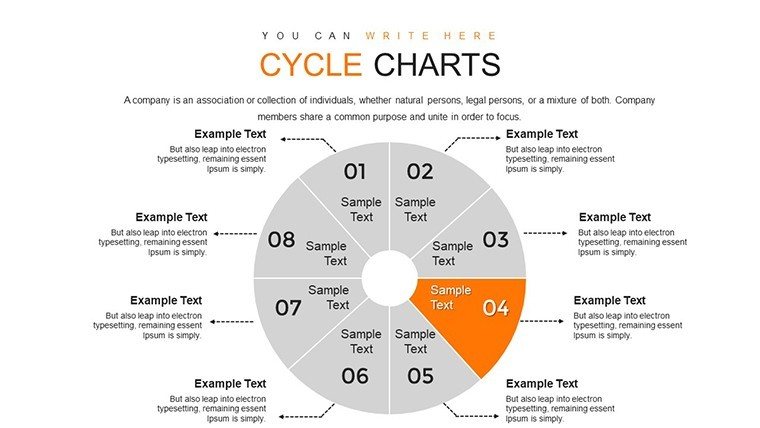
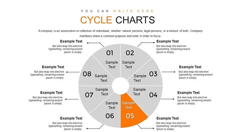
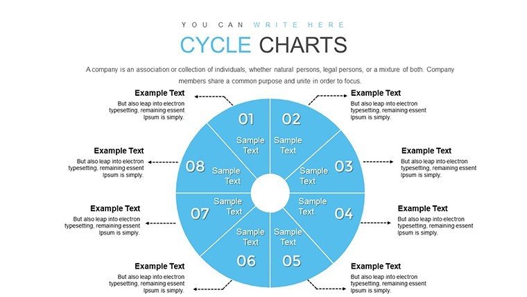
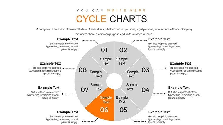
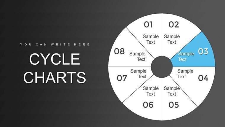
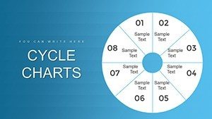
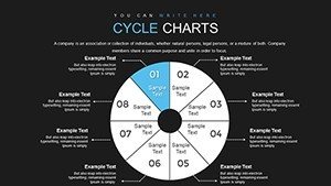
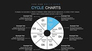
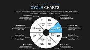
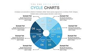
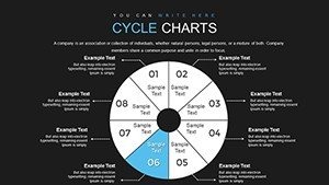
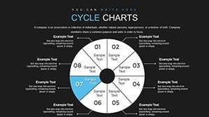
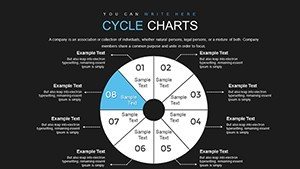
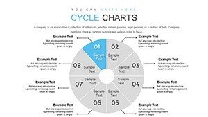
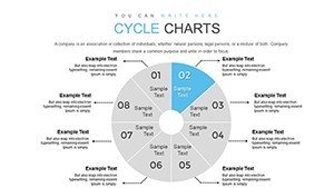
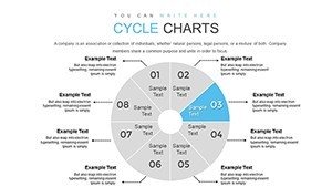
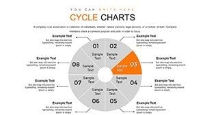
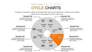
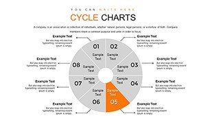
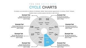
- Engaging Segments: 8-part cycles for detailed process mapping.
- Brand Alignment: Tailor graphics to your identity with ease.
- Professional Graphics: High-quality elements for a refined finish.
- Quick Edits: Intuitive interface for rapid updates.
Additional perks include narrative-building slides, where cycles integrate with text boxes for explanatory depth, drawing from storytelling techniques in business communications.
Diverse Applications in Professional Settings
Harness this for varied uses: In education, dissect learning cycles; in business, outline supply chains. A case in point: A logistics firm used 8-segment cycles to visualize inventory rotations, optimizing operations and echoing efficiencies in Amazon's models.
Workflow steps: Download, select a cycle slide, populate segments with data. Customize arrows for directionality, add icons for visual pop. Present with confidence, knowing it's optimized for both in-person and virtual formats.
- Assess your cycle's components and assign segments.
- Input data and adjust visuals for emphasis.
- Incorporate supporting pie charts for sub-distributions.
- Review for flow and export.
Another application: Marketers mapping customer journeys, with segments for touchpoints, leading to improved strategies as seen in HubSpot case studies.
Tips: Use color psychology - blues for trust in financial cycles. Integrate with tools like Visio for pre-design, then import.
The Edge in Visual Communication
With 814 ratings and 5 stars, it's a proven choice. Explore linked cycle variations for more. Reliable across devices, it's your go-to for cycle mastery.
In essence, this template empowers you to cycle through ideas with flair, making every presentation a cycle of success.
Frequently Asked Questions
- How many segments can I adjust?
- Fixed at 8, but easily modifiable by grouping or ungrouping elements.
- Compatible with older PowerPoint versions?
- Yes, works on PowerPoint 2010 and later.
- Ideal for what industries?
- Versatile for business, education, marketing, and more.
- Can I add animations?
- Absolutely, built-in support for segment reveals.
- Refund policy?
- Contact support for details on satisfaction guarantees.