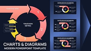
Dynamic Circumvolution PowerPoint Charts Template: Transform Data into Engaging Narratives


Type: PowerPoint Charts template
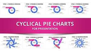
Category: Cycle
Sources Available: .pptx
Product ID: PC00700
Template incl.: 20 editable slides
In the fast-paced world of professional presentations, capturing your audience's attention is key to delivering your message effectively. The Circumvolution PowerPoint Charts Template steps in as your ultimate ally, offering a suite of dynamic visuals designed to turn complex data sets into captivating stories. Whether you're a business leader pitching innovative strategies to stakeholders or an educator breaking down intricate concepts for students, this template empowers you to visualize information in ways that resonate deeply. With 20 fully editable slides, it provides a versatile canvas for cycle-based charts that illustrate processes, workflows, and iterative developments with elegance and clarity.
Imagine presenting quarterly performance metrics where data doesn't just sit static on the slide but flows in a circumvolutionary pattern, highlighting interconnections and progress loops. This isn't just about charts; it's about crafting experiences that leave lasting impressions. Tailored for seamless integration with Microsoft PowerPoint and Google Slides, the template ensures compatibility across platforms, allowing you to focus on content rather than technical hurdles. Its user-friendly design means even those new to advanced visualization can produce professional-grade outputs quickly, saving precious time in high-stakes environments.
Unlocking the Power of Cycle Charts in Your Presentations
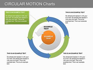
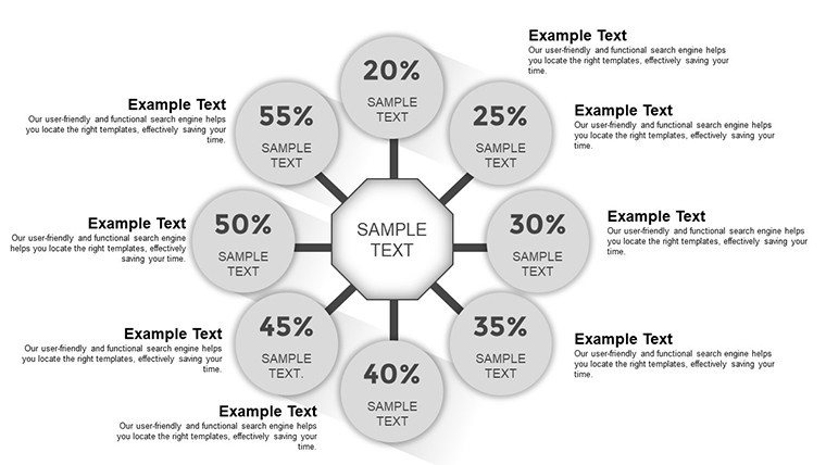
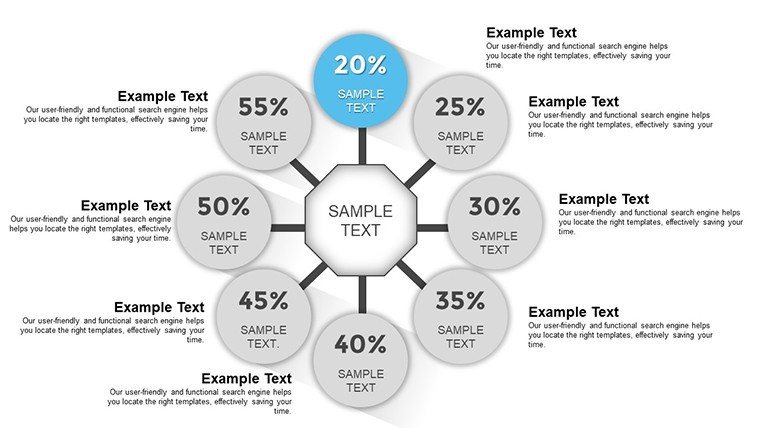
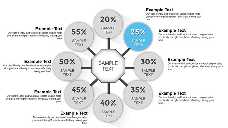
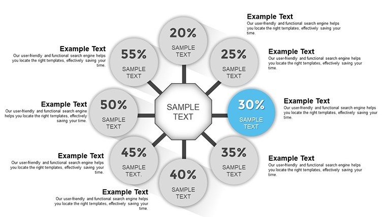
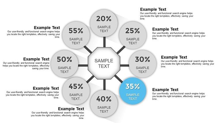
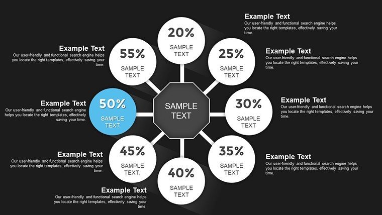
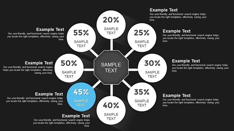
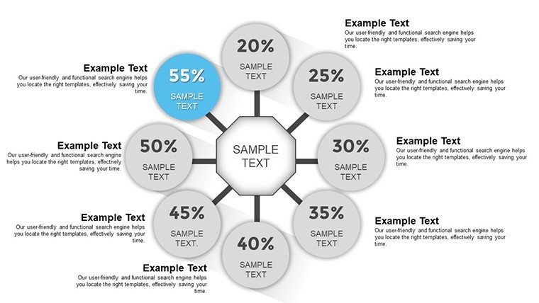
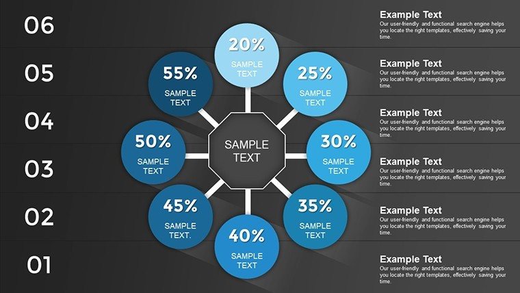
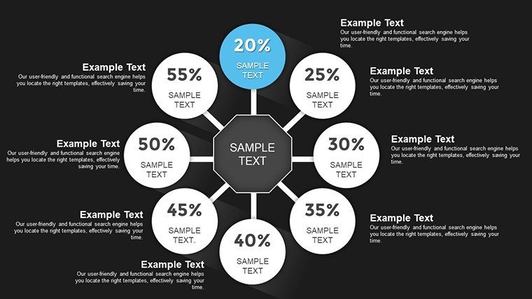
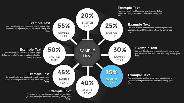
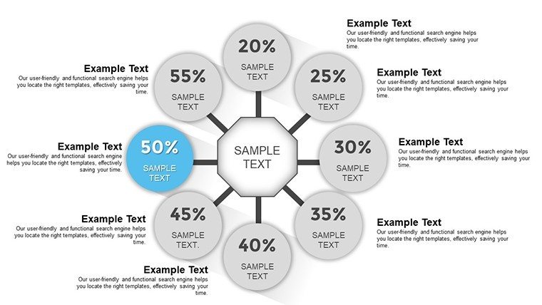
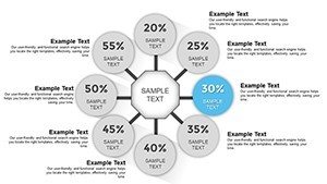
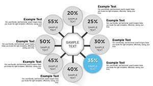
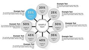
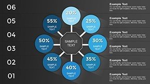
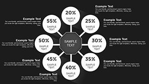
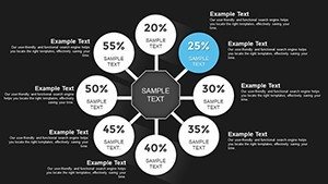
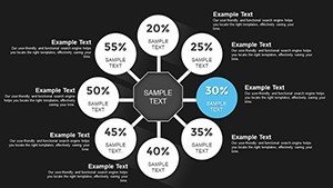
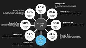
Cycle charts are more than mere diagrams; they represent the ebb and flow of processes in a visually intuitive manner. In this template, circumvolution elements take center stage, enabling you to depict recurring patterns such as product development cycles or customer journey loops with precision. Each slide is meticulously crafted to support data from various sources, whether it's Excel spreadsheets or database exports, ensuring your visuals are always up-to-date and relevant.
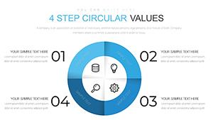
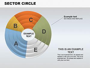
For instance, consider a scenario in project management where you need to showcase iterative improvements. Slide 5 features a multi-layered circumvolution chart that allows you to overlay phases like planning, execution, and review, complete with customizable icons and color schemes to match your corporate branding. This not only enhances aesthetic appeal but also aids in audience comprehension, reducing the cognitive load often associated with dense information.
Key Features That Set This Template Apart
- Full Editability: Every element, from chart segments to text labels, can be modified effortlessly. Adjust sizes, colors, and fonts to align perfectly with your theme.
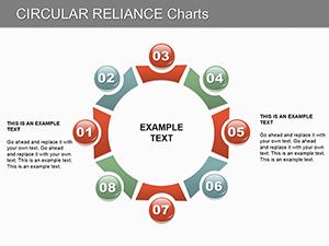
- Variety of Chart Styles: Choose from spiral, looped, or radial circumvolution designs to best fit your data narrative.
- High-Resolution Graphics: Ensure crisp visuals even when projected on large screens, maintaining professionalism in boardrooms or lecture halls.
- Animated Transitions: Built-in animations bring your cycles to life, guiding viewers through the data flow step by step.
- Data Integration Tools: Easily link to external data sources for real-time updates, ideal for dynamic environments like market analysis.
Beyond these, the template includes thematic icons that add a layer of sophistication, such as arrows indicating directionality in cycles or nodes representing key milestones. This attention to detail draws from best practices in information design, inspired by experts like Edward Tufte, who emphasize clarity and efficiency in visual communication.
Real-World Applications: From Business to Education
In the corporate realm, this template shines in strategic planning sessions. Take a tech startup preparing for a venture capital pitch: Using Slide 10's advanced circumvolution layout, they can illustrate their agile development cycle, showing how feedback loops drive innovation. This not only demonstrates process maturity but also builds investor confidence through transparent visualization.
Educators, on the other hand, can leverage it for interactive lessons. For a history class on economic cycles, Slide 15's editable chart allows insertion of timelines with boom and bust phases, making abstract concepts tangible. Students engage more when data spins into stories, fostering better retention and discussion.
Researchers presenting at conferences will find value in the template's ability to handle multifaceted data. A case study from a sustainability report could use circumvolution to map out environmental impact cycles, integrating metrics like carbon footprints and recovery efforts. This approach aligns with AIA standards for clear communication in professional fields, ensuring your work stands out.
Step-by-Step Guide to Customizing Your Charts
- Select Your Base Slide: Browse the 20 options to find the circumvolution style that matches your data structure.
- Input Data: Use PowerPoint's data tools to populate charts directly from spreadsheets, avoiding manual errors.
- Customize Aesthetics: Apply your brand colors and fonts via the theme editor for a cohesive look.
- Add Interactivity: Incorporate hyperlinks or animations to make slides more engaging during delivery.
- Test and Refine: Preview in slideshow mode to ensure smooth transitions and readability.
This workflow not only streamlines creation but also encourages iterative improvements, much like the cycles the template depicts. Users report saving up to 50% more time compared to building from scratch, allowing focus on analysis over design.
Why Choose Circumvolution Over Standard Charts?
Standard bar or pie charts often fall flat in conveying interconnected processes. Circumvolution designs excel here by emphasizing continuity and relationships, making them superior for scenarios like supply chain management or feedback mechanisms. Unlike basic PowerPoint defaults, this template offers pre-optimized layouts that prevent common pitfalls such as cluttered visuals or mismatched scales.
In a comparative lens, while free templates might offer basic cycles, they lack the depth of customization and professional polish found here. Our version includes exclusive elements like gradient fills and shadow effects, drawing from modern design trends to elevate your slides above the competition.
Enhancing Audience Engagement with Visual Storytelling
Visual storytelling isn't just a buzzword; it's a proven method to boost retention rates by up to 65%, according to cognitive science studies. This template harnesses that by providing tools to weave narratives around data. For example, in a marketing report, use Slide 8 to show customer acquisition cycles, highlighting touchpoints with annotated icons for a story that unfolds visually.
To add a touch of inspiration, think of your presentation as a journey - the circumvolution chart as the map guiding your audience through twists and turns of information. This metaphorical approach can inject energy into even the driest topics, turning skeptics into advocates.
Tips for Maximizing Impact in Your Next Presentation
- Keep text concise: Limit labels to key phrases to avoid overwhelming viewers.
- Balance colors: Use contrasting hues for segments to improve accessibility, adhering to WCAG guidelines.
- Incorporate narratives: Start each chart with a brief intro slide explaining the cycle's significance.
- Practice delivery: Rehearse transitions to ensure they enhance, not distract from, your message.
- Gather feedback: Post-presentation, solicit input on visual clarity to refine future uses.
Integrating these tips with the template's features creates a powerhouse for communication. Whether in virtual meetings via Zoom or in-person seminars, the adaptability ensures consistent quality.
As you wrap up your preparation, remember that great presentations stem from tools that amplify your expertise. This Circumvolution Template does just that, bridging the gap between data and decision-making with flair.
Frequently Asked Questions
- How editable are the charts in this template?
- All 20 slides are fully editable, allowing changes to data, colors, fonts, and layouts directly in PowerPoint.
- Is this template compatible with Google Slides?
- Yes, it works seamlessly with Google Slides, maintaining all features and editability.
- Can I use this for non-business purposes?
- Absolutely, it's versatile for education, research, and personal projects involving cycle visualizations.
- What file format is provided?
- The download includes a .pptx file, ready for immediate use.
- Are there animation options included?
- Yes, pre-set animations enhance data flow, customizable to your preference.