Economic Charts in PowerPoint - Fully Editable | ImagineLayout


Type: PowerPoint Charts template
Category: Pie, Tables, Illustrations, Analysis
Sources Available: .pptx
Product ID: PC00669
Template incl.: 36 editable slides
Files and Formats Included
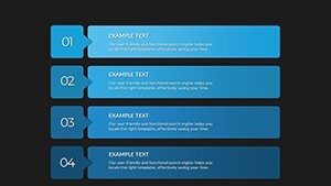
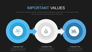
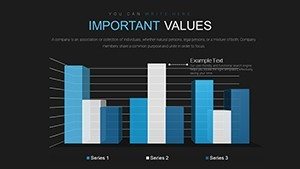
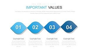
36 editable slides arrive in one PPTX file.
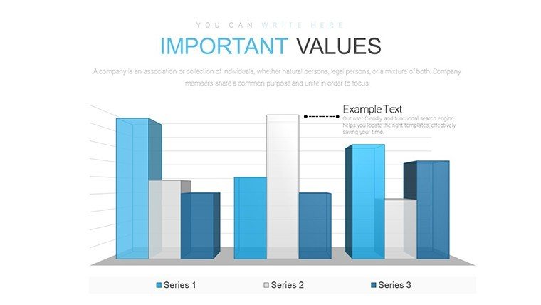
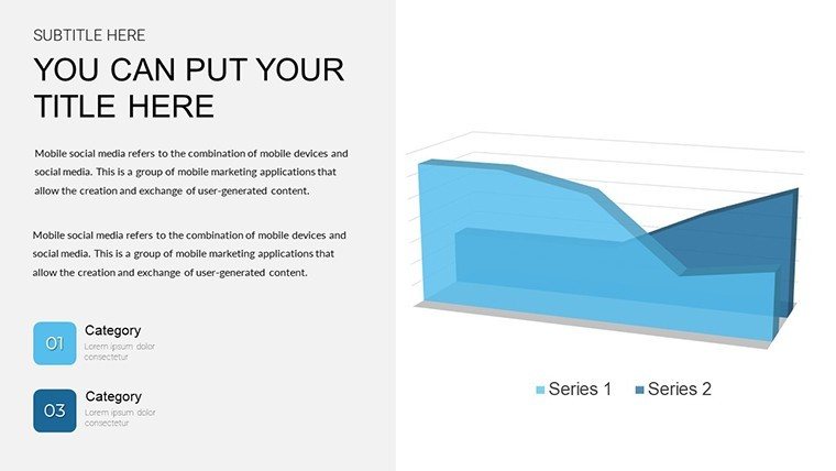
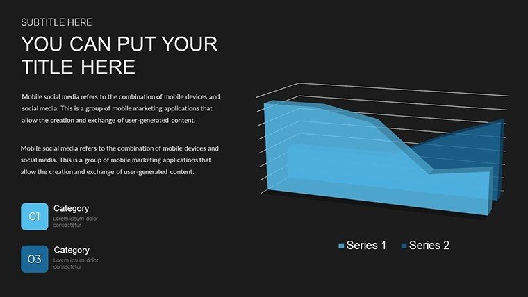
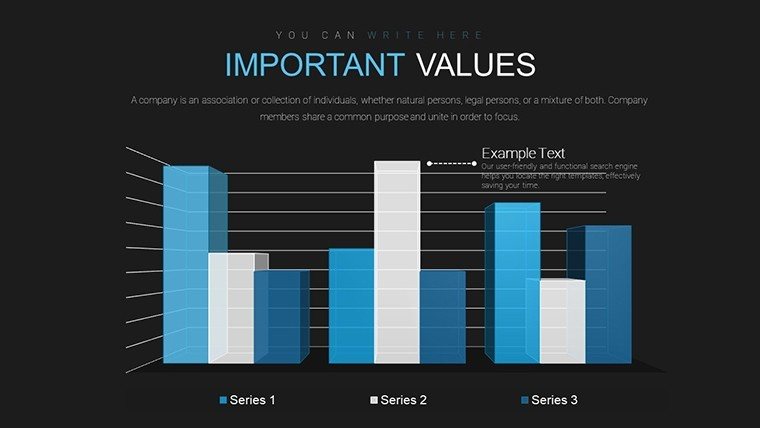
Bar graphs combine with line charts and scatter plots to cover cost projections and inflation correlations in a single deck.
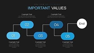
These chart types integrate for financial tasks by letting zone segmentation highlight key metrics while color contrast guides attention during board briefings.
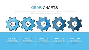
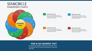
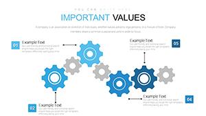
The economic-specific combinations with architecture-inspired palettes set it apart from gear mechanics or circle analysis sets because they focus on data correlations rather than mechanical metaphors.
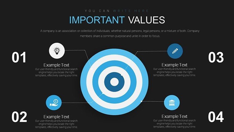
This collection works best for financial viability pitches in architecture since the chart pairings match budget tracking better than neighbors centered on planning circles or training visuals.
The paid version covers all 36 slides with full chart types and theme adjustments.
At a Glance
| Feature | Details |
|---|---|
| Slides included | 36 mixed economic chart layouts |
| Editable shapes | graph segments resize and recolor independently |
| Text placeholders | labels update without unlocking grouped elements |
| Color theme adjustments | compatible with PowerPoint slide master palette |
| Diagram connectors | lines adjust in direction and weight |
| File formats | PPTX for editing and PDF export |
Adapting the Template to Your Brand
- Open the .pptx file in PowerPoint 2016 or later (1 minute)
- Replace placeholder text with your content (3 minutes)
- Adjust brand colors via the slide master (2 minutes)
- Edit chart data and connectors (4 minutes)
- Export as PPTX or PDF (1 minute)
Editing difficulty: Moderate.
Who Reaches for This Template
Architects in construction firms pitch cost projections to clients and cut deck preparation from three hours to 45 minutes.
Firm managers in urban development reuse the same file for market trend reports across three consecutive briefings by swapping color schemes.
Download the economic charts now
Compared to Starting From Zero
Building equivalent charts from scratch requires two hours and intermediate design skill for data alignment.
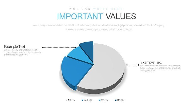
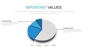
Colors segment phases rather than decorating because that approach clarifies budget phases on projection screens without extra effort.
This layout keeps phase colors tied to data structure and avoids visual noise that commonly appears in manual builds.
Purchase the economic analysis template
Which PowerPoint versions does the file support?
The template opens in PowerPoint 2016, 2019 and Microsoft 365 on Windows and Mac. Compatibility extends to older versions with limited support for scatter plots. Users report smooth performance in version 2019 without plugins. Test the slide master for any custom fonts if your installation differs.
How do I change the color scheme?
Open the slide master view in PowerPoint. Select the chart elements and update colors through the theme palette. Apply changes to all slides at once via the master. Save the file and the new scheme propagates across every layout.
What license applies to client work?
The paid download permits use in internal presentations and paid client deliverables. You may not resell the file or sublicense it to third parties. Internal company training sessions fall under allowed use. Always keep the original attribution if required by the download terms.
What file formats open the template?
The PPTX format opens in PowerPoint on Windows or Mac. Export options include PDF for distribution or image formats for sharing. Keynote users convert via import tools with minor layout checks. The single file contains everything needed for editing.
Is animation support included?
Basic entrance animations appear on chart elements. Remove or add them through the animation pane in PowerPoint. The layouts remain fully editable after any animation changes. No advanced motion paths ship with the file.