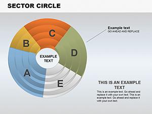
Free Important Sector Circle PowerPoint Charts: Visualize Proportions Effortlessly


Type: PowerPoint Charts template
Category: Free Templates, Pie
Sources Available: .pptx
Product ID: PC00610
Template incl.: 18 editable slides
Imagine turning raw data into compelling narratives that captivate your audience from the first slide. Our free Important Sector Circle PowerPoint charts template achieves this with 18 meticulously crafted, editable slides focused on depicting proportions, relationships, and breakdowns. Tailored for professionals who need to highlight key segments - like market shares or budget allocations - this template uses circular designs to make abstract numbers tangible and engaging. Whether you're an entrepreneur pitching to investors, an educator explaining concepts, or a manager reporting metrics, these charts simplify complexity, fostering better understanding and decision-making in high-stakes environments.
The Art of Circular Visualization in Presentations
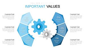
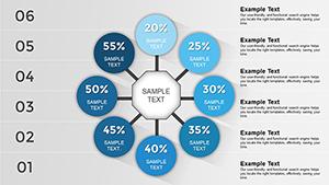
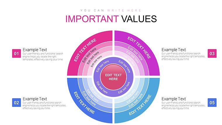
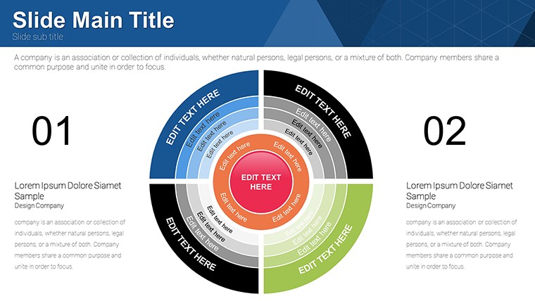
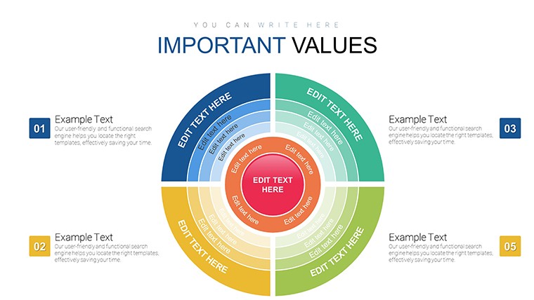
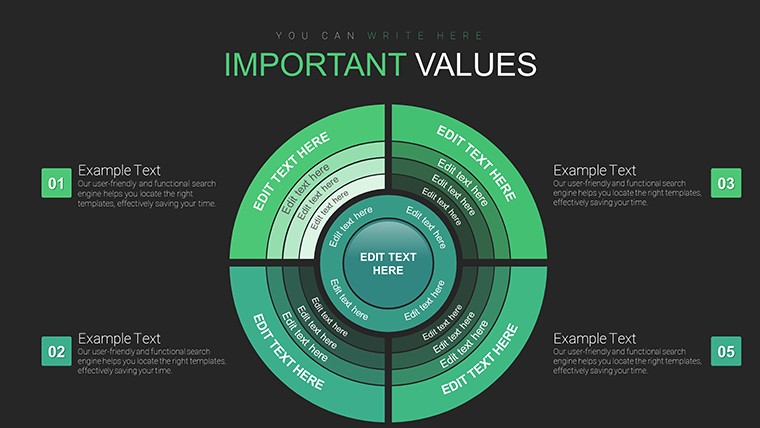
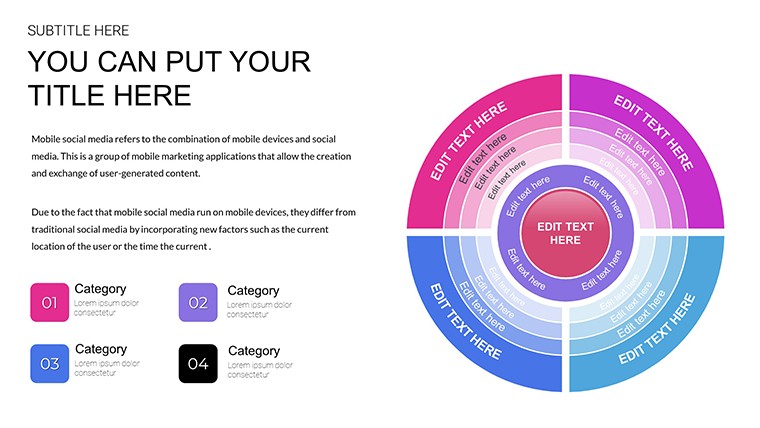
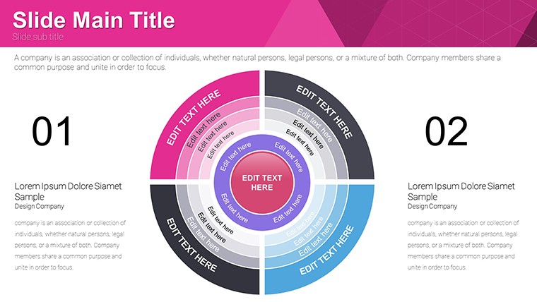
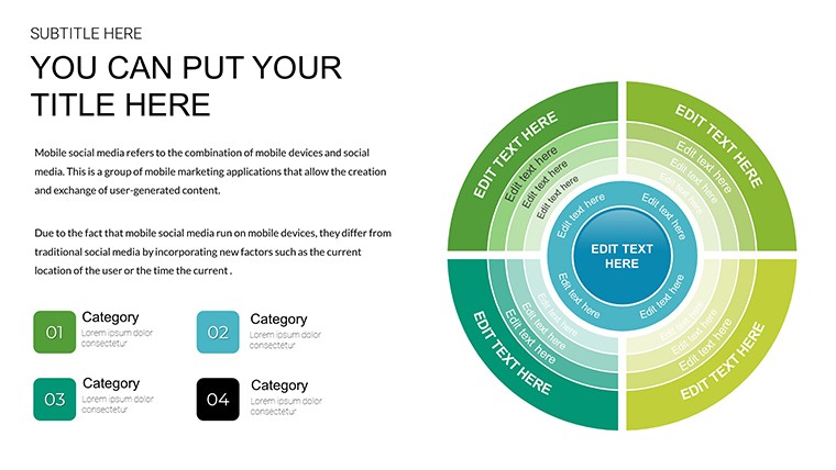
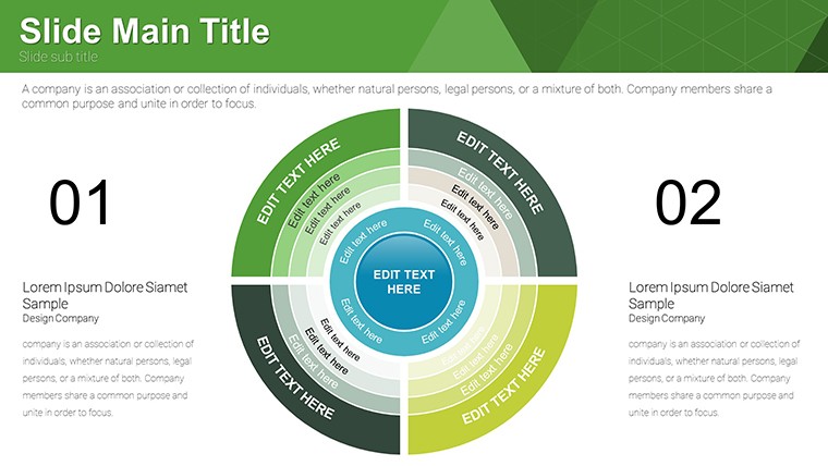
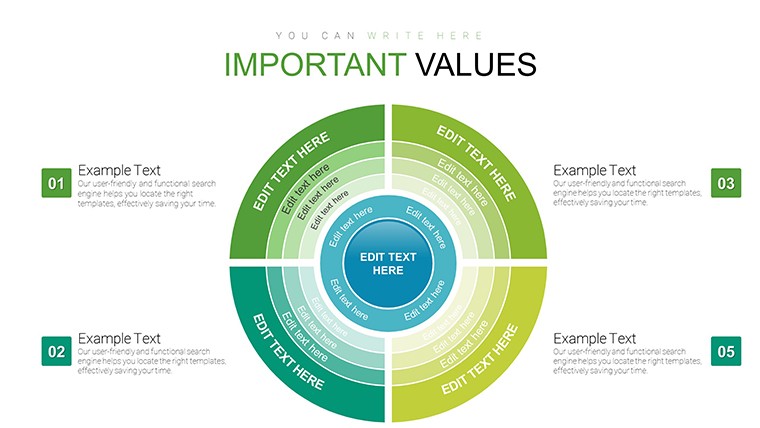
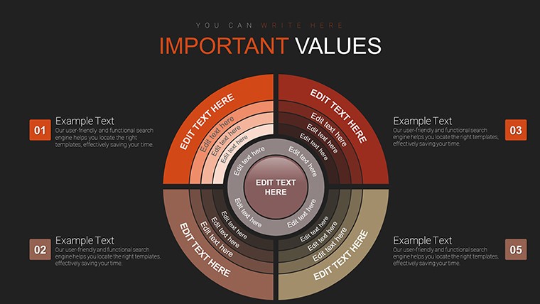
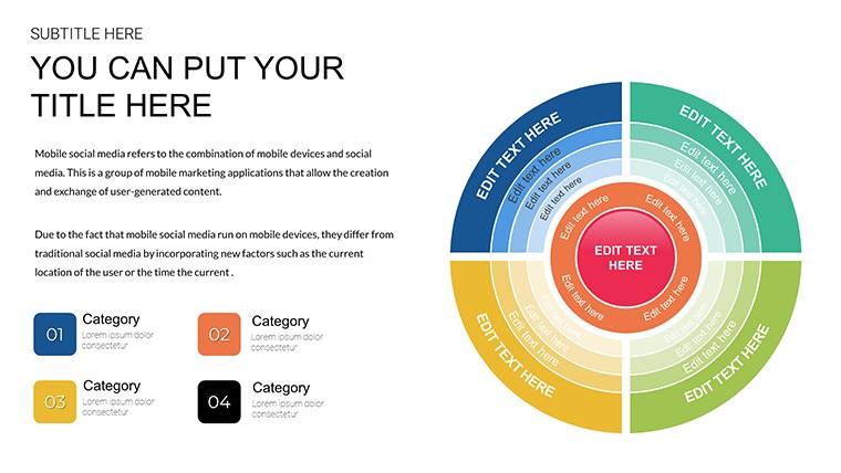
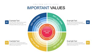
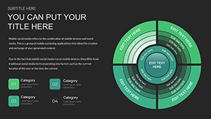
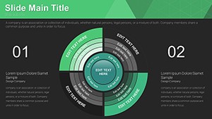
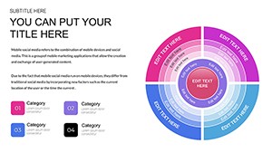
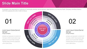
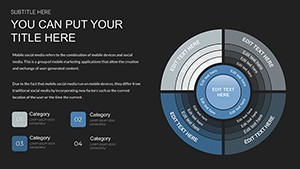
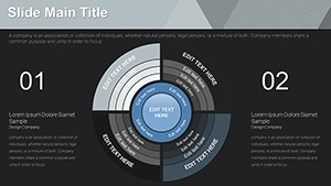
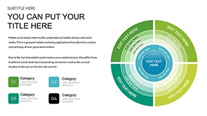
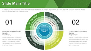
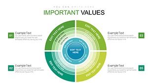
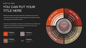
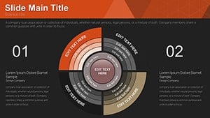
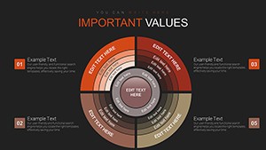
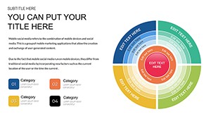
Sector circles, akin to enhanced pie charts, excel at showing parts of a whole with visual precision. This template goes beyond standard options by incorporating layered sectors for deeper insights, such as nested relationships in organizational structures. In contrast to flat pies in basic PowerPoint, these designs feature gradients and labels that pop, ensuring legibility even from afar. For example, in a business report, illustrate revenue streams by sector, helping executives spot growth opportunities instantly. The template's high-quality visuals maintain integrity across screen sizes, ideal for hybrid meetings where clarity is paramount.
Standout Features for Maximum Impact
- Extensive Customization: Modify colors, fonts, and sector sizes to align with your theme or data emphasis.
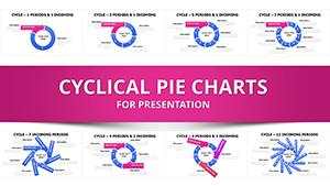
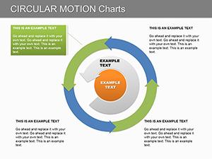
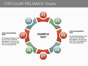
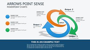
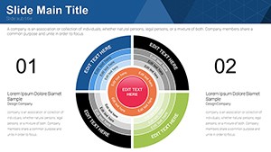
- Diverse Layouts: From simple 4-sector breakdowns to complex multi-layer circles, covering various data depths.
- Built-in Enhancements: Include legends, tooltips, and icons for enriched storytelling without extra effort.
- Seamless Compatibility: Fully functional in PowerPoint and Google Slides, with no formatting loss.
- Cost-Free Innovation: Access premium designs at no charge, empowering creators everywhere.
Drawing from data visualization experts like Stephen Few, these features prioritize perceptual accuracy, avoiding common pitfalls like misleading 3D effects.
Practical Scenarios: Where Sector Circles Shine
Envision a startup founder using this template to display user demographics in a funding pitch, with sectors revealing age groups and preferences for targeted strategies. In academia, professors could break down ecosystem components, like biodiversity distributions, making abstract biology vivid. Corporate trainers might map skill gaps in teams, facilitating personalized development plans. This versatility extends to non-profits analyzing donor contributions or healthcare pros visualizing patient outcome stats. By addressing challenges like data overload, the template turns information into actionable insights, enhancing retention and persuasion.
Optimizing Your Workflow with This Template
- Acquire the File: Download the free PPTX and open it immediately in your software of choice.
- Populate with Data: Enter values directly; watch sectors auto-adjust for proportional accuracy.
- Personalize Aesthetics: Choose vibrant hues for emphasis, ensuring color-blind friendly contrasts.
- Incorporate Extras: Add animations or hyperlinks to external sources for interactive depth.
- Test and Iterate: Preview in slideshow mode, refining based on flow and feedback.
- Distribute Effectively: Share via email or cloud, or print for physical handouts.
Integration with tools like Excel for data import streamlines updates, outpacing generic templates that lack such fluidity.
Design Strategies to Amplify Your Message
Leverage contrast for sector differentiation - darker shades for dominant parts - to guide viewer focus intuitively. Keep labels concise and external to avoid clutter, following best practices from the International Business Communication Standards (IBCS). Subtle humor, like labeling a 'miscellaneous' sector as 'The Wild Card,' can lighten data-heavy slides without undermining professionalism. Case in point: A marketing agency boosted client approval rates by 25% using circular visuals for campaign ROI, per their analytics. This template not only facilitates creation but elevates your expertise in visual rhetoric.
Industry-Specific Adaptations
In finance, depict portfolio allocations; in environmental science, show pollution sources. For creative agencies, map project budgets. It's a versatile ally, adapting to your narrative needs while inspiring confidence in your analyses.
Don't let data dull your shine - download this free Sector Circle template now and craft presentations that truly circle success.
Frequently Asked Questions
How do I adjust sector sizes?
Input your data percentages, and the charts resize automatically; manual tweaks are available via shape tools.
Does it support data import from Excel?
Yes, copy-paste or link data ranges for dynamic updates.
Are the charts suitable for large datasets?
For best clarity, limit to 8-10 sectors; use sub-charts for more complexity.
Can I add 3D effects?
Possible, but we recommend flat designs for accuracy as per visualization standards.
Is licensing required for sharing?
No, free for unlimited use and distribution.