USA States Map Keynote Template: Mapping American Insights with Precision


Type: Keynote Maps template
Category: North America
Sources Available: .key
Product ID: KM00031
Template incl.: 46 editable slides
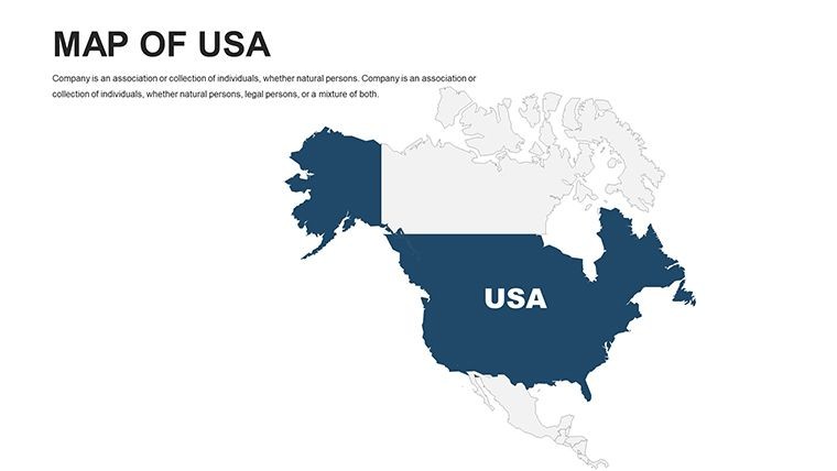
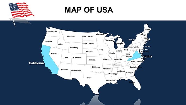
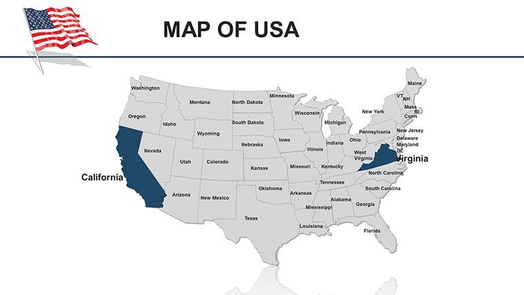
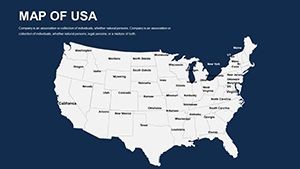
In the vast landscape of American business and education, nothing captures attention like a well-crafted map of the United States. Our USA States Keynote Maps Presentation Template, boasting 46 editable slides, is engineered for those pivotal moments when you need to showcase regional data that drives decisions. Tailored for Keynote users, this template empowers marketers, educators, and analysts to transform raw statistics into dynamic visuals that tell the story of America's diverse regions - from the tech hubs of California to the industrial power of the Midwest.
This isn't your standard map pack; it's a comprehensive toolkit designed with professional infographics in mind. Each slide is vector-precise, allowing seamless customization of state boundaries, color schemes, and data layers. Whether you're illustrating election results, sales distributions, or demographic trends, the template's intuitive structure ensures your presentation flows logically, keeping audiences hooked from coast to coast.
Key Features That Set Our USA Map Template Apart
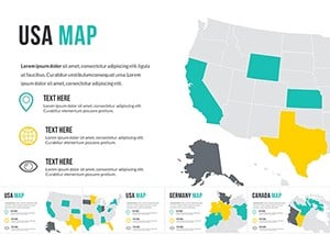
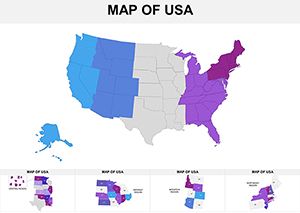
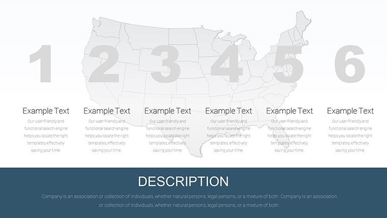
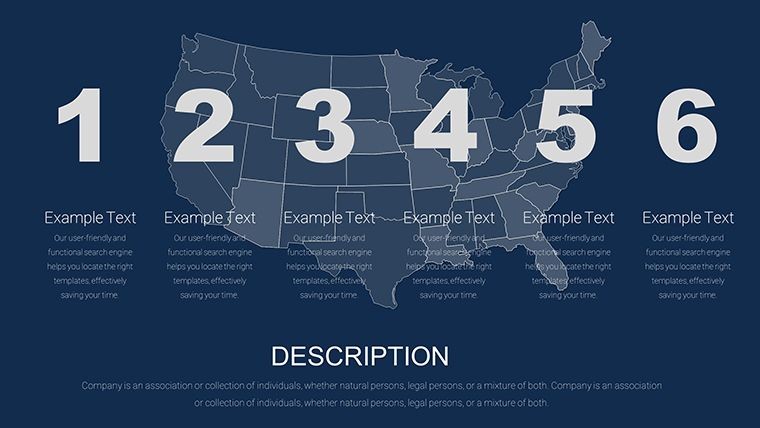
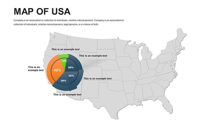
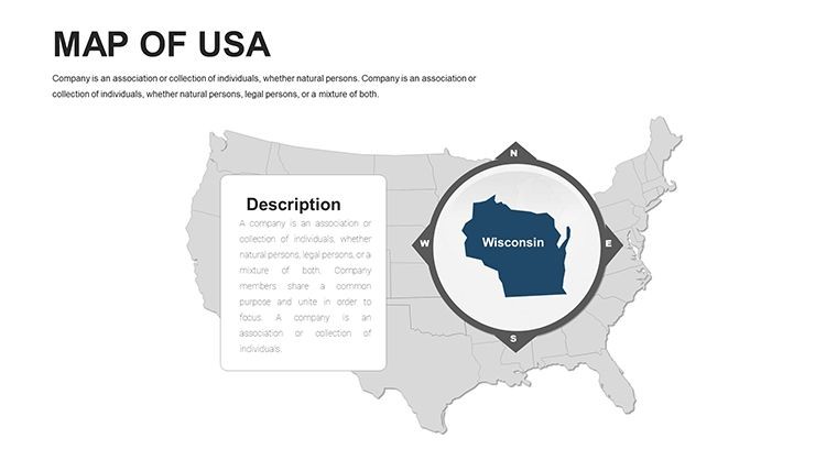
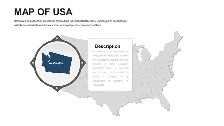
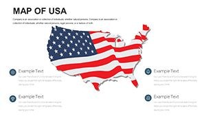
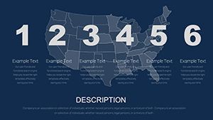
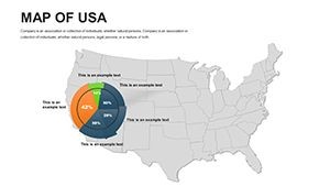
At the heart of this template are features that blend creativity with functionality. The 46 slides cover everything from overview maps to state-specific deep dives, complete with built-in charts and icons for immediate impact.
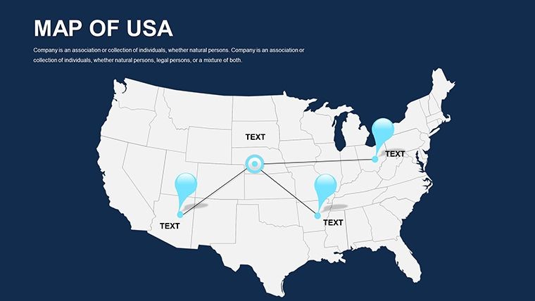
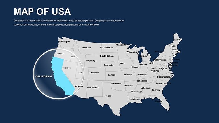
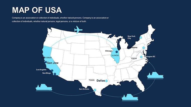
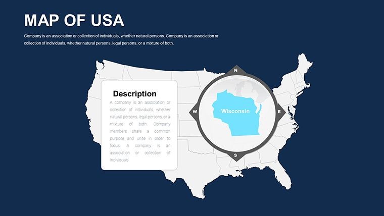
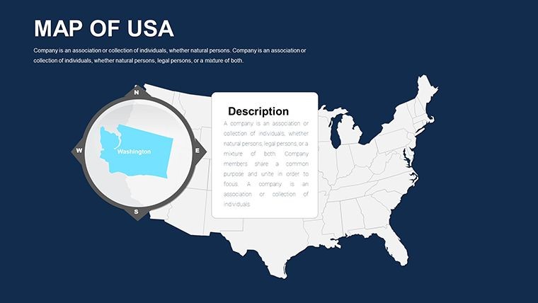
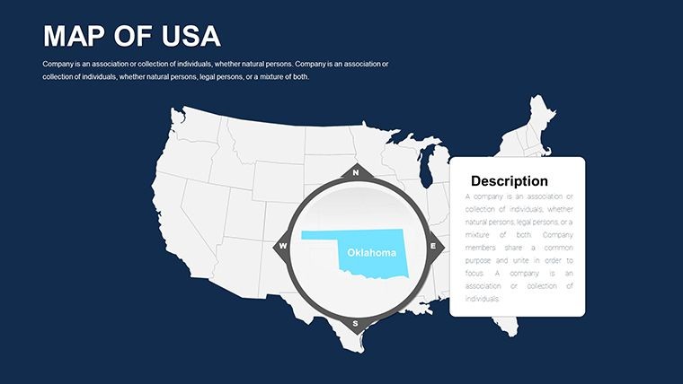
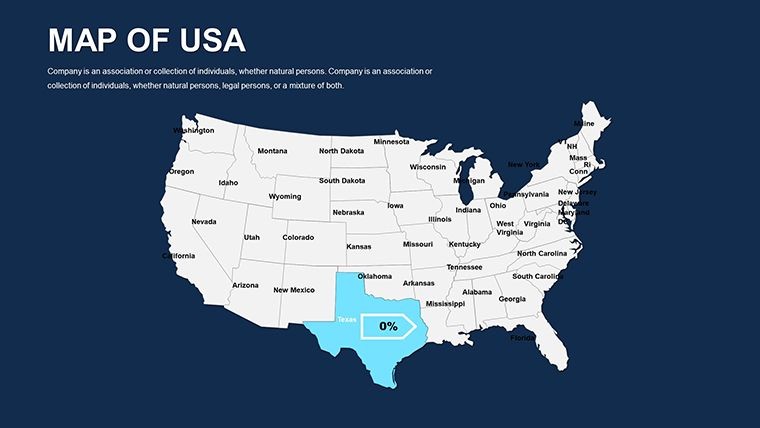
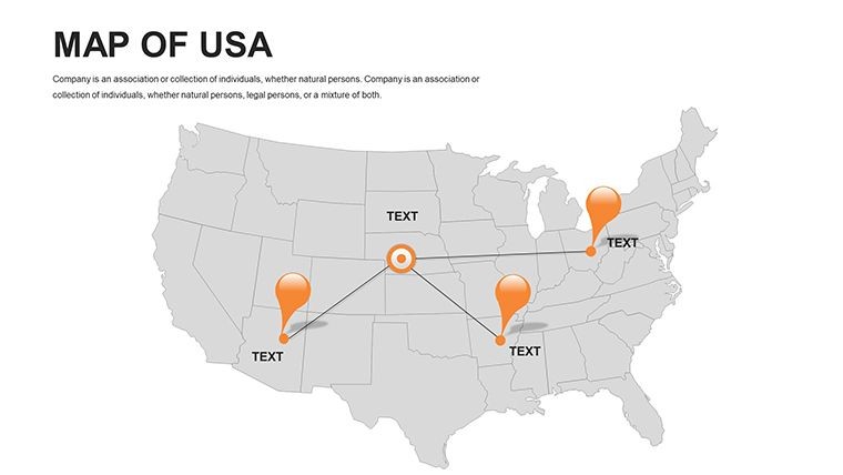
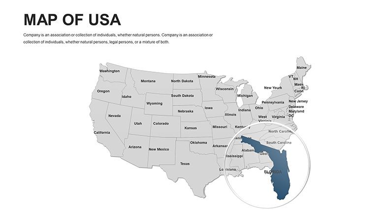
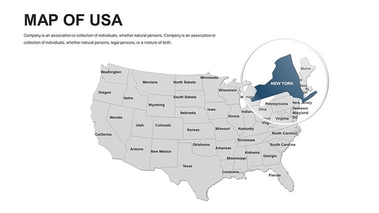
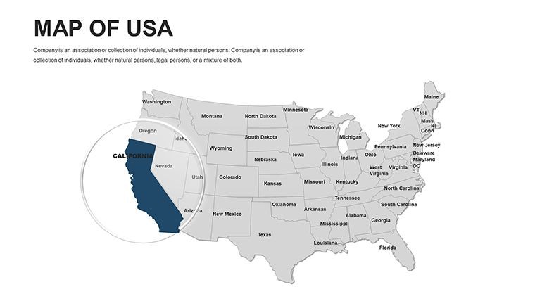
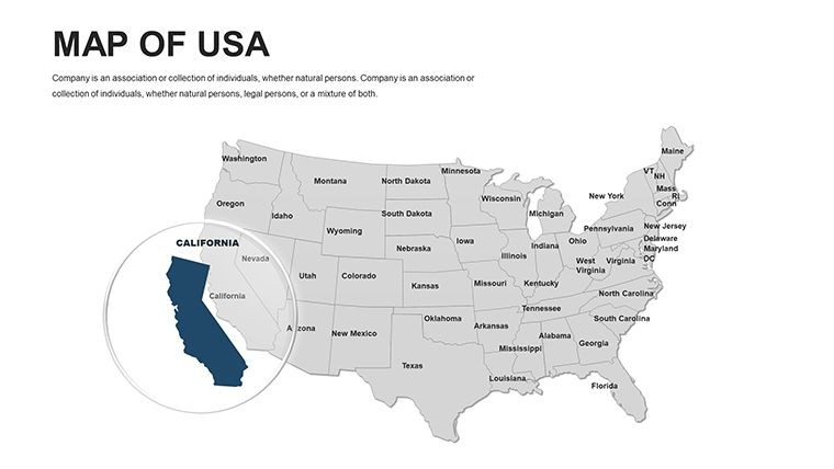
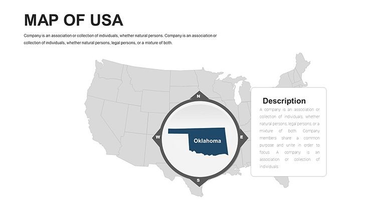
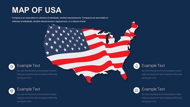
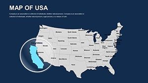
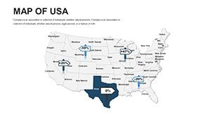
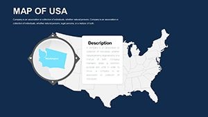
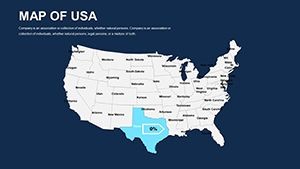
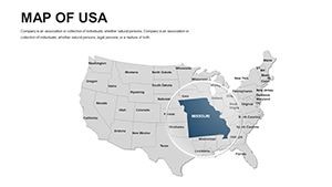
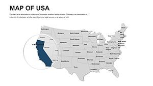
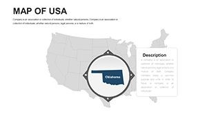
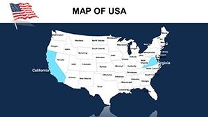
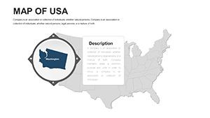
- Advanced Customization: Highlight states like Texas for energy sectors or New York for finance with gradient fills and interactive hotspots.
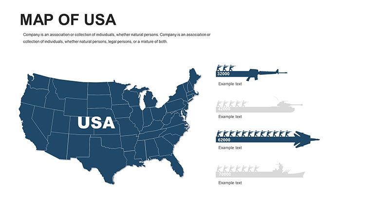
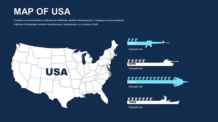
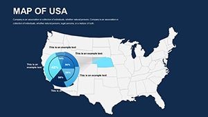
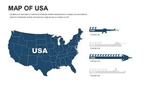
- Infographic-Rich Design: Pre-built elements for bar graphs overlaying population data or flowcharts for migration patterns.
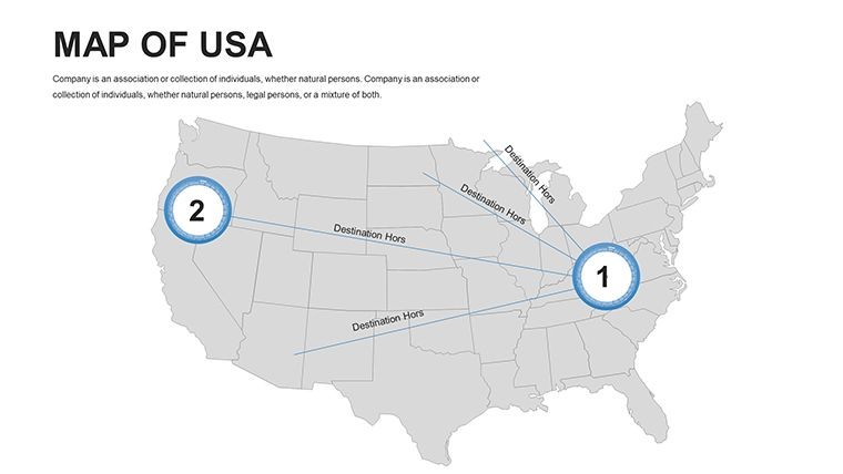
- Smooth Animations: Reveal states sequentially, perfect for building narratives around westward expansion or regional growth.
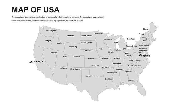
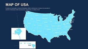
- High-Resolution Vectors: Scalable for any screen size, maintaining clarity in boardrooms or classrooms.
- Modular Layouts: Easy-to-swap sections for tailoring to themes like agriculture in the Plains or innovation in Silicon Valley.
Drawing from best practices in data visualization - much like those used in Fortune 500 reports - this template ensures your maps are not only beautiful but also informative, reducing cognitive load for viewers.
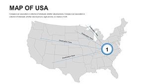
Practical Use Cases: Bringing USA Data to Life
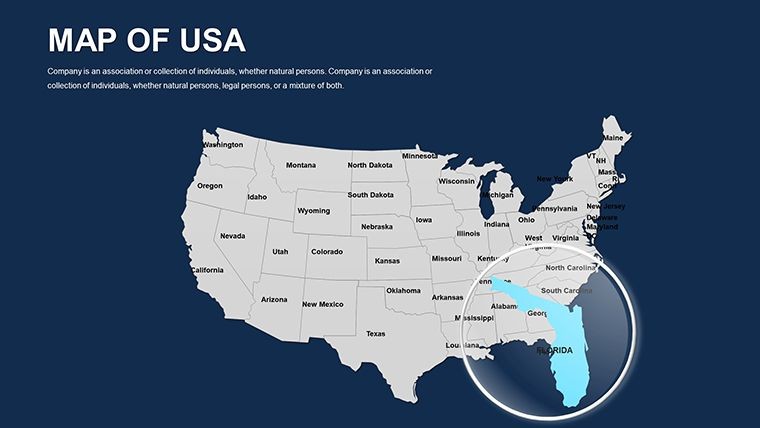
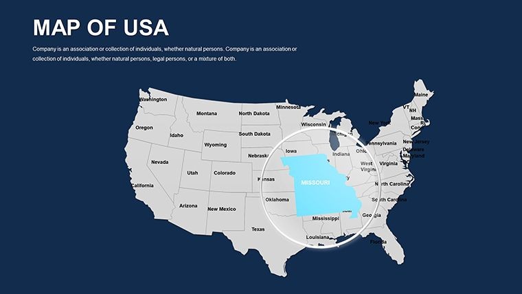
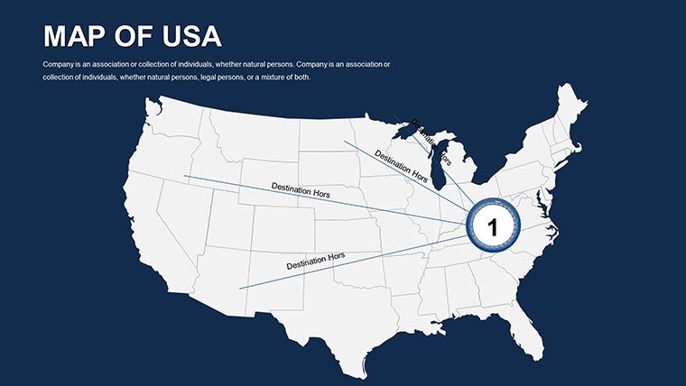
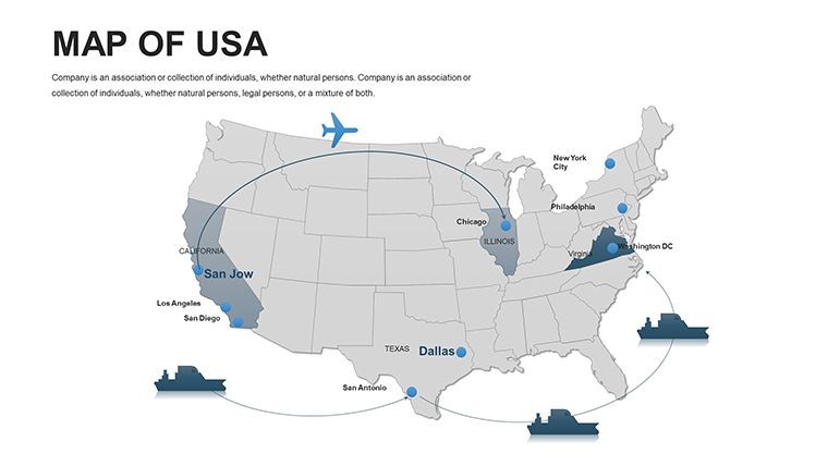
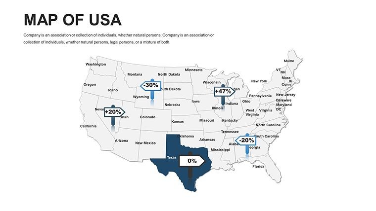
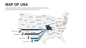
Envision a sales team using slide 15 to map quarterly revenues across states, color-coding high-performers in red to spotlight successes. Or, in an educational context, animate slide 28 to trace the Lewis and Clark expedition, engaging students with historical geography. For researchers, the template shines in environmental reports - customize slide 35 to overlay climate change impacts on coastal states like Florida and Louisiana.
Business applications abound: Consultants can leverage it for market entry strategies, detailing competitor footprints state-by-state. Nonprofits might map donation flows, using pie charts on slide 40 to show regional contributions. Compared to generic PowerPoint options, this Keynote template offers superior animation controls, cutting preparation time in half while boosting retention rates through visual storytelling.
- Prepare Your Dataset: Link external CSV files for auto-updating state stats in Keynote.
- Layer Information: Add legends and tooltips for interactive elements during live demos.
- Test Animations: Sequence state highlights to align with your speech rhythm.
- Refine and Share: Export for web embeds or print, preserving vector quality.
In real scenarios, like analyzing the 2024 economic forecasts, this template has helped users create pitches that secured funding by making regional disparities crystal clear.
Pro Tips from Presentation Experts
With a background in corporate training, I advise incorporating LSI elements like "regional demographics" naturally into your slides for better searchability and relevance. For USA-focused talks, pair maps with timelines - use slide 22's blank canvas to blend history and data. Accessibility tip: Ensure alt text for images describes state focuses, aiding screen readers.
Integrate with tools like Tableau for advanced data imports, then refine in Keynote. For political presentations, update boundaries post-elections effortlessly, keeping your content current and authoritative.
Download and Dominate Your USA Presentations
Why settle for bland visuals when you can map out success? Grab this template now and customize your way to standout slides that inform and inspire.
Frequently Asked Questions
Can this template handle large datasets for USA states?
Yes, with Keynote's robust charting, it supports up to 50 data points per slide without lag.
Is it suitable for educational use?
Perfectly - educators love the engaging animations for teaching U.S. geography.
Does it include state-specific icons?
Over 100 icons, from eagles for national symbols to industry reps like oil rigs.
How do I customize colors for branding?
Simply select shapes and apply your palette via the color wheel - vector-based for consistency.
What's the compatibility with older Keynote versions?
Works with Keynote 09 and later; full features in recent versions.
Are there templates for specific regions like the South?
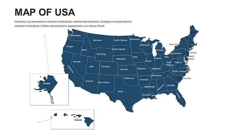
This covers all states; zoom into sub-regions with editable layers.