Financial Risks Keynote Diagrams: Chart Your Course Through Uncertainty
In the volatile dance of markets and mergers, one wrong step can cascade into crisis. But what if your presentations could spotlight risks before they strike, turning potential pitfalls into proactive plans? Enter our Financial Risks Keynote Diagrams Templates - 15 meticulously crafted slides for finance pros, risk analysts, and execs who need to dissect dollars with diagrams that demand attention.
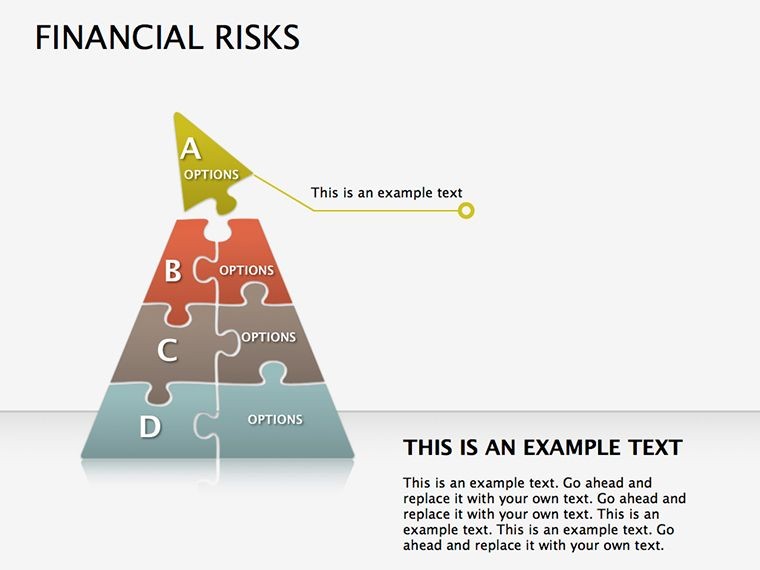
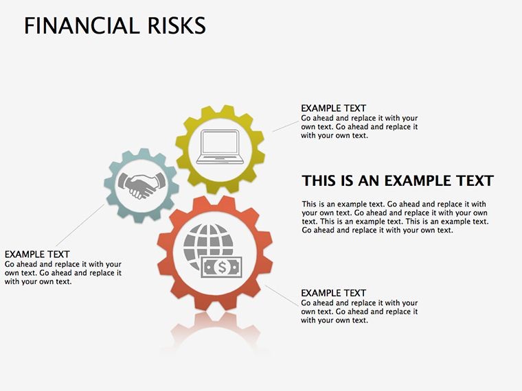
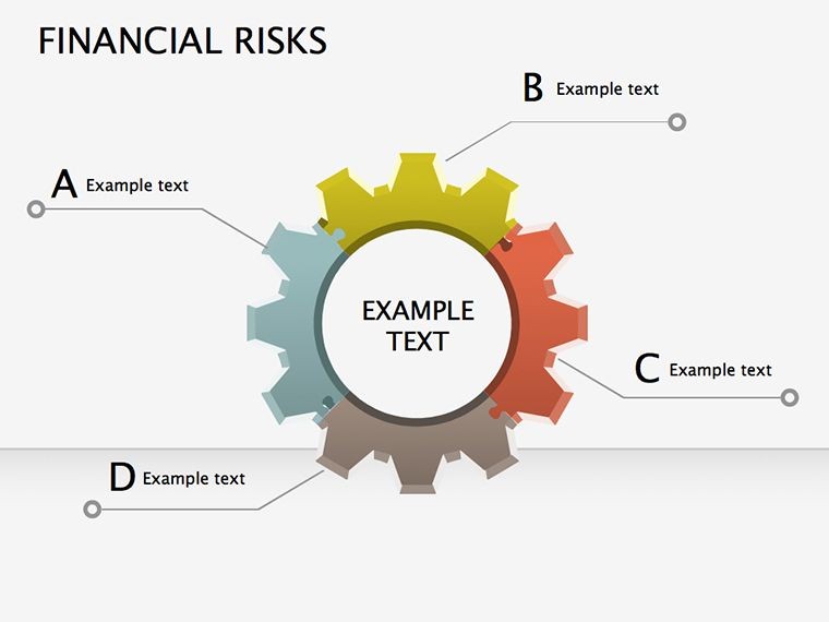
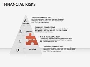
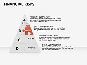
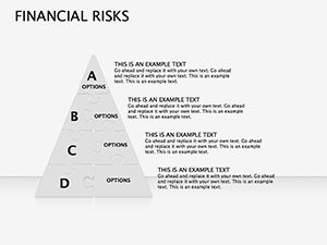
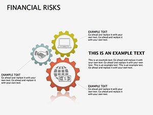
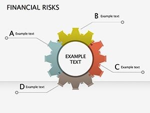
Built for Apple Keynote, this collection demystifies economic exposures with pie breakdowns, pyramid hierarchies, and puzzle interconnections. No more vague spreadsheets or monotonous monologues; these visuals frame threats - from currency fluctuations to compliance snags - in ways that inform and impress. Ideal for boardroom briefings or audit reviews, they bridge data to dialogue, helping teams anticipate and armor against fiscal storms.
Unraveling Risks: The Template's Core Strengths
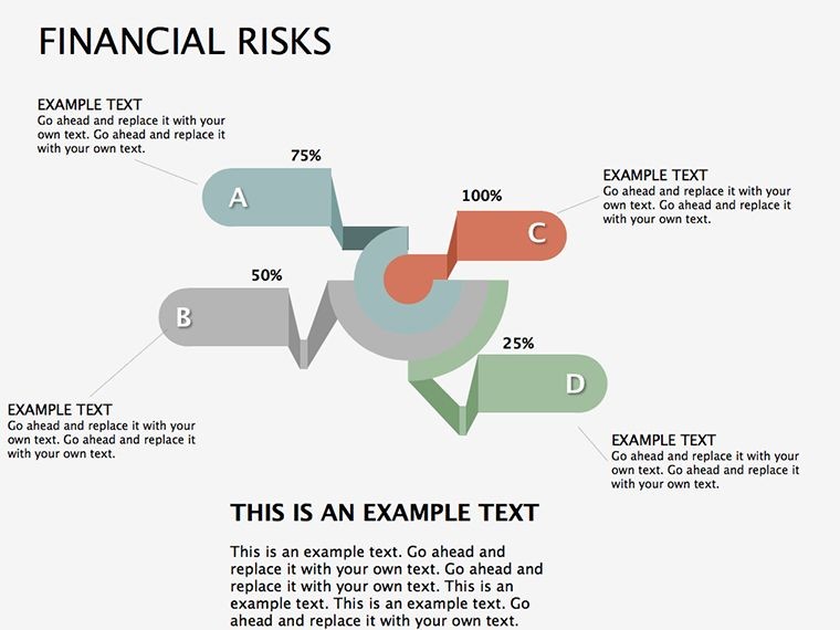
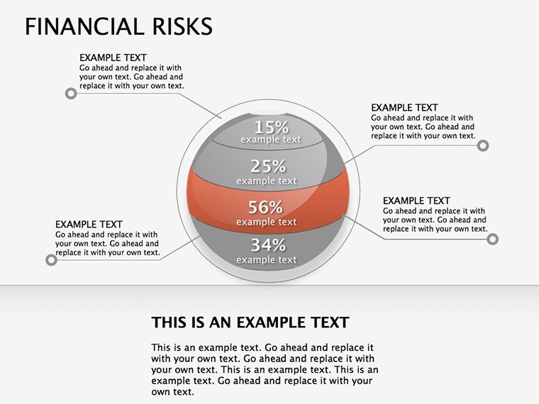
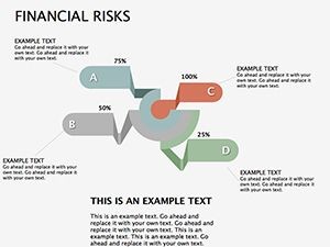
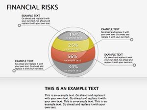
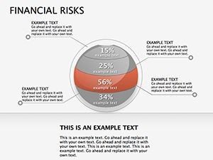
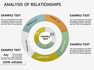
Dive into Slide 2's pie chart mosaic, segmenting risk categories by impact probability - customize slices with your latest audit figures for instant relevance. It's a far cry from Keynote's stock shapes; our puzzles interlock variables like regulatory changes and supply chain shocks, revealing hidden dependencies at a glance.
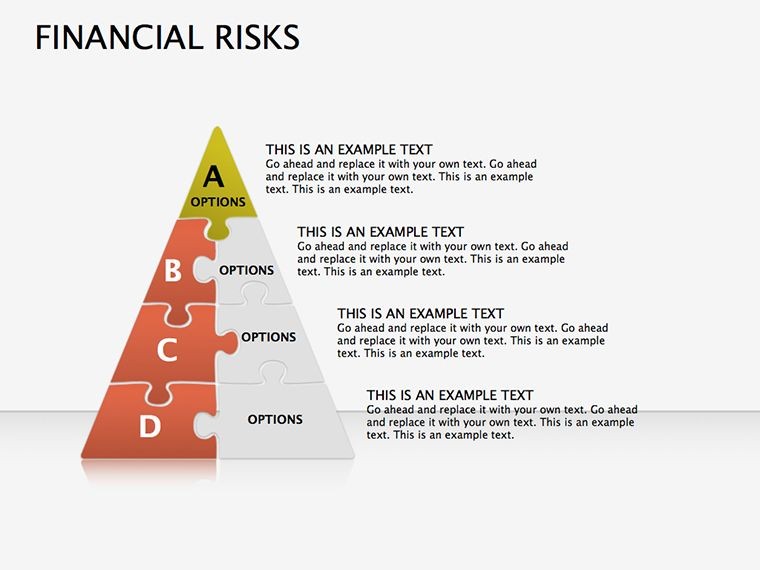
Unique? Absolutely. Infused with forensic finance flair, these designs draw from Basel III frameworks, ensuring diagrams that not only look sharp but align with global standards. A hedge fund manager once used our pyramid slide to layer risk appetites, swaying stakeholders to greenlight a $50M portfolio shift.
Essential Features for Risk Wranglers
- 15 Editable Slides: Holistic coverage from threat matrices to mitigation maps.
- Pie, Pyramid & Puzzle Mix: Versatile visuals for allocation, escalation, and complexity.
- Data-Driven Tweaks: Embed formulas for auto-updating exposure metrics.
- Compliance Icons: Symbols for standards like SOX or GDPR integration.
- KEY Native: Flawless rendering on all Apple ecosystems.
Crafted with input from CFA charterholders, these elements prioritize precision over pizzazz.
Strategic Scenarios: Risks in Action
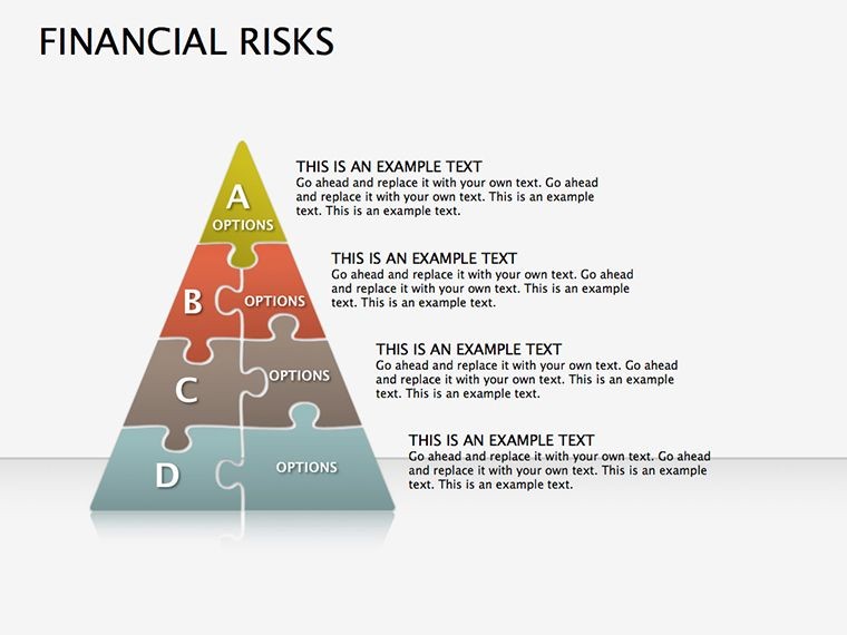
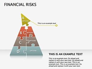
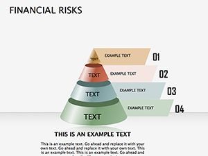
Consider a quarterly risk review for a manufacturing firm. Slide 7's pyramid escalates from operational hiccups to geopolitical threats, topped with contingency crowns. Populate with real metrics - say, 15% forex volatility - and facilitate focused fixes. Or, in M&A due diligence, our puzzle diagrams untangle counterparty exposures, clarifying deal-breakers before signatures.
For fintechs, these tools illuminate cyber-financial intersections. One user visualized phishing probabilities via pie overlays, fortifying board defenses and averting breaches. Adaptable across sectors, they transform dread into discussion, fostering resilience.
Mastering Risk Viz: Your 4-Step Protocol
- Scope the Spectrum: Pinpoint key risks; select fitting diagram types.
- Quantify & Qualify: Feed in probabilities and impacts via linked tables.
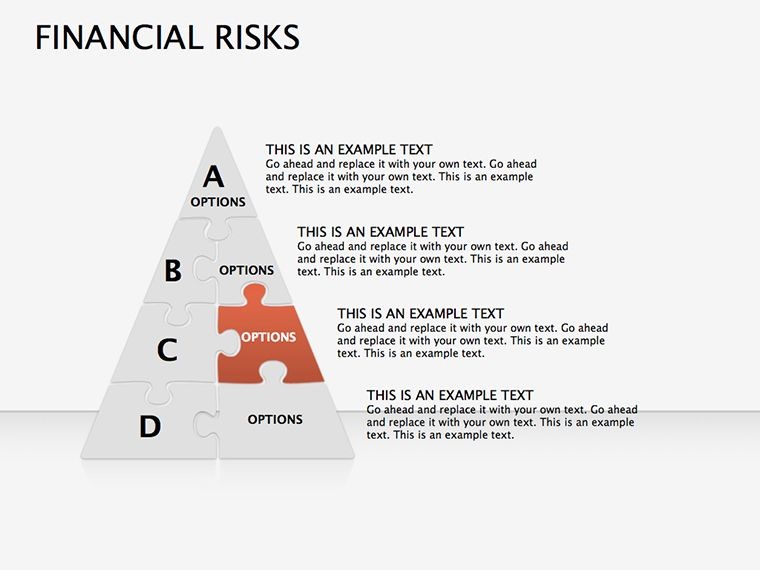
- Interconnect Insights: Use puzzles to link causes and cascades.
- Advise & Animate: Add fades for phased reveals; rehearse for punchy delivery.
Echoing COSO guidelines, this method minimizes oversight, maximizing mastery in under an hour.
Insider Tactics for Bulletproof Briefs
Pro tip: Color-code by severity - red for red flags - to trigger intuitive responses. Limit pyramids to three tiers for scannability, per Deloitte visualization studies. For global teams, embed hyperlinks to risk registers, turning static slides into navigable hubs.
This template empowers everyone from junior analysts to CFOs to communicate crises calmly. Secure yours today and steer through storms with savvy. Check our pie templates for deeper dives.
Frequently Asked Questions
Are the diagrams finance-standard compliant?
Yes, aligned with IFRS and Basel principles for credible, audit-ready visuals.
Can I integrate live data?
Certainly; connect to Excel or Apple Numbers for dynamic risk updates.
What's ideal for board reports?
Slide 10's executive pyramid - concise layers for high-level overviews.
Do puzzles support branching?
Indeed, add connectors for if-then scenarios in mitigation planning.
How editable for custom risks?
100% - reshape, relabel, and recolor to fit your unique exposures.

