World Maps Keynote Template: Charting Global Stories


Imagine standing before a room of executives, unveiling not just numbers, but a vivid tapestry of worldwide trends that pulls everyone into your narrative. That's the power of the World Maps Keynote Template - a carefully crafted set of diagrams designed to transform raw global data into compelling visuals. Whether you're a market analyst breaking down international trade flows or an educator mapping demographic shifts, this template arms you with eight fully editable slides that breathe life into complex information. Built for Apple Keynote, it ensures seamless integration into your workflow, letting you focus on the story rather than the setup.
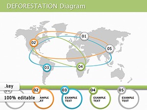
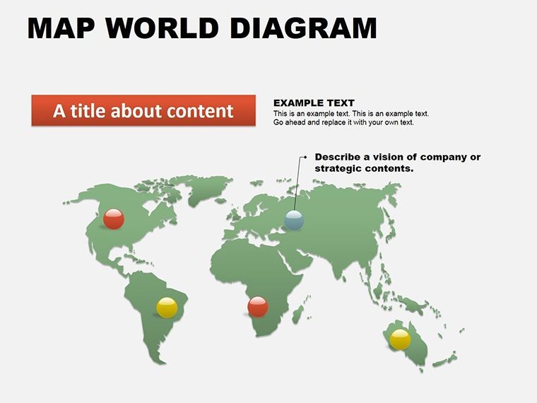
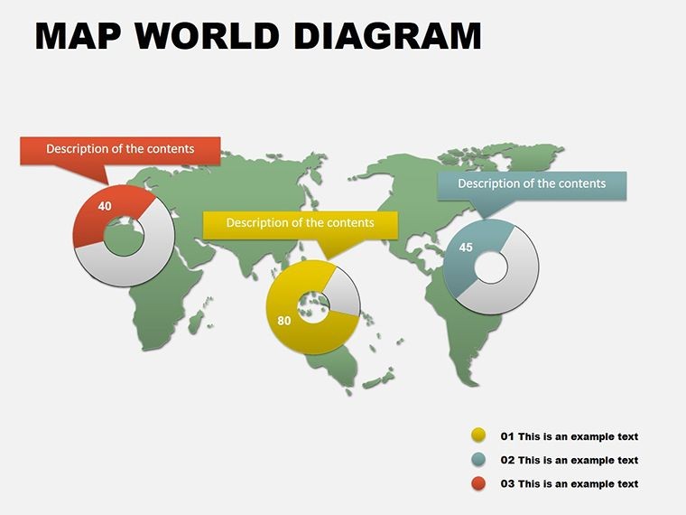
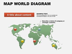
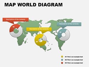
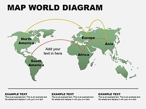
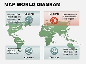
At its core, this template shines in its ability to simplify the vastness of our interconnected world. Picture overlaying economic indicators on a customizable world map, where continents glow with pie charts representing market shares or spheres denoting population densities. It's not about static images; it's about dynamic tools that adapt to your data, helping you highlight regional disparities or spotlight emerging opportunities. Professionals in consulting firms have turned to similar map-based visuals to secure multimillion-dollar deals, much like how firms like McKinsey layer geography with strategy in their client decks. With this template, you get that level of polish without starting from scratch - simply drag, drop, and dazzle.
What sets this apart is its intuitive design for real-world application. Swap out default colors to match your brand palette, or resize elements to emphasize key regions like Asia-Pacific trade hubs. And because it's vector-based, your maps remain sharp whether projected on a massive screen or shared via email. Download this Keynote map diagrams collection today and turn your next global overview into a conversation starter that lingers long after the slides fade.
Essential Features of the World Maps Keynote Template
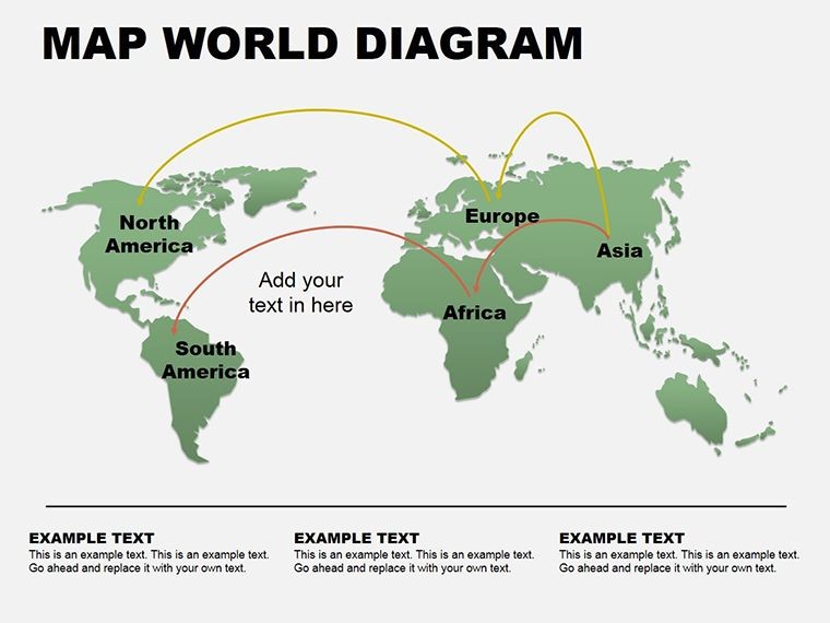
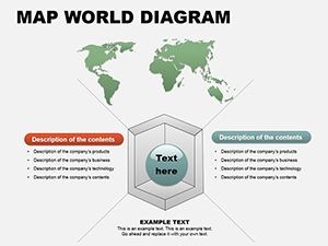
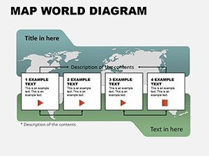
Diving deeper, the template's features are tailored for precision and flexibility, ensuring every slide serves your presentation's purpose. Start with the foundational world outline slide, where you can pinpoint countries with pinpoint accuracy - ideal for layering sales data across borders. Then, explore the thematic overlays: pie charts that dissect economic sectors per continent, or interconnected spheres that illustrate migration patterns. Each of the eight slides comes pre-loaded with placeholders for your stats, but they're far from rigid; tweak animations to reveal data progressively, building suspense as you guide your audience through the insights.
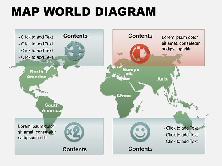
- Fully Editable Vectors: Adjust shapes, lines, and fills without losing quality, compatible with Keynote 2016 and later versions.
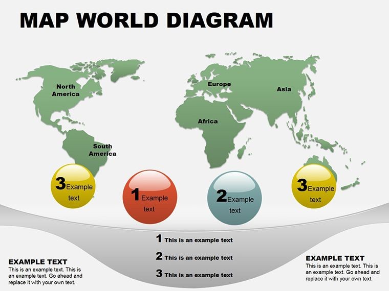
- Themed Data Visuals: From puzzle-piece continents for market segmentation to layered maps for multi-variable analysis.
- Brand-Ready Customization: Embed your logos or adjust fonts to align with corporate guidelines, saving hours of reformatting.
- High-Resolution Exports: Output to PDF or images that retain clarity for reports or social shares.
These aren't just bells and whistles; they're practical tools that address common pain points in global presentations. Forget squinting at tiny labels or wrestling with misaligned data - this template streamlines it all, letting you iterate quickly during late-night prep sessions.
Real-World Applications: Where Global Maps Make an Impact
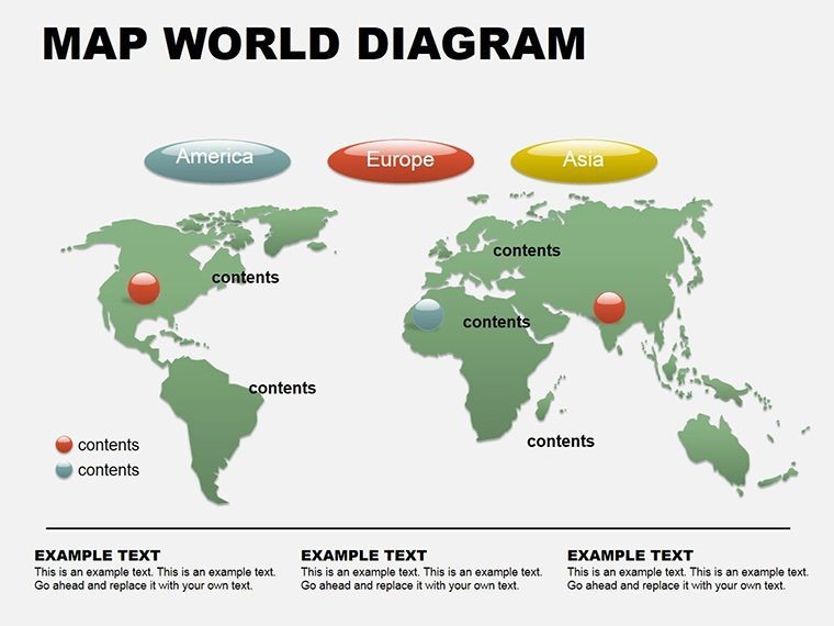
Consider a scenario in international development: You're pitching a sustainability initiative to stakeholders across Europe and Africa. Using the template's sphere diagram slide, you visualize carbon emission hotspots, with adjustable sizes reflecting impact levels. Add subtle gradients to denote policy influences, and suddenly, your pitch isn't a lecture - it's a call to collaborative action. Or shift to corporate strategy: A logistics director employs the pie chart map to show supply chain efficiencies, where slices represent regional contributions. This visual clarity has helped teams like those at DHL optimize routes, proving that well-mapped data drives decisions.
In education, the template finds a home in geography or social studies classes. An instructor might use the puzzle slide to assemble student-contributed data on cultural exchanges, fostering interactive discussions. The editability encourages experimentation - resize pieces for emphasis or color-code for themes like urbanization trends. For nonprofits tracking aid distribution, the layered map slide becomes invaluable, overlaying funding flows with beneficiary locations to demonstrate reach and gaps.
To get started, open Keynote and import the template. Select a slide, like the demographics overview, and input your dataset via simple copy-paste. Use the built-in tools to animate reveals: Fade in continents one by one to mirror your talking points. Test on different devices to ensure responsiveness, then rehearse with a timer. This workflow not only polishes your delivery but builds confidence, knowing your visuals are as robust as your message.
Customization Tips to Tailor Your Global Narrative
Unlocking the template's full potential means embracing its adaptability. Begin by auditing your data sources - ensure they're in a clean format like CSV for easy import. For the economy-focused slide, experiment with color theory: Blues for stable markets, reds for volatility, creating an intuitive heatmap effect. If your presentation involves time series, duplicate a base map and evolve it across slides, showing progression from 2020 baselines to projected 2030 scenarios.
Integrate multimedia sparingly but effectively - embed hyperlinks to detailed reports on clickable regions, turning passive viewers into active explorers. For accessibility, add alt text to images: "Editable world map pie chart for global market shares." This not only aids screen readers but boosts your deck's professionalism. Compared to vanilla Keynote shapes, this template cuts creation time dramatically, freeing you to refine your script or gather feedback.
One pro tip from design leads: Pair maps with minimal text overlays. Let the visuals lead, using slides as prompts rather than scripts. This approach, echoed in Edward Tufte's principles of data integrity, ensures your audience absorbs the big picture without distraction.
Step-by-Step: Building a Trade Analysis Deck
- Import and Setup: Drag the template into Keynote; choose the world outline as your opener.
- Data Entry: Populate pie segments with export figures - use formulas if linking to spreadsheets.
- Visual Tweaks: Align elements via guides; apply shadows for depth on 3D-like maps.
- Animate and Test: Sequence builds to sync with your flow; preview in presentation mode.
- Export and Share: Save as .key for collaborators or PDF for archives.
Following these steps, you'll craft a deck that's not just informative but inspiring, ready to influence boardrooms or classrooms alike.
Frequently Asked Questions
What makes these Keynote map diagrams stand out for global presentations?
They combine editable vectors with thematic layouts like pies and spheres, specifically tuned for economic and demographic data, ensuring clarity across diverse audiences.
Are the slides compatible with older Keynote versions?
Yes, designed for Keynote 2016 and above, with backward compatibility tips included in the download.
How do I customize colors for my brand?
Select any element, access the format panel, and apply your hex codes - changes propagate instantly across slides.
Can I use this template for non-business topics like travel planning?
Absolutely; adapt the maps for route visualizations or cultural highlights with ease.
Does it support animations for data reveals?
Built-in transitions are ready to use, or add custom ones via Keynote's animate tab for smoother storytelling.
What's the file format and size?
Delivered as .key files, optimized for quick loading under 5MB.
Ready to map your path to standout presentations? Secure this World Maps Keynote Template for $16 and start visualizing the world on your terms.