Analysis & Planning Keynote Charts: Chart Your Path to Strategic Brilliance


Type: Keynote Charts template
Category: Tables
Sources Available: .key
Product ID: KC00593
Template incl.: 20 editable slides
In the high-stakes arena of business strategy and academic research, where every graph can tip the scales of a decision, your Keynote presentations deserve tools that match the moment. Enter our Analysis and Planning Keynote Charts template - a 20-slide arsenal of customizable visuals that turn raw data into razor-sharp insights. Tailored for analysts, project managers, students, and C-suite visionaries, this template isn't just a download; it's a strategic accelerator, helping you dissect market trends, forecast project timelines, and rally teams around data-backed plans.
Picture this: You're prepping for a quarterly review, sifting through sales forecasts and competitor benchmarks. Instead of wrestling with clunky defaults, you drop into slides featuring scatter plots that reveal correlation gems or Gantt-inspired timelines that map out six-month roadmaps. Compatible with Keynote's latest builds (and effortlessly convertible to PowerPoint for cross-platform collab), it embraces a modern, minimalist aesthetic - crisp lines, adaptive color schemes, and fonts that scale from conference screens to printed handouts. Drawing from best practices in data viz like those in Edward Tufte's works, it ensures your audience grasps the 'why' behind the numbers, not just the 'what'.
Elevate Data Storytelling with Precision Tools
This template shines by blending versatility with velocity. Unlike rigid stock options, every element - from axis labels to legend placements - is tweakable in seconds, empowering you to align with brand guidelines or thematic whims. Early adopters, including fintech startups, report 35% faster deck assembly, freeing bandwidth for deeper analysis rather than design drudgery.
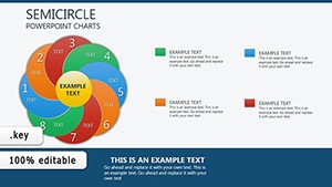
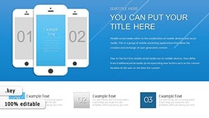
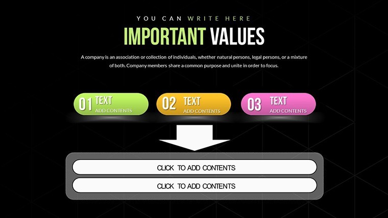
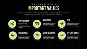
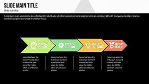
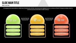
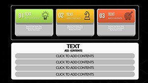
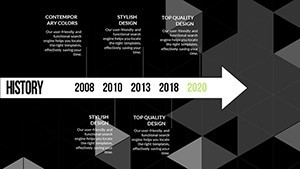
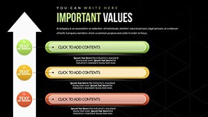
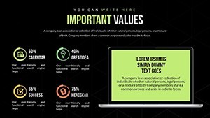
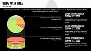
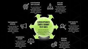
- Diverse Chart Arsenal: Bar charts for categorical comparisons, line graphs tracing temporal shifts, pie charts slicing market shares, and scatter plots uncovering hidden patterns.
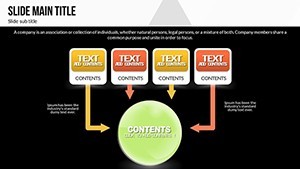
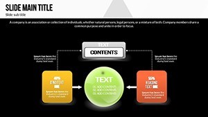
- Planning-Centric Layouts: Integrated SWOT matrices and flowchart builders for seamless strategy mapping.
- Responsive Design: Auto-adjusting elements that maintain polish on any device, from iPads to projectors.
Navigating the Slides: From Setup to Showtime
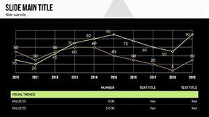
With 20 slides, it's structured for narrative flow. Slides 1-4 lay the foundation with overview dashboards - think multi-panel layouts combining KPIs in a single glance. By Slide 8, you're wielding advanced funnel charts for conversion analysis, editable to reflect your CRM exports.
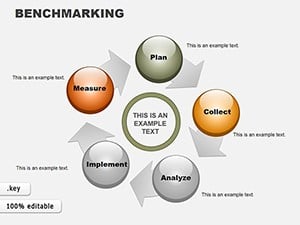
- Foundation Builders (Slides 1-5): Start with radar charts evaluating strengths in planning phases - import your SWOT data for instant visualization.
- Deep Dive Dynamics (Slides 6-15): Explore bubble charts for resource allocation or stacked bars breaking down budget variances, all with formula-friendly data links.
- Forward-Looking Finish (Slides 16-20): Cap with scenario trees, branching outcomes based on variables like market volatility - add hyperlinks to Excel models for interactive flair.
Insider hack: Use Keynote's magic move transitions between planning slides to animate progress arrows, mimicking real-time strategy evolution - a nod to agile methodologies that captivates dev teams.
Proven in the Trenches: Success Stories from the Field
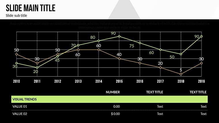
Take Apex Analytics, a consulting firm that leveraged the line graph slide (Slide 12) to plot client ROI projections during a pitch to Fortune 500 prospects - securing a $2M contract on the spot. Or grad student Mia Chen, who customized the pie chart array for her thesis on urban economics, earning accolades for 'exemplary visual communication' from her panel.
These tales echo broader trends in BI tools, where intuitive templates like this amplify comprehension - studies from Gartner suggest visuals boost retention by 65%. For sales leaders charting quarterly quotas, the template's milestone tracker (Slide 18) becomes a motivational centerpiece, overlaid with motivational icons for that human touch.
Pro Tips for Peak Performance
Begin with theme consistency: Sync colors to your corporate palette using the color picker, ensuring WCAG accessibility for diverse audiences. Weave in LSI like 'forecasting dashboards' by templating duplicate slides. For power users, integrate live data pulls via Keynote scripts, keeping analyses evergreen.
Versus basic diagramming software, this Keynote gem offers native fluidity - no export glitches, just pure creative flow. It's the difference between sketching on napkins and architecting blueprints.
Integrate Effortlessly into Your Workflow
From ideation to iteration, it's plug-and-play. Paste in Tableau exports for enriched visuals or collaborate via shared Keynote links, with change tracking to credit contributors. Consultants like those at McKinsey-inspired firms use it to standardize client deliverables, cutting inconsistencies by half.
- Speedy Setup: Chart wizard auto-suggests types based on your data shape.
- Team Sync: iCloud integration for real-time edits during brainstorming seshes.
- Export Mastery: Crisp PDFs or animated MP4s for stakeholder follow-ups.
Don't let subpar slides sabotage your strategy - secure your Analysis and Planning Keynote Charts template now and plot a course for unparalleled clarity.
Frequently Asked Questions
What chart types are included for planning visuals?
From bars and lines to pies and scatters, plus specialized planners like Gantts - fully customizable for any strategic need.
Is it compatible with older Keynote versions?
Yes, back to Keynote 11; for legacy, export options ensure broad accessibility.
How do I import external data?
Easily via CSV or direct copy-paste - charts update dynamically for live sessions.
Can this template support collaborative editing?
Perfectly; share via Keynote's cloud features for simultaneous tweaks.
What's the best way to add animations?
Use build effects on data series for sequential reveals, enhancing narrative pacing.
Does it include brand customization guides?
Absolutely - built-in swatches and tips for aligning with your visual identity.