Revolutionize Your Research Presentations with Research Methods Keynote Charts Template


Research is the backbone of innovation, but presenting methodologies effectively requires more than just facts - it demands visual storytelling. The Research Methods Keynote Charts Template delivers exactly that, with 21 widescreen editable slides featuring creative designs, special animations, and vector elements. Crafted for Mac's Keynote, this template empowers users to build robust presentations on qualitative and quantitative methods, from surveys to case studies.
Suited for academics dissecting experimental designs or entrepreneurs validating business hypotheses, it incorporates modern aesthetics to make complex theories accessible. Backed by insights from research gurus like Creswell, who advocate mixed-methods approaches, this tool helps you construct slides that not only inform but inspire critical thinking.
Standout Features for Scholarly Excellence
This template's strength lies in its blend of functionality and flair. Widescreen format ensures compatibility with projectors, while animations add depth to methodological flows.
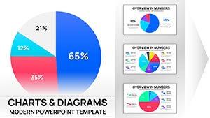
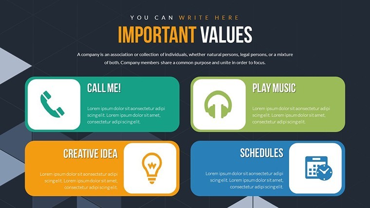
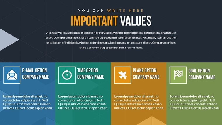
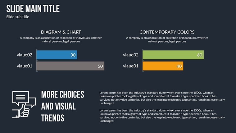
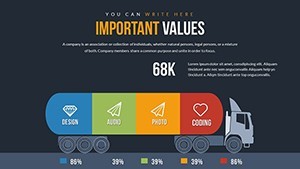
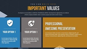
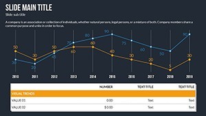
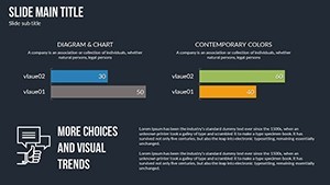
- Matrix and Table Charts: Organize variables and findings in grids, ideal for comparative analyses.
- Animation Effects: Reveal steps in research processes sequentially, enhancing comprehension.
- Vector Scalability: Stretch elements without quality loss, perfect for detailed diagrams.
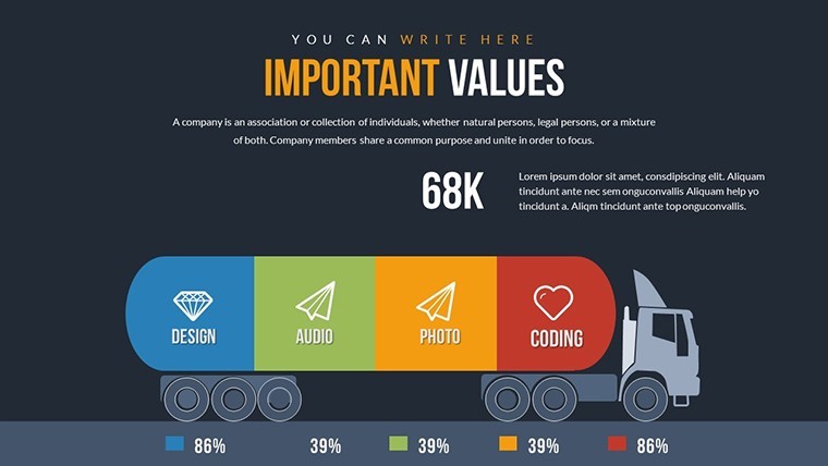
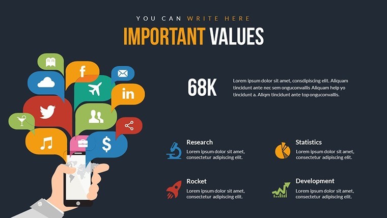
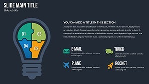
- Media Integration: Embed photos, videos, or audio clips to illustrate real-world applications.
In contrast to plain Keynote slides, this offers professional polish, akin to APA-style visuals for credibility. For example, a university researcher used similar matrices to present ethnographic data, aligning with ethical standards and earning peer acclaim.
Slide-by-Slide Exploration
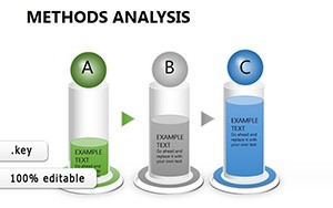
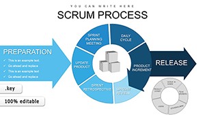
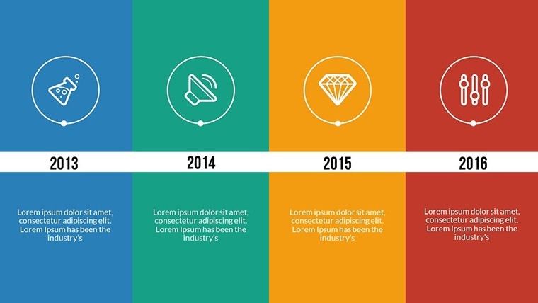
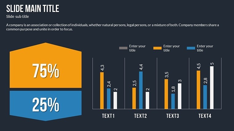
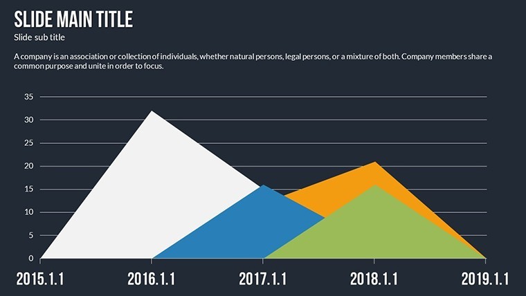
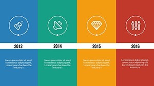
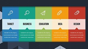
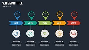
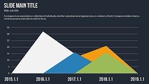
Slides 1-5 introduce foundational concepts with flowchart charts mapping research paradigms, from positivism to interpretivism. Mid-slides (6-12) cover data collection tools, like funnel charts for sampling strategies.
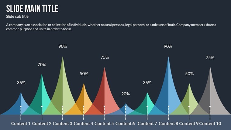
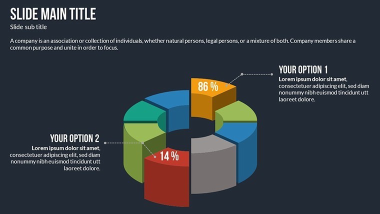
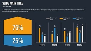
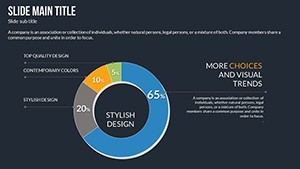
The back half (13-21) focuses on analysis and recommendations, using bubble charts for variable correlations and bar graphs for statistical significance. Transitions between slides are spectacular, guiding viewers through logical progressions.
Diverse Applications in Research Contexts
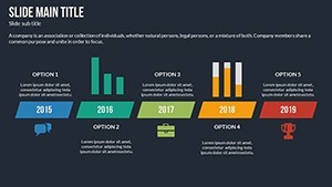
From classrooms to conferences, this template adapts. Teachers can use it for lesson plans on hypothesis testing, while mentors guide startups through market research visuals.
- Academic Lectures: Break down methodologies for students, fostering deeper understanding.
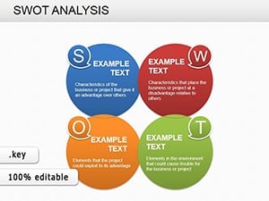
- Professional Workshops: Demonstrate practical tools like SWOT analyses for business insights.
- Entrepreneurial Pitches: Visualize validation processes to attract investors.
Incorporate into workflows by adding tables from SPSS outputs or modifying charts with fresh data. Tip: Use animations to pace your delivery, pausing on key ethics discussions for emphasis.
Expert Advice for Impactful Research Slides
Draw from pros: Prioritize clarity over clutter - limit variables per chart to three for focus. Ensure inclusivity with alt text and color-blind-friendly palettes. A study from an educational journal showed visualized methods improved retention by 25%, validating this template's approach.
For interdisciplinary work, blend qualitative quotes with quantitative graphs, creating holistic views.
Advance Your Research Narrative Now
Trust in this template's design for authoritative presentations. Keynote-exclusive, it's your gateway to professional research communication.
Embark on better research storytelling - download and customize today for presentations that resonate.
Frequently Asked Questions
How do the animations enhance research presentations?
They reveal information step-by-step, making complex methods easier to follow.
Is the template beginner-friendly?
Yes, with easy edits suitable for all skill levels.
What types of charts are included?
Mainly matrices and tables, customizable for various research needs.
Can I add media elements?
Absolutely, integrate photos, videos, and more seamlessly.
Is it compatible with older Keynote versions?
Works best with current versions, but check for animation support.
How to modify vector elements?
Simply scale or recolor them without losing quality.