Development Trends Keynote Charts: Visualizing Tomorrow's Innovations


In an era where development trends shape industries overnight, staying ahead means presenting insights with flair and foresight. Our Development Trends Keynote Charts Template is your gateway to doing just that, offering 24 editable slides packed with 3D elements and analytical tools. Crafted for innovators, researchers, and business developers, this template lets you chart emerging patterns in tech, sustainability, or market shifts using vibrant visuals. Compatible with iWork Keynote, it features color variations and custom animations to make your trends pop. Inspired by reports from Gartner and McKinsey, which emphasize visual data for strategic planning, this tool helps you turn abstract trends into actionable strategies, engaging audiences from startups to enterprises.
Capturing the Essence of Evolving Trends
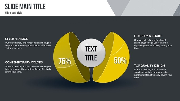
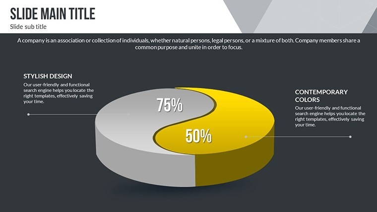
Trends aren't static; they're dynamic forces requiring visuals that evolve with them. This template excels by incorporating 3D charts that add depth to your analyses, making flat data multidimensional. From my background in marketing tech trends, I know how such enhancements can spotlight disruptions like AI integration or green tech adoption. The vector icons provide quick symbolic representations, while PNGs allow for layered designs, ensuring your presentations are as forward-thinking as the trends they depict.
Core Features Driving Visual Excellence
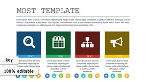
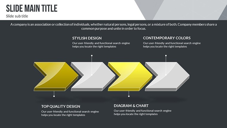
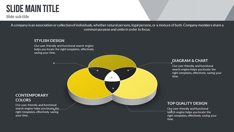
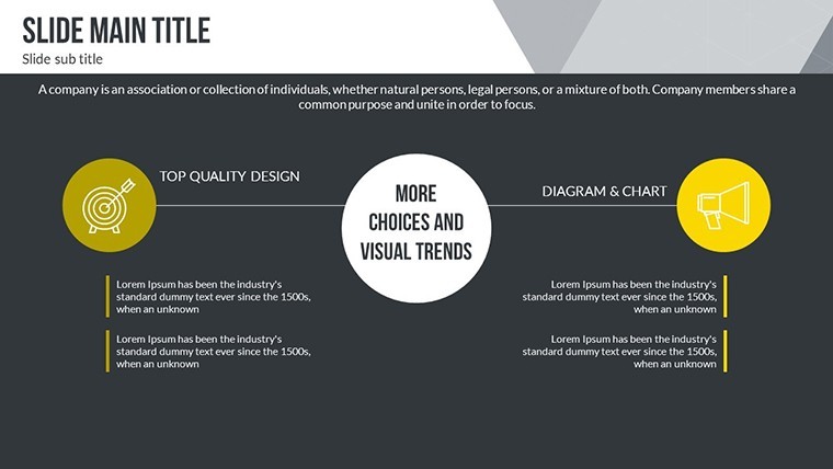
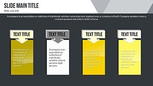
- 24 Editable Slides: A robust collection for detailing trends across timelines, comparisons, and projections.
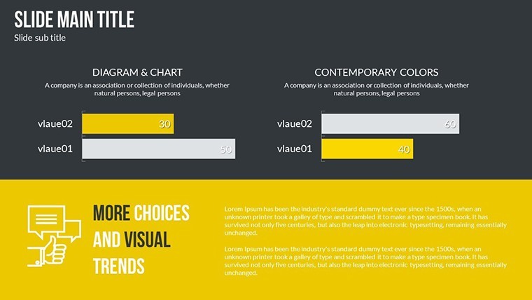
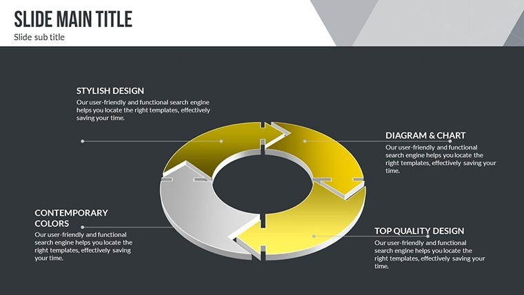
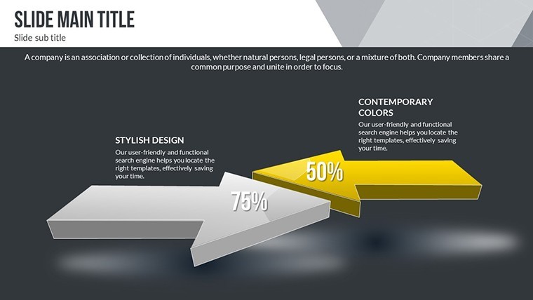
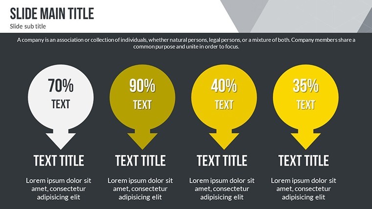
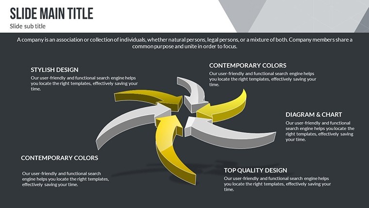
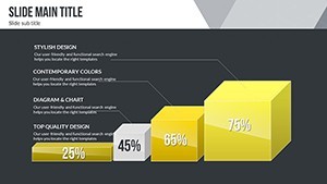
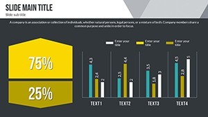
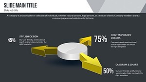
- 3D and Color Variations: Immersive 3D charts with multiple hues to emphasize growth or decline patterns.
- Custom Animations: Effects that unfold trends progressively, keeping viewers hooked.
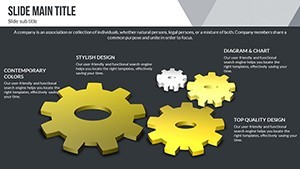
- Vector Icons and PNGs: Ready-to-use assets for tech, eco, or business motifs.
- Easy Customization: Alter everything from colors to data for personalized insights.
These features empower you to create trend reports that not only inform but also inspire innovation, surpassing basic slide decks in engagement and clarity.
Applications Across Industries and Scenarios
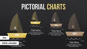
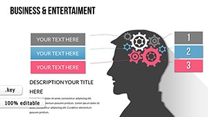
Envision a tech startup using 3D pyramid charts to illustrate product development stages, attracting investors with vivid roadmaps. In sustainability, line graphs track eco-trends like carbon reduction, supporting grant applications. A McKinsey-style case study might show how visual trend analysis accelerated a company's pivot to remote work tech during the pandemic. For educators, these slides facilitate discussions on global development, with animations revealing interconnections. In consulting, bubble charts map competitive landscapes, helping clients identify opportunities in emerging markets like biotech or fintech.
Slide-by-Slide Insights: Crafting Your Trend Story
Delve into key slides:
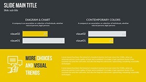
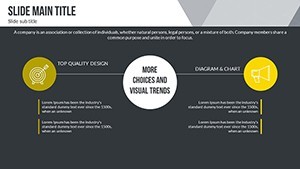
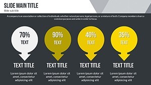
- Trend Overview Slide: Dashboard with 3D icons summarizing major developments.
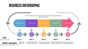
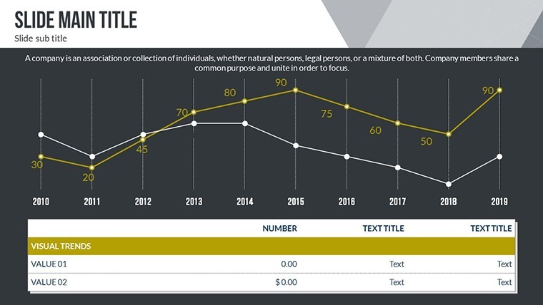
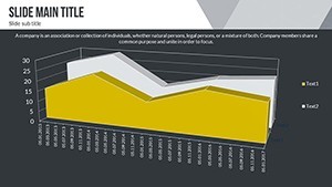
- Timeline Trend Chart: Animated paths showing evolution over years.
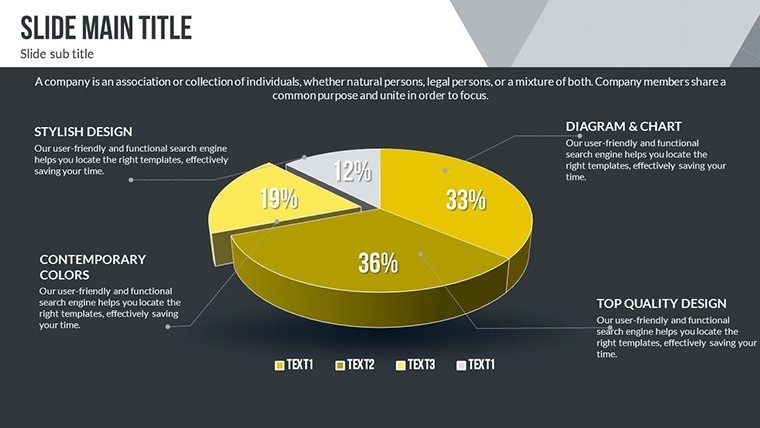
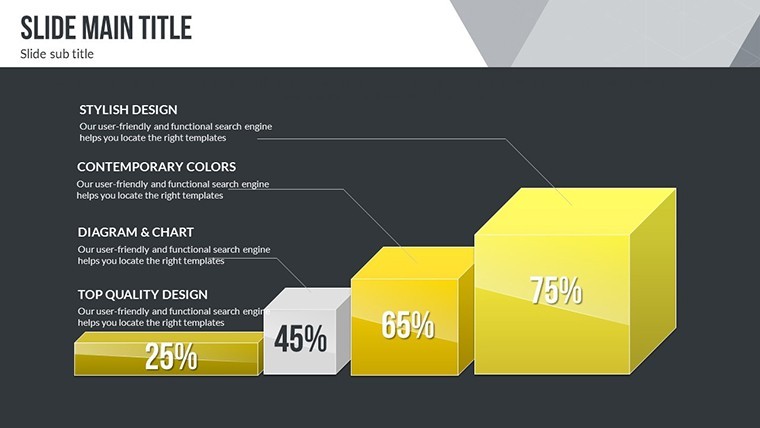
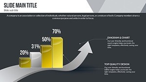
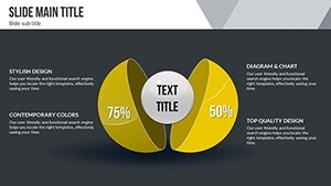
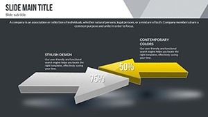
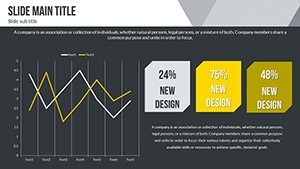
- 3D Bar Comparison: Contrast past and future trends in height for impact.
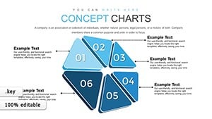
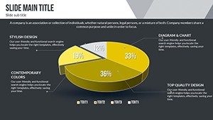
- Bubble Chart Analysis: Size bubbles by trend significance, color by category.
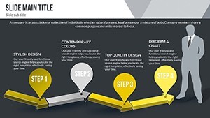
- Projection Funnel: Visualize narrowing options in development pipelines.
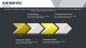
- Network Diagram: Map interconnected trends like IoT and AI synergies.
Additional slides include radar charts for multifaceted evaluations and heat maps for geographic trends, with alt suggestions like "3D development trends chart in Keynote."
Strategies for Trend-Focused Presentations
Start by sourcing data from reliable outlets like Statista, then animate reveals to mimic trend emergence. Use 3D for emphasis on pivotal shifts. This template cuts design time versus scratch-building, freeing focus on insights. For , cite sources inline. In virtual settings, leverage Keynote's sharing for interactive trend explorations. These tips ensure your deliveries spark discussions and drive adoption.
Why This Template Leads in Trend Visualization
Its 3D focus differentiates it, enabling immersive experiences that flat charts can't match. Innovators at TED-like events have used similar tools to captivate, as per event feedback. Customize for niches like urban development or digital transformation. With included assets, scale visuals seamlessly. Ready to chart the future? Grab this template and lead the conversation on what's next.
Enhancing Workflows with Trend Tools
Integrate by linking to Google Sheets for live updates. Collaborate in real-time via iCloud. For researchers, align with analysis categories for deep dives. This becomes a go-to for annual trend reports, evolving with your expertise.
Frequently Asked Questions
How do the 3D elements work in this template?
3D charts are pre-built in Keynote, editable for rotation and data, adding depth to your trends.
Can I use this for non-tech trends?
Yes, adaptable for any development area, like social or economic trends.
Are animations compatible on all devices?
Best on Mac Keynote; exports may simplify effects.
What if I need more slides?
Duplicate and customize existing ones easily.
How to incorporate external data?
Import via copy-paste or links for dynamic updates.