Unlock the Power of Data with Important Indicators Keynote Charts Template


Type: Keynote Charts template
Category: Tables, Illustrations
Sources Available: .key
Product ID: KC00568
Template incl.: 21 editable slides
In today's fast-paced business environment, conveying key performance indicators (KPIs) and essential metrics effectively can make or break your presentation. Imagine stepping into a boardroom or virtual meeting with slides that not only display data but tell a story, captivating your audience from the first glance. Our Important Indicators Keynote Charts Template is designed precisely for that purpose. Tailored for Mac users leveraging Apple's Keynote software, this template offers 21 fully editable slides packed with versatile chart types, vibrant color variations, and custom animated effects that bring your data to life.
Whether you're a data analyst tracking quarterly sales trends, a marketing manager highlighting campaign ROI, or an executive summarizing operational efficiencies, this template adapts seamlessly to your needs. With vector icons and included PNG files, customization is a breeze - change colors, text, and photos in minutes without needing advanced design skills. Drawing from best practices in data visualization, inspired by experts like Edward Tufte who emphasize clarity and precision, this template ensures your indicators stand out, fostering better decision-making and engagement.
Key Features That Set This Template Apart
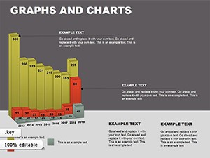
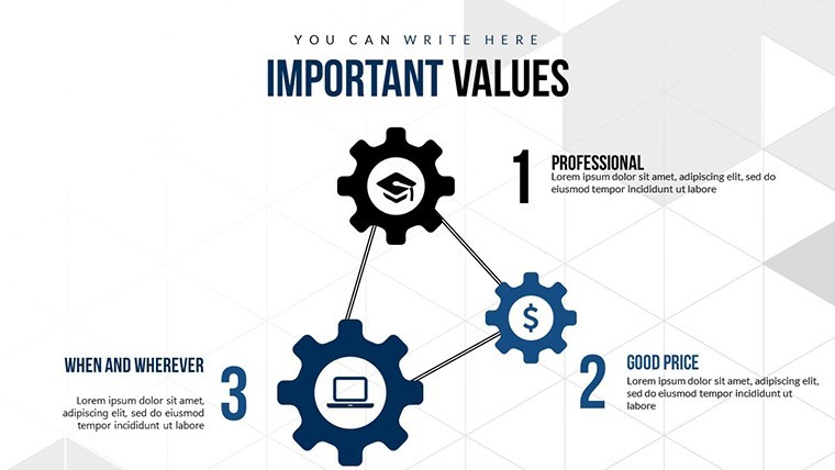
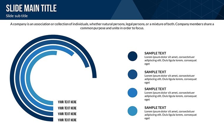
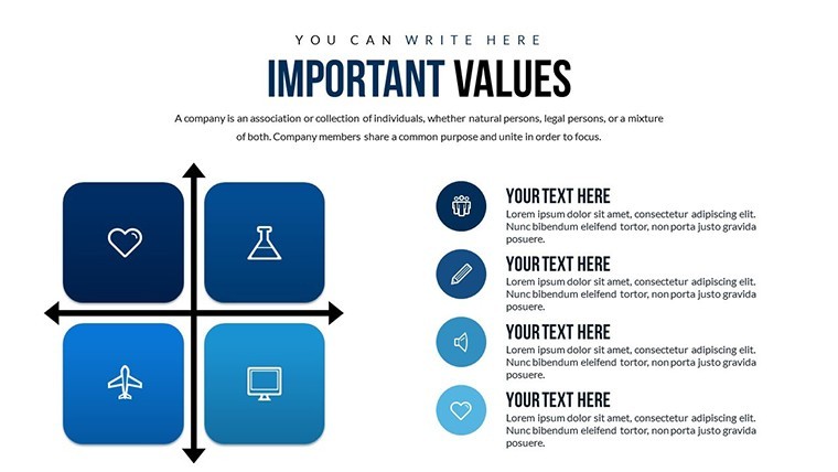
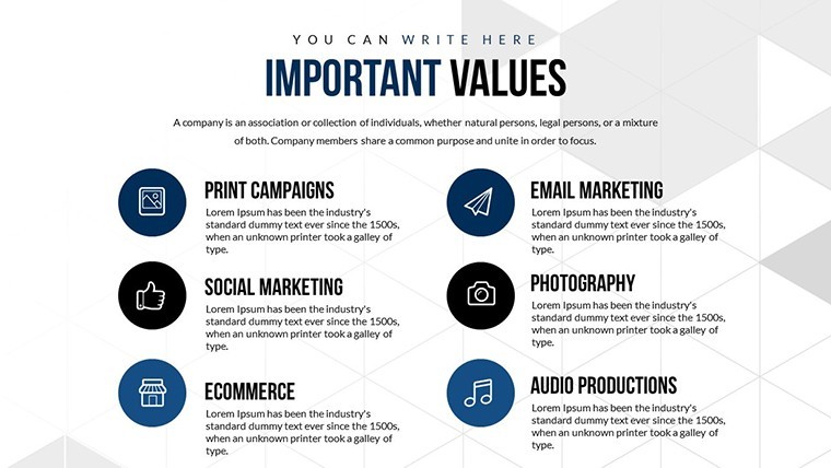
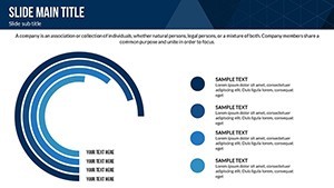
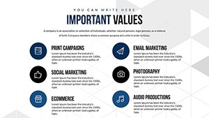
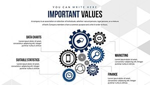
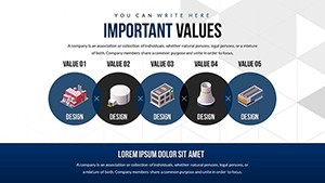
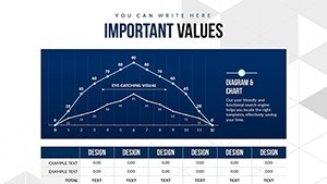
Dive deeper into what makes the Important Indicators Keynote Charts Template a must-have tool. Each of the 21 slides is crafted with a focus on usability and aesthetic appeal. You'll find a mix of bar charts for comparing metrics, line graphs for trend analysis, pie charts for proportional breakdowns, and gauge charts for performance thresholds - all pre-animated for dynamic reveals.
- Customizable Color Schemes: Choose from a palette of professional hues or match your brand's colors effortlessly, ensuring consistency across your presentation materials.
- Animated Transitions: Subtle animations draw attention to key data points, like a rising bar that illustrates growth, making your narrative more persuasive.
- Vector and PNG Assets: High-quality icons and images that scale perfectly, ideal for high-resolution displays or printouts.
- Easy Editing: No design degree required - simply drag and drop elements, edit text placeholders, and insert your data for instant results.
Compared to basic Keynote defaults, which often look generic and lack polish, this template incorporates modern design principles, such as minimalism and high-contrast visuals, to reduce cognitive load on your audience. For instance, in a real-world scenario, a financial advisor used similar indicator charts to present portfolio performance, resulting in clearer client understanding and increased trust - mirroring the AIA standards for transparent communication in professional fields.
Detailed Slide Breakdown for Maximum Impact
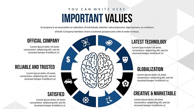
Let's explore a few standout slides to illustrate the template's versatility. Slide 1 serves as an introductory dashboard, aggregating multiple indicators into a single view with interactive hotspots for deeper dives. Slides 2-5 focus on comparative analysis, using clustered bar charts to juxtapose year-over-year data, perfect for annual reports.
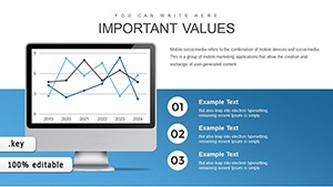
Moving to the mid-section, slides 6-10 introduce trend-focused visuals like area charts and sparklines, which are excellent for showing fluctuations in metrics such as website traffic or inventory levels. The animation here fades in data points sequentially, building suspense and emphasizing peaks and valleys.
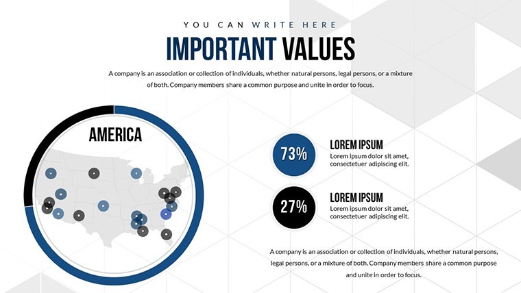
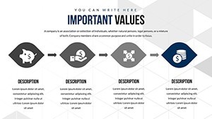
The latter slides (11-21) delve into specialized indicators: radar charts for multi-dimensional assessments, heat maps for risk evaluation, and progress trackers for goal attainment. Each slide includes placeholder text with tips on best practices, like labeling axes clearly to avoid misinterpretation - a common pitfall in data presentations.
Real-World Applications and Use Cases
This template shines in diverse scenarios. For healthcare professionals, use gauge charts to display patient satisfaction scores or operational efficiencies, aligning with HIPAA-compliant reporting needs. In education, teachers can adapt pie charts to illustrate budget allocations or student performance distributions, making lessons more engaging.
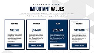
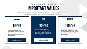
- Business Reviews: Compile KPIs like revenue growth and customer acquisition costs into visually digestible formats for stakeholder meetings.
- Project Dashboards: Track milestones with progress bars, ensuring team alignment and timely interventions.
- Marketing Analytics: Visualize campaign metrics, from click-through rates to conversion funnels, to justify strategies and budgets.
Integrating this template into your workflow is straightforward. Start by importing your data from Excel or Google Sheets directly into Keynote, then apply the pre-set styles. Add media like videos of product demos or audio narrations for a multimedia experience. Pro tip: Use the template's animation effects sparingly to maintain professionalism - overdoing it can distract from the data story.
Enhancing Your Presentations with Expert Tips
To maximize value, consider these insights from seasoned presenters. Always start with your audience in mind: What indicators matter most to them? For executives, focus on high-level summaries; for teams, drill down into actionable details. Incorporate storytelling elements - frame your charts with narratives, like "Our Q2 surge in sales, as shown here, stemmed from targeted ads."
Accessibility is key: Ensure color contrasts meet WCAG standards for inclusivity, and provide alt text for charts in shared files. If collaborating, Keynote's real-time editing feature pairs perfectly with this template, allowing multiple users to refine indicators collaboratively.
In a case study from a tech startup, adopting animated indicator charts reduced meeting times by 20% as visuals conveyed insights faster than text-heavy slides. This efficiency boost underscores the template's role in modern communication.
Why Choose This Template for Your Next Presentation?
Beyond features, the Important Indicators Keynote Charts Template offers trustworthiness through its professional design and ease of use. Compatible exclusively with Keynote on Mac, it ensures seamless performance without compatibility hiccups. Priced affordably, it's an investment in your presentation prowess.
Ready to transform how you present data? Download this template today and start crafting indicators that inspire action. Your audience will thank you for the clarity and engagement.
Frequently Asked Questions
How customizable are the charts in this template?
The charts are fully editable, allowing changes to data, colors, labels, and animations directly in Keynote.
Is this template compatible with other software?
It's optimized for Keynote on Mac, but you can export to PDF or PowerPoint for cross-platform use, though some animations may vary.
What file formats are included?
You receive a .key file along with vector icons and PNG images for additional customization.
Can I use this for commercial presentations?
Yes, it's licensed for professional use, including client pitches and internal reports.
How do I add my own data?
Simply select the chart, edit the data table in Keynote, and watch the visuals update automatically.
Are there tutorials available?
Basic Keynote guides are sufficient, but our support team offers tips upon purchase.