Harness Business Insights with Purchasing Power Keynote Charts


Type: Keynote Charts template
Category: 3D, Illustrations
Sources Available: .key
Product ID: KC00540
Template incl.: 24 editable slides
In today's competitive business landscape, where data drives decisions, having the right tools to visualize purchasing power can set you apart. Our Purchasing Power Keynote Charts template, with 24 editable slides, is engineered for business professionals, educators, and marketers who need to present financial projections, market trends, and sales data with unparalleled clarity. Imagine transforming dense spreadsheets into captivating 3D illustrations that not only inform but also persuade stakeholders. This template, compatible with Keynote on macOS, offers a seamless way to customize visuals, ensuring your message resonates deeply.
Drawing from real-world applications, such as how companies like Amazon analyze consumer spending patterns, this template incorporates illustrative elements that make complex economic concepts accessible. With easy editing features, you can infuse your brand's essence, from color schemes to logos, creating presentations that feel bespoke. As per McKinsey reports, effective data visualization can improve decision-making speed by 28%, and this template is your shortcut to that efficiency.
Essential Features for Impactful Business Visuals
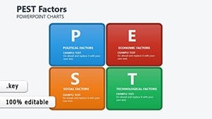
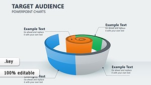
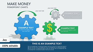
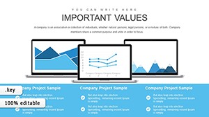
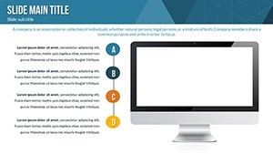
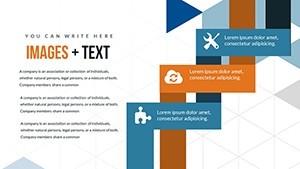
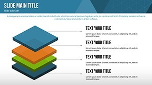
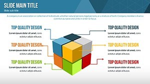
This template shines through its blend of 3D designs and illustrative charts, perfect for depicting multidimensional data like purchasing power parity or consumer expenditure forecasts. Each slide is widescreen-ready, ensuring professional polish in boardrooms or virtual meetings.
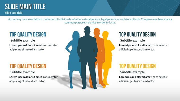
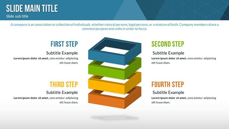
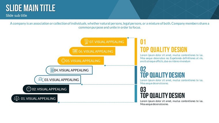
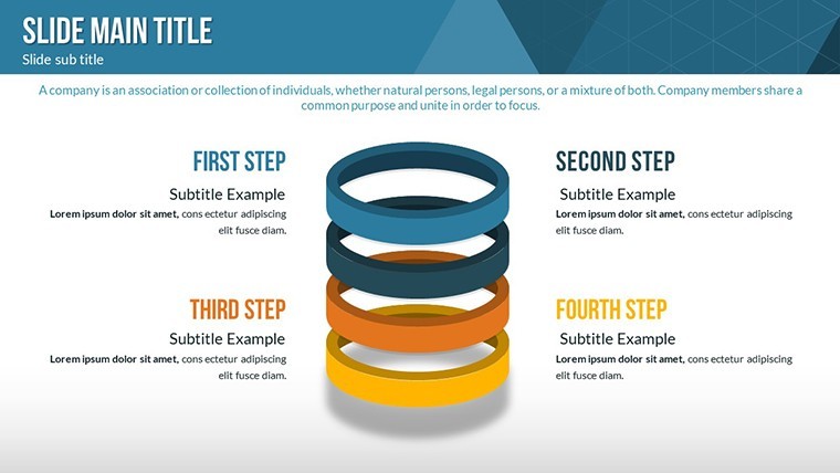
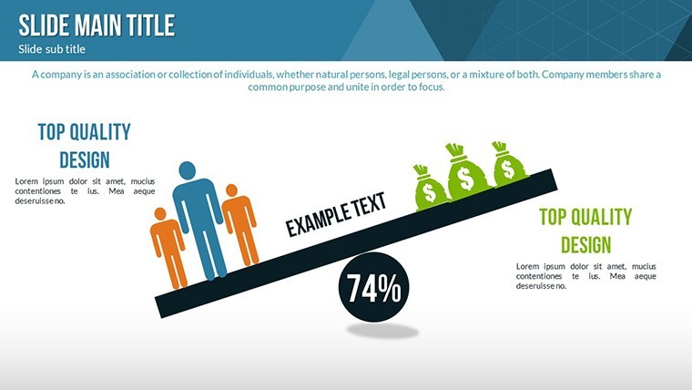
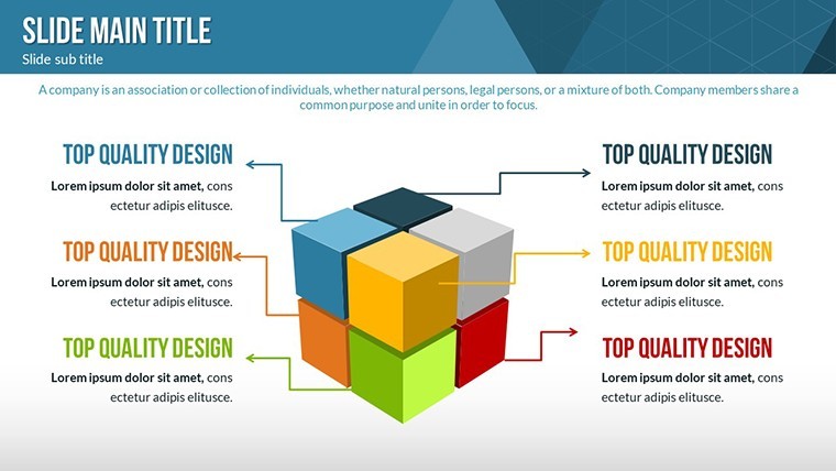
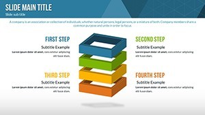
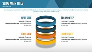
- 3D Visualization Mastery: Render data in three dimensions for depth, such as pyramid charts showing hierarchy in spending behaviors.
- Customization Flexibility: Alter every aspect - fonts, colors, and layouts - to align with your corporate identity.
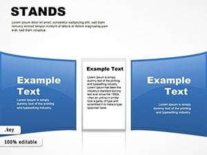
- Broad Applicability: From sales dashboards to market analysis, adapt slides for diverse scenarios.
- User-Friendly Interface: Intuitive tools make editing straightforward, even for non-designers.
- High-Quality Graphics: Vector-based elements scale perfectly without pixelation.
These features are informed by best practices from financial analysts, ensuring your presentations meet industry standards like those from the CFA Institute for clear economic reporting.
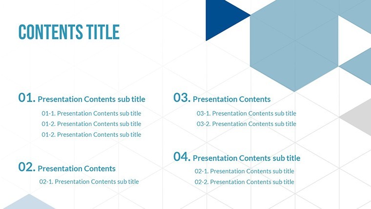
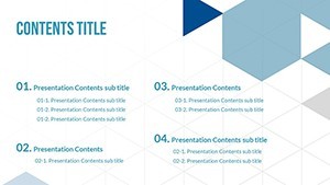
In-Depth Slide Exploration
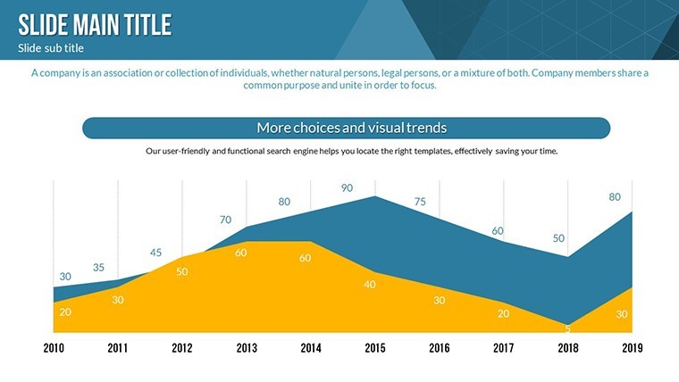
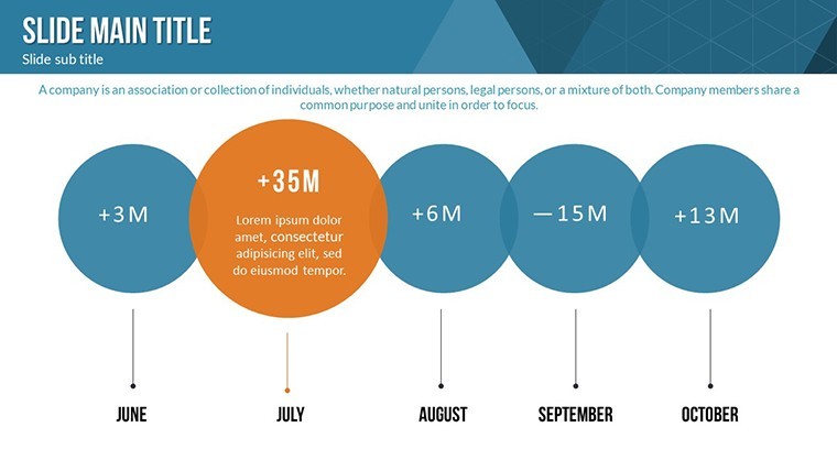
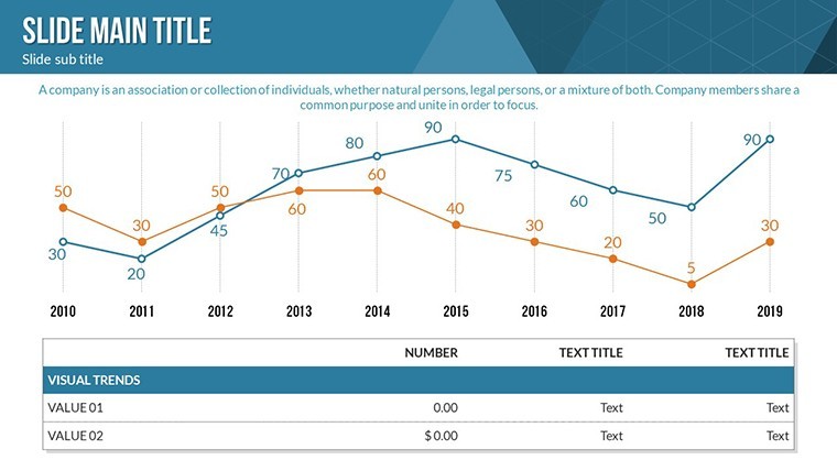
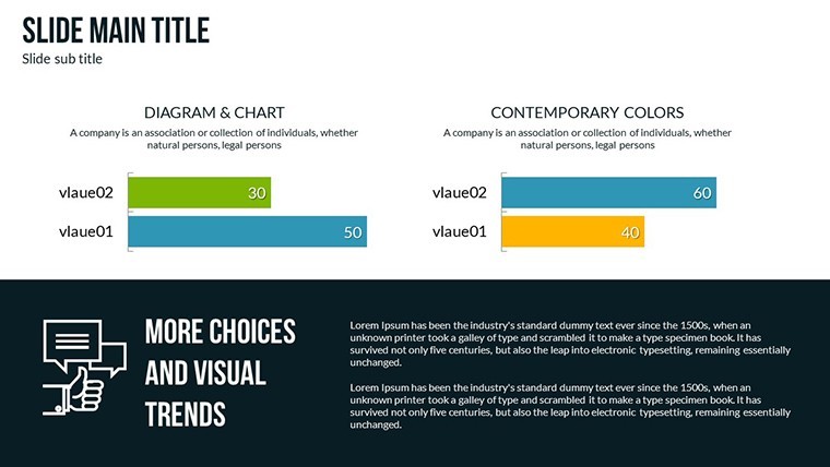
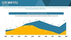
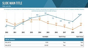
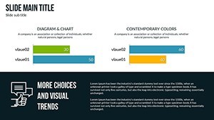
Slide 1 serves as an executive summary, with a 3D globe illustrating global purchasing power indices. Slides 2-6 delve into sales data: bar charts for regional comparisons, line graphs for trend tracking over quarters, and scatter plots for correlation between income and spending.
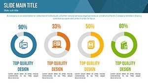
For market trends, Slides 7-12 offer heat maps of consumer hotspots, funnel diagrams for purchase journeys, and illustrative icons representing economic factors like inflation. Financial projections take center stage in Slides 13-18, with 3D pie charts for budget allocations, forecast models using area graphs, and risk assessment matrices.
The final slides, 19-24, include comparative analyses, such as versus competitors' purchasing metrics, and actionable summaries with callout boxes. This structure allows for a logical flow, mirroring how top consultancies like Deloitte structure their reports.
Practical Use Cases in Business Contexts
Envision a sales team leader using these charts to pitch expansion strategies, highlighting purchasing power growth in emerging markets via 3D animations. Or, an educator training future MBAs on economic principles, customizing slides to include real-time data from sources like the World Bank.
Marketers can leverage them for campaign planning, visualizing ROI on ad spends against consumer purchasing trends. In a case study reminiscent of Coca-Cola's market segmentation approaches, users have reported enhanced stakeholder buy-in when presenting with such vivid tools.
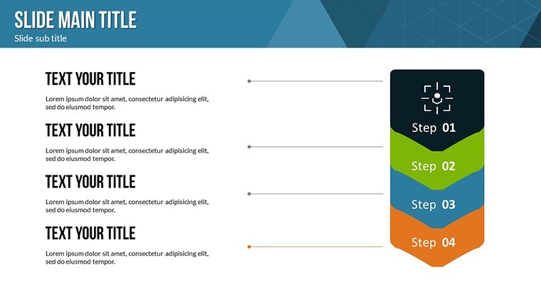
Customization Workflow Step-by-Step
- Secure your download of the .key file post-purchase.
- Launch in Keynote and navigate to desired slides.
- Enter data into charts for automatic updates.
- Tweak aesthetics using built-in inspectors.
- Incorporate images or videos for richer context.
- Enhance with animations for engaging reveals.
- Test and share in various formats.
This process streamlines creation, allowing focus on insights rather than design hurdles.
Expert Tips to Maximize Presentation Value
Integrate storytelling by weaving narratives around data - explain how a dip in purchasing power signals market shifts, using illustrative examples from the 2008 recession recovery. Employ LSI elements like "economic indicators" or "consumer spending patterns" organically to enrich content.
Compared to standard charts, the 3D aspects here provide a wow factor, increasing retention as per eye-tracking studies from the Nielsen Group. Build trust by citing data sources within slides, aligning with authoritative practices.
Step up your game - download this template and unlock new levels of business communication.
Frequently Asked Questions
- What makes the 3D elements special?
- They add depth to data, making abstract concepts like purchasing trends more tangible and engaging.
- Can I edit on non-Mac devices?
- Primarily for Keynote on macOS, but export options allow broader accessibility.
- Are icons included?
- Yes, vector icons for business themes are part of the package.
- Suitable for financial reports?
- Absolutely, with charts tailored for projections and analyses.
- How to handle large datasets?
- Charts support extensive data; simplify visuals for clarity.