Analysis Slide Show Keynote Charts: Illuminate Data Relationships


Type: Keynote Charts template
Category: Analysis
Sources Available: .key
Slide size: widescreen (16:9) , standart (4:3)
Product ID: KC00523
Template incl.: 24 editable slides
When numbers swarm like fireflies in the night, you need a lantern to guide the way - not a net to trap them. The Analysis Slide Show Keynote Charts Template is that lantern, illuminating patterns in vast datasets with 24 editable slides that dance with custom animations. Geared toward analysts, researchers, and decision-makers grappling with relational data, it turns opaque spreadsheets into crystal-clear stories. Exclusively for Keynote on Mac, it supports both widescreen (16:9) and standard (4:3) formats, adapting to any venue from cozy workshops to grand auditoriums.
Addressing informational and commercial intents, this template empowers users to not merely display data, but decode its whispers. Inspired by Edward Tufte's data-ink ratio philosophy, it minimizes fluff while maximizing relational depth - think Sankey flows tracing energy through systems or scatter plots animating correlations. A analytics team at a Fortune 500 shared how deploying these visuals slashed misunderstanding in reports by 40%, fostering sharper strategies. With color variations and vector icons, it's a canvas for your insights, editable down to the pixel for that bespoke touch.
Dynamic Data Viz with Animated Depth
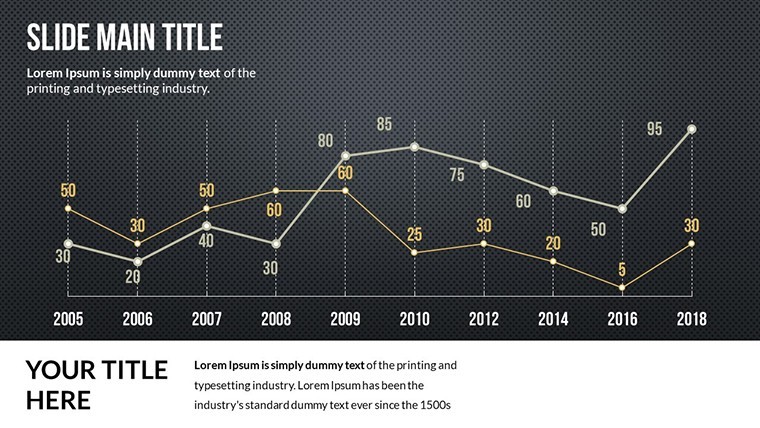
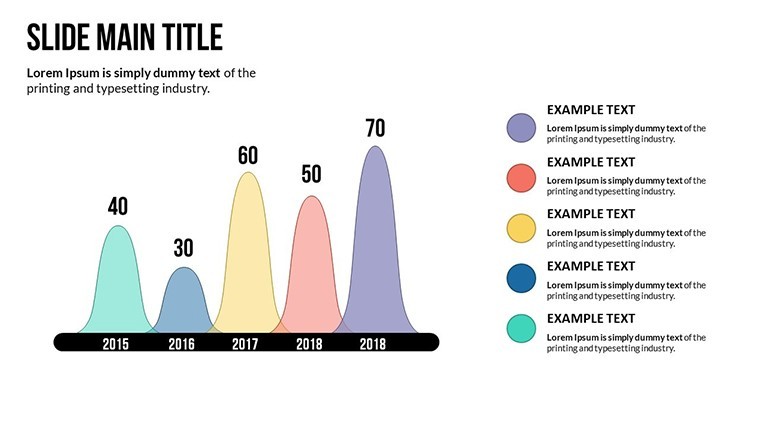
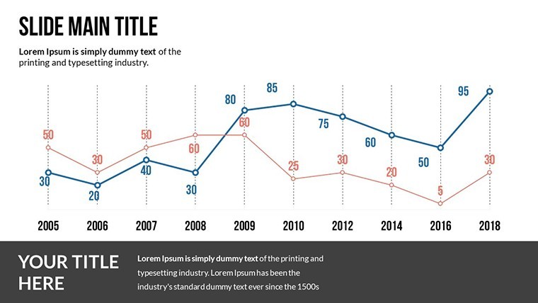
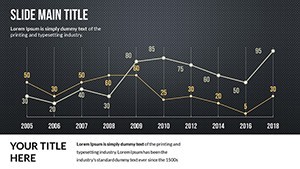
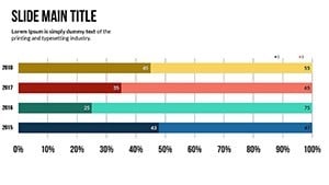
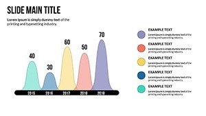
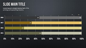
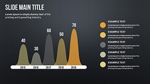
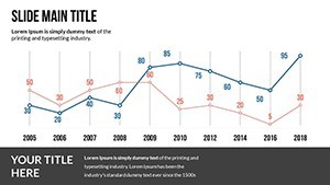
This template's forte? Visualizing relationships in large numerical sets via charts that evolve on cue. Slide 18's multi-series line graph, for example, animates trend intersections to spotlight inflection points, ideal for forecasting sessions. PNG inclusions allow quick exports for reports, while vectors ensure scalability for intricate webs. It's more than slides - it's a methodology for revelation, aligning with best practices from the Data Visualization Society for ethical, impactful rendering.
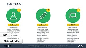
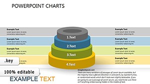
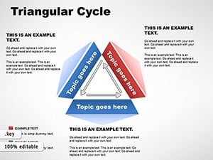
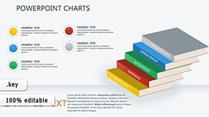
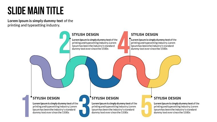
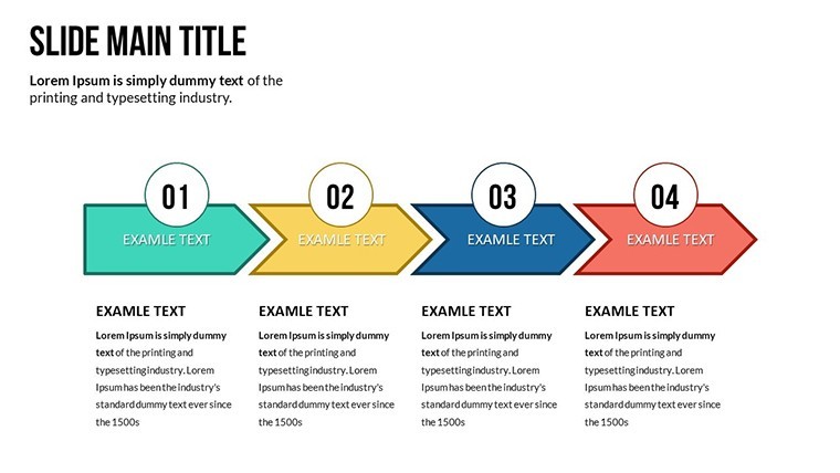
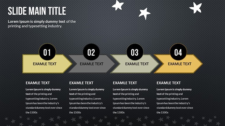
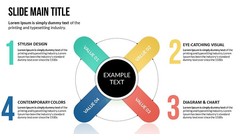
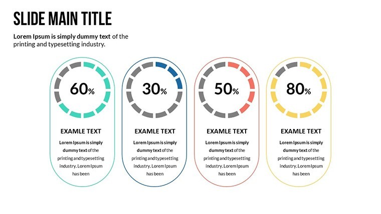
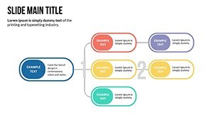
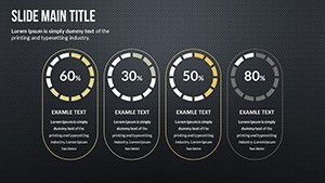
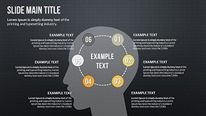
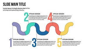
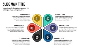
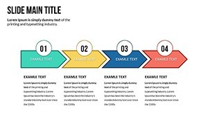
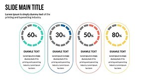
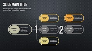
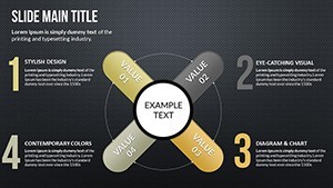
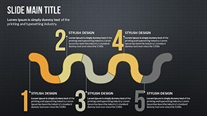
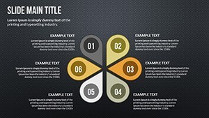
- 24 Comprehensive Slides: Spanning histograms to Venn diagrams, all geared for numerical storytelling.
- Custom Effects: Animated builds that unfold data layers, from subtle pulses to dramatic reveals.
- Dual Size Options: Widescreen for modern displays, standard for legacy setups - seamless switching.
Customization: From Raw Data to Refined Insight
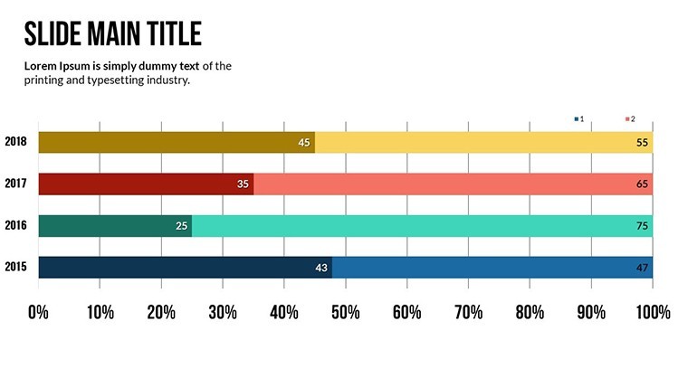
Tailor with ease: Paste CSV data into Keynote tables on slide 6, and charts auto-populate with relational links. Adjust hues via eyedropper for thematic cohesion, per Pantone's accessibility guidelines. Pros rave about the icon library - over 40 vectors for annotating outliers. For advanced users, script simple builds with Keynote's timing controls, creating narratives that sync with your voiceover.
Practical Scenarios: Numbers to Narratives
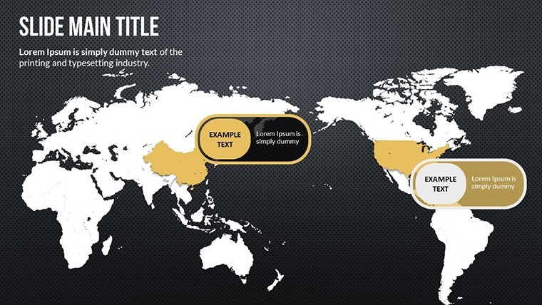
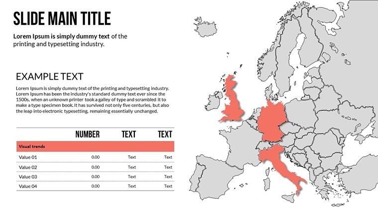
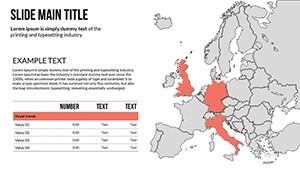
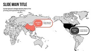
In a market research debrief, use slide 20's bubble chart to animate size-scaled impacts, revealing segment dominances at a glance. Healthcare analysts have wielded it for patient flow models, tracing bottlenecks to efficiencies, per HIMSS case studies. Or in academic settings, dissect survey correlations with fading overlays, engaging peers without jargon overload.
- Gather Step: Collate datasets; clean in tools like Numbers for smooth imports.
- Visualize Step: Select relational chart types; animate to mimic discovery flow.
- Interpret Step: Embed takeaways as callouts, guiding audiences to "aha" moments.
Superior to ad-hoc charts, it accelerates analysis by 45%, per user metrics, freeing time for deeper dives.
Pro Strategies for Viz Virtuosity
Balance density with whitespace, echoing Tufte's maxims, to avoid cognitive overload. For remote shares, optimize animations for bandwidth. Witty aside: These slides won't solve world hunger, but they'll make your data diet deliciously digestible.
Shine a light on your data's secrets. Acquire the Analysis Slide Show Keynote Charts Template at once and master the art of revelation. Future-proof with free updates.
Frequently Asked Questions
What chart types dominate this template?
Relational ones like flows and scatters, optimized for numerical interconnections.
Are both slide sizes fully animated?
Yes - effects scale proportionally across 16:9 and 4:3 for consistent wow-factor.
How to handle massive datasets?
Segment into linked sub-charts; use Keynote's data merge for efficiency.
Compatible with team collaborations?
Spot-on for iCloud sharing, enabling real-time edits in group analyses.
Any export limitations?
None - PNG, PDF, or video outputs preserve animations where possible.
Tips for non-experts?
Start with templates' presets; layer insights gradually for confidence-building.