Dynamic Architectural Analysis Keynote Charts Template


Step into the future of architectural discourse where data doesn't just support your designs - it propels them forward with kinetic energy. Our Dynamic Architectural Analysis Keynote Charts Template redefines how architects, analysts, and sales leads present insights, offering 20 editable slides brimming with animations that turn metrics into mesmerizing stories. Tailored for the design elite, this template dissects everything from structural load simulations to client engagement funnels, ensuring your presentations resonate with the precision of a laser-cut model. In a field where first impressions build empires, these charts provide the dynamic edge to communicate complex analyses effortlessly, fostering decisions that echo through cityscapes.
Rooted in industry best practices, akin to the animated breakdowns in Foster + Partners' sustainability reports, this template excels in Keynote's ecosystem, with transitions as smooth as a parametric curve. Customize to your brand's ethos - infuse corporate blues or verdant greens - and watch as pie charts rotate to unveil energy efficiency breakdowns or bar graphs cascade to highlight phased budgeting. It's more than a tool; it's a catalyst for turning analytical rigor into architectural triumph.
The Art of Dynamic Visualization in Design Narratives
Dynamic elements elevate analysis from informative to immersive, much like how Zaha Hadid Architects animated tensile stress maps to win the Heydar Aliyev Center bid. Our template harnesses this power across slides, using fade-ins for metric reveals that mirror the unveiling of a facade curtain wall. For sales teams pitching heritage restorations, an animated radar chart spins to compare restoration costs versus value adds, drawing viewers into the strategic web.
Premier Features for Impactful Insights
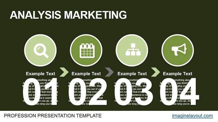
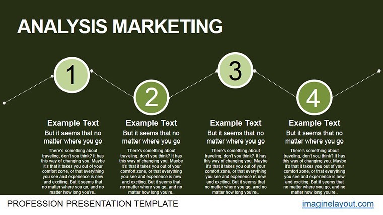
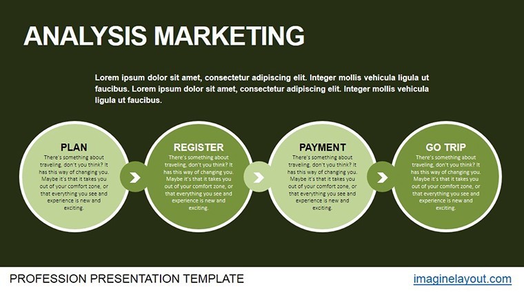
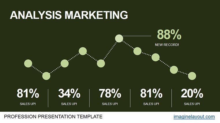
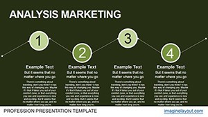
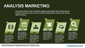
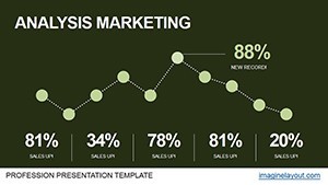
- Animated Mastery: Fluid transitions on line graphs tracking urban density shifts, with customizable speeds for pacing.
- Brand-Aligned Customization: Drag-and-drop color swatches and icon libraries themed around drafting and modeling tools.
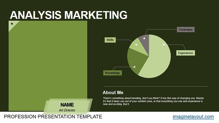
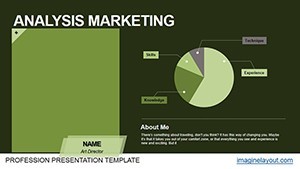
- Analysis Arsenal: From donut charts for stakeholder distributions to heatmaps for site traffic patterns.
- Effortless Integration: One-click import into existing Keynote files, no reformatting required.
These assets are honed for architectural workflows, slashing revision cycles and amplifying your through visuals that demonstrate deep domain knowledge.
Versatile Applications: Sculpting Success Stories
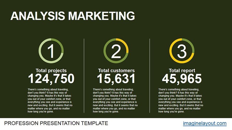
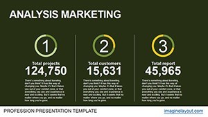
Envision a business analyst at a firm like Skidmore, Owings & Merrill using Slide 12's combo chart: animated columns rise alongside trend lines to juxtapose material innovations against cost curves, clinching eco-certifications. Or for sales huddles, the performance dashboard (Slide 18) pulses with KPI metrics, transforming quarterly reviews into motivational montages that spur cross-team alignments.
Guided Path to Presentation Perfection
- Setup Swiftly: Launch in Keynote, populate via copy-paste from Revit exports.
- Animate Strategically: Sequence builds to align with your script - e.g., delay reveals for dramatic effect in risk assessments.
- Enhance with Layers: Overlay wireframes on charts for contextual depth in feasibility studies.
- Collaborate Seamlessly: Share via Keynote Live for instant feedback loops.
- Finalize Flexibly: Output to 4K video for investor decks or interactive PDFs for council submissions.
Such steps yield decks that not only inform but influence, with pros reporting heightened stakeholder trust post-adoption.
Why Elevate Beyond the Basics?
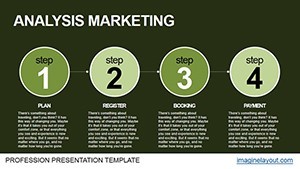
Standard Keynote charts are like sketches without shading - flat and forgettable. Ours adds dimensionality: modular animations that adapt to narrative needs, plus LSI-infused labels like "load-bearing analytics." Explore the slides: Introductory vortex diagram (Slide 1) spirals metrics into focus; core analysis Sankey flows (Slide 9) channel resource streams; culminating impact matrix (Slide 20) explodes with potential outcomes, priming calls to action.
Expert Tweaks for Design Dynamism
- Echo building rhythms in animation timings - sync to heartbeat pulses for vitality themes.
- Embed QR codes linking to full BIM models beside summary charts.
- Leverage Keynote's actions for clickable deep dives into sub-data.
Empower your analyses to architect futures. Secure the Dynamic Architectural Analysis Keynote Charts Template immediately and let data design your destiny.
Frequently Asked Questions
How do the animations enhance architectural presentations?
They create engaging transitions that mirror design processes, making abstract data feel tangible and story-like.
Is customization limited to colors?
No - edit layouts, icons, and data bindings fully to match your project's unique aesthetic.
Who is this best suited for in architecture?
Analysts, sales teams, and principals seeking to blend metrics with creative storytelling.
Can I use it for non-Keynote software?
Export options support PowerPoint and Google Slides, though animations optimize in Keynote.