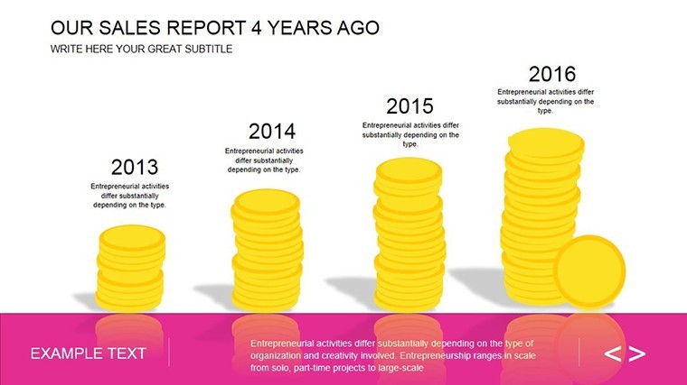
Sales Report Keynote Charts: Editable Infographics


Type: Keynote Charts template
Category: Analysis
Sources Available: .key
Product ID: KC00457
Template incl.: 17 editable slides
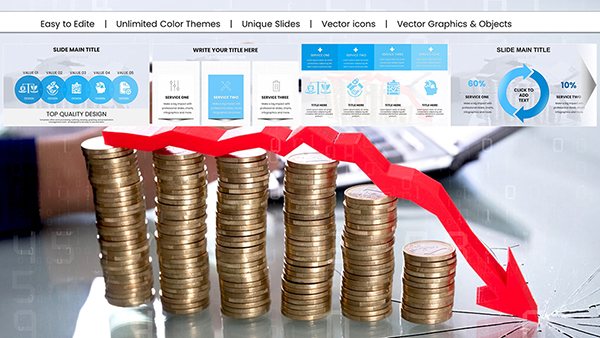
In the high-stakes arena of sales, where numbers must not just inform but persuade, your presentations need to hit like a chart-topping single. Enter our Sales Report Keynote Charts template - a 17-slide powerhouse crafted for sales managers, marketing leads, and analysts who demand visuals that convert data into compelling narratives. Forget flat spreadsheets; this template transforms quarterly figures into vibrant infographics that spotlight trends, forecast wins, and rally teams toward targets.
Picture this: You're in a boardroom, unveiling Q3 results not as a monotonous table, but as an animated funnel chart that funnels leads through stages, with conversion rates blooming like success metrics. Inspired by real triumphs - like how a SaaS company boosted close rates by 30% using similar dynamic reports - this template harnesses Keynote's interactivity to make your data dance. With 17 editable slides, it's your secret weapon for turning raw analytics into strategic gold, compatible across devices for seamless remote pitches.
Why does it resonate? Because in sales, clarity wins deals. We've baked in LSI-rich elements like KPI dashboards and revenue waterfalls, ensuring your deck speaks the language of decision-makers. Customize effortlessly: Swap datasets, tweak palettes to match your brand's energy, and add hyperlinks to live sources for that extra layer of trust.
Standout Features for Sales Superstars
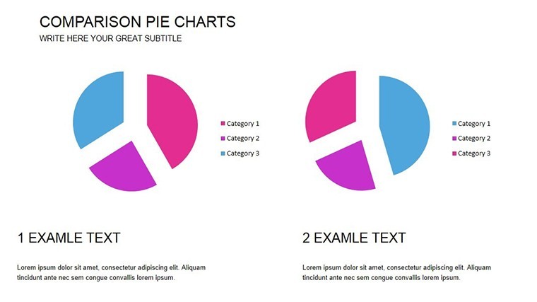
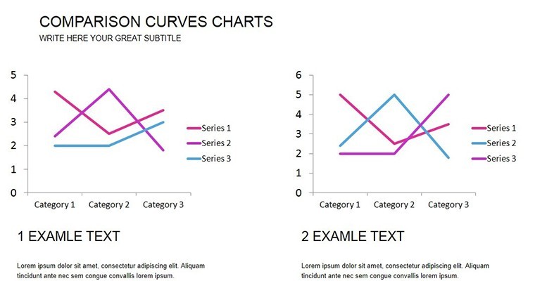
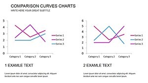
This isn't your average chart pack; it's engineered for impact. Dive into slides featuring pie charts that segment market shares with 3D depth illusions, or line graphs tracing YoY growth with smooth curve animations. Each element is vector-sharp, scaling perfectly for projectors or mobile views.
- 17 Versatile Slides: From bar comparisons to scatter plots, cover every sales angle imaginable.
- Brand-Aligned Customization: Infinite color schemes and font pairings to echo your corporate vibe.
- Interactive Elements: Hover effects and drill-downs that reveal sub-metrics on click.
- Data Integration: Link to Excel for auto-refreshing visuals - no manual tweaks mid-pitch.
Mastering the Sales Flow: A Step-by-Step Guide
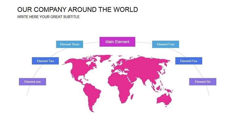
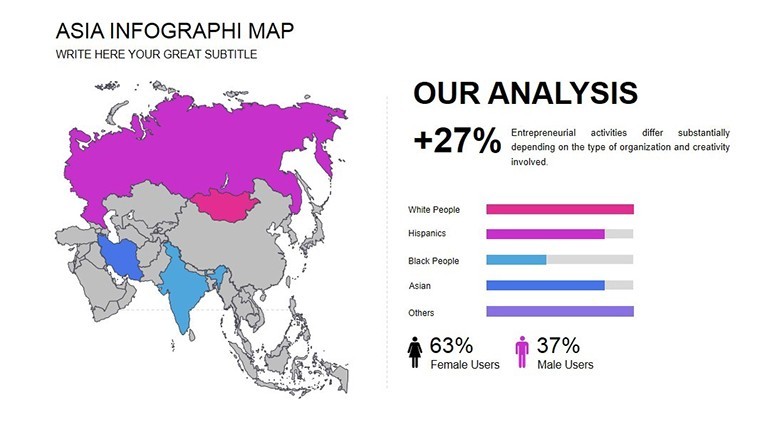
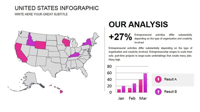
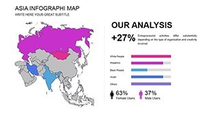
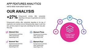
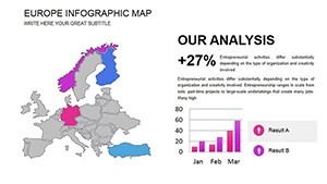
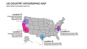
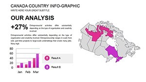
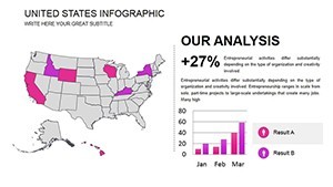
Getting started is a breeze. Slide 1 kicks off with an executive summary dashboard, aggregating key metrics into one glanceable pane. For deeper dives, use Slide 8's territory map - geospatial charts that pinpoint regional performance, ideal for field sales alignments. Pro hack: Layer in conditional formatting; reds fade to greens as quotas fill, visually gamifying progress.
Consider a marketing exec prepping for a campaign review: Import A/B test data, and the template's built-in formulas calculate lift percentages on the fly. This shaved hours off prep for one ad agency, letting them focus on storytelling instead.
Targeted Use Cases: From Pitch to Close
For sales teams, it's gold during pipeline reviews. Animate a Gantt-style slide (Slide 14) to project deal timelines, with drag-and-drop milestones that adjust forecasts in real-time. In consulting, showcase client ROI with before-after comparisons, where bar heights metaphorically "build" value over time.
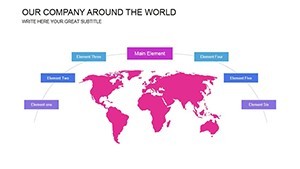
Educators in business schools love it too - teaching revenue models via simulated reports that students can manipulate. Or in nonprofits, track donor funnels, turning giving trends into motivational arcs that inspire board buy-in.
- Gather Data: Pull from your CRM; templates handle up to 1,000 rows seamlessly.
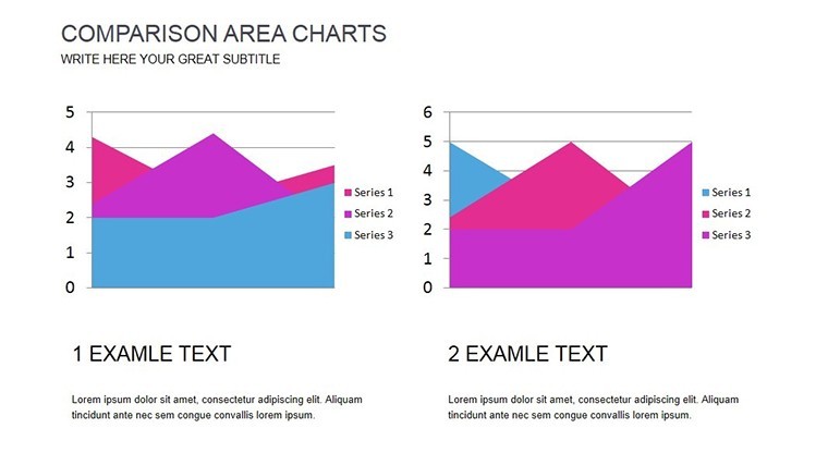
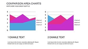
- Visualize Trends: Select slide types - e.g., area charts for cumulative sales.
- Add Narrative: Embed speaker notes with talking points tied to each visual.
- Rehearse & Refine: Keynote's presenter view syncs animations to your pace.
Beyond Basics: Elevating with Advanced Tweaks
Compare to vanilla Excel exports: Those often look dated and static, while our infographics pulse with life, adhering to data viz best practices like Tufte's principles - maximizing ink-to-data ratio for purity. Integrate with Tableau previews for hybrid decks, or use shape libraries for custom icons like currency symbols that morph into trends.
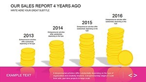
For architecture firms pitching developments, adapt sales slides to cost breakdowns - waterfalls showing budget allocations, with animated builds revealing overruns early. A design studio reported nailing a high-profile contract by framing financials this way, blending numbers with narrative flair.
Why This Template Drives Results
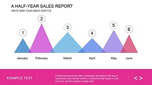
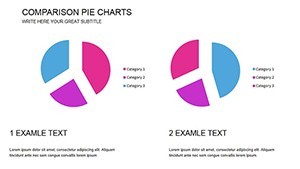
Slide breakdowns reveal genius: Slide 3's donut chart dissects product lines with inner rings for subcategories, perfect for portfolio diversification talks. Tips: Vary chart types to combat audience fatigue - mix radial radars for competitor analysis with timelines for historical context.
Workflow-wise, it slots into Agile sprints; update weekly, and share via iCloud for collab. The result? Presentations that don't just report sales - they propel them.
Seize the momentum: Download your Sales Report Keynote Charts now and chart the course to your next win.
Frequently Asked Questions
Is this template compatible with older Keynote versions?
Yes, built for Keynote 13+, with fallbacks for earlier via static exports.
How do I handle large datasets?
Slides support filtering and grouping; for massive sets, link external sheets for overflow.
Can I use it for Google Slides?
Export as .pptx and import - most animations preserve, though test for fidelity.
Are there pre-built formulas?
Indeed, including SUMIF for aggregations and TREND for forecasts - plug-and-play.
What's the update policy?
Lifetime access with free quarterly enhancements, like new chart styles.
How does it support team collaboration?
iCloud sync enables real-time edits; version history tracks changes.